Command-line interfaces (or CLIs) are becoming more and more interactive lately. They accept user input, render many variations of user interfaces, have improved designs, and are generally more pleasant to work with these days.

Thanks to these advancements, CLIs are no longer reserved for hardcore programmers. More people have started using CLI over graphical user interfaces.
Take Jest for example: it offers a user-friendly interactive watch mode that eliminates the need for any GUI. However, creating such a CLI is not an easy task.
Rendering something to terminal involves basically joining multiple strings together and writing them to output stream.
This code can be hard to test, because it doesn’t usually decouple from the rest of the codebase well.
Interactivity is another headache, since tools mostly solve a specific problem, such as asking a user a question and letting them select an answer from a list of questions.
What if we had a platform for building interactive command-line applications that would provide us with the building blocks for creating any user interface imaginable?
Better yet, what if those building blocks were components, too?
That’s where React and Ink come in.
React lets you structure terminal output in components in the same way you’d build an app for a browser.
Ink takes these components and renders them to terminal, relieving you from the burden of assembling terminal output manually.
Here’s how easy it is to create a simple counter with Ink in terminal:
const React = require('react');
const {render, Text, Color} = require('ink');
const useAutoCounter = require('@use-it/auto-counter');

const Counter = () => {
  // Count from zero to infinity every 100ms
  const count = useAutoCounter(0, 100);

  return (
    <Text>
      Count: <Color green>{count}</Color>
    </Text>
  );
};

render(<Counter/>);
Here’s an example of the auto-counter in action.
It’s important to note that Ink not only renders components like Text, Color and Box, but also allows you to use Flexbox to lay out these components almost as you would in the browser with CSS.

The Replay is a weekly newsletter for dev and engineering leaders.
Delivered once a week, it's your curated guide to the most important conversations around frontend dev, emerging AI tools, and the state of modern software.
Thanks to React and Ink, you can import 3rd-party components and mix and match them in your terminal application.
This was not easily achievable before. There are all kinds of components you can reuse, from text inputs, selectable lists, spinners and progress bars to links (yes, links in the terminal), and images (yes, images in the terminal!)
Companies like Gatsby and Shopify), as well as popular projects such as Parcel and Tap, are already using Ink for building and rendering the user interface of their CLIs.
Let’s find out why.
Now, let’s experience the magic first-hand and create our own command-line application with React and Ink.
We’re going to build a tiny utility that searches for files in the current directory and then opens it in the user’s favorite code editor.
At the end of this tutorial we’ll have an interactive CLI that looks like this.
Here’s how it’s going to work:
Let’s skip the boilerplate and use create-ink-app, which scaffolds a new CLI with React and Ink pre-configured so we can start building our tool right away. You may have heard of create-react-app, which does the same job but for React apps in the browser.
Create a new directory called search (this will be the name of our CLI) and run create-ink-app inside it:
$ mkdir search
$ cd search
$ npx create-ink-app
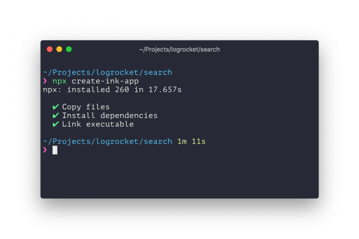
It may take create-ink-app a few minutes to install all dependencies for you. Once it’s finished, you should see the following output:

At this point, search CLI is already available in your environment and you can try running it:
$ search
If all is well, you should see a “Hello, Stranger” message, where the word “Stranger” is green.
If you take a look at the search directory, you’ll find cli.js and ui.js files. For the sake of simplifying this tutorial, we’re going to be working only with ui.js, since that’s where the user interface of our CLI is implemented.
Replace the source code of ui.js that create-ink-app scaffolded for us with this so that we can start from scratch:
'use strict';
    const React = require('react');
    const {Box} = require('ink');

    const App = () => {
      return (
        <Box/>
      );
    };

    module.exports = App;
If you run it, nothing will be rendered, because App returns an empty Box component. The Box component is used as a container for other components like Text or Color.
Every Box component aligns its children horizontally, similar to a div element with display: flex applied in a browser.
The first thing that our CLI needs to do is accept and handle user input.
We need to install ink-text-input component to implement that easily, which already handles things like cursor management and recording of user input.
$ npm install ink-text-input
Now, we’ll add a TextInput component to our CLI.
TextInput component doesn’t handle input state, so we need to pass the value property with a current input value and an onChange handler to update it when the user enters more characters.
Text that you pass via the placeholder property will be displayed when the user hasn’t entered any text yet.
'use strict';
const React = require('react');
const {Box} = require('ink');
const TextInput = require('ink-text-input').default;

const App = () => {
  const [value, setValue] = React.useState('');

  return (
    <Box>
      <TextInput
        placeholder="Enter your search query..."
        value={value}
        onChange={setValue}
      />
    </Box>
  );
};

module.exports = App;
If you try running the search command in the terminal now, you should see an “Enter your search query…” text and be able to type any text you want.
You should also be able to use a cursor to move left and right inside the text value you’ve entered.
Let’s rename value and setValue to searchQuery and setSearchQuery, respectively, to better reflect what this variable is for.
We’ll also use the Color component to add a nice green arrow before text input to highlight it better:
'use strict';
const React = require('react');
const {Box, Color} = require('ink');
const TextInput = require('ink-text-input').default;

const App = () => {
  const [searchQuery, setSearchQuery] = React.useState('');

  return (
    <Box>
      <Color green>❯ </Color>
      <TextInput
        placeholder="Enter your search query..."
        value={searchQuery}
        onChange={setSearchQuery}
      />
    </Box>
  );
};

module.exports = App;
If you run the search command again, you should see a nice green arrow before the text you’re typing.
Now, let’s add an actual searching functionality.
As the user types their query, we’re going to search the entire directory for files that match that query.
To do this, we’re going to install two new modules – globby and fuzzaldrin. Globby returns a list of all files in the current directory while fuzzaldrin searches this list to see if any file names match the search query.
$ npm install globby fuzzaldrin
To speed up the search, we only need to scan the directory once and then just keep filtering it with different search queries.
To do that, we’re going to use a useEffect hook with an empty list of dependencies, which makes it execute only once after the component is first rendered.
We’re also going to create a new state variable via useState called files, where we’ll store the list of all files.
'use strict';
const React = require('react');
const {Box, Color} = require('ink');
const TextInput = require('ink-text-input').default;
const globby = require('globby');

const App = () => {
  const [searchQuery, setSearchQuery] = React.useState('');
  const [files, setFiles] = React.useState([]);

  React.useEffect(() => {
    globby(['**/*', '!node_modules']).then(files => {
      setFiles(files);
    });
  });

  return (
    <Box>
      <Color green>❯ </Color>
      <TextInput
        placeholder="Enter your search query..."
        value={searchQuery}
        onChange={setSearchQuery}
      />
    </Box>
  );
};

module.exports = App;
There are two patterns passed to globby and each of them does the following:
**/* – signals to search all directories recursively (find all nested files)!node_modules -signals to ignore node_modules directory, since you wouldn’t normally want to search inside dependenciesNext, since we already store the current search query in searchQuery, we can immediately filter the files array with fuzzaldrin to get our search results.
Fuzzaldrin is fast enough that we can execute it on every render.
'use strict';
const React = require('react');
const {Box, Color} = require('ink');
const TextInput = require('ink-text-input').default;
const globby = require('globby');
const fuzzaldrin = require('fuzzaldrin');

const App = () => {
  const [searchQuery, setSearchQuery] = React.useState('');
  const [files, setFiles] = React.useState([]);

  React.useEffect(() => {
    globby(['**/*', '!node_modules']).then(files => {
      setFiles(files);
    });
  });

  const searchResults = fuzzaldrin.filter(files, searchQuery);

  return (
    <Box>
      <Color green>❯ </Color>
      <TextInput
        placeholder="Enter your search query..."
        value={searchQuery}
        onChange={setSearchQuery}
      />
    </Box>
  );
};

module.exports = App;
Now, we need to display the list of results and allow the user of our CLI to select the file they want.
We can use the ink-select-input module, which provides a SelectInput component that implements a list of choices. To install this component, run the following command:
$ npm install ink-select-input
Next, we’ll modify our ui.js file by adding a SelectInput component and a list of choices.
There’s one step in-between, though.
In our current code, searchResults is an array of strings where each item is a file path. However, SelectInput expects an array of objects where each object looks like this:
{
  label: "Label of item, displayed to the user",
  value: "Internal value, not displayed to the user"
}
To pass along a list of items that SelectInput understands, we’ll need to update the searchResults array to contain objects like these:
'use strict';
const React = require('react');
const {Box, Color} = require('ink');
const TextInput = require('ink-text-input').default;
const SelectInput = require('ink-select-input').default;
const globby = require('globby');
const fuzzaldrin = require('fuzzaldrin');

const App = () => {
  const [searchQuery, setSearchQuery] = React.useState('');
  const [files, setFiles] = React.useState([]);

  React.useEffect(() => {
    globby(['**/*', '!node_modules']).then(files => {
      setFiles(files);
    });
  });

  const searchResults = fuzzaldrin.filter(files, searchQuery).map(file => ({
    label: file,
    value: file
  }));

  return (
    <Box flexDirection="column">
      <Box>
        <Color green>❯ </Color>
        <TextInput
          placeholder="Enter your search query..."
          value={searchQuery}
          onChange={setSearchQuery}
        />
      </Box>

      <SelectInput
        limit={5}
        items={searchResults}
      />
    </Box>
  );
};

module.exports = App;
Note that I’ve also added a limit={5} property so the list only displays a maximum of 5 items at a time.
If the number of items is actually bigger than 5, the list will become scrollable. How cool is that?
You may have also noticed that I wrapped the entire output in <Box flexDirection="column">.
I did this to position search results below search input. Otherwise they would all be displayed horizontally, side by side.
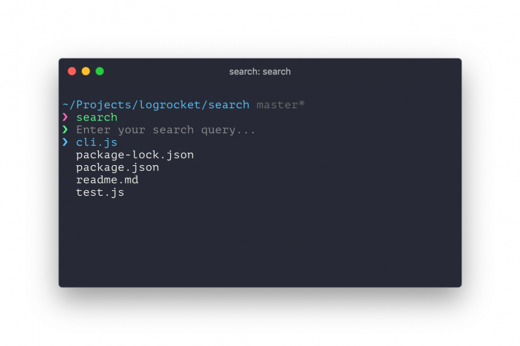
Let’s see how our CLI looks! Run the search command and you should see something like this:
By default, it displays all files in the current directory. You can move up and down the list with your arrow keys.
If you enter a search query, it should filter the list with files that only match the search pattern.
Now let’s add the last missing piece — selecting files and opening them in the user’s preferred code editor. We will need to install an open-editor dependency, which does this for us.
$ npm install open-editor
Before we start, it’s important to check if you have a preferred code editor set in the first place.
You can verify this by running the following command in the terminal:
$ echo $EDITOR
If the command runs successfully, feel free to skip the next paragraph.
If it doesn’t output anything, that means you need to set a preferred code editor.
For the purposes of this tutorial, we’re going to set it only for the current terminal session.
However, it’s best to set it in your configuration file, like .bashrc or .zshrc. Here are few examples of how to select different code editors as preferred ones:
# Set Atom as preferred editor
export EDITOR=atom

# Set Sublime Text as preferred editor
export EDITOR=subl

# Set Vim as preferred editor
export EDITOR=vim
Next, let’s add an onSelect handler to the SelectInput component. This handler will receive an item from the searchResults array, which we’ll use to open a file in the user’s editor.
'use strict';
const React = require('react');
const {Box, Color} = require('ink');
const TextInput = require('ink-text-input').default;
const SelectInput = require('ink-select-input').default;
const globby = require('globby');
const fuzzaldrin = require('fuzzaldrin');
const openEditor = require('open-editor');

const App = () => {
  const [searchQuery, setSearchQuery] = React.useState('');
  const [files, setFiles] = React.useState([]);

  React.useEffect(() => {
    globby(['**/*', '!node_modules']).then(files => {
      setFiles(files);
    });
  });

  const searchResults = fuzzaldrin.filter(files, searchQuery).map(file => ({
    label: file,
    value: file
  }));

  const handleSelect = searchResult => {
    openEditor([
      {
        file: searchResult.value,
        line: 1,
        column: 1
      }
    ]);
  };

  return (
    <Box flexDirection="column">
      <Box>
        <Color green>❯ </Color>
        <TextInput
          placeholder="Enter your search query..."
          value={searchQuery}
          onChange={setSearchQuery}
        />
      </Box>

      <SelectInput
        limit={5}
        items={searchResults}
        onSelect={handleSelect}
      />
    </Box>
  );
};

module.exports = App;
Voila! Our very own command-line app with React and Ink is ready.
Try evolving this CLI further to strengthen your knowledge of Ink.
You can add a loading spinner while the file list is loading, let users select multiple files, add a big fancy logo, or do just about anything that comes to mind.
As you can see, building interactive CLIs isn’t that scary when you have the right tools on hand.
With the superior capabilities of React, it’s easier than ever to split your user interface into components.
It’s important to remember that React’s scope is far beyond the applications that live in the browser.
People use React to build mobile, VR, and now terminal applications. I’m sure we’ll see even more environments where React’s methodology shines.
Don’t stop your curiosity train.
Install LogRocket via npm or script tag. LogRocket.init() must be called client-side, not
server-side
$ npm i --save logrocket

// Code:

import LogRocket from 'logrocket';
LogRocket.init('app/id');
// Add to your HTML:

<script src="https://cdn.lr-ingest.com/LogRocket.min.js"></script>
<script>window.LogRocket && window.LogRocket.init('app/id');</script>

Learn how Vite+ unifies Vite, Vitest, Oxlint, Oxfmt, Rolldown, and Node.js management in one CLI.

AI companies are buying developer tools as coding agents turn runtimes, package managers, and linters into strategic infrastructure.

Learn how AI-assisted development governance uses rules, agents, hooks, and protocols to help AI coding tools produce safer, more consistent code.

A step-by-step guide to building your first MCP server using Node.js, covering core concepts, tool design, and upgrading from file storage to MySQL.
Hey there, want to help make our blog better?
Join LogRocket’s Content Advisory Board. You’ll help inform the type of content we create and get access to exclusive meetups, social accreditation, and swag.
Sign up now