According to the MDN Web Docs, the HTML <form> element represents a document section containing interactive controls for submitting information. Whenever we, as web developers, require information from our users, we present them with a <form> element.

On a high-level, it could be the commonplace login form with the user’s email address and password, or a security enhanced two-factor authentication (2FA) form to double check sensitive operations. Either way, forms represent a contractual interface between our requirements and the user’s possessions.
The basic building blocks of the <form> element are its controls. These controls range from basic interactive elements like the <input>, to structural elements like the <fieldset> used to group several other controls. Others include controls like <button> for performing a click action, and <label> for describing other controls.
Of all the controls, the input is perhaps the most variant and most used. Or as documented on MDN, it is one of the most powerful and complex in all of HTML elements due to the sheer number of combinations of input types and attributes.
<input> elementTo understand the true complexity behind <input>s is to step back to understand the primary purpose of web forms: to get information from the user, but more importantly, to foster interaction between users and websites, and even more fundamentally between Human and Computer. This kind of interaction is sufficiently complicated and complex enough to have given rise to the multidisciplinary field of Human-Computer Interaction (HCI).
The crux here is that when a user interacts with a website, they are basically performing one of the basic CRUD (Create, Read, Update, Delete operations Query, Mutation, and Subscription in GraphQL. And when we present the user with a form, we are basically interacting with them through a “dialogue system”.
When speaking of HCI in relation to web forms, we are often led down the road of usability and security. We often do not need to augment the default form elements as many websites do, neither do we need to manually enhance validation, but attempting to provide a generic API will not serve the best, specific, and secure needs of everyone.
As you work through this dialogue system, you’ll notice that the type of data you are trying to get from the user depends on what type of <input> you use, and as you’ll learn, data type and input type are sometimes mutually exclusive.
Nevertheless, the flexibility of <inputs>s still shine above other form controls. For most every interaction, there’s often an <input> that can get you the type of data you want from the user. It also has some sensible defaults that you do not have to re-wire, like the password input where the user input is already obscured. And there are times when you need to extend the functionality of certain inputs to do just as you want them to.
The flexibility of the <input> control makes it powerful but also makes it complex, and when coupled with the fact that it is one of the controls used to achieve the goal of a web form, you can expect a plethora of ways to do it right and wrong.
<input> typesSimilar to every other HTML element, the <input> element has a number of attributes that can be used to configure it to a particular need. Of all the available attributes, the type attribute is the most important because it gives an <input> its identity. When not explicitly specified or when not supported, or when a non-existing type is specified, the type defaults to text. That is, <input> or <input type="undefined"> is technically equivalent to <input type="text">
Technically, all inputs share the HTMLInputElement interface and, by extension, have the same exact set of attributes.
However, these attributes are functionally dependent on the type of the input they’re used with. For example, both the text and checkbox input have the autocomplete attribute, but while it works on a text input, it is ignored on a checkbox.
Also, an <input>’s functionality, design, and availability is dependent on the device and user agent.
Take the telephone input ( <input type="tel">) for example. It displays a telephone keypad in supported devices with on-screen/virtual keypads like a phone, and has no practical advantage over the text input when used on a device without an on-screen keypad.
Speaking of virtual keypads, how you configure or customize them and the type you use can also result in differences in what you see.
Apart from the type attribute, there are other important attributes like required (indicating that the user must provide a value for that control before the form can be submitted) or the placeholder (representing a hint describing the <input>).
But the type attribute is the most important, not just because it gives an <input> its identity, or because they contribute to that sheer number of combinations that makes <input>s complex, but also because of the functional dependence attributes have on them.
Excluding the obsolete datetime type, there are currently 22 types of input in total as shown in the table below:
| Type | Description | Basic definition |
|---|---|---|
button |
Represents a button that with no default behavior. | <input type="button"/> |
checkbox |
Renders a checkbox that can be checked, unchecked, or indeterminate |
<input type="checkbox"/> |
color |
Renders a color picker when supported, or a text box for entering color codes/values with validation. |
<input type="color"/> |
date |
A control for entering a date whose parsed valid is in the format: YYYY-MM-DD |
<input type="date" /> |
datetime-local |
Renders a control for selecting or entering a date and time. | <input type="datetime-local" /> |
email |
Renders a control for email address entries. It validates the format of the entered email addresses. | <input type="email" /> |
file |
Allows file upload from local storage. | <input type="file" /> |
hidden |
It’s an hidden control, according to the name. It has no visual representation but its value will be submitted. | <input type="hidden" /> |
image |
Represents a button but with an image as its value. | <input type="image" /> |
month |
A control for entering a date whose parsed valid is in the format: YYYY-MM |
<input type="month" /> |
number |
Represents a control that allows number entries, including validation. On devices with on-screen keypads, an optimized numeric keypad may be shown. | <input type="number" /> |
password |
Renders a text field enhanced for password entries. Entries are obscured often with a dot symbol. |
<input type="password" /> |
radio |
Similar to a checkbox but mostly useful in a group. Allows selection of a singe radio button in a group, and can only be checked or unchecked |
<input type="radio" /> |
range |
Represents a slider control with a predefined minimum and maximum value. | <input type="range" /> |
reset |
Represents a button that with the default behavior or resetting form values to their initial state. | <input type="reset" /> |
search |
It is basically a text type visually optimized for search. |
<input type="search" /> |
submit |
Represents a button with a default behavior of submitting a form. | <input type="submit"/> |
tel |
It is basically a text type optimized in devices with on-screen keyboards for entering telephone numbers. It does no validation of its entry. |
<input type="tel"/> |
text |
It renders a basic single-line text field, and acts as the default for other non-supported inputs |
<input type="text" /> |
time |
A control for entering a date whose appearance and format is dependent on the user-agent, but often hh:mm:ss |
<input type="time" /> |
url |
It is basically a text type optimized for entering properly formatted URLs with automatic validation. |
<input type="url" /> |
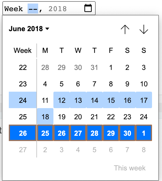
week |
A control for entering a date whose parsed valid is in the format: yyyy-Www |
<input type="week" /> |
Before we dive into each of these types, there are some things you should keep in mind:
types provide, consider them only sufficient for uninformed users:valid and :invalid CSS pseudoclasses are applied accordinglyrequired attribute can be used for invalidationhtml-inputs
html-inputs by adebiyial
<input type="hidden">This one is relatively simple. It has no visual representation whatsoever, but it always exists in the DOM so it can be interacted with.
It is often used to send additional data with the form values when the user submits it, although I doubt it is of any real or practical use these days. More so, just because the user can’t see it doesn’t mean they can’t change the value in the DOM, which leaves it susceptible to vulnerability if you’re using it for sensitive data. Don’t.
<input type="text"> and <input type="search">Text inputs are perhaps the most common and flexible of all <input>s. When push comes to shove (and it will), certain inputs lack support in browsers. Like the date input, text inputs are usually the fall guy or hero.
It renders a basic single-line text field.
<input type="text" />
Its value is a DOMString, and it supports a bevy of attributes like placeholder, maxlength, and minlength for enhancements.
<input type="text" placeholder="Beetwen 1 and 30 characters" minength="1" maxlength="30" />
The text input above will have a value with a length of at least minlength, 1, and at most maxlength, 30. Keep in mind that empty spaces are valid. In these cases, you might want to use the pattern attribute to enforce a RegExp pattern, or a required to invalidate empty spaces.
Search inputs are technically text inputs, but they are implicitly enhanced for search. You can get away without using them, and when not supported, it falls back to a text input.
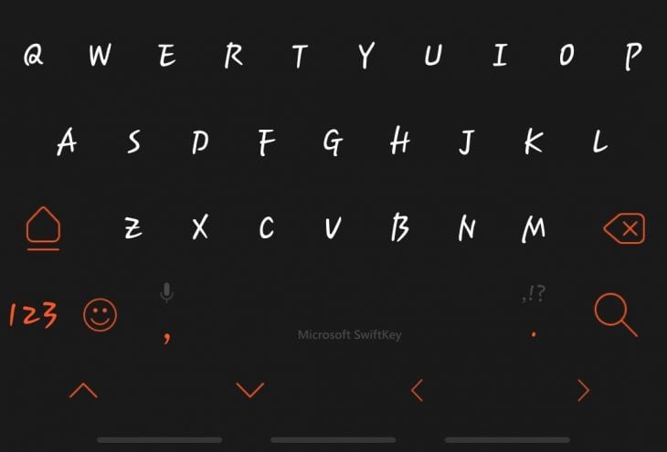
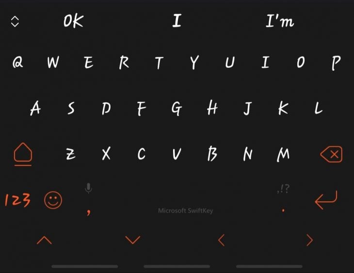
Some of the enhancements are in the styling. Remember, this is dependent on devices and user-agents. In terms of design, search shines more when used with a device that has a virtual keypad, like your phone. I compared the text and search keyboard display on my Android’s Swift keypad:
There are also some fundamental differences in how they operate. but currently this is only applicable if you’re using one of the non-standard attributes like incremental or results.
Its visual representation is also enhanced, and can be different across user-agents.
<input type="url"> and <input type="tel">url inputs allows the user to enter a URL and validate automatically that it is a properly formatted URL (not that the URL exists). Also, an empty string is valid unless overturned by the required attribute:
<input type="url" placeholder="Enter your profile URL" required/>
Just like text inputs, the pattern attribute can be used to check that the entered URL conforms to a specific case. In the definition below, this input will only be valid if it has the HTTPS URL scheme and it isn’t empty.
<input type="url" placeholder="Enter your profile URL" pattern="https://.*" required/>
tel inputs are almost not worth it, but they exist for a reason. Unlike url inputs, tel inputs are not automatically validated. However, they can be useful for devices with virtual keypads that may display a custom keyboard, which helps with usability.
Note that their overall usefulness can also be achieved with the inputmode global attribute (which is used to hint at the user-agent what kind of data is required), where the tel value can be used to cause the same effect as the tel type.
<input type="tel" /> // tel type
<input type="text" inputmode="tel" /> // text type with an inputmode of tel
Like the url input, the empty string is also valid, so you might want to include the required attribute, and also the pattern attribute for some level of validation.
Both the url and tel type fall back to text when not supported.
<input type="email">This one is one of the most common. It is much more like a text input, except that the value needs to be a properly formatted email, hence the type email. You can include the multiple attribute to accept multiple email addresses.
<input type="email" /> // default
<input type="email" multiple /> // multiple, values will be a comma-separated list
Validation is also done automatically, so you can rest assured that there’s some level of enforcement to begin with. The :valid and :invalid CSS pseudoclasses are automatically applied according to the validity of the email address(es).
With the multiple attribute specified, the entered email will be a comma separated list of valid emails (the user wouldn’t necessarily know this, so you might want to provide a hint). There are also a number of other attributes that can be added to enhance the functionality of the email input, like pattern if you want to specify what the required email should look like. Or autocomplete to enhance the usability of the control.
// Only accepts emails that ends with @logrocket.com
<input type="email" pattern="[email protected]" />
<input type="password">Password inputs are common on websites that require a password. It allows the user to enter a string that is almost immediately replaced with a user-agent defined symbol, most commonly a dot. On mobile devices, the password characters are shown for a brief moment before obscuring them, keeping the users aware of their entry.
<input type="password" />
Browsers will auto-complete the password field when the password has been saved in the browser. This is a good thing, but it can unknowingly lead to unwanted behaviors.
Even when the user isn’t logging in, browsers still try to prefill the password input, say on the registration page, and by cause expose the user’s password (it’s been exposed on the login page already, so what makes that different to the registration page? Well, it is expected on the login page when the user might actually log in, but not on the registration page).
You can use the off or new-password auto-complete value to instruct the browser not to automatically prefill the password field (though I find Chrome doesn’t respect this – here’s an issue in the Chromium page. New-password also allows the browser (or a password manager) to suggest a password to the user.
/* The for values of autocomplete applicable to a password field
 on, off, current-password, new-password */

<input tye="password" autcomplete="on" /> /* Yes, prefill the password field */
<input tye="password" autcomplete="current-password" /> /* Same as on */
<input tye="password" autcomplete="off" />
<input tye="password" autcomplete="new-password" />
If you are requesting a digit-only pass from the user, like a PIN, you can use the inputmode="numeric" with the password input to activate a numeric keypad on supporting devices.
Constraining the value can be done with the minlength, maxlength, or pattern attribute to keep uninformed users in-check.
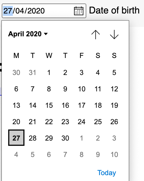
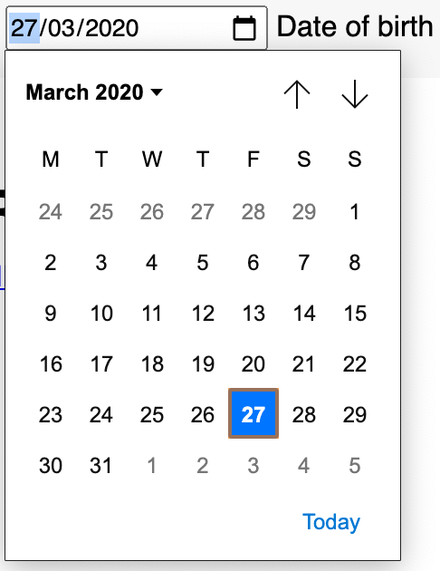
<input type="date">, <input type="datetime-local">, <input type="time">, <input type="month">, and <input type="week">The date type represents an input that allows the selection of dates formatted according to the location of the user’s browser. In unsupported browsers, it falls back to the text input. When a date has been selected, the parsed value will be in the format: YYYY-MM-DD.
Typically, you would be presented with a date picker UI. However, this also varies between browsers.
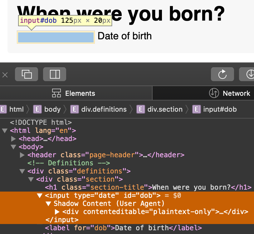
Safari (Version 13.1) falls back on a
contenteditableinstead of atextinput. Chrome shows something similar to Edge since they’re fundamentally the same.
The min and max attribute can be used to provide a lower and upper boundary to date selection, as well as to enforce those boundaries. However, it is always a good idea to manually validate the provided value, because not all browsers support the date input yet (as in the case with Safari above). Always validate.
Speaking about validation, one thing you can do is use the pattern attribute to specify an accepted pattern. So even if the date input isn’t supported, the text input will validate according to that pattern.
Or, you can use the required attribute. Just keep in mind that someone could go into the DOM to remove all your constraining attributes just to submit the form. In other words, do your manual validation.
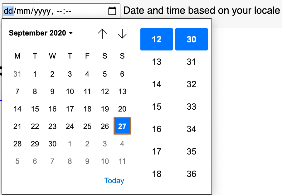
datetime-local is similar to the date input, except that you also get to select or enter a time alongside. Support isn’t all that great. As of this writing, and MDN has an extensive explanation I’d encourage you to read.
Here’s what it looks like on Chrome Version 87 (Canary):
Time inputs presents the user with a time selection field whose appearance differs depending on user-agents. There’s no automatic validation because of the constraints available. A user can not go beyond or fall below the minimum and maximum boundaries for a 24-hour clock time format.
<input type="time" />
Apart from its appearance, the format also differs across browsers. The time format is dependent on the user’s system location in some browsers, and not in others. Also, some browsers present a time picker like Chrome, while some don’t.
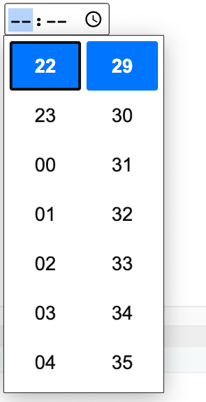
The value of the time input is always in a 24-hour format. That is, hh:mm, including leading zeros, as in: 01:30. You can use the step attribute to include the seconds in the format: hh:mm:ss, but it isn’t completely reliable because of browser differences.
<input type="time" id="timeOfBirth" name="timeOfBirth" step="2" required />
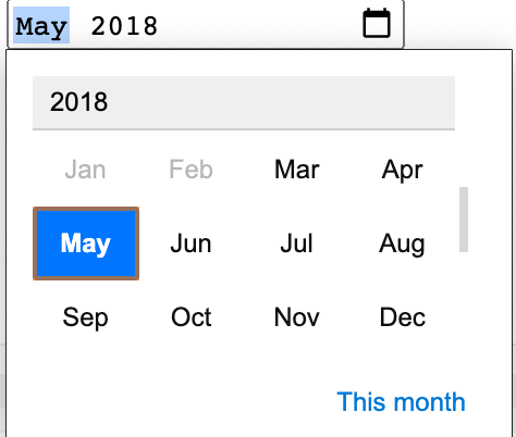
The month and week inputs are similar to the date input, except to the month and week. They differ in appearance and value format. The format of a month is YYYY-MM as in “2018-07” while the week yyyy-Www as in “2020-W24”.
There’s a lot in this Twitter thread by Jen Simmons I’d encourage you to skim through about the frustration about the types month and week.
It is important to read Date and time formats used in HTML if you want to understand the various formats available.
<input type="number"> and <input type="range">Number inputs allow the user to enter a number with an automatic validation against non-numeric entries. Some browsers also show an up and down arrow that can be used to increase or decrease the value of the input.
There is a default step size of 1, that is, incrementing or decrementing using the provided arrows or your keyboards moves in step of 1, but can be altered with the step attribute. The min and max attribute can also be used to enforce some constraints.
<input type="number" />
<input type="number" step="2" min="18" max="70" />
<input type="number" step="0.1" min="18" max="70" />
The pattern attribute doesn’t work for the number input, and on devices with virtual keypads, a number keypad may be shown.
Brad Frost wrote an article, You probably don’t need input type=”number”, that I’d encourage you to read because number inputs, as good and useful as they come, can cause you some grief that often begins with you correctly determining if number is really what you need.
I’ve seen custom number fields where I couldn’t type anything on my keyboard other than numbers, like in a price field, and they weren’t number types. It goes without saying that trust and reliability goes a long way, and you should make sure it works perfectly well before using it.
Range inputs are represented with a slider control, allowing the user to choose between a predefined minimum and maximum value.
When not specified, the minimum and maximum defaults to 0 and 100 respectively. You most likely can’t get away with the default behavior, so you need to adjust the functionality to your taste after you’ve decided that it is worth the trouble. Like the number input, it has a default step size of 1, but can be altered with the step attribute.
Range inputs are imprecise and are advised to be used in situations where an exact value isn’t needed, like volume controls or a color theme picker. How they appear varies across user-agents, but they can be customized with some extra effort to make them look nice and savvy.
<input type="color">Did you know there was a native color picker in HTML? Well, maybe not — it is a little complicated. I wouldn’t even call it a color picker, because the representations are different across browsers. While some browsers show a color picker, some show a text input that automatically validates the color format. There is also another limit: alpha colors are not allowed. You can have RGB, but not RGBA, etc.
<input type="color" />
This is the color picker for the Mac:
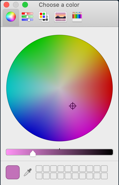
There are two events that can be used with the color type:
change – fires when the color picker has been closedinput – fires as long as you keep changing colors<input type="checkbox"> and <input type="radio">Check-boxes are represented by boxes that can be checked (true) or unchecked (false). They have a checked attribute that informs about their checked state, and a third indeterminate state which is neither checked nor unchecked, neither true nor false.
One of the use- cases for checkboxes is when you want the user to select multiple values in an enumerable list of options (this is what makes them different to radio buttons. With radio buttons, section is single rather than multiple). Think about filling in a form with questions like the number of programming languages you know, or checking a list of destinations you’ve visited.
<input type="checkbox" value="Toronto" />
<input type="checkbox" value="Ilorin" />
Checkboxes are also interesting. Since they have a boolean state of checked/unchecked, we can build some exotic things if we think about them as click events.
A checkbox can be checked by default with the checked attribute, like so:
<input type="checkbox" value="Toronto" />
<input type="checkbox" value="Ilorin" checked/>
One thing to note with checkboxes is how they react to form submission.
If a checkbox is unchecked, it doesn’t get sent to the server, because it doesn’t have any actual value. It makes no sense to send an unchecked value to the server since we can determine that it is unchecked if it is absent.
Radio inputs are dissimilar to checkbox inputs in that only one option can be selected in a group. They are barely useful when not in a group.
<input type="radio" />
To create a group of radio buttons, they must all have the name attribute with a similar value:
<input type="radio" name="accent-color" value="orange" />
<input type="radio" name="accent-color" value="yellow" />
Radio inputs don’t have the indeterminate state like the checkbox, but they do have the checked. However, only one radio button can be selected at a time.
<input type="file">This input allows the user to select a file from their computer, which can then be used however it is programmed.
<input type="file" />
With the accept attribute, you can specify the types of files allowed. It is a comma-separated list of valid or accepted MIME types
<input type="file" id="profile-img" accept="image/png, image/jpeg" />
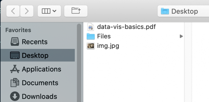
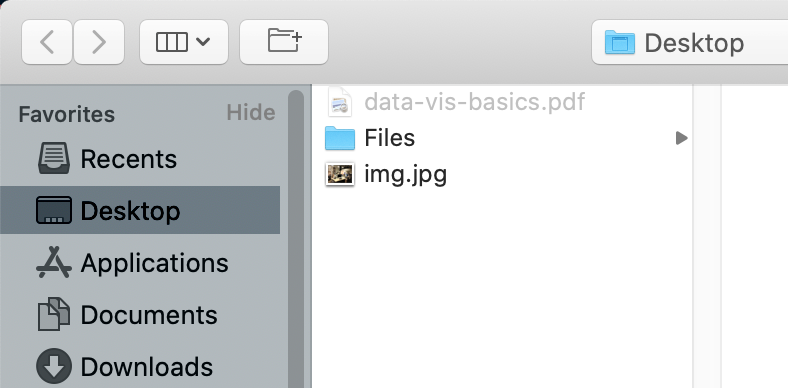
Above, you can see the result of applying accept to the file input.
In the top image, the accept is absent. In the bottom image, it is specified as accept="image/png, image/jpeg", meaning the user can only select images that end with .png, or .jpeg (jpg is technically the same as jpeg). Did you notice the Files folder can be selected? Actually, it can’t. It is active because there might be acceptable files in there.
The accept attribute is a constraint that enforces what type of file can be uploaded. In reality, the user can bypass that, so make sure to validate what’s been uploaded.
<input type="button">, <input type="reset">, and <input type="submit">Button inputs represent a clickable control that can be programmatically controlled to perform a click action. An input button can be defined as follows:
<input type="button" />
Defining your input button as we did above causes the button to be empty. This is because the label text is expected to be in the value attribute, and we haven’t specified one. Specifying one is as simple as giving the value attribute a value.
<input type="button" value="click me" />
Even though this is absolutely technically correct, the newer button element is now the favored way to create buttons.
Unlike reset and submit inputs, button inputs have no default behavior unless specifically programmed to do so.
Reset and submit buttons are useful when used with a form. They both have a default behavior of resetting and submitting a form, respectively.
<input type="reset" value="Reset form" />
<input type="submit" value="Submit form" />
Unlike the button input, they also both have a default value that is dependent on the user-agent. Apart from the mentioned differences, they operate very much like the button input.
<input type="image">If we have the <img/> element, what do you think this one is? It is a button whose value is an image. Value in this case is not the value attribute. In fact, it doesn’t have one. If you specify one, it will be ignored. So how do you specify the image?
The src attribute for the image input is what the value attribute is to the button input, at least visually. If <input type="button" value="click me" /> renders a button input with the text “Click me”, then <input type="image" src="./path/to/img" /> will render a button with the image specified in src.
Image inputs are similar to img elements with attributes like the src and alt attribute.
<input> attributesHTML attributes are configurations for its elements. Just like we mentioned that the type attribute give the input element its identity, other attributes can also contribute their quota in making the input element more flexible, powerful, and complex (considering their functional dependence on different types).
There are two types of attributes:
Content attributes are attributes that satisfy three criteria:
class, id, placeholder etcelement.setAttribute method[element.getAttribute methodPerhaps the most common is the class attribute or the id attribute, and there are a lot of them. In fact, most global attributes fall under this category.
IDL stands for Interface Description Language and attributes that fall under this category typically can be accessed only programmatically, like the indeterminate attribute for checkbox inputs.
There’s a twist to IDL attributes that specifically has a section in the spec: Reflecting content attributes in IDL attributes. Some of the attributes can have deflecting behaviors. It is advisable to read through that section to gain a better understanding and to monitor whether the spec has been updated.
There are 32 (standard) attributes shown in the table below:
| Attribute | Description | Basic use |
|---|---|---|
accept |
Hint for expected file type in file upload controls | <input *type*="file" *accept*="image/png, image/jpeg" /> |
alt |
alt attribute for the image type. Required for accessbility |
<input type="image" alt="alternate text" /> |
autocomplete |
Instructs browser on proactive autofill | <input type="email"autocomplete="current-password" /> |
autofocus |
Automatically focus the form control when the page is loaded | <input type="text"autofocus /> |
capture |
Media capture input method in file upload controls | See Capture |
checked |
Whether the command or control is checked | <input type="checkbox" checked /> |
dirname |
Name of form field to use for sending the element’s directionality in form submission | See Dirname |
disabled |
Indicates that the is disabled or can not be interacted with | <input type="button" disabled /> |
form |
Associates the control with a form element | <input type="submit" form="form-id" /> |
formaction |
URL to use for form submission | <input type="submit" formaction="url-to-submit-form-data" /> |
formenctype |
Form data set encoding type to use for form submission | <input type="submit" formenctype="text/string" /> |
formmethod |
Method that handles form submission | <input type="submit" formmethod="POST" /> |
formnovalidate |
Turns off native validation | <input type="submit" formnovalidate /> |
formtarget |
Browsing context for form submission | <input type="submit" formtarget="_blank" /> |
height |
Used to specify image height |
<input type="image" height="30" /> |
list |
Value of the id attribute of the <datalist> of autocomplete options |
<input type="text" list="id-of-a-defined-datalist"> |
max |
The maximum acceptable value | <input type="number" max="30" /> |
maxlength |
Specifies the maximum length of acceptable character(s) | <input type="text" maxlength="50" /> |
min |
The minimum acceptable value | <input type="number" min="0" /> |
minlength |
Specifies the minimum length of acceptable character(s) | <input type="text" minlength="10" /> |
multiple |
Indicates that multiple values are allowed | <input type="email" multiple /> |
name |
Represents the name of the control, used in form submission | <input type="password" name="secret" /> |
pattern |
Used for providing a Regular Expression for valid entries | <input type="url" pattern="https://.*" required/> |
placeholder |
Hint for a control. | <input type="url" placeholder="Enter your profile URL" /> |
readonly |
Indicates that control can not be edited | <input type="email" readonly /> |
required |
Indicates that the user must provide a value | <input type="email" required /> |
size |
Used to specify size of the control | <input type="email" size="50 /> |
src |
Used to specify the path to an image for the image input |
<input type="image" src="/path/to/image" /> |
step |
Incremental values that are valid. | <input type="time" step="2" /> |
type |
Gives the input its identity (type). |
<input type="email" /> |
value |
Holds the value of a form control. | <input type="text" value="John Doe" /> |
width |
Used to specify image width |
<input type="image" width="100" /> |
Both W3 and WHATWG have the table below on their specs page, but I just wanted to make sure it was here to further explain “functional dependency”.
Basically, what the table depicts is the overlap between types and their corresponding applicable attributes.
For example, autofocus can be used on every input control except hidden. Autocomplete doesn’t have any impact on checkboxes, radio buttons, file inputs etc. And the hidden input is notorious for being a loner.
| Attributes | hidden |
text, search |
url, tel |
email |
password |
datetime-local, date, time, month, week |
number |
range |
color |
checkbox, radio |
file |
submit |
image |
reset, button |
|---|---|---|---|---|---|---|---|---|---|---|---|---|---|---|
accept |
✅ | |||||||||||||
alt |
✅ | |||||||||||||
autocomplete |
✅ | ✅ | ✅ | ✅ | ✅ | ✅ | ✅ | ✅ | ||||||
autofocus |
✅ | ✅ | ✅ | ✅ | ✅ | ✅ | ✅ | ✅ | ✅ | ✅ | ✅ | ✅ | ✅ | |
capture |
✅ | |||||||||||||
checked |
✅ | |||||||||||||
dirname |
✅ | |||||||||||||
disabled |
✅ | ✅ | ✅ | ✅ | ✅ | ✅ | ✅ | ✅ | ✅ | ✅ | ✅ | ✅ | ✅ | ✅ |
form |
✅ | ✅ | ✅ | ✅ | ✅ | ✅ | ✅ | ✅ | ✅ | ✅ | ✅ | ✅ | ✅ | ✅ |
formaction |
✅ | ✅ | ||||||||||||
formenctype |
✅ | ✅ | ||||||||||||
formmethod |
✅ | ✅ | ||||||||||||
formnovalidate |
✅ | ✅ | ||||||||||||
formtarget |
✅ | ✅ | ||||||||||||
height |
✅ | |||||||||||||
list |
✅ | ✅ | ✅ | ✅ | ✅ | ✅ | ✅ | |||||||
max |
✅ | ✅ | ✅ | |||||||||||
maxlength |
✅ | ✅ | ✅ | ✅ | ||||||||||
min |
✅ | ✅ | ✅ | |||||||||||
minlength |
✅ | ✅ | ✅ | ✅ | ||||||||||
multiple |
✅ | ✅ | ||||||||||||
name |
✅ | ✅ | ✅ | ✅ | ✅ | ✅ | ✅ | ✅ | ✅ | ✅ | ✅ | ✅ | ✅ | ✅ |
pattern |
✅ | ✅ | ✅ | ✅ | ||||||||||
placeholder |
✅ | ✅ | ✅ | ✅ | ✅ | |||||||||
readonly |
✅ | ✅ | ✅ | ✅ | ✅ | ✅ | ||||||||
required |
✅ | ✅ | ✅ | ✅ | ✅ | ✅ | ✅ | ✅ | ||||||
size |
✅ | ✅ | ✅ | ✅ | ||||||||||
src |
✅ | |||||||||||||
step |
✅ | ✅ | ✅ | |||||||||||
type |
✅ | ✅ | ✅ | ✅ | ✅ | ✅ | ✅ | ✅ | ✅ | ✅ | ✅ | ✅ | ✅ | ✅ |
value |
✅ | ✅ | ✅ | ✅ | ✅ | ✅ | ✅ | ✅ | ✅ | ✅ | ✅ | ✅ | ✅ | ✅ |
width |
✅ |
Validation will forever be an ongoing topic. When thinking about form validation, I like to think about it in terms of usability and security. There are a lot of attributes with the sole purpose of constraining the user to adhere to our input specification. Required makes sure the user provides a value, pattern enforces a specific pattern, min and max enforce a lower and upper boundary, and so on.
But in the end, these are all client-side validation, and most importantly in HTML where everything is in the DOM, they can easily be bypassed. A more informed user can easily go into the DOM to remove the disabled attribute on a submit button — I’ve done it before and it’s worked.
Knowing what’s at risk, I try to take validation up a notch by programmatically validating. There are conflicting opinions on this topic, so I’d rather we discuss how I like to do it.
Let’s take a login form with a username (text input) and email (email input) as an example.
Here’s a list of things I do:
onBlur (when the input field loses focus). This way I can show error messages immediately after the user leaves the inputonChange. This way the user gets an error message (if there is one) because they most likely won’t attempt to submit the form with a disabled button, and they might be oblivious to why the button isn’t enabledSay I’ve made the form usable with steps 1-4. There would still be a security risk. This is where authentication and authorization come in.
What I’ve done initially is basically client-side validation. Of course, I’m not relying on the default input validation and I’m taking my validation a little further with custom validation. Still, I suspect this could be bypassed, so server-side validation should always be done regardless.
Usability and security are broad topics. As Phil Nash pointed out in his article HTML attributes to improve your users’ two factor authentication, developers should be building applications that support the need for account security but don’t detract from the user experience. Sometimes it can feel as though these requirements are in a battle against each other.
While working with <input>s, there have been some helpful tips and tricks I’ve learned along the way. Some have been born out of bug-fixes, design, or just out of curiosity. My favorite discovery is one I like to call “show me your password”, and I know you might be familiar with this, but it is one I’m really proud of.
Password inputs are everywhere, from login forms to registration forms. When users type in their password, it is a good idea to let them see what they’re typing so they can correct their mistakes should they need to.
You’ve seen it before. Here’s an example in the wild:

There’s often a toggle button at the end of the input that toggles the display of the password. What happens when the user clicks that button? Well, we programmatically switch the type of the input from password to text.
Here’s an example:
We have three states checked and indeterminate — refer to the checked state alone.
This one is interesting. Think about what a click state is: a boolean, true or false, clicked or not-clicked. The <input type="checkbox" /> has a checked property that lets us know if the checkbox has been checked or not. Couple this with a label, and we can create something interesting.
Let’s take a look at this snippet:
<div class="div">
  <input type="checkbox" id="toggle" />
  <label for="toggle">toggle dropdown</label>
  <div class="dropdown">
    <p>Lionel Messi</p>
    <p>Cristiano Ronaldo</p>
    <p>Andres Iniesta</p>
    <p>Xavi</p>
  </div>
</div>
When a label is clicked, it focuses the corresponding input whose id value matches its for value.
In the case of a checkbox, clicking the associated label activates it. It toggles the checked attribute on (true) or off (false).
That’s an interesting lead.
One of my use cases for this is for a dropdown. With an extra bit of CSS, I can control the height of my dropdown:
.dropdown {
  max-height: 0px;
  overflow: hidden;
}

input[type="checkbox"]:checked + label[for="toggle"] + .dropdown {
  max-height: 150px;
}
Initially the dropdown height will be 0. Then, when the checkbox is checked, (input[type="checkbox"]:checked), you’ll look for the next sibling (which is a label). Then, look for the next sibling after that — that’s the dropdown.
Here’s a complete example:
The “Checkbox Hack” (and things you can do with it)
The Checkbox hack is more of a side-effect, and it’s definitely far from perfect. You need to have an absolute maximum height for your dropdown when it shows up, and ordinarily the dropdown elements will remain in the DOM. So be prudent with it, and make sure it solves your entire use case before using it.
As you continue to work with these HTML inputs, you will find them extremely useful. However, they are sometimes imperfect due to user-agents, support, and any other things that have been built upon the original specifications to achieve a specific or streamlined goal.
You should remember that these specifications will continue to grow, and so will support, so don’t just dismiss them entirely. Always check back on their current capability before reinventing the wheel.

Learn how to build smooth staggered animations in CSS using modern features like sibling-index(), complete with practical examples, fallbacks, and accessibility tips.

Compare the top AI development tools and models of July 2026. View updated rankings, feature breakdowns, and find the best fit for you.

Learn how to detect unused and ghost dependencies in JavaScript projects using Knip, a project-level linter that keeps your dependency graph accurate.

Learn how Storybook MCP enables AI agents to understand your component library, generate accurate UI, and validate code using documentation, stories, and automated tests.
Would you be interested in joining LogRocket's developer community?
Join LogRocket’s Content Advisory Board. You’ll help inform the type of content we create and get access to exclusive meetups, social accreditation, and swag.
Sign up now

 Learn more →
