As a UX designer, one of the most common pieces of feedback I’ve heard is, “Can we make this more intuitive?” It’s become a design goal that nobody questions. We often assume it’s the end goal for every user experience. After all, if a product is intuitive, users should be able to pick it up instantly with little effort.
Throughout my experience designing for enterprise software, I’ve questioned whether intuitive should always be the goal. Some of the most successful software products, like Figma, Excel, and Photoshop, aren’t designed to be fully understandable the moment you open them. They’re powerful because they support sophisticated workflows, and some complexity is simply inherent to the work.
In this article, I’ll explore why intuitive isn’t always the right design objective, when learnability or efficiency is a better measure of success, and how designers can reduce the learning curve without sacrificing the flexibility that advanced users rely on.
Key Takeaways
The word “intuitive” gets used so often in design discussions that we rarely stop to question what it actually means. People often use “intuitive” to mean “easy to use,” but the two aren’t always the same. Something feels intuitive because it aligns with knowledge or mental models a user already has. If they’ve never encountered a workflow before, there’s nothing intuitive to build upon.
That’s why I think it’s important to separate intuitive from learnable. A product doesn’t necessarily fail because a user can’t master it in the first five minutes. In many enterprise environments, users receive training, complete the same tasks every day, and gradually become more proficient over time. Their goal isn’t to use the product once. It’s to become efficient at using it hundreds or even thousands of times.
For example, compare Google Search to Adobe Photoshop. Almost anyone can open Google, type a question, and get value immediately. The interaction is simple, familiar, and designed for occasional use. Photoshop is the complete opposite. The first time you open it, you’re presented with dozens of tools, panels, shortcuts, and workflows that can feel overwhelming. Yet millions of designers use it every day because the product becomes more efficient as they build experience. In fact, if Photoshop were redesigned to be completely intuitive for first-time users, it would likely lose much of the flexibility and efficiency that experienced designers rely on.
Before trying to simplify a workflow, I ask myself whether the challenge comes from the interface or the task itself. If the work is inherently complex, hiding that complexity doesn’t necessarily make the experience better. It often just makes it harder for users to understand what’s actually happening. Instead of trying to eliminate every learning curve, our job as designers is to make that curve as approachable as possible.
One of the biggest lessons I’ve learned from designing enterprise software is that not all complexity should be treated the same. Some complexity comes from poor design decisions, inconsistent workflows, or unnecessary steps, which we should eliminate. But some challenges are simply part of the work.
Throughout my career, I’ve designed products that support complex workflows involving business rules, approvals, dependencies, and exceptions. Those challenges are inherent to the work itself, not the interface. Instead of trying to hide them, my job is to organize them through clear hierarchies, information architecture, and manageable steps that help users understand the impact of their decisions.
I’ve found that trying to oversimplify these workflows often creates new problems. Hiding important settings or removing critical information may reduce visual clutter, but it can also leave users confused when they need more control or encounter an edge case. While simple interfaces benefit new users, experienced users often value transparency and flexibility because their needs aren’t always the same.
Good enterprise UX isn’t about making complex work look simple. It’s about helping users navigate it with confidence. When users understand what’s happening, why it’s happening, and what they need to do next, they’re far more capable of navigating even the most complicated workflows.
Rather than asking whether a workflow should be intuitive, I now ask whether it should instead be learnable or efficient based on who the user is and what they’re trying to accomplish. The answer is often all three, but just not at the same time. For simple, everyday tasks, intuitive is usually the right goal. Google Search is a good example.
Learnability becomes more important when users are expected to invest time in a product. Tools like Figma or Photoshop aren’t easy to master on day one, but they should help users gain familiarity with every interaction. The experience should teach users how the product works instead of expecting them to figure it out on their own.
Efficiency is the goal for experienced users. Once someone is familiar with a product, they care less about whether a feature is immediately discoverable and more about completing their work quickly. Excel shortcuts are a good example. They’re not intuitive, but they significantly improve productivity for people who use them every day.
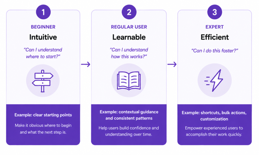
These goals aren’t mutually exclusive. A product can optimize for all three at different stages of the user journey. The first interaction might be intuitive enough to help users get started. Guided onboarding can make the product more learnable as they become proficient. Then, advanced features like shortcuts, bulk actions, and customization can improve efficiency as they become experts. Understanding which goal you’re designing for at each stage helps prevent teams from trying to make every workflow intuitive when that’s not what users actually need:
Once I accepted that not every workflow needed to be intuitive, I started focusing on how I could help users become more confident every time they used the product. Here are a few principles that have consistently shaped how I approach UX for enterprise products.
Users shouldn’t have to relearn how your product works every time they move between screens or workflows. I focus on using consistent terminology, familiar interaction patterns, and clear relationships between features so users can build mental models they can reuse throughout the experience.
For example, if an object behaves differently in one part of a product than another, or the same action is labeled differently across workflows, users have to stop and rethink what they’re seeing. Those small inconsistencies create unnecessary cognitive load. The more predictable your product becomes, the easier it is for users to develop expertise and transfer knowledge from one task to the next.
One mistake I made earlier in my career was thinking I had to choose between flexibility and simplicity. If I exposed every option upfront, the interface felt overwhelming. If I hid too much, users struggled to find the functionality they needed. Over time, I realized the best solution was rarely either extreme.
I once worked on a workflow with a lot of advanced configuration options. My initial design surfaced most of them because I didn’t want experienced users to lose any flexibility. During feedback sessions, however, it became clear that new users didn’t know where to start because they were immediately confronted with decisions they didn’t yet understand. The problem wasn’t that the advanced functionality existed. It was that users encountered it before they had enough context to understand why it mattered. Instead of removing those capabilities, I reorganized the experience so users could complete the primary task first, while more advanced options became available as they needed them.
That experience changed how I think about progressive disclosure. Users should be able to accomplish their primary task without feeling overwhelmed, while still knowing the product can grow with them as their confidence and expertise increase.
Most people don’t want to sit through a 20-minute onboarding video before they can start using a product. They learn by exploring and trying different things. I’ve found contextual guidance to be much more effective than trying to teach everything upfront. Templates, examples, thoughtful empty states, and inline guidance help users learn while completing real work instead of interrupting them with long tutorials. Rather than teaching everything at once, the interface introduces information when it’s most relevant, allowing users to build knowledge naturally over time.
There’s a lot of emphasis on the first-time user experience, but we don’t spend nearly as much time designing for repeated use. Enterprise products are built for people who rely on them every day, so the experience should become more efficient as users become more familiar with it.
Features like keyboard shortcuts, bulk actions, saved views, and customization may not matter on a user’s first day, but they become invaluable over time. I’ve found it’s just as important to optimize for someone’s hundredth interaction with a product as it is for their first. That’s how products become more rewarding to use as people build confidence and expertise.
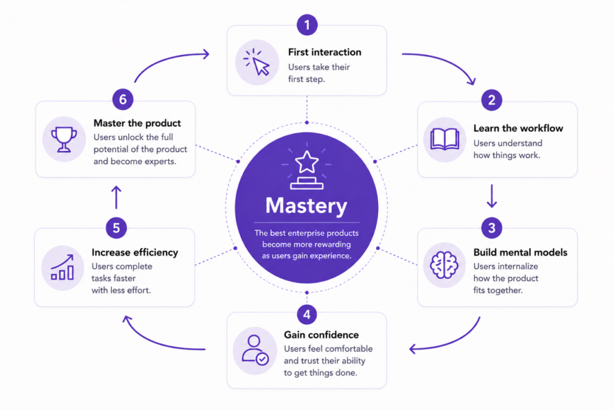
Not every product needs to be intuitive. For many enterprise products, success isn’t measured by how quickly users understand the interface, but by how confidently they use it after weeks or months of real work. As designers, our goal isn’t to eliminate every learning curve, but to remove unnecessary friction while making inherently complex work easier to learn.
The next time you’re designing a feature or workflow, resist the urge to make everything more intuitive. Instead, think about whether the work itself is inherently complex, what level of expertise you’re designing for, and whether the experience should optimize for intuitiveness, learnability, or efficiency. Those decisions will shape the product far more than simply trying to make everything feel simpler.
The best enterprise products don’t hide the reality of complex work. They help people understand it, navigate it, and ultimately master it. If your product becomes more rewarding as users gain experience, you’ve designed something that people will master over the long term.
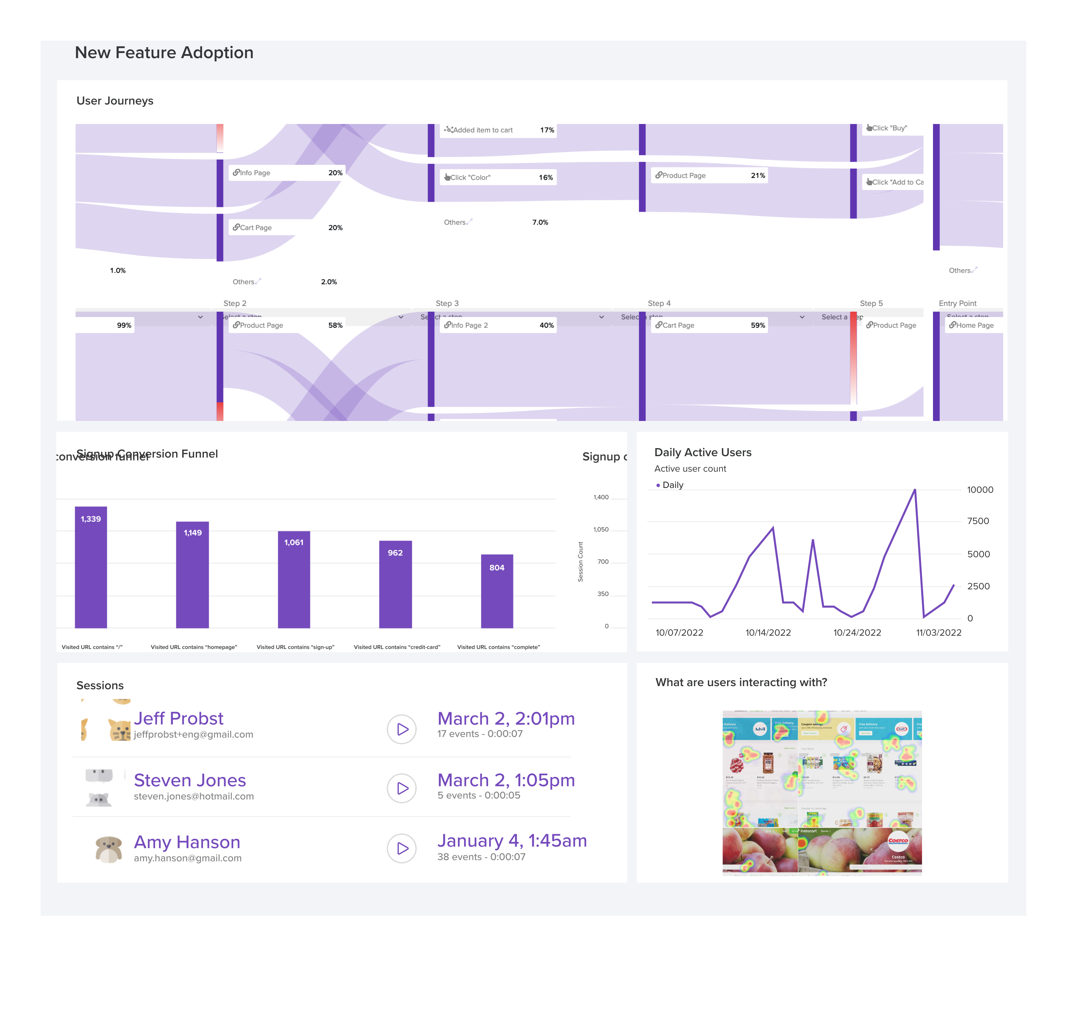
LogRocket's Galileo AI watches sessions and understands user feedback for you, automating the most time-intensive parts of your job and giving you more time to focus on great design.
See how design choices, interactions, and issues affect your users — get a demo of LogRocket today.
Open-source Figma alternatives are becoming viable for teams seeking self-hosting, open file formats, offline access, flexible AI integrations, and greater control over their design workflows. Compare Penpot, OpenPencil, Quant UX, and Open Design to see where open-source tools stand against Figma.

I used to leave design reviews with a stack of subjective edits. Then I learned to tell the story behind my work and rework dropped fast.
Learn what human-computer interaction is, discover its principles, and take a look at interaction design in HCI and its applications here.
Where AI appears in your interface can shape how users discover, trust, and adopt it. Learn the strengths of common AI UI placement patterns and how to choose the right one for your product.


 Learn more →