Staggered animations breathe life into web interfaces by creating smooth, coordinated movements that naturally guide user attention. Instead of having every element animate at the same time, staggered animations introduce deliberate delays between individual animations, creating a more polished and choreographed effect. They’re particularly effective for revealing UI elements, emphasizing important actions, and making interface changes feel more natural.

Pulling off staggered animations in CSS was a hacky endeavor. People typically reached for an HTML/CSS preprocessor to generate the repetitive styles, or just did the animation in JavaScript instead. The addition of the CSS functions sibling-index() and sibling-count() has unlocked staggered CSS animations.
In this article, we’ll explore what staggered animations are, why they’re useful, how to build them using modern CSS, when JavaScript is still necessary, and how to provide fallbacks and accessibility support so the effect works well across different browsers and user preferences.
A staggered animation consists of a series of sequential animations that may overlap. In other words, multiple elements animate one after another with a slight delay, rather than all starting at the same time.
A good visual analogy of this is when you topple a line of upright dominoes. Once you topple the first domino, the dominoes fall in sequence. When a domino is hit by the preceding domino, it falls and hits the next domino to trigger another falling domino; it continues to fall until it hits the ground. In this scenario, you have two dominoes falling at the same moment but at different stages.

A commonplace example on the web of a staggered animation is a chat interface revealing a response incrementally. The response is animated letter by letter. This gives a real-time, narrative-like feeling to the interaction.
In the figure below, you can see an outline of ChatGPT’s animated response to a question. The yellow dotted lines show the sequential animations that reveal the text.

Motion has significant implications for user experience. Staggered animations allow users to process information in manageable chunks. They can guide a user’s focus and establish the hierarchy of UI elements.
In the Material Design guide, staggered animations are touched on in the Choreography section. The general concept is that a coordinated motion sequence holds the user’s focus while an interface adapts. A good sequence helps users understand what has changed on a screen, if elements were added or removed, and adds focus to anything important about the interaction.
To create a staggered animation, we want each individual animation to start at different times. To do this, we need to add a delay to the animations. We use the property animation-delay to delay an animation, or transition-delay to delay a transition.
Let’s create an animation for a list where we introduce each item (li element) incrementally. The animation will make each item fade in and expand to its full size. This is more visually pleasing than a simple fade-in effect.
Here is the demo:
See the Pen
List staggered intro animation (series) by rob2 (@robatronbobby)
on CodePen.
The initial state of the list items is that they are invisible (opacity of zero) and are 70% of their final size (scale of 0.7).
We want the animation for the first item to start immediately (no delay). A delay in the initiation of the effect can make a user think that something went wrong! So, we want to avoid that!
We stagger the animation by adding a delay of 100 milliseconds for the second item, 200 milliseconds for the third item, and so on. We are using a delay of 100 milliseconds. This is summarized in the table below.
li index |
Animation Delay | Animation Duration |
|---|---|---|
| 1 | 0 | 400 milliseconds |
| 2 | 100 milliseconds | 400 milliseconds |
| 3 | 200 milliseconds | 400 milliseconds |
| 4 | 300 milliseconds | 400 milliseconds |
| 5 | 400 milliseconds | 400 milliseconds |
I find that visualizing the animations as a series of timelines makes things easier to understand. In Chrome DevTools, there is an Animations drawer tab that presents animations as a group of timelines. To understand the visualization: the dotted blue line indicates the delay period, the beginning of the solid blue line is when the animation starts, and the blue dot indicates when the animation finishes.

In this case, the timeline for the first li animation has no dotted line. This indicates no delay. The dot is at the 400 ms point. The second li animation has a dotted line that goes from 0 to 100 ms. Its dot is at the 500 ms point. What I hope you appreciate from this visualization is that the animations start at different times and overlap.
We use the sibling-index() CSS function to get the index of a list item. We can use this index to calculate the delay value for each list item. We can multiply the index value by our delay multiple (100 milliseconds) to use the desired sequence of delays (0, 100, 200, 300, 400). The value of sibling-index() begins at one. Since we want the first item to have a delay of zero, we want to use an index that starts at zero. Subtracting one from the index will give us our desired sequence of delays with the declaration below.
li {
    /* other stuff */

    animation-delay: calc((sibling-index() - 1) * 100ms);
}
Here is the full code for the staggered animation:
li {
  --duration: 400ms;
  --delay: 100ms;

  opacity: 0;
  scale: 0.7;

  animation-name: show;
  animation-delay: calc((sibling-index() - 1) * var(--delay));
  animation-duration: var(--duration);

  animation-timing-function: ease-in-out;
  animation-fill-mode: forwards;
}

@keyframes show {
  to {
    opacity: 1;
    scale: 1;
  }
}
The animation-timing-function gives the animation its feel. Here, I chose ease-in-out as it suits the expansion effect; it starts slowly and finishes slowly. The type of animation you are going for will inform this choice. This topic is referred to as easing and is a deeper topic worth exploring separately.
Animations overlap when they run in parallel for some period of time. In our previous example, adjacent animations overlapped for 300 milliseconds, e.g., first li and second li. You can see the overlap highlighted in green in the figure below.

To appreciate the impact of overlapping animations, let’s rework our list animation to remove the overlap. Instead, the animations will run back-to-back. Now, the timelines look like a series of waterfalls.

Here is the demo:
See the Pen
List staggered intro animation (series) by rob2 (@robatronbobby)
on CodePen.
This version has a more regimented feel. It is more mechanical in nature. In real life, actions tend to overlap more often.
A quick rule of thumb, animations overlap when animation-delay is less than the animation-duration on a group of elements.
/* overlap */
li {
  --delay: 100ms;
  --duration: 300ms;

  animation-delay: calc((sibling-index() - 1) * var(--delay));
  animation-duration: var(--duration);
}

/* no overlap */
li {
  --delay: 300ms;
  --duration: 300ms;

  animation-delay: calc((sibling-index() - 1) * var(--delay));
  animation-duration: var(--duration);
}
The example we covered animates from the first to the last item, i.e., ascending order of indexes. You may want to animate in descending order for actions such as closing a widget. How do we do that?
Let’s say that we have a list with 5 items and we want to stagger the animations by 100 milliseconds. What would be the value for animation-delay?
| Item index | animation-delay(descending stagger) |
|---|---|
| 1 | 400ms |
| 2 | 300ms |
| 3 | 200ms |
| 4 | 100ms |
| 5 | 0 |
For a descending order, we want to animate the last item first, so it should have animation-delay of zero. The last item index is equal to the number of items. We can get this value through sibling-count(), which is 5 in our case.
We want the second last item (index of 4) to animate next; we want it to have an animation-delay of 100 milliseconds. In other words, we want it to have one stagger unit. If we subtract the item index from the count of items, we have the correct stagger unit. If we multiply this by the delay multiple of 100 milliseconds, we get our desired values for animation-delay .
| Item index | Stagger unit |
|---|---|
| 1 | 4 |
| 2 | 3 |
| 3 | 2 |
| 4 | 1 |
| 5 | 0 |
The core CSS for a descending stagger animation looks like this:
li {
  --duration: 400ms;
  --delay: 100ms;

  animation-name: hide;
  animation-delay: calc((sibling-count() - sibling-index()) * var(--delay));
  animation-duration: var(--duration);
}
Here is the demo:
See the Pen
List staggered dismissal animation by rob2 (@robatronbobby)
on CodePen.
The first example I want to show you is a hero section that ushers in content. It lets users consume the content bite by bite, guiding the user to the call-to-action (“Discover More” link). It does not require using sibling-index().
Here is the demo:
See the Pen
Hero section – staggered intro by rob2 (@robatronbobby)
on CodePen.
As touched on earlier, chat interfaces are more prevalent now and many of animate responses by writing the text out like it is composed in real time. You can animate text character-by-character as below, or word by word.
Here is the demo:
See the Pen
Pull-up text animation by rob2 (@robatronbobby)
on CodePen.
There are many variations of this that you can try out using properties such as opacity, translate, rotate, and scale. You need to split the text content into individual elements to animate them.
There are times when you need JavaScript to use staggered animations in a meaningful manner.
There are not many interactive HTML elements that can perform actions without JavaScript. One exception is the details element (disclosure widget), of course; however, it has interoperability issues for some time that make animating it challenging.
There has been progress with responding to user actions without JavaScript, such as the addition of the Invoker Commands API. It has enabled actions to be performed on the dialog element, such as opening and closing, by declaring the actions in HTML attributes. Scroll-driven animations are now possible in CSS and can trigger animations when they come into view, but the API has some issues that need to be resolved before it can be adopted widely. It is early days for these APIs.
To tie together our earlier work and demonstrate when you may need to reach for JavaScript for an interaction. Let’s create a disclosure widget that reveals/hides a list with a staggered animation (both directions) when it is clicked on.
Ideally, we would use the details element for this. We can use a CSS transition to animate the list when the disclosure widget is opened. However, it is not possible to use a CSS transition to animate out the list items when it is closed, as far as I can tell.
Instead, we can make our own custom disclosure widget with a button. We need a little bit of JavaScript to toggle the state. We use the aria-hidden attribute on our list to identify if it is visible or not. We can use this to trigger our CSS transitions, and they will work as expected in both cases:
See the Pen
Disclosure widget staggered animation by rob2 (@robatronbobby)
on CodePen.
When you make your own component like this, aim to make it accessible.
An exit animation is an animation of an element as it is removed from the DOM. Currently, you can’t do this in CSS. As soon as an element is removed from the DOM, it is gone. There is no animation opportunity.
There is a possibility to animate the hiding of a popover element, going from display: block to display: none, now that discrete animations are permitted in CSS.
Up until recently, JavaScript frameworks have been the primary source for exit animations. They have wily ways to provide this capability. There is a proposal for adding an @exit-style at-rule to CSS to provide this capability.
/* Proposal: not currently possible in CSS */

li {
    transition: 300ms opacity;

    @exit-style {
      opacity: 0;
    }
  }
}
The View Transitions API has opened up the door to perform exit animations in JavaScript in a more straightforward manner. This is because view transitions operate on a rasterized version of the element. The element can be removed immediately, and the rasterized version is animated. This is still a maturing API, so some use cases are not covered yet.
If you want animations that have some logic, then you will need some JavaScript. For example, this is a movie selection demo by Preethi Sam. Selecting a movie card causes the preceding and succeeding movie cards to disappear sequentially from the outside, with the selected movie being brought into the center. JavaScript is required to work out which movies are before and after the chosen movie card.
See the Pen
Staggered Animation with `sibling-*` CSS Functions by rob2 (@robatronbobby)
on CodePen.
sibling-index() is not supportedYou can provide a fallback by using the @support rule. The following negation will allow you to provide an alternative:
@supports not (animation-delay: calc(sibling-index() * 100ms)) {
  /* your fallback styles */
}
The fallback styles are the cumbersome styles that we are hoping to avoid, but you can reduce the length depending on your use case and how much editorial control you have of the codebase. For example, if its a short list with a maximum of 5 items, you could do the following:
@supports not (animation-delay: calc(sibling-index() * 100ms)) {
  li:nth-child(2) {
    animation-delay: calc(1 * var(--delay));
  }

  li:nth-child(3) {
    animation-delay: calc(2 * var(--delay));
  }

  li:nth-child(4) {
    animation-delay: calc(3 * var(--delay));
  }

  li:nth-child(5) {
    animation-delay: calc(4 * var(--delay));
  }
}
Alternatively, you could create your indexes with custom CSS properties in the HTML and reference them in the fallback style, reducing it to a single rule:
<ul>
  <li style="--index: 0;">
  <li style="--index: 1;">
  <li style="--index: 2;">
  <li style="--index: 3;">
  <li style="--index: 4;">
  <li style="--index: 5;">
</ul>
@supports not (animation-delay: calc(sibling-index() * 100ms)) {
  li {
    animation-delay: calc(var(--index) * var(--delay));
  }
}
Some people experience motion sickness and vertigo from animations. We can adjust the animations for these users through the prefers-reduced-motion media query:
@media screen and (prefers-reduced-motion: reduce) {
  li {
      animation: none !important;
  }
}
Here we are turning the animations off, but it is important to understand that reduced motion doesn’t always mean remove motion.
Browser support for sibling-index() and sibling-count() is good. Both are in Chromium-based browsers and Safari currently (75% of browsers).
Staggered animations improve user experience by giving web interfaces smooth, coordinated movements that guide user attention. As CSS is evolving, we are needing less and less JavaScript to pull off effects like staggered animations. The addition of the CSS functions sibling-index() and sibling-count() has enabled us to escape the verbose and hacky solutions of the past.
The browser support is good for sibling-index() and sibling-count(), solutions using these CSS functions can be used as a progressive enhancement today. You still need JavaScript at times to initiate animations, but most of the time the animation can be the dominion of CSS. I hope today that I was able to show you how to utilize staggered animations in your web projects.
As web frontends get increasingly complex, resource-greedy features demand more and more from the browser. If you’re interested in monitoring and tracking client-side CPU usage, memory usage, and more for all of your users in production, try LogRocket.
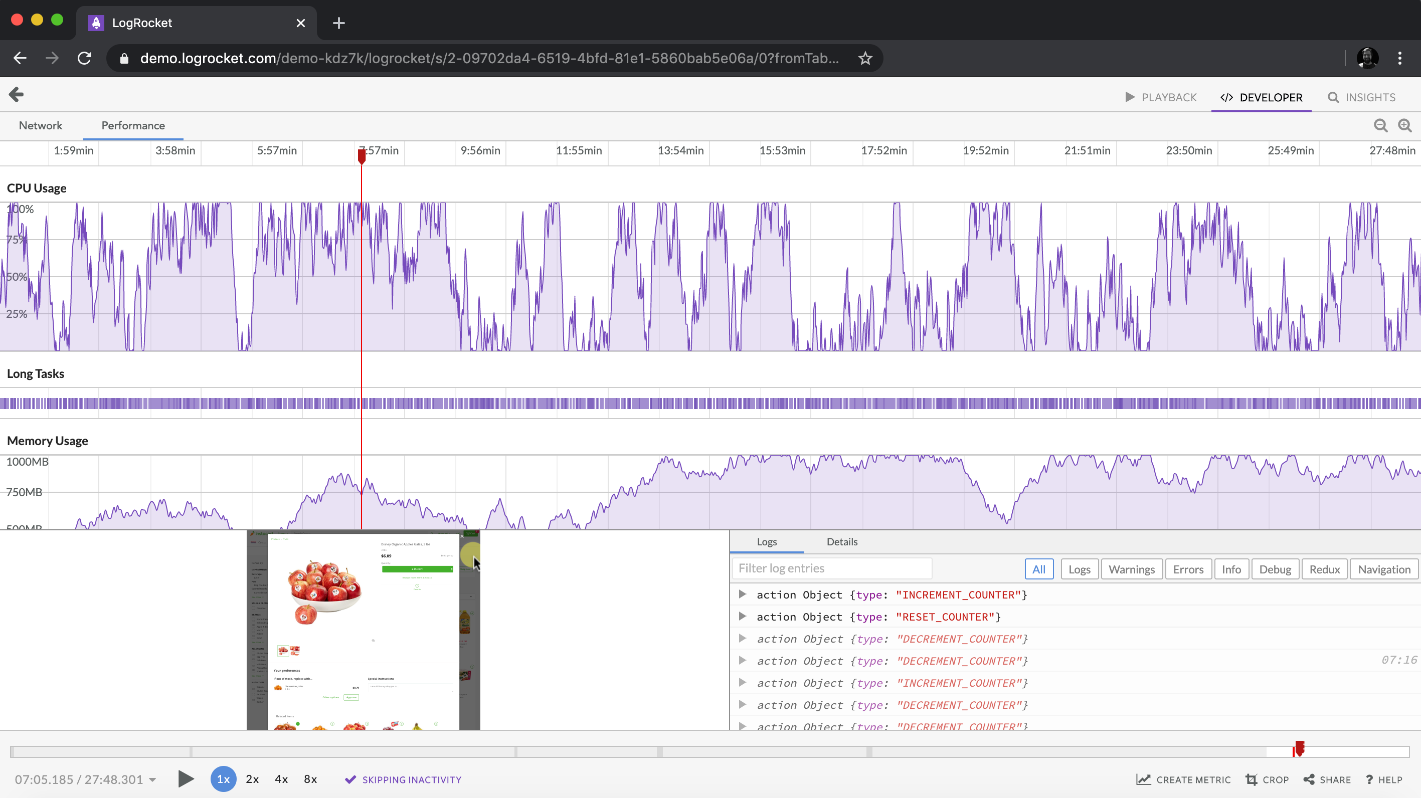
LogRocket lets you replay user sessions, eliminating guesswork around why bugs happen by showing exactly what users experienced. It captures console logs, errors, network requests, and pixel-perfect DOM recordings — compatible with all frameworks.
LogRocket's Galileo AI watches sessions for you, instantly identifying and explaining user struggles with automated monitoring of your entire product experience.
Modernize how you debug web and mobile apps — start monitoring for free.
A guide for using JWT authentication to prevent basic security issues while understanding the shortcomings of JWTs.
Discover how to build, render, and automate product demo videos with Remotion, replacing traditional screen recordings with reusable React code.
Chrome’s Modern Web Guidance embeds modern web platform skills into AI coding agents, helping them choose native HTML, CSS, and browser APIs over legacy patterns.
Learn how to use Fallow to analyze AI-generated code, detect dead code, duplicate logic, and complexity issues, and integrate automated code quality checks into your AI-assisted development workflow.
Hey there, want to help make our blog better?
Join LogRocket’s Content Advisory Board. You’ll help inform the type of content we create and get access to exclusive meetups, social accreditation, and swag.
Sign up now


 Learn more →