
TailwindCSS gives its users a great developer experience, but with the right plugins, you can take that experience to the next level. Tailwind plugins allow you to create new utility classes and variants with JavaScript, and then reuse them across as many projects as you want.

In this article, you’ll discover seven plugins that can elevate your Tailwind projects, offering functionalities like container queries to effortless dark modes. To follow along with this article, you’ll need working knowledge of npm, HTML, vanilla CSS, and TailwindCSS.
Jump ahead:
The Replay is a weekly newsletter for dev and engineering leaders.
Delivered once a week, it's your curated guide to the most important conversations around frontend dev, emerging AI tools, and the state of modern software.
tailwindcss-container-queries is a Tailwind plugin for v3.2+ that adds utility classes for CSS container queries to your project. Container queries are a CSS feature that lets you write style rules for an element that the browser applies conditionally, based on the size of a parent element you mark as a container.
After reading that, you might be wondering: why not just use media queries? This is what web.dev has to say:
Using container queries means that if you have the exact same component in different parts of your UI, it’s able to use its own logic to resize and best fit its container. You have better control over the component’s layout than you would if you only had the global viewport to rely on.
Container queries can’t replace media queries, but they give you extra flexibility when building responsive components.
Now, back to the plugin. Just like Tailwind has sm:, lg:, and other variants that make it convenient to use media queries, using the tailwindcss-container-queries plugin will give you variants like @sm: and @md: that you can use to apply container queries. You can find the full list of variants the plugin provides in its documentation. Here’s a demo showing the plugin in action:
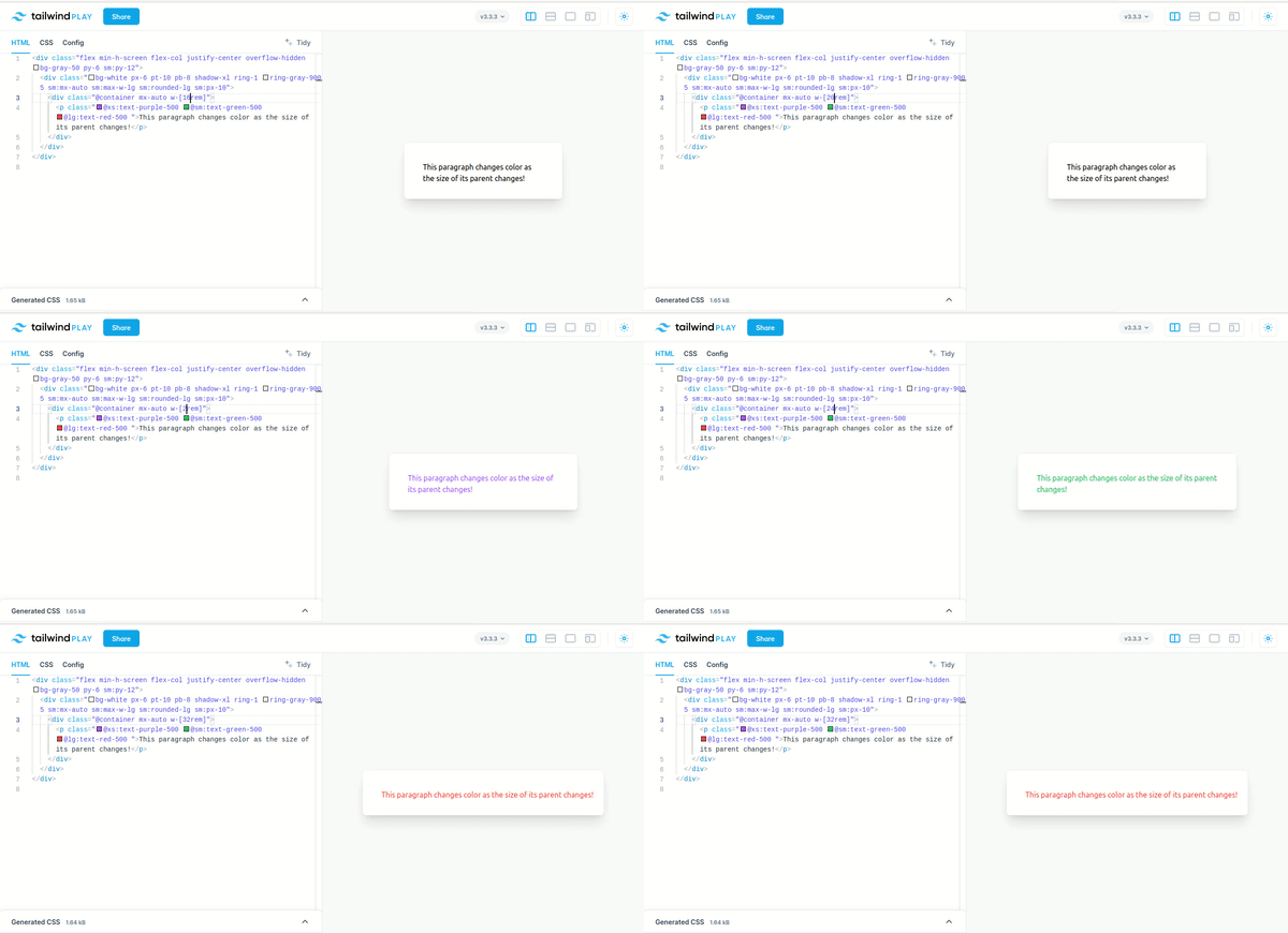
With the tailwindcss-container-queries plugin, you specify an element as a container by giving it the @container class and then applying conditional styles on its children using the media query variants. You can install the plugin via npm like this:
npm install @tailwindcss/container-queries
Then you can add it to your Tailwind config:
// tailwind.config.js
module.exports = {
  theme: {
    // ...
  },
  plugins: [
    require('@tailwindcss/container-queries'),
    // ...
  ],
}
And you’re all set!
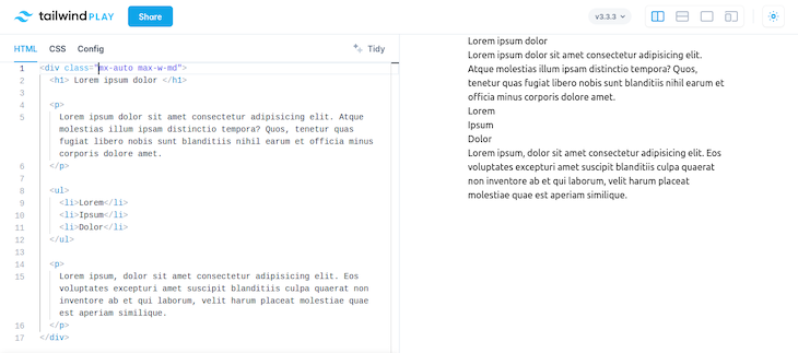
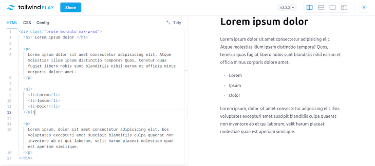
Typography is a Tailwind plugin that helps you easily style long blocks of text, like blog posts. It gives text a readable look without any extra effort from you. But why would you need any help? Tailwind applies a set of CSS reset rules to your project that makes most unstyled HTML elements look like plain text, and to fix this, you have to style all of them again from scratch.
The typography plugin saves you this effort — it gives you a prose class you can add to a container element to give a clean, readable appearance to all markup inside it. Here are images demonstrating what text on a Tailwind site looks like before and after you apply the Typography plugin.
This is the text before the plugin:
This is the text after applying the plugin:
You can play with the demo here, and check out more ways to use it in the Typography documentation.
Here’s how to install the Typography plugin via npm:
npm install -D @tailwindcss/typography
Then you can add it to your Tailwind config:
// tailwind.config.js
module.exports = {
  theme: {
    // ...Because of Tailwind’s CSS reset rules
  },
  plugins: [
    require('@tailwindcss/typography'),
    // ...
  ],
}
Now, it’s ready to use.
The forms plugin is similar to the typography plugin. Because Tailwind CSS’ resets also affect form elements, the job of the forms plugin is to give form elements a set of pretty, default styles. The default styles are minimal so you won’t want to use them as is, but they make a convenient base you can override and extend.
Here’s what a basic form looks like before you use the forms plugin:
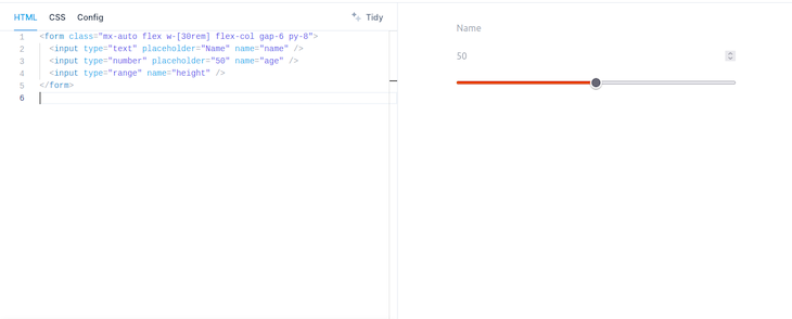
And here’s what it looks like after:
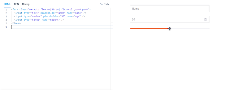
Play with the demo here. You can install the Forms plugin with the following command:
npm install -D @tailwindcss/forms
Then you can add it to your Tailwind config like this:
// tailwind.config.js
module.exports = {
  theme: {
    // ...
  },
  plugins: [
    require('@tailwindcss/forms'),
    // ...
  ],
}
tailwindcss-logical is a Tailwind plugin for v1.20+ that gives you utility classes for CSS logical properties and values. Logical properties and values is a name for a group of CSS properties and values that the browser evaluates based on the flow of the document instead of the dimensions of the screen. The document’s flow dictates the order you should read the elements on the screen. For example, the flow of an English document is usually that lines are laid out horizontally and top-to-bottom, and are read left-to-right.
Logical properties and values simplify the process of styling websites where the contents may have different flows, like a blog that has articles in multiple languages. Without using logical properties, you would have to write multiple sets of style rules, because you would need to account for the different flows. But if you used logical properties, you could write your layout rules once, and the browser would do the rest.
Here’s an example. Let’s assume you have this style rule in your app:
p {
  text-align: left;
}
This will work fine for contents meant to be read left to right, but it will force a wrong alignment on right-to-left contents. To fix it, you’ll have to add another rule like this:
html[dir="rtl"] p {
  text-align: right;
}
Now, the paragraphs will always be aligned correctly. But if you used the logical value start instead of the values left or right, you can write a single equivalent rule like the code below and the paragraphs will always be aligned correctly:
p {
  text-align: start;
}
To install tailwindcss-logical, use the following command:
npm install tailwindcss-logical --save-dev
Then add it to your project like this:
// tailwind.config.js
module.exports = {
  plugins: [
    require('tailwindcss-logical')
  ]
}
And you’re all set. You can find a list of the logical utility classes in the plugin’s documentation.
Note that TailwindCSS v3.3+ comes with some logical utility classes out of the box, so be sure to check if the default classes are enough for your use case before you install the plugin.
Nightwind is a plugin whose mission is to give you the gift of an effortless dark mode. The plugin uses your Tailwind config to automatically generate and apply classes for dark mode. It lets you write just one set of classes for your site, then you install and initialize it, and your site gets a dark mode without any further CSS on your part.
By default, Nightwind will choose the appropriate theme for your site based on the user’s current (light or dark) mode. It also gives you helper functions so you can manually switch your site between modes, or to always enable one mode or the other.
Here’s a demo showing Nightwind’s generated dark mode:
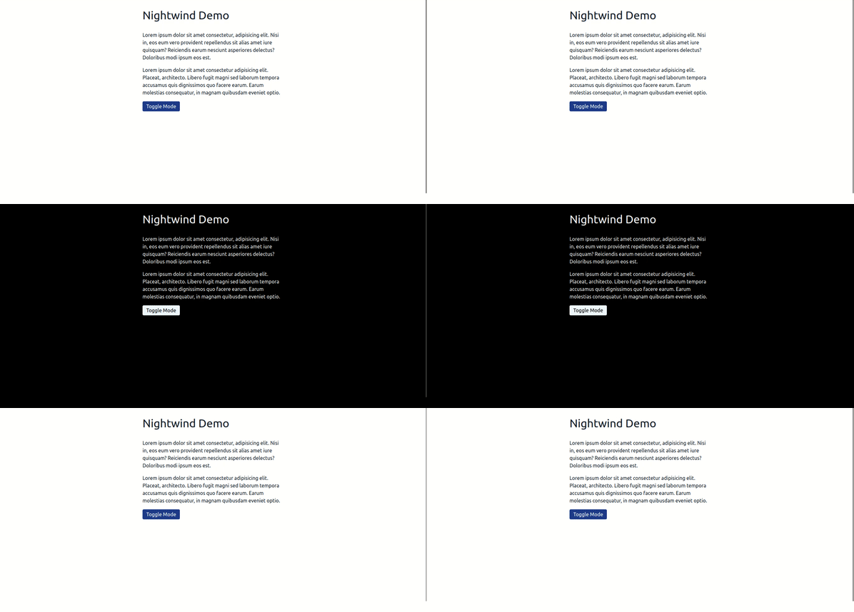
You can also customize the dark mode that Nightwind generates for you. You can install Nightwind with the following command:
npm install nightwind
Then add it to your Tailwind config:
// tailwind.config.js
module.exports = {
  darkMode: "class",
  // ...
  plugins: [require("nightwind")],
}
And finally, you need to initialize Nightwind in the head of every page you want to use it on. The documentation includes examples of how to do this in different environments, but here’s the code to do it in React:
// React Example
import nightwind from "nightwind/helper"

export default function Layout() {
  return (
    <>
      <Head>
        <script dangerouslySetInnerHTML={{ __html: nightwind.init() }} />
      </Head>
      // ...
    </>
  )
}
And you’re done! Your site will now have an automatic dark mode for all Tailwind styles. Check out the documentation for information about Nightwind’s helper functions and customization.
Tailwind-heropatterns is a plugin that makes it easy to add beautiful SVG backgrounds to your website. The backgrounds the plugin provides come from Hero Patterns, a site that provides a collection of SVG patterns you can use in your project. The plugin provides utility classes to make it convenient to use these SVG patterns.
In the project configuration, you can specify the colors and opacity values you want to use with the patterns, then you can just use the class bg-[pattern]-[color]-[opacity] and you’ll get the pattern you need. The plugin allows you to load as many or as few patterns as you want and provides a full list of the patterns it currently supports.
Here’s a quick demo using Tailwind-heropatterns:

You can install it like this:
npm install --save-dev tailwind-heropatterns
Add it to your Tailwind config like this:
// tailwind.config.js
module.exports = {
  plugins: [
    require("tailwind-heropatterns")({
  // the list of patterns you want to generate a class for
  // the names must be in kebab-case
  // an empty array will generate all 87 patterns
  patterns: [],

  // The foreground colors of the pattern
  // if you don't specify a color, the default will be used
  colors: {
    default: "#9C92AC",
    "vermillion": "#ffedee" //also works with rgb(0,0,205)
  },

  // The foreground opacity
  opacity: {
    default: "0.4",
    "100": "1.0"
  }
})
  ]
}
Tailwind CSS Theme Variants is a plugin that allows you to define multiple themes for a single project and apply different themes in varying scenarios. It lets you choose which theme should be active based on the value of a media query (like prefers-color-scheme or prefers-contrast ), the presence of a CSS selector (like a class or data attribute), or some combination of both.
In practice, what this looks like is that you can define two themes, say red and blue, you can set conditions for them to become active, and then you can write your utility classes like this: <div class="red:bg-red-900 blue:bg-blue-900">…</div>. The div will have the appropriate background depending on which theme is active. The plugin also allows you to specify a fallback theme, which will become the active theme if none of the activation conditions for the other themes are triggered.
You can install Tailwind CSS Theme Variants from npm like this:
npm install --save-dev tailwindcss-theme-variants
And then add it to your Tailwind project like this:
// tailwind.config.js
const { themeVariants } = require("tailwindcss-theme-variants");

module.exports = {
    plugins: [
        themeVariants({
            themes: {
                red: {
                    selector: ".red",
                },
                blue: {
                    selector: "[data-theme=blue]",
                },
            },
        }),
    ],
};
And that’s it!
This article covered a variety of plugins you can use in your Tailwind projects. Some are more broadly useful than others, but they all have the potential to save you much time and effort while you’re working on your website. I hope you enjoyed the article. Happy coding!
As web frontends get increasingly complex, resource-greedy features demand more and more from the browser. If you’re interested in monitoring and tracking client-side CPU usage, memory usage, and more for all of your users in production, try LogRocket.

LogRocket lets you replay user sessions, eliminating guesswork around why bugs happen by showing exactly what users experienced. It captures console logs, errors, network requests, and pixel-perfect DOM recordings — compatible with all frameworks.
LogRocket's Galileo AI watches sessions for you, instantly identifying and explaining user struggles with automated monitoring of your entire product experience.
Modernize how you debug web and mobile apps — start monitoring for free.

Learn how AI-assisted development governance uses rules, agents, hooks, and protocols to help AI coding tools produce safer, more consistent code.

A step-by-step guide to building your first MCP server using Node.js, covering core concepts, tool design, and upgrading from file storage to MySQL.

Using security headers in your Next.js apps is a highly effective way to secure websites from common security threats.

A deep dive into May 2026’s AI model and tool rankings. We break down performance, usability, pricing, and real-world capabilities across 50+ features to help you pick the right tools for your development workflow.
Hey there, want to help make our blog better?
Join LogRocket’s Content Advisory Board. You’ll help inform the type of content we create and get access to exclusive meetups, social accreditation, and swag.
Sign up now