Before browsers gradually begin to implement them, CSS features are first defined in specifications of the W3 Consortium — usually after long discussions. There are countless new CSS features that are worth mentioning, but for this guide, we’ll focus on five that you can already test in the stable version of at least one web browser:
content-visibility propertycontain-intrinsic-size property:is and :where pseudo-classes
Note that browser support for these features changes all the time, so always check the current level of support on sites such as Can I Use, the MDN CSS Reference (support info is at the bottom of each page), and Chrome Platform Status.
CSS Grid is a flexible layout module that allows developers to create complicated layouts without using JavaScript or resorting to messy CSS hacks.
To apply the grid layout to an HTML element, add the following rule to it.
 .grid-container {
    display: grid;
}
There are several grid-specific properties you can use to set up the exact layout you need.
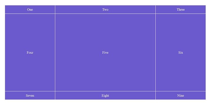
For instance, in the above example, the child elements of .grid-container will be the grid items, and they will be laid out according to the rules you define with the grid-template-columns and grid-template-rows properties:
.grid-container {
    display: grid;
    grid-template-columns: 1fr 2fr 1fr;
    grid-template-rows: 50px 70vh 50px;
}
The code above defines the following CSS grid layout.
But, what if you want to include some (or all) of the grandchild elements of .grid-container in the grid layout too? That’s where the CSS subgrid comes into play.
You can add the following rules to a grid item to enable it to adopt its parent’s grid tracks (including the name grid lines and areas, even though it can also define its own).
.grid-item {
    /* these rules specify the subgrid's position within the layout */
    grid-column: 2 / 4;      /* two columns vertically */
    grid-row: 1 / 3;         /* two rows horizontally */

    /* these rules belong to the subgrid itself */
    display: grid;
    grid-template-columns: subgrid;
    grid-template-rows: subgrid;
}
The grid-column and grid-row properties define the grid item’s position within the grid columns or rows. The child elements of .grid-item will form the subgrid. A grid item can span more than one grid cell. For instance, here it spreads across four cells (the values of grid-column and grid-row are arbitrary in the example above).
As you can see, subgrid is not a standalone CSS property, but a value you can add to the grid-template-columns and grid-template-rows properties. It makes the children of .grid-item included in the grid layout:
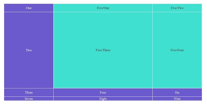
As you can see, the subgrid has become part of the grid layout, and it’s been positioned to the exact place where we wanted to (between the second and fourth vertical grid lines and the first and third horizontal grid lines).
The rest of the grid items has kept the normal grid flow, and a fourth row has also appeared at the bottom of the layout. However, since we only defined three rows with the grid-template-rows property, the fourth row doesn’t have a preset value, so it just takes the natural height of its contents. If we were to remove the text from the last three grid items, they wouldn’t even show up because their natural height would be 0.
You can test the example above using the following CodePen demo.
See the Pen
Subgrid test by Anna Monus (@amonus)
on CodePen.
You can also create a one-dimensional subgrid by adopting only either grid-template-columns or grid-template-rows and using a new value for the other one.
For example, in the following case, the subgrid only adopts the columns of the main grid, but it creates a new rule for the rows.
.grid-item {
        display: grid;
        grid-template-columns: subgrid;
        grid-template-rows: 200px 400px 200px;
}
The CSS subgrid specification is a W3C candidate recommendation as of August 2020. Currently, it’s only supported by Firefox 71+, but it’s also coming to Chromium, the open-source web browser that’s used as the foundation for major browsers including Chrome, Opera, Brave, and the new Microsoft Edge.
If you need a fallback method, note that a nested grid (defined with the inherit value) is not the same thing as the CSS subgrid. You can emulate a subgrid using a nested grid and recalculating the grid tracks; however, in that case, you’d still have two independent grids instead of one that shares its tracks with some or all children of the grid items.
Adding gaps between flex rows or flex columns in a flexbox layout has been a difficult question for a long time. It’s usually solved by adding margins to flex items, but the problem with margins is that they are also added to the beginning and end of each flex row or column. Even though these can be removed by adding negative margins to the first/last element, it’s not the most elegant solution.
Luckily, browser support for flexbox gaps is getting better. The gap, row-gap, and column-gap properties exist in different contexts, with different levels of browser support. You can use the gap properties in the following layout modules.
display: flex; declarationdisplay: grid; declarationcolumn-count and/or column-width propertiesYou can find the shared syntax of gap properties in the CSS Box Alignment Module (level 3) specification.
You can use the gap, row-gap, and column-gap properties with any length values (px, em, rem, cm, mm, vmin, vmax, etc.) or percentages (%).
In the flexbox context, you need to add them to the flex container (not to the flex items).
.flex-container {
  row-gap: 10px;
  column-gap: 15px;
}
The gap property is the shorthand for row-gap and column-gap. If you use it with two values, then the first value belongs to row-gap and the second one to column-gap.
.flex-container {
  gap: 10px 15px;
}
If you use it with just one value, row-gap and column-gap will take the same value.
.flex-container {
  gap: 10px;
}
You can check browser support for the gap properties in the related Can I Use tables, which show support in various contexts. You can see that it’s the most widely supported in the CSS grid layout since this is where it was first defined.
In the flexbox layout, the gap properties are currently supported by Edge 84+, Firefox 63+, Chrome 84+, and Opera 70+. Internet Explorer (obviously) and Safari do not support it.
Considering fallback for Safari and older browsers, the problem with the gap property is that you can’t test it with a @supports feature query since browser support is different in the three layout modules (flexbox, CSS grid, multicol) and @supports checks for the most widely supported context (CSS grid). If you need to support Safari, IE, or older browsers, you’re better off using the margin hack for now (unless you want to do extra checks with JavaScript).
content-visibility propertyThe content-visibility property enables you to manage the rendering process (and visibility) of off-screen elements. Part of the CSS Containment Module this compoment can help you significantly improve the rendering performance of your page.
It can take three values:
visible (default) — The rendering of the element happens as normalhidden — When rendering of the element is skipped, whether it’s off- or on-screenauto — When the element is off-screen, its rendering is skipped; when it becomes on-screen, its rendering is automatically implementedYou can simply add the content-visibility property to the element you want to change the rendering process of.
article {
  content-visibility: auto;
}
When content visibility is automated (takes the auto value), the different aspects of the rendering process (the layout, style, paint, and size containment) are turned on and off automatically — you can read about it in detail in this excellent guide. On their test site (a travel blog), the authors managed to reduce the rendering time by more than seven times (from 232ms to 30ms) on initial page load by adding the content-visibility: auto; rule to different sections of the test blog — which is a quite impressive result.
The content-visibility property is currently supported by Chrome 85+, Edge 85+, and Opera 71+. The Firefox team is also discussing adding the feature, but it’s still in a very early stage.
contain-intrinsic-size propertyThe contain-intrinsic-size property defines the explicit width and height of elements with size containment activated, which means that the size of an element is not affected by the size of its children. Setting an explicit width and/or height aims to prevent these elements from collapsing to zero under certain circumstances.
For instance, it’s recommended that you define a value for contain-intrinsic-size when content-visibility is set as auto (see the above section). When the rendering process of off-screen elements is skipped, they are rendered as empty elements, so their width and height are setto 0 by default. However, before they scroll into view, their content automatically gets rendered on the screen, which can lead to UX issues such as the sudden change of the size of the scrollbar.
The default value of contain-intrinsic-size is none, but it can take any length value (px, rem, em, cm, mm, etc.) as well. You can use it with either one or two values. With one value, the intrinsic width and height will be the same, while with two values, the first one provides the width and the second provides the height value. For example:
article {
  content-visibility: auto;
  contain-intrinsic-size: 700px 1000px;
}
The contain-intrinsic-size property is supported by Chrome 83+, Edge 83+, and Opera 69+ at the moment. Firefox doesn’t support it.
:is() and :where() pseudo-classesThe :is() and :where() pseudo-classes, defined by the Selectors Level 4 specification, make it possible to reduce repetition in longer CSS selector lists. They can be used to mark unique items within repetitive selectors so that you only have to add one selector instead of several ones.
These two pseudo-classes do almost the same thing; the only difference is in the level of specificity. :is() takes the specificity of the most specific element within the parentheses while the specificity of :where() is always 0. Specificity is important because it determines how easy it is to override a given CSS rule.
For instance, if you have the following selector list:
.my-class p em,
.my-class li em,
.my-class section em {
    // CSS rules
}
You can shorten the list using :is() if you want to keep specificity high to make it harder to override the belonging rules with subsequent declarations.
.my-class :is(p, li, section) em {
  // CSS rules
}
You can use :where() if you want to keep specificity 0 to make it easy to override the belonging rules.
.my-class :where(p, li, section) em {
  // CSS rules
}
In the example above, the .my-class em selector would override the :where rule, but wouldn’t override :is. You can compare the effect of the two pseudo-classes in the CodePen demo below — currently, it only works in Firefox (:is works in Safari as well but :where doesn’t), but you can test the feature in Chrome by enabling the Experimental Web Platform features flag at the chrome://flags/ URL.
See the Pen
Testing :is and :where pseudo-classes by Anna Monus (@amonus)
on CodePen.
The :is pseudo-class is currently supported by Firefox 78+ and Safari 14+. The Chromium-based browsers (Chrome 15+, Edge 79+, Opera 15+) support its prefixed syntax using the :-webkit-any() prefix. You can also enable the feature by setting the Experimental Web Platform features flag to checked in Chrome 68+, Opera 55+, and Edge 79+.
The :where pseudo-class is less widely supported. At the moment, only Firefox 78+ supports it, but you can enable it in Chrome 72+ by using the Experimental Web Platform features flag.
You should use the new CSS features discussed in this article with caution. Ideally, you should provide a feedback method for them, use the prefixed version, or wait until they are more widely implemented.
However, if you like to experiment, you can already use the content-visibility and contain-intrinsic-size properties. You can achieve serious performance optimization in browsers that already support it (you can test browser support with the @supports rule) and they won’t affect browsers that don’t support it yet.
Besides these five new CSS features, there are many other interesting developments, such as the aspect-ratio (W3, MDN, Can I Use) and leading-trim (W3) properties, which are not yet implemented in any browsers, and the ::marker pseudo-element (W3, MDN, Can I Use), which is already implemented in the newest versions of Firefox, Chrome, and Safari.
All in all, it’s worth constantly watching the standardization and implementation process of new CSS features.Tthere are many useful functionalities coming to browsers that will ultimately make frontend development easier and faster.
As web frontends get increasingly complex, resource-greedy features demand more and more from the browser. If you’re interested in monitoring and tracking client-side CPU usage, memory usage, and more for all of your users in production, try LogRocket.

LogRocket is like a DVR for web and mobile apps, recording everything that happens in your web app, mobile app, or website. Instead of guessing why problems happen, you can aggregate and report on key frontend performance metrics, replay user sessions along with application state, log network requests, and automatically surface all errors.
Modernize how you debug web and mobile apps — start monitoring for free.
Hey there, want to help make our blog better?
Join LogRocket’s Content Advisory Board. You’ll help inform the type of content we create and get access to exclusive meetups, social accreditation, and swag.
Sign up now
Get to know RxJS features, benefits, and more to help you understand what it is, how it works, and why you should use it.

Explore how to effectively break down a monolithic application into microservices using feature flags and Flagsmith.

Native dialog and popover elements have their own well-defined roles in modern-day frontend web development. Dialog elements are known to […]

LlamaIndex provides tools for ingesting, processing, and implementing complex query workflows that combine data access with LLM prompting.

 Learn more →
