“C’mon I placed the div by the right, why does it still appear on the left?”
“Really? Why does my browser no longer support flex?”
CSS is fun sometimes, kind of fun other times, and frustrating most of the time. In my experience, most of the frustrations arise when the result on the webpage is not exactly as we expected.
What I’ve discovered is that most of the time the problem isn’t spelling or selectors, but that we aren’t using compatible properties and values. Which is why, sometimes, when we change few things, it suddenly, and seemingly randomly, works.
To avoid these headaches in the future, in this article, I will address 5 CSS properties and values that do not work together in CSS (no matter how much we might want them to).
To understand the contents of this article completely, we will first review positioned and non-positioned values.
To begin, positioned values include absolute, fixed, relative, and sticky. An absolute positioned element loses its position in the flow of the document, but is bounded by the parent element if relative positioned (otherwise, the viewport). A top property with value 0 will position the element at the top of its boundary.
Unlike with absolute, a fixed positioned element is bounded by the viewport, meaning that a top property with value 0 will position the element at the top of the viewport. A relative positioned element is relative to itself, and accepts top, left, bottom, and right. The next section shows a little of how these properties affect relative positioned elements.
Finally, a sticky positioned element is a combination of fixed and relative. While using the top position properties, you can restrict such elements within the parent’s viewport until the parent is no longer in view. You can read more here.
Important to note for our next two sections, an element with position static, though similar to a relative positioned element, is not considered positioned. Instead, static is the default position of every declared element in a document.
position: static and z-index: nSince static elements are placed in respect to the normal flow of the document and cannot be removed from that flow, you must have a relative value on a parent before an absolute child will respect the position of the parent element. This becomes problematic when z-index is added to the mix.
z-index is a property used to position elements (above or below other elements) in the z-axis; this property also only respects positioned elements. Remember, static is a default position, and therefore not considered positioned itself. Below, we’ll see where this becomes a problem.
With static, elements must respect the normal flow:
<div class='block1'></div>
<div class='block2'></div>
Now, try adding z-index:
.block1,
.block2 {
  width: 300px;
  height: 300px;
}

.block1 {
  background-color: yellow;
  z-index: 1;
}

.block2 {
  position: absolute;
  background-color: red;
  margin-top: -60px;
  margin-left: 10px;
}
Here is the output:
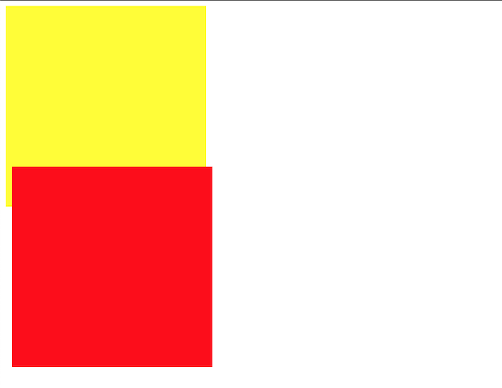
You’ll notice that the normal flow is from .block1 to .block2. And, even though the z-index property is included in the code block, it is ignored in style declarations for .block1 because z-index only respects positioned elements.
To fix, add position relative to .block1 to see this instead:
.block1,
.block2 {
  width: 300px;
  height: 300px;
}

.block1 {
  position: relative;
  background-color: yellow;
  z-index: 1;
}

.block2 {
  background-color: red;
  margin-top: -60px;
  margin-left: 10px;
}
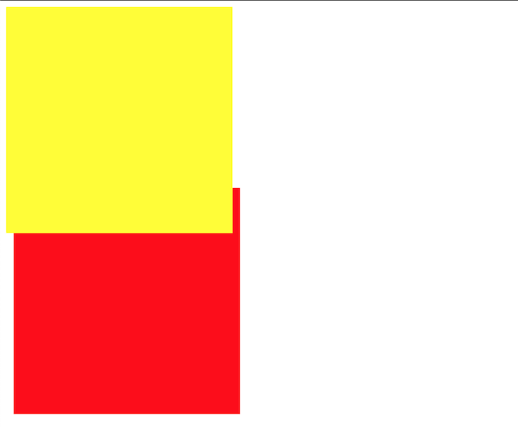
Remember, if you do not explicitly declare a position property, static will become your default and z-index will not work on it.
position: static and top|bottom|left|rightAs you may have guessed, this also has something to do with the explanations of static above. We know that top, bottom left, and right are used for repositioning elements, so it follows that using these properties may get us into trouble with elements that have a static position.
But what about margin-top and the like? We’ll take a look at the difference between these margin- associates and their repositioning counterparts in the following example.
First, create your blocks:
<div class="block block1">content</div>
<div class="block block2">content</div>
Now, try adding margin-top:
.block {
  width: 400px;
  height: 400px;
}
.block1 {
  margin-top: 100px;
  background-color: red;
}
.block2 {
  background-color: yellow;
}
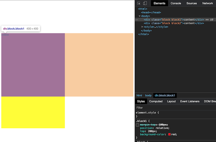
Here is your output:
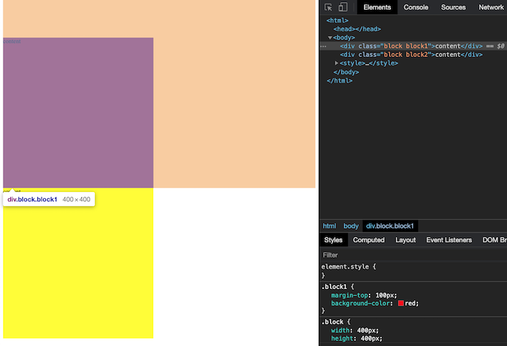
With margin-top, you’ll notice that the red box is pushed, but not repositioned. The red box is pushed from its original position (the orange overlay when the element is selected in dev tools), and consequently affects every other element that follows it. In this case, you’ll notice that the yellow box was also pushed.
Now, as you might have guessed, top and the likes will not work with a static element. However, in this example, we can solve this problem by using top with an established position (relative):
.block {
  width: 400px;
  height: 400px;
}
.block1 {
  position: relative;
  top: 200px;
  background-color: red;
}
.block2 {
  background-color: yellow;
}
As you can see, the element is now repositioned, and also does not affect the surrounding elements (the yellow box).
In the examples above, we can see that margin- positions only push elements to different sides — affecting the surrounding elements in the process — while top repositions elements without affecting other elements. What you may also have noticed is that while all elements can be pushed, not all elements (see: static )can be repositioned.
To avoid potential mishaps when using these properties, it is also useful to note that while margins behave the same way for all positions, top|bottom|left|right behave differently for different positions (relative, absolute, fixed, and sticky).
position: x and animation|transitionAnimations and transitions are CSS properties that allow smooth transformations from one style property to another.
Take, for example, transforming an element of opacity 0 to opacity 1. The element starts from 0 and is completely invisible, then gradually begins to transform until it can be clearly seen. An even simpler example is the transformation of an element from one height to another.
If you’ve been following along, you know the question I’m going to ask next: how do animations and transitions work with position? There’s a simple answer, which we’ll explore in the following example.
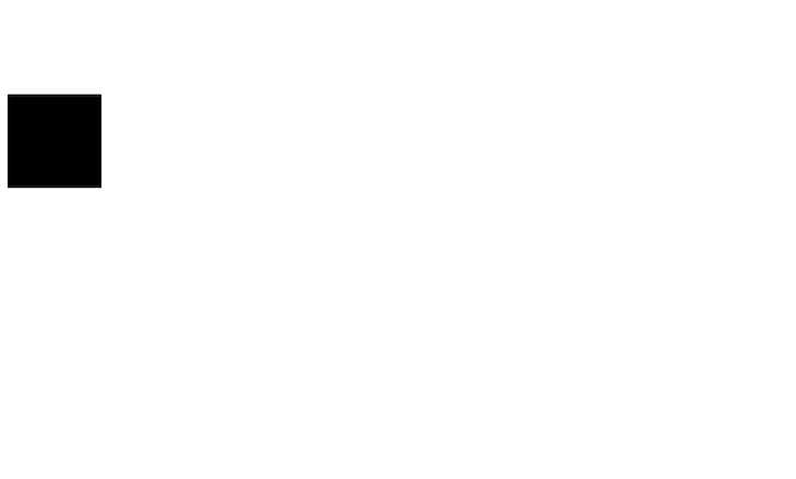
<div class="container">
  <div class="elem"></div>
</div>
For this example, we will use the relative position:
.container {
  margin-top: 100px;
}

.elem {
  position: relative;
  width: 100px;
  height: 100px;
  background-color: black;
}
Result:
We can then introduce a transformation (on a state like hover) involving the position property like so:
.elem:hover {
  width: 100px;
  height: 100px;
  background-color: black;
  position: fixed;
  right: 0;
}
Result:
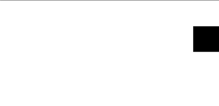
At first glance, this appears to have worked because the value has changed. However, because the browser does not know what to animate, no smooth transition occurs. The reason for this is simple: animations generally involve values that change over time. For example, an animation on opacity from 0 to 1 involves opacity 0, 0.1, 0.2, and so forth. For a change from position: static to position: fixed, however, there are no such middle values to pass through.
Therefore, if you’re trying to do a transition on a position property, you’ll likely never succeed — and that’s the simple answer. Now you know!
display: inline and height|widthThe two major types of display elements are inline and block. Block elements always start on a new line, which requires that the next immediate element must appear on a new line too. Block elements cover as much horizontal space as they have access to, even if it is excessive. Some examples of block elements include p, h1, div, form and pre.
In contrast, inline elements only take up as much space as they require, and therefore do not break up the flow of the document. As their name implies, inline elements appear inline of any content they are found. Some examples of inline elements are span, a, and button.
In the following example, we will see these display elements in action.
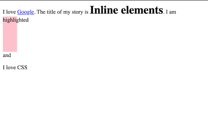
<div>
  I love <a href='https://google.com'>Google</a>. The title of my story is
  <h1>Inline elements</h1>. I am <span class="highlight">highlighted</span> and
  <p>I love CSS</p>
</div>


.highlight {
  background-color: pink;
  padding: 30px;
}
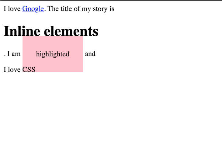
As you can, the anchor tag does not disrupt the flow, but the heading (“Inline elements”) does. This is because the heading, h1, is a block element.
The span element (“highlighted”), on the other hand, is treated a bit differently. padding was applied to the four corners, but the elements around the element only respect the left and right padding. Other elements were not moved. This is because span is an inline element.
Because inline elements only take as much space as they need to fit in, they do not accept height or width styles. Below, I will explain why you should always check display if your heights or widths aren’t working.
When we add height and width values to inline elements …
.highlight {
  background-color: pink;
  padding: 30px;
  width: 40px;
  height: 100px;
}
… the result is the same as our previous example!
It is also useful to note that you can explicitly specify an inline display for a block element and vice versa like so:
.highlight {
  background-color: pink;
  padding: 30px;
  width: 40px;
  height: 100px;
  display: block;
}
h1 {
  display: inline;
}
In a classic twist, the h1 now only uses as much space as required and the span element can now accept heights or widths.
In summary, if your heights or widths are not working, you should check the display of the target element. It most probably has something to do with inline.
It also worth noting that there is a display value called inline-block. It behaves like inline element but accepts properties that block elements allow.
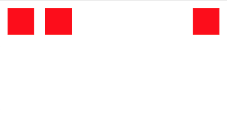
display: flex and justify-selfLet’s say I wanted to display three elements in a container: the first two at the left edge of the container, and the last element at the right edge of the container.
Some people (like myself) would immediately think to do this:
<div class="container">
  <div class="block block1"></div>
  <div class="block block2"></div>
  <div class="block block3"></div>
</div>


.container {
  display: flex;
}
.block {
  width: 100px;
  height: 100px;
  margin: 20px;
  background-color: red;
}
.block3 {
  justify-self: end;
}
After all, justify-self is supposed to justify the last block to the end of the main axis (which is horizontal) right? Turns out, not so much.
After some trial and error, I discovered that even though justify-self works with block-level layouts, absolutely-positioned elements, and grid-layouts, it does not work with flex containers.
The reason for this is because, on the main axis, flex containers treat content as a group. For that group, it tries to allocate enough and equal spaces for each child depending on the justify-content property. Therefore, it is limited in how much space is available for each individual elements.
On the other hand, using align-self gives us more flexible space in the cross axis to position individual items.
In the following example, I’ll show you what I ended up doing to achieve what I had set out to do in the first place.
.block3 {
margin-left: auto;
}
Through this approach, .block3 has access to all available space on the main axis, so a margin-left of auto pushes it to the right. If margin-right: auto is also added, this makes the element positioned at the center of the available space.
Some (or most, depending on who you ask) of CSS struggles are a result of incompatible combinations of CSS properties and values. In this article, we looked at five such combinations which are:
position: static and z-index: nposition: static and top|bottom|left|rightposition: x and animation|transitiondisplay: inline and height|widthdisplay: flex and justify-selfWhile I’m sure that there are still more combinations of properties and values out there that make CSS so frustrating, with these five tips, I hope that writing CSS is a bit easier than before.
Good luck!
As web frontends get increasingly complex, resource-greedy features demand more and more from the browser. If you’re interested in monitoring and tracking client-side CPU usage, memory usage, and more for all of your users in production, try LogRocket.

LogRocket lets you replay user sessions, eliminating guesswork around why bugs happen by showing exactly what users experienced. It captures console logs, errors, network requests, and pixel-perfect DOM recordings — compatible with all frameworks.
LogRocket's Galileo AI watches sessions for you, instantly identifying and explaining user struggles with automated monitoring of your entire product experience.
Modernize how you debug web and mobile apps — start monitoring for free.

Learn how to use Fallow to analyze AI-generated code, detect dead code, duplicate logic, and complexity issues, and integrate automated code quality checks into your AI-assisted development workflow.

Learn how to protect full-stack projects from NPM supply chain attacks with a practical security checklist.

Explore 15 essential MCP servers for web developers to enhance AI workflows with tools, data, and automation.

Learn how contrast-color() automatically picks accessible text colors using native CSS, without JavaScript.
Hey there, want to help make our blog better?
Join LogRocket’s Content Advisory Board. You’ll help inform the type of content we create and get access to exclusive meetups, social accreditation, and swag.
Sign up now

 Learn more →
