Let’s say you have built a successful mobile app in React Native. However, according to your users, even though the project does the job, it doesn’t “look nice.” In other words, your app’s user interface is lackluster and needs a fresh coat of paint.

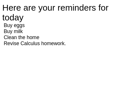
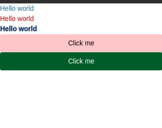
For example, what do you think looks better? A boring list comprised of Text components:
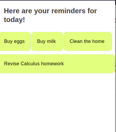
Or a better-looking list with Cards and layouts:
To create a UI in React Native, this is what you would need to do:
Button, Text, and other componentsSure, this solution might work. However, there is a minor flaw: developing a great interface requires time and skill. Therefore, this solution is a no-go for small teams. So how do we mitigate this issue?
This is where NativeBase comes in. It’s an easy-to-use, open source component library for React Native. At around 17k stars on GitHub, NativeBase assures users that it’s a popular and robust choice among developers.
Recently, the developer team has released version 3.0, which brings in a multitude of features and bug fixes. In this article, we will cover what’s new in the latest version of NativeBase.
The Replay is a weekly newsletter for dev and engineering leaders.
Delivered once a week, it's your curated guide to the most important conversations around frontend dev, emerging AI tools, and the state of modern software.
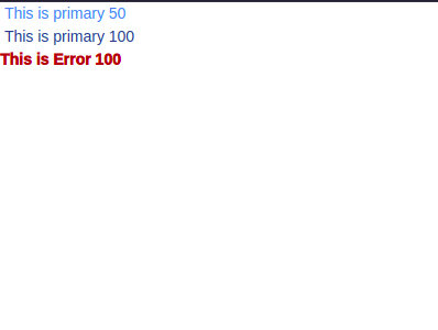
Theming is one of the core fundamentals of this technology. You can now alter the default style properties of your project using few lines of code.
To do so, first use extendTheme in your app:
import {extendTheme } from 'native-base';

const theme = extendTheme({
  //add colors
  colors: {
    primary: {
      50: '#179def',
      100: '#005489',
    },
    error: {
      50: '#000000',
      100: '#af0808',
    },
  },
  //add font weights.
  fontWeights: {
    hairline: 100,
    extrathick: 950,
  },
});
A few inferences from this code:
colors object to create our primary and error colors. They have varying shades of blue and red respectivelyfontWeights property. This will change the thickness of our typographyLet’s test it out! To use our new theme in action:
import { NativeBaseProvider, Text } from "native-base";

export default function App() {
  return (
    <NativeBaseProvider theme={theme}>
      {/* Apply our custom theme on this component */}
      <Text color="primary.50"> This is primary 50</Text>
      <Text color="primary.100"> This is primary 100</Text>
      <Text color="error.100" fontWeight="extrathick">
        This is Error 100
      </Text>
    </NativeBaseProvider>
  );
}
Here, we applied our newly-created styles to our Text elements.
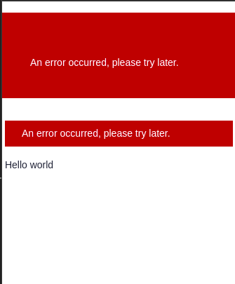
This feature allows you to build your UI with constrained-based utility props. This allows for more granular control over your theme and styles. Furthermore, the fact that you don’t have to remember style names is a big plus:
<NativeBaseProvider>
  {/* Verical and horizontal paddding 10 units, and vertical margin of 4 units */}
  <Box bg="danger.700" px={10} py={10} my={4}>
    An error occurred, please try later.
  </Box>
  {/* Horizontal and vertical padding of 6 and 2 units. Vertical margin of 4 units and horizontal margin of 1 unit*/}
  <Box bg="danger.700" px={6} py={2} my={4} mx={1}>
    An error occurred, please try later.
  </Box>
  <Text> Hello world</Text>
</NativeBaseProvider>
Based on Chakra and other utility first alternatives, NativeBase’s team has also provided support for pseudo props. This allows for styles on various conditional domains like platforms, color modes, interaction states, etc.
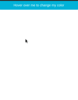
Here is a simple example of pseudo props:
<Button
  _hover={{
    _text: { color: "danger.400" },
    backgroundColor: "tertiary.900",
  }}
>
  Hover over me to change my color
</Button>
Here, we are instructing React Native to change the text.color and backgroundColor properties of Button if the user hovers over the component.
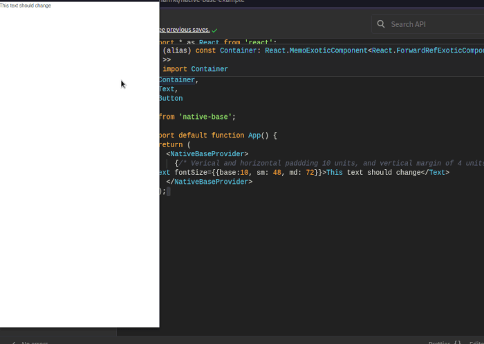
As of version 3, you can now incorporate responsive styling to your components. This ensures that your interface looks great on screens of all sizes:
import * as React from "react";
import { Text } from "native-base";

export default function App() {
  return (
    <NativeBaseProvider>
      <Text fontSize={{ base: 10, sm: 48, md: 72 }}>
        This text should change
      </Text>
    </NativeBaseProvider>
  );
}
Notice that in our fontSize prop, we have passed in an object consisting of base, sm, and md properties. This means that if the user is running our app on a narrow screen, the font size should be 10 units. Otherwise, it should be 48 or 72 units.
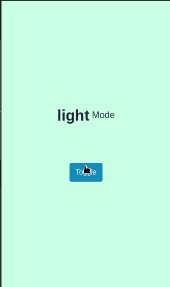
NativeBase now lets developers configure themes out of the box. The library bundles a hook called useColorMode, which allows the user to switch between dark and light themes easily:
import React from "react";
import { Text, Button, Center, useColorMode } from "native-base";

function ColorChanger() {
  const { colorMode, toggleColorMode } = useColorMode();
  return (
    <Center flex="1" bg={colorMode === "light" ? "success.100" : "success.900"}>
      {/*If the theme is light, set background to success.100, otherwise set it to success.900*/}
      <Text fontSize="lg" display="flex" mb={20}>
        <Text bold fontSize="30px">
          {colorMode}
        </Text>
        <Text> Mode</Text>
      </Text>
      <Button onPress={toggleColorMode}>Toggle</Button>
    </Center>
  );
}
In this code, we are using the useColorMode hook to customize the styles of the ColorChanger component. Later on, we also used a Button element. When clicked, the app will flip the current theme.
As the last step, let’s display ColorChanger to the UI:
import { NativeBaseProvider } from "native-base";
export default function App() {
  return (
    <NativeBaseProvider>
      <ColorChanger />
    </NativeBaseProvider>
  );
}
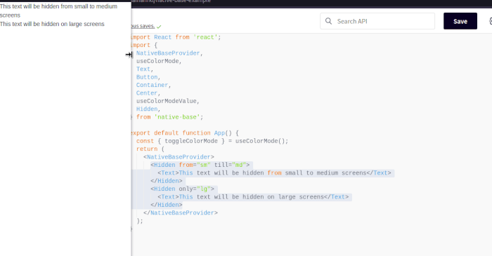
Hidden componentHidden is used to toggle the visibility value of child components responsively, based on the colorMode or based on the platform:
<NativeBaseProvider>
  <Hidden from="sm" till="md">
    <Text>This text will be hidden from small to medium screens</Text>
  </Hidden>
  <Hidden only="lg">
    <Text>This text will be hidden on large screens</Text>
  </Hidden>
</NativeBaseProvider>
In this piece of code, we are displaying or hiding Text components based on breakpoints. In the first part, we are using from and till props to tell React to obscure the component if the user is on a small or medium screen. In the second part, we are using the only prop to hide the Text if the user is viewing on a large screen.
Based on the Styled System theme specification, NativeBase 3.0 has bundled themable core components. This allows you to customize app’s color palette, font thickness, and other properties with extreme ease.
Combined with React ARIA and React Native ARIA, this feature enables you to build accessible UIs in a short span of time.
NativeBase is an extremely competent component library that aids programmers in building gorgeous user interfaces. It has been thoroughly tested and optimized, thus bringing security and performance to the table. When it comes to personal projects, NativeBase is my go-to library for sourcing components.
Thank you so much for reading!

LogRocket's Galileo AI watches sessions for you and and surfaces the technical and usability issues holding back your React Native apps.
LogRocket also helps you increase conversion rates and product usage by showing you exactly how users are interacting with your app. LogRocket's product analytics features surface the reasons why users don't complete a particular flow or don't adopt a new feature.
Start proactively monitoring your React Native apps — try LogRocket for free.
When should you move API logic out of Next.js? Learn when Route Handlers stop scaling and how ElysiaJS helps.

Explore how Dokploy streamlines app deployment with Docker, automated builds, and simpler infrastructure compared to traditional CI/CD workflows.

A side-by-side look at Astro and Next.js for content-heavy sites, breaking down performance, JavaScript payload, and when each framework actually makes sense.

AI-generated tests can speed up React testing, but they also create hidden risks. Here’s what broke in a real app.re
Hey there, want to help make our blog better?
Join LogRocket’s Content Advisory Board. You’ll help inform the type of content we create and get access to exclusive meetups, social accreditation, and swag.
Sign up now

 Learn more →
