Variable fonts are popular for two reasons: they expand design possibilities and improve website performance. While the former statement is definitely true since variable fonts do provide infinite typographical choices, the latter only holds under certain conditions.

In this tutorial, we’ll conduct a performance test on a live server to better understand the performance trade-off of variable fonts.
Variable fonts, as defined by a new OpenType font specification, don’t come with preset font styles such as bold, italic, or thin. Instead, they consist of one or more design axes that allow us to generate unique values for attributes such as width, weight, slant, and many others.
The design axes are always chosen by the creator of the font, and they differ from variable font to variable font. However, there are five registered axes that are standardized by the OpenType Font Variation specification: weight (wght), width (wdth), italic (ital), slant (slnt), and optical size (opsz). Besides these, font creators can register any custom axis that users can access with the font-variation-settings CSS property.
To learn more about variable fonts, check out MDN’s excellent variable fonts guide or experiment with them on the V-Fonts or Axis Praxis test sites.
Before we proceed with our performance test, let’s examine how variable fonts impact website performance.
In general, variable fonts improve performance because you only have to use one font file. Static fonts require a different file for each variation you want to use on the site, while variable fonts are dynamic in nature. In other words, they include all possibilities in a single file, which means only one HTTP request instead of multiple. In addition, you only have to use one @font-face rule, which results in a smaller CSS file.
On the other hand, a variable font file is huge, precisely because it contains all the variations. The Roboto Variable Font, for instance, is 3.36MB in TTF format, while a static Roboto font variant is around 165–175KB in TTF format. Even if we need to use all 12 variants, that’s still only around 2MB in total.
Ultimately, the performance trade-off of variable fonts depends on how these two metrics — the number of HTTP requests and the total size of font files — balance each other out.
Testing variable fonts can be difficult because most variable fonts don’t have a static version, and vice versa. A typeface is typically either a static or a variable font, but not both. In fact, I could only find one typeface that has both a static and a variable version: Roboto.
In our variable font performance test, we’ll compare the static version of Roboto that you can download from Google Fonts and Roboto Variable Font, which you can find in TypeNetwork’s GitHub repository.
The static version of Roboto comes in 12 variations (the numbers stand for the font-weight value):
In variable font terms, it has 12 static font variations along two design axes: weight (wght) and italics (ital). On the other hand, the Roboto Variable Font includes three design axes: weight (wght), width (wdth), and slant (slnt).
To accurately compare the two font types, we should generate 12 variations of the Roboto Variable Font that are identical to the 12 variations of the static version. But while both versions include the wght axis, Roboto VF uses slnt instead of ital. Because of this, we’ll use the slnt design axis to generate the italic variants of the variable fonts. However, it’s important to remember that it’s not the same thing.
The ital axis has a binary value (either 0 or 1). It can be accessed with either the high-level font-style or the low-level font-variation-settings property. If both properties are available/supported, you should always use the high-level one, which is font-style here.
font-style: italic;
font-variation-settings: 'ital' 1;
The slnt axis typically ranges between 0 and 20 degrees. It can be accessed with the same CSS properties (font-style and font-variation-settings), but in a different way.
font-style: oblique 12deg;
font-variation-settings: 'slnt' 12;
Since the slnt axis of the Roboto Variable Font ranges between 0 and 12, we will use its highest value (12) to create a slanted font variation that’s more or less comparable to the italic variation of the static version.
You might have also noted that the static version uses two design axes instead of three like Roboto VF. However, since these are only theoretical axes (I call them axes to make the two kinds of fonts comparable), this doesn’t skew the test result. Static fonts don’t include any axes; the characters are simply drawn without providing the user with any dynamic functionality.
We will use three test cases to analyze the performance trade-off of variable fonts. Each test case works with the same HTML page that consists of 12 “lorem ipsum” paragraphs, where each paragraph is displayed in a different variation of the Roboto font. The three test cases are:
In addition, we’ll explore a bonus test case with only four variations of the static version of the Roboto font.
You can find the entire performance test in this GitHub repo and run the tests by yourself on this demo site, where you can also find further information about the tests.
All test cases use the WOFF2 compressed font format and do not include any fallback for older browsers. Even though Roboto VF was available only in TTF format, I created a WOFF2 version using Google’s woff2 CLI tool, which reduced its size from 3.36MB to 1.40MB.
For the performance tests, we’ll use two tools:
We can pull Roboto Static from Google’s CDN by adding the following code to the <head> section of the HTML page.
<link href="https://fonts.googleapis.com/css?family=Roboto:100,100i,300,300i,400,400i,500,500i,700,700i,900,900i&display=swap" rel="stylesheet">
The link specifies the font variations we want to load — for instance, 100 stands for Roboto Thin and 700i stands for Roboto Bold Italic. It’s easy to generate this custom link on Google Fonts by selecting the variations under the Customize tab.

The link points to a CSS file hosted on Google’s servers and includes a bunch of @font-face rules — 84, to be exact. Google Fonts adds a @font-face rule for each character set (Latin, Cyrillic, Greek, etc.), and it’s not possible to change this. However, Google Fonts only loads the font files that the page requests (in our case, the Latin character set).
Altogether, we pulled 84 @font-face rules and 12 WOFF2 files from Google’s CDN in this test case.
Note: If you run the performance test using an older browser, Google will load either the WOFF or TFF format for you — it always loads the most modern format that the user’s browser supports.
In addition, we have two local files — index.html and style.css — on our server.
Now, let’s see how this setup performs. First, we’ll run the demo page for the first test case in the GTMetrix app.

As you can see, we have a total page size of 197kB and 15 HTTP requests — 12 for the font files, one for index.html, one for style.css, and one for the online CSS file that contains the 84 @font-face rules.
The Lighthouse performance report looks like this:

The total performance score is 99, and the first contentful paint happened in 1.6 seconds. Let’s see how these results compare to the other test cases.
In this test case, we’ll work with the same index.html and style.css files. You can check out the files in the GitHub repo. However, this time we’ll add the @font-face rules manually. Since we want to load 12 font files, we’ll need 12 @font-face rules.
We’ll try to make it as similar to Google CDN’s (immutable) @font-face rules as possible, but we won’t add @font-face rules for character sets we don’t want to use. Even though this skews the test results a bit, no one would use these character sets on a real website, and our main goal is to determine which setup is better.
Let’s take a look at one of our @font-face rules (you can check out the entire fonts.css on GitHub):
@font-face {
    font-family: 'Roboto';
    font-style: normal;
    font-weight: 100;
    font-display: swap;
    src: local('Roboto Thin'), local('Roboto-Thin'),
         url('fonts/roboto-v20-latin-100.woff2') format('woff2');
     unicode-range: U+0000-00FF, U+0131, U+0152-0153, U+02BB-02BC, U+02C6, U+02DA, U+02DC, U+2000-206F, U+2074, U+20AC, U+2122, U+2191, U+2193, U+2212, U+2215, U+FEFF, U+FFFD;
  }
As you can see, we placed the 12 WOFF2 font files into the fonts/ folder.
Here’s what GTMetrix returned:

Both the page load time (0.7s) and the number of HTTP requests (15) are the same as in the previous case. However, the total page size is 1KB smaller, which must be the result of the reduced number of @font-face rules (12 instead of 84).
Lighthouse’s performance audit resulted in the following metrics.

The first contentful paint took just 1.2s, down from 1.6s, a 25 percent improvement. Consequently, Lighthouse’s performance score is also a bit higher: 100 instead of 99. This is most likely because Google Fonts runs a few checks to decide which font format/file to load, while our self-hosted CSS contains static file paths.
In the third test case, we’ll analyze the performance of the Roboto Variable Font using the same index.html file as before. The style.css file is nearly identical, but, as mentioned earlier, the italic effect is achieved by using the slant axis since Roboto VF doesn’t have a design axis for italics.
We’ll load fonts.css locally, similar to the second test case, except now it contains only one @font-face rule.
@font-face {
        font-family: 'Roboto VF';
        font-weight: 100 900;
        font-stretch: 75% 100%;
        font-style: oblique 0deg 12deg;
        font-display: swap;
        src: local('Roboto VF'), local('Roboto-VF'),
             url('fonts/Roboto-VF.woff2') format('woff2-variations');
        unicode-range: U+0000-00FF, U+0131, U+0152-0153, U+02BB-02BC, U+02C6, U+02DA, U+02DC, U+2000-206F, U+2074, U+20AC, U+2122, U+2191, U+2193, U+2212, U+2215, U+FEFF, U+FFFD;
}
We defined the available ranges of all three design axes found in Roboto VF. This is also the recommended way of adding variable fonts (see the MDN docs for more details).
The font-weight property stands for the wght axis and spans from 100 to 900. font-stretch stands for the wdth axis and spans from 75 percent to 100 percent — we won’t use this axis since Roboto Static doesn’t have variants for different font widths. font-style: oblique; stands for the slnt axis and spans from 0deg to 12deg (we use this axis with its maximum value instead of italics).
Note that in production, we would use this @font-face rule inside a @supports feature query and add Roboto Static (or another font) as a fallback, since many browsers still don’t support variable fonts. This somewhat distorts the test results because we’re working with a smaller fonts.css file than we would in production. However, as already mentioned, it’s impossible to compare static and variable fonts with 100 percent accuracy due to their different nature.
For the third test case, the GTmetrix tool returned the following result.

The number of HTTP requests decreased drastically, from 15 to four. This is because we’re working with only one font file instead of 12. On the other hand, the total page size grew markedly, from 197/196KB to 1.41MB, which is due to the huge size of the variable font file.
How do these two values balance each other out? Given that the total page load time shrank from 700ms to 490ms — a 30 percent improvement — it seems that switching to a variable font was a good choice in this case.
The Lighthouse performance audit also shows improved performance metrics.

The first contentful paint happened twice as fast as in the first test case (0.8s compared to 1.6s), and 1.5 times faster than in the second test case (0.8s compared to 1.2s).
Judging by these test results, using a variable font is a good choice when you want to load all 12 variations of the static version of Roboto. Although the total font size and page size are much bigger, the significant decrease of HTTP requests (four compared to 15) still results in a better page load time.
An important question arises here: at what point is it no longer worth using variable fonts? To answer this, we’ll look into one additional test case.
This test case is almost identical to the first one. We’ll load Roboto Static from Google’s CDN and add index.html and style.css locally. However, instead of adding all 12 static variations, we’ll use only four: Roboto Light, Roboto Regular, Roboto Regular Italic, and Roboto Bold. The index.html file still consists of the same 12 paragraphs, but we’ll use the same font variation on three paragraphs instead of one.
The following <link> tag will load the four font variations.
<link href="https://fonts.googleapis.com/css?family=Roboto:300,400,400i,700&display=swap" rel="stylesheet">
Let’s see how this additional test case performed in GTmetrix:

As expected, the number of HTTP requests shrank from 15 to seven since we loaded four font files instead of 12. Obviously, the total page size is also much smaller than in the first test case (66.3KB versus 197).
The total page load time is much faster than in any of the previous test cases. In the first two test cases, it was 700ms, while the Roboto Variable Font loaded in 490ms. This time around, the page loaded in just 301ms.
But, what does the Lighthouse performance audit say?

The first contentful paint was 1.6s, which is the same result as in the first test case and worse than both the second (1.2s) and third (0.8s). This is most likely because the fonts were downloaded from a CDN instead of locally, rather than using a static font instead of a variable one or the number of HTTP requests.
All in all, since the total page load time is much faster than in the case of variable fonts, we can say that using Roboto VF is not worth it if you want to use/load only four font variations.
Before drawing a final conclusion, let’s see the results side by side:
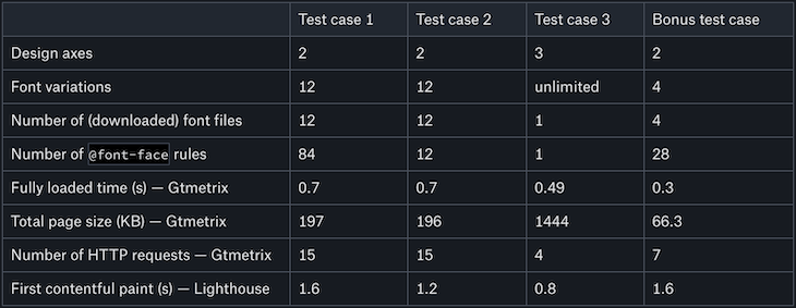
Whether using variable fonts is worth it performance-wise depends on how the decrease in HTTP requests and the increase in total page size balance each other out.
If you want to use several variations of the same typeface, using variable fonts is definitely a good option. However, if you want to use a font in an ordinary way — for instance, the bold, italic, and bold italic variations — you may want to stick with the static version.
Right now, the performance trade-off of variable fonts is more of a theoretical question than a practical one. Since the vast majority of fonts don’t have both a static and a variable version, in reality, we don’t usually have a choice. However, this is poised to change in the future as variable fonts develop and improve.
Finally, don’t forget that the performance aspect is only one consideration when evaluating the usefulness of variable fonts. Design flexibility is just as important. Variable fonts push the limits of web typography to the next level, allowing us to create website designs we never thought possible.
As web frontends get increasingly complex, resource-greedy features demand more and more from the browser. If you’re interested in monitoring and tracking client-side CPU usage, memory usage, and more for all of your users in production, try LogRocket.
LogRocket lets you replay user sessions, eliminating guesswork around why bugs happen by showing exactly what users experienced. It captures console logs, errors, network requests, and pixel-perfect DOM recordings — compatible with all frameworks.
LogRocket's Galileo AI watches sessions for you, instantly identifying and explaining user struggles with automated monitoring of your entire product experience.
Modernize how you debug web and mobile apps — start monitoring for free.
Hey there, want to help make our blog better?
Join LogRocket’s Content Advisory Board. You’ll help inform the type of content we create and get access to exclusive meetups, social accreditation, and swag.
Sign up now
Not sure if low-code is right for your next project? This guide breaks down when to use it, when to avoid it, and how to make the right call.

Compare Firebase Studio, Lovable, and Replit for AI-powered app building. Find the best tool for your project needs.

Discover how to use Gemini CLI, Google’s new open-source AI agent that brings Gemini directly to your terminal.

This article explores several proven patterns for writing safer, cleaner, and more readable code in React and TypeScript.


3 Replies to "Variable fonts: Is the performance trade-off worth it?"
I’m surprised that you were only able to find one font family with both static and variable versions, when there are quite a few out there, including, but not limited to Gimlet by David Jonathan Ross, Oswald hosted by Google fonts, and Zeitung by Underware.
Not all variable fonts are created equally. Some are created with a much better emphasis on file size. I was shocked when you mentioned the huge size for Roboto variable, since this is not the normal for variable fonts. I have seen many under 100kb. Here’s an article here that shows how the Gimlet variable font is smaller in size than the static alternative (http://stuff.djr.com/gimlet-vf-size-test/).
So by using only a single example of a font family that is out of the norm for file size, it can give a very misleading impression on the performance of variable fonts.
> The first contentful paint took just 1.2s, down from 1.6s, a 25 percent improvement. Consequently, Lighthouse’s performance score is also a bit higher: 100 instead of 99. This is most likely because Google Fonts runs a few checks to decide which font format/file to load, while our self-hosted CSS contains static file paths.
There is definitely a performance hit to using Google Fonts. See here: https://www.tunetheweb.com/blog/should-you-self-host-google-fonts/
Good post though. Seems to me variable font makers need to be careful how many axis’s they add. If Roboto used italic (one variant which is on or off) rather than slant (12 variants with full range) would it be smaller? Also dropping wdth would also presumably make it up to a third smaller?
I presume the Lighthouse First Contentful Paint (FCP) is larger than the GTMetrix Fully Loaded Time (FLT) because Lighthouse was set to simulate a slow mobile connection. But, why does the “Bonus Test Case” do so badly on the Lighthouse FCP (relative to Test cases 2 and 3) but not on the GTMetrix FLT?