Problem statements are an often neglected yet immensely important part of any UX/UI design initiative. After all, designers are not pixel pushers; they are problem solvers, and to effectively solve a problem, you first must understand which problem you are solving for.

A well-crafted UX problem statement can help eliminate ambiguity and focus your whole process on designing solutions that drive impact, not just look pretty. Let’s learn how.
In simple terms, a UX problem statement, often called a user-need statement, is a brief and precise description of which problem you are solving and what you are trying to achieve. It serves as a guardrail in the whole design process.
When we start brainstorming solutions or dive deep into Figma and start polishing the interface, it’s often easy to get lost in the flow of things and forget which problems we are actually trying to solve, which inevitably leads to suboptimal solutions. The goal of a UX problem statement grounds us in user thinking and even helps quickly prevalidate solutions.
Problem statements are critical in each phase of a user-centered design process. At the empathize phase, it helps guide your research questions and capture the most important learnings.
It then helps you wrap up the problem definition phase, allowing you to synthesize your key learning in a digestible, shareable artifact. A well-researched problem statement then constrains and focuses your ideation toward solutions that have the greatest chance to move the needle, and later, you can reference it regularly when prototyping your solutions.
Problem statements are also an excellent tool for aligning everyone on the team, from UX researchers to UI designers to product managers. It’s a significant step toward solving the omnipresent design problem: keeping everyone focused on the same thing.
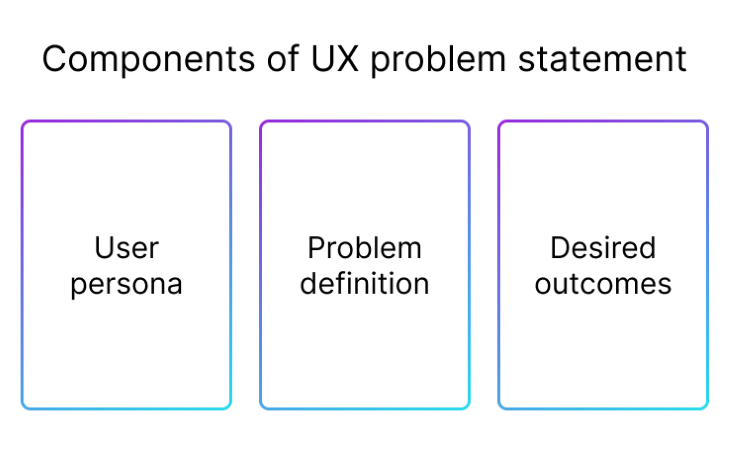
There is no silver bullet for how to craft an effective problem statement. Various companies, designers, and managers approach it slightly differently. However, most of them have three things in common:

I tend to structure my problem statements similarly. In this section, I’ll combine theory with sharing the story of how we used the UX problem statement to design a solution for marketplace sellers.
The first step is to understand who you are designing for. The most common trap here is to focus on generic users. I saw numerous problem statements saying we are designing for “company X’s user.”
The problem with that? Your product is most likely used by various groups and subsegments of users.
Whoever you are designing for, odds are the solution isn’t focused on 100 percent of your user base. Different users have different problems, needs, and expectations. Unless you touch a fundamental flow (such as the homepage), you are likely designing for no more than 20–70 percent of the user base.
Specificity is the key. The more specific your target audience, the higher the chance you’ll discover specific problems and low-hanging fruits. To better understand who you are solving for, you can employ various user discovery techniques:
Regardless of your chosen technique, I’d recommend having at least two interviews. Nothing helps build empathy better than a direct interaction with users.
We had a high-level objective of boosting sellers’ satisfaction in a pet marketplace. It already narrowed down our focus group to sellers, but that was still too broad a category to focus on.
We started with a quantitative approach to spot whether there are any segments of sellers with the lowest satisfaction scores. To our surprise, our most frequent sellers were also often most dissatisfied with buyer quality.
We then proceeded with a survey and four interviews to dig deeper and see what they had in common. Turns out sellers had issues managing frequent in-product chats with prospective buyers. The volume was simply too overwhelming, and it took conversations with numerous prospects before closing a deal.
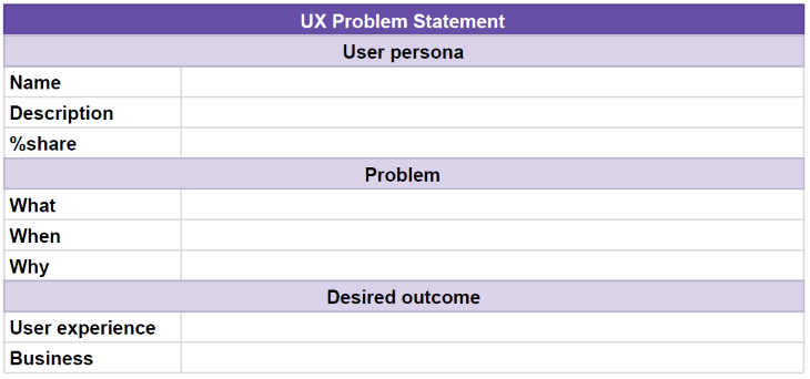
Based on that insight, we narrowed our user focus to sellers averaging more than 10 open chats daily:

I am also a big fan of mapping the percent share of users to better understand the size of the opportunity. It later helps prioritize the size of various opportunities.
Now that you’ve identified who you are designing for, go deep into the problem space.
Focus your research on your defined persona. If other users also experience problems with the chat feature, I’d recommend mapping it as a separate problem statement.
Nothing prohibits you from designing for two problem statements simultaneously, but you don’t want to confuse your insights across user groups. Ultimately, it’s better to fully satisfy one group of users than to provide a suboptimal solution for everyone.
Your persona identification exercises from the previous step probably gave you a sense of where the main problem lies. I’d treat it as an initial problem hypothesis. Follow up with problem identification exercises to further validate and refine that hypothesis by, for example:
Once again, there are various ways to capture the problem, ranging from robust one-pagers to one-sentence summaries. I found the sweet spot in quickly summarizing three main areas of the problem:
The what part gives you a high-level picture, the when part will help you focus your solutions better, and the why part gives extra context and helps with further prioritization.
We knew that the volume of chat interactions was the problem, but we wanted to dig deeper. We proceeded with an extra survey focused on chat interactions sent to our top sellers and an additional five interviews.
It turned out that although the volume itself is problematic, the biggest pain point is during weekends. Sellers reported a work-life balance issue since buyers’ interest peaked during weekends, and sellers feared that if they waited until Monday, they’d lose sales opportunities.
We mapped the problem space in the following way:

Answering all three questions helped us not only understand the basic problem, but also:
Now that we know who we are designing for and which problem we are solving, we need to identify what we actually want to achieve. The truth is that each problem can be solved in many ways. Identifying success criteria will help you narrow the focus even further and maximize the chances the solutions will bring meaningful results for both users and businesses.
I recommend splitting it into two parts:
Don’t neglect the business outcome. You’ll have a higher chance of getting buy-in for the direction if you can showcase how the solution will help the business grow.
Let’s revisit our chat case study. The desired outcome is clear for the pain point of working during the weekend, driven by the fear of losing leads. Ideally, we’d like our sellers to have free time during the weekend without sacrificing the number of leads.

Let’s now look at the challenge from the business perspective. After consulting with the business owner, we learned that the ideal business outcome would be to design changes resulting in quicker transaction lead time (the time from the first interaction to finalizing the deal), as that is what the chat was initially designed for.
But since it might be extremely difficult to both reduce sellers’ work time during weekends and decrease the lead time, as a bare minimum, we won approval to go forward as long as we don’t harm the lead time, meaning we don’t delay the whole sales funnel. That gave us clear goals to strive for.
With a clear problem statement, we can jump into ideation exercises and start planning potential solutions. Although I won’t get into solution ideation in depth here, let me just share a few examples of how the UX problem statement can help you quickly filter and prevalidate ideas.
The whole ideation process was rather messy, but for the sake of example, here are two of the ideas we brainstormed:
We could then use our UX problem statement to validate the idea quickly.
One solution was to let sellers snooze the chat. This solved the user problem of not having free time during the weekend. However, it doesn’t address their fear of not losing leads, nor does it contribute to our business outcomes. We concluded it would help neither from a business nor user perspective, so we killed the idea
Our other solution was to create an FAQ section for each seller. We assumed that the FAQ sections in the flow of starting a new chat could reduce the need to open a new chat. It also seemed the section could even lead to faster lead times (no need to wait for chat answers to get the information the buyer needs), and the FAQ section also works on weekends! We kept it on the list of ideas to pursue.
Although the problem statement itself didn’t tell us which solution was best (we had ~40 ideas in total), it helped us quickly narrow down the list of ideas and guide further direction.
On the other hand, if we had just a loosely defined problem without any deeper understanding, how would we know that the chat snooze option wouldn’t work? We could spend weeks designing and implementing it just to figure out it doesn’t solve the right problem since it wasn’t the distraction that was the problem, but the fear of losing leads.
A UX problem statement gave us both a quick and informed prioritization tool. It was faster than deeply debating each idea and way more precise than choosing on the merit of gut feeling-driven dot votes.
If you’re interested, we ended up introducing and iterating on the FAQ section, which reduced the number of chats by about 30 percent and slightly improved the lead time. It didn’t fully solve the problem, but it was a great first step.
If you’d like to use the same template I used when showcasing the buyer-seller chat story, here’s the link to a UX problem statement template.

Click on File, and then Make a copy to create your UX problem statement.
I won’t lie to you: crafting a solid problem statement is a challenging and time-consuming endeavor. However, it’s still a drop in the ocean compared to investing in a solution that doesn’t solve underlying user and business needs.
A well-defined UX problem statement leads to these outcomes:
Most of the designers I’ve met who never used problem statements (or any similar alternatives) always had the same answer: “We simply don’t have time.” I hope this article showed you that problem statements actually save time by having a more focused process and helping you choose better solutions.
If you have a manager or a client who pushes you to jump into Figma and start producing hi-fi solutions as soon as possible, try sharing this article with them to open the conversation. As tough as it is, educating stakeholders is also part of the designer’s job.
LogRocket's Galileo AI watches sessions and understands user feedback for you, automating the most time-intensive parts of your job and giving you more time to focus on great design.
See how design choices, interactions, and issues affect your users — get a demo of LogRocket today.

As products evolve into ecosystems, navigation becomes a system-level challenge. This article explores how to align structure, context, and user journeys to create seamless movement across tools without confusion.

Figma’s AI features have exploded in 2026 — from text generation and image editing to full UI drafts and code handoff. But speed isn’t the same as quality. This guide breaks down every major feature, what it’s good at, and where human judgment still does the heavy lifting.

Zero UI works well for screenless, voice-first experiences, but most digital products still require visual interaction. Here’s why multimodal UX offers a more scalable foundation for the future of design.

Multimodal UX goes beyond designing for screens. Learn how context-aware systems, progressive modality, failover modes, and accessibility-first design create better digital product experiences.