Typography is one of the cornerstones of any website or application. You may think: Isn’t typography just choosing the right fonts for my page? But, as with many other deceptively simple things, it’s way more important than you may think. Not only that, good typography requires more than simply checking items off a list.

This post covers the philosophy behind typography’s role in UX, delving into its history, its key elements and terminology. It also tackles the question of whether or not typography still matters by going over how it matters. By doing so, you can get started on exploring how to leverage its unique contributions for your UX design.
Words make up language; they’re an essential part of how we communicate information. How words appear on a page, a screen, or even a button, can change how people interact with a book, a website, or an app.
How words appear to us can cue us to act, can help us understand information better, and can change the way we view a company or brand. Words are important aspects of how we navigate our world, and how they’re arranged gives us the cues we need to navigate successfully.
This is where typography comes in. Typography is the art and discipline of arranging type — letters, numbers, punctuation, and various other marks that make up written language — in order to convey a message in an attractive and readable way. Typography has a long and rich history going back to the early days of computing, and even before that, to previous centuries of printed mass communication.
The practice of printing information goes all the way back to ancient Mesopotamia, where clay seals were engraved with receipts, contracts, ownership seals, and other transactions.
One of the most significant developments in communication technology and design came in 1440 when Johann Gutenberg invented the early printing press. With its movable and rearrangeable metal type, the Gutenberg Press revolutionized the mass production of reams upon reams of information previously produced individually by hand. It made it easier and faster to print books on demand and for large audiences.
With its innovative use of metal type, ink, parchment and paper, the Gutenberg press laid down the foundations of typography as the world moved from the Renaissance and into the Industrial Revolution:

The technologies developed from the Gutenberg Press would later allow for printed communication on a massive scale as pamphlets, signs, posters, books, and newspapers began to be produced and circulated for various populations. Early type families (expressed collections of metal fonts) were developed by pioneering designers such as Nicolas Jenson and Aldus Manutius.
Later, ornamental designs were developed, attempting to catch the attention of all who would chance upon them. Both decorative and practical typefaces became part of the visual language of everyday life:
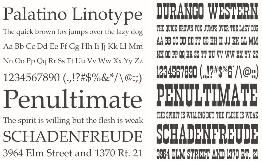
In 1957, Max Miedinger created Helvetica — clean, neutral, and ubiquitous. It stripped away all the flourishes and unnecessary embellishments to arrive at pure, functional aspects. Helvetica communicated clarity, modernity, and universality.
It rapidly turned into a favorite for corporate branding, institutional signage, and advertising, becoming a cornerstone of what’s now called Swiss style design. Helvetica has become so popular that a feature-length documentary was made about it and its impact on contemporary design.
For more discussion on Swiss Design, also called the International Typographic Style, take a look at our article on The History of the International Typographic Style.

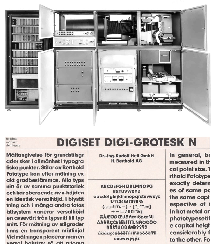
Ever since Gutenberg and his movable type, typography and technology have become inseparable, and as our communication technologies changed and developed so too has our typography. The move from the mechanical to the digital production of text began in the mid-1960s with an electronic typesetting system called Digiset.
Developed by German electrical engineer Rudolph Hell, the system assembled typefaces developed through a CRT (cathode ray tube) and projected onto photosensitive paper. Typefaces were developed for the system by notable designers such as Hermann Zapf and Gerard Unger:
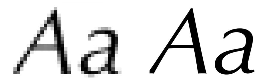
The first digital typefaces were bitmap fonts, which relied on a pixel-based or block grid approach. Also called raster fonts, these allowed for quick typesetting using a computer, but had their disadvantages.
Later, systems of encoding letter shapes as Bézier curves — sets of mathematical formulae to describe the lines that make up each shape or glyph — were developed. Sometimes referred to as outline or vector fonts, these saved a great deal of digital storage space compared to bitmap fonts and allowed typefaces to be scalable to any font size:
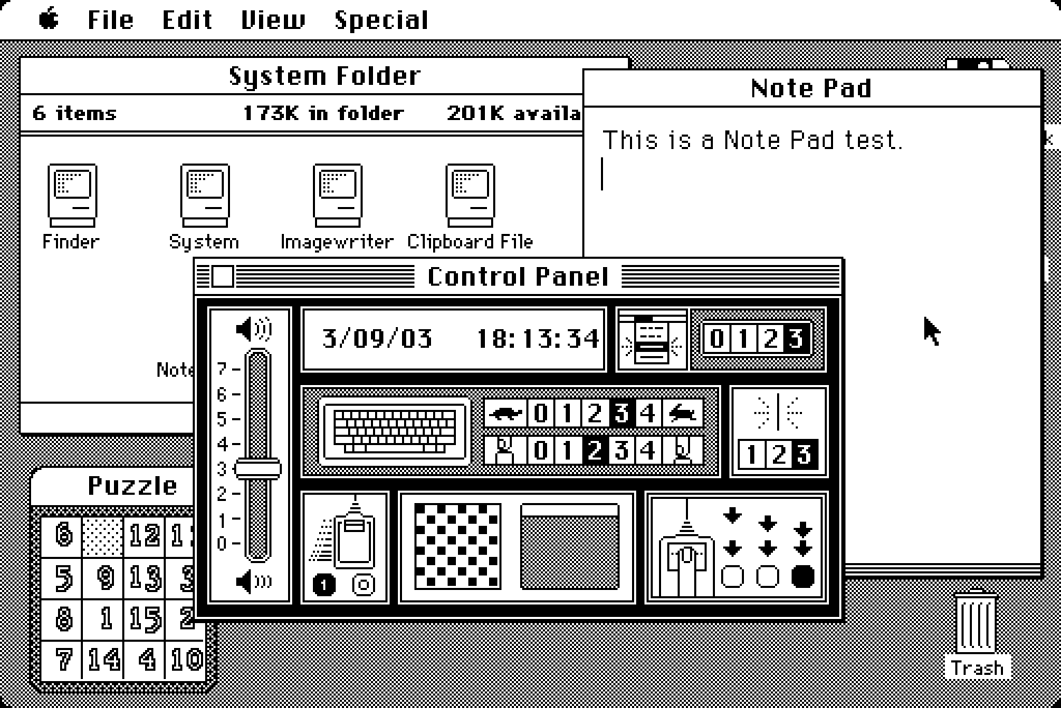
As personal computing became more accessible by the mid-1980s, the first desktop publishing software, Aldus Pagemaker, was released. Later acquired by Adobe, Pagemaker would help spur timely developments in digital typography, including the development of typefaces specifically for screens as well as various technologies, such as Postscript and TrueType, that helped manage fonts on computers and printers for both home and commercial use.
The end of the 1990s saw the wide adoption of the OpenType format allowing the efficient cross-platform use of various typefaces. As the World Wide Web and its supporting technologies grew in complexity, the first Cascading Style Sheet (CSS) rules concerning fonts were written into web standards allowing designers more control over their site’s typography.
By the 2010s, all major web browsers had adopted the Web Open Font Format (WOFF) that allowed for the lightweight, easy-to-implement integration of fonts into websites and web-based applications.
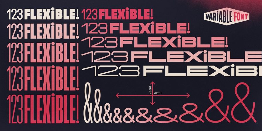
The designers of today now have tremendous control over how they can integrate typography in UX development. One significant addition to font technology in recent years has been the gradual adoption of variable weight fonts whose thickness can be controlled precisely with CSS, allowing even more fine-grained precision over how type appears in websites, applications, and all manner of UX implementations:
Before we dive any deeper, you should feel comfortable using the following essential terminology when talking about typography.
The words “type” and “font” are sometimes used interchangeably but they aren’t actually synonymous. Type refers to the design of the various forms that make up the visual appearance of an alphabet — the shape of the letters, numbers, and punctuation, the spacing nuances, special characters for letter combinations, and so on. It refers to something like an architectural plan and as such, still needs to be “built” as a file that can be utilized by an application, a web browser, or printer.
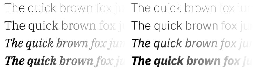
This file is what the term font refers to. In pre-digital typography, “font” meant the actual physical set of metal letters used to assemble a matrix to print words onto paper. Typically, a font will include variations on the type for use in different sizes, weights (thickness or thinness), or different styles referred to as normal, bold, semi-bold, oblique, italic, and so on.
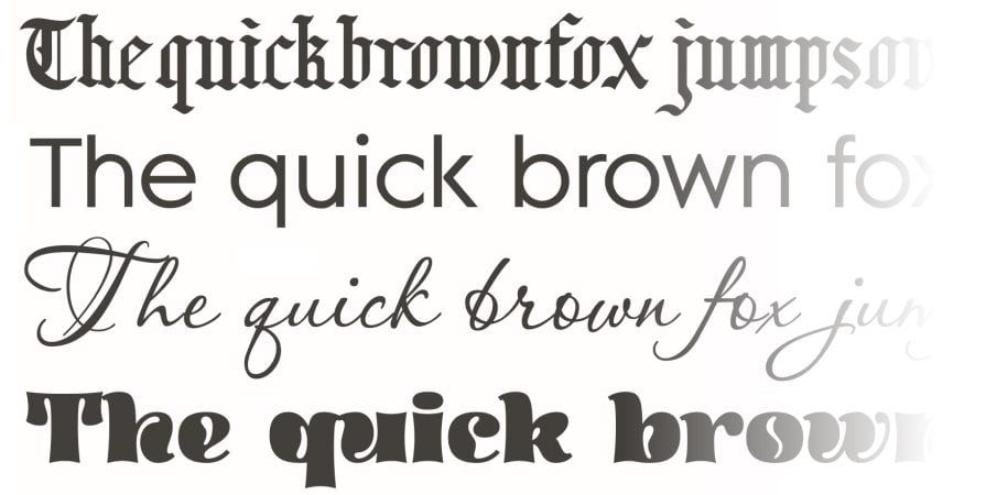
Serif type have small lines at the ends of their letters while sans serif type doesn’t. These small lines, called serifs, are used to aid in reading by providing a guiding line that the eye can follow across the text. Serif type is often seen as more traditional and formal, whereas sans serif type is considered modern and clean:
If you’re curious about the technical details of font anatomy (e.g. serifs, descenders, x-height, and so on) our article on typography anatomy is a great way to read up on this very interesting topic.
As you explore typography, you may encounter categories such as decorative, humanist, script, grotesque, slab, and so on. These indicate general visual classifications that can be helpful to sort fonts into. Sometimes they also refer to nuances in the history of typography.
For example, humanist refers to a style developed during the early days of the printing press, while blackletter refers to a style based on the calligraphy of books produced by hand in pre-printing press periods:
In order to leverage the powers of typography, you must first recognize its central importance in UX design. Once you see this, you can then make deliberate choices to align its use with the core UX principles behind your strategy, platform, team, company, or brand. The key uses of typography in the UX context fall under these three aspects:
While a picture or diagram may communicate tremendous amounts of information, it goes without saying that written language is equally as significant, and often even more so. How language appears to the user is the domain of typography and its importance cannot be understated.
Good typographic decisions, used consistently across your UI/UX, will promote maximum legibility not only for the message you’re trying to convey, but also for decision points in your design that you want users to navigate through such as confirmations or click-throughs. Further, when text is deployed in a legible, well-ordered manner, not only is it better understood by your users, but it also helps them recall it easier.
Controlling the number of typefaces your users experience will promote increased clarity and readability of your text. Using only a couple of typefaces and their variant fonts (bold, italic, etc.) consistently throughout your UX help establish a clear hierarchy of information for your users.
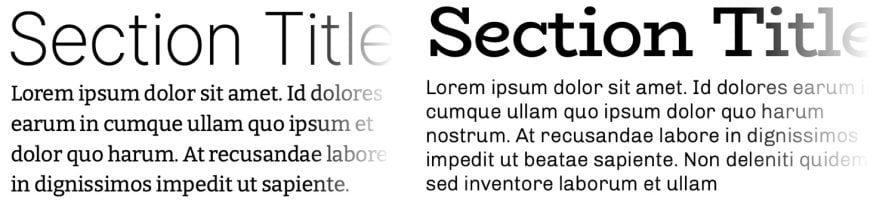
A good general rule is to consider choosing pairs of type, typically sans serif type paired with serif type (or vice versa). From there, you can explore each type’s variations in size, weight, or style to provide emphasis (such as for keywords, section titles, links, etc.) where needed:
Reputable repositories such as Adobe Fonts or Google Fonts can be excellent starting points to search for the fonts for all manner of UX implementations.
Choosing from properly designed type families will provide your user with a clear reading experience not only for items such as headings or titles, but most importantly for blocks of longer text.
Also consider the effects of line height (or spacing) and line length in designing blocks of texts across your UX. These aspects aid with legibility and provide your users with a pleasant reading experience.
Today’s users often need to quickly scan a site for information, so you want to make your text as scannable as possible. Limit the line length (the width of your text block) to 45 to 90 characters only — this works out to around 12 to 15 words of average length. Some excellent information about this and related issues can be found at Butterick’s Practical Typography.
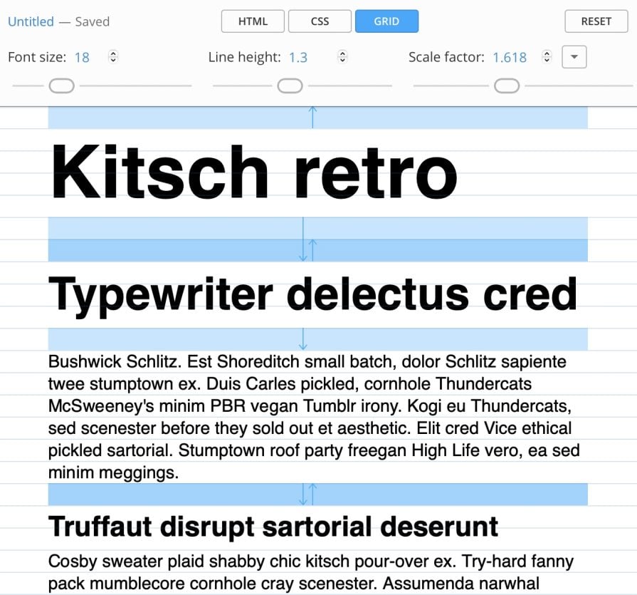
Line height should be set in a manner (not too great or too small) that allows for a flowing reading experience with the reduced appearance of clutter. A fruitful way to explore possible variations here is to experiment with a tool like Gridlover. It even gives you the CSS code to render your text block:
Readability isn’t the sole goal of typography in UX design. The highly regarded graphic designer David Carson infamously said: “Just because something is legible doesn’t mean it communicates. More importantly, it doesn’t mean it communicates the right thing” (from David Carson’s 2003 TED Talk on Design + Discovery).
Typography contributes meaningfully not only towards readability, but also towards expressing the vision and goals of a brand, company, app, website, or platform. By deliberately choosing an appropriate type (deployed in a readable and scannable way), you’re designing the final look and feel of your brand or company for your specific end users.
Do you want your brand identity to be associated with the timelessness of vintage themes? Do you want to communicate the energy and enthusiasm of a future to come? Do you want to project stability and solid dependability?
Alongside the other visual elements of your UX design such as color, typography plays an essential role in answering these questions.

Finally, good typography is also a cornerstone of accessibility. The need to facilitate access for the widest number of users is an exceedingly important consideration for every UX designer and guidelines exist to help us with this.
There’s a section specifically for typography in the US digital design standards and similar information is present in the World Wide Web Consortium’s (W3C) Web Content Accessibility Guidelines — all of which attest to typography’s central role in accessible design.
Typography can be a rich and fruitful field to explore. Choosing the right typography for your UX is more than simply an intellectual or visual exercise. Properly utilized, it can lead to great rewards for you and your users.
The key to effective typography is to think of it as an essential element from the very beginning of the design process. It isn’t something you can simply tack on at the end just before your design meets its first users. Typography is part of the visual structure of communication that forms the bones of every UX implementation.
Ready to choose your fonts? Our article on the different types of fonts and when to use them can help you with the next step on the use of typography in your design.
This post contains original images by John Hirota. John Hirota is an illustrator working in the fields of design, culture, and education.

LogRocket's Galileo AI watches sessions and understands user feedback for you, automating the most time-intensive parts of your job and giving you more time to focus on great design.
See how design choices, interactions, and issues affect your users — get a demo of LogRocket today.

AI tools can generate beautiful UI concepts in minutes, but most teams struggle to integrate those outputs into real design systems. This guide explores why AI drifts toward generic patterns and how to build governed workflows that keep speed without sacrificing brand consistency.

Adaptive interfaces personalize experiences using behavioral signals and machine learning. But when personalization becomes autonomous, systems can reinforce patterns, limit discovery, and shape user behavior in ways designers didn’t intend.
Security requirements shouldn’t come at the cost of usability. This guide outlines 10 practical heuristics to design 2FA flows that protect users while minimizing friction, confusion, and recovery failures.

2FA failures shouldn’t mean permanent lockout. This guide breaks down recovery methods, failure handling, progressive disclosure, and UX strategies to balance security with accessibility.

 Learn more →
