Editor’s note: This article was updated on 3 December 2024.
Different types of grids have been used in UI/UX design for centuries. They make design layouts not only functional, orderly, and stable but also visually appealing. And given that they can be adapted to various screen sizes, such as for mobile devices, grids have become essential tools for modern web designers.
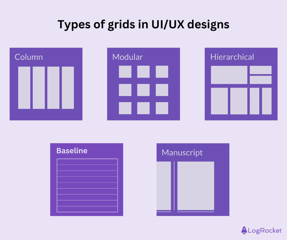
There are several types of grid systems that are commonly used in web design:
In this blog, I’ll talk about each of these in detail. I’ll also discuss where we can see these grids in modern designs and how you can use all of this theory to design for the modern user.
A grid system is a structure made of intersecting horizontal and vertical lines that helps organize a design layout.
We see examples of grid systems practically everywhere — in print, on websites, and on mobile apps. Social media apps like Instagram also rely on grids. The main feed uses a column layout to showcase images, while the profile view adopts a modular grid to organize posts in neat rows and columns, making them easy to scan. Even survey forms use grids.
In UI/UX design, specifically, grids serve to organize content, making layouts cleaner, more consistent, and visually appealing:
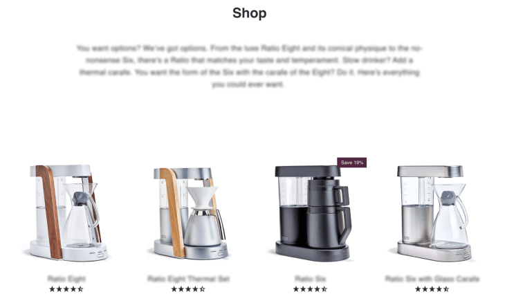
Grids enable UX designers to control the position of elements on a page and make user interfaces more intuitive to navigate.
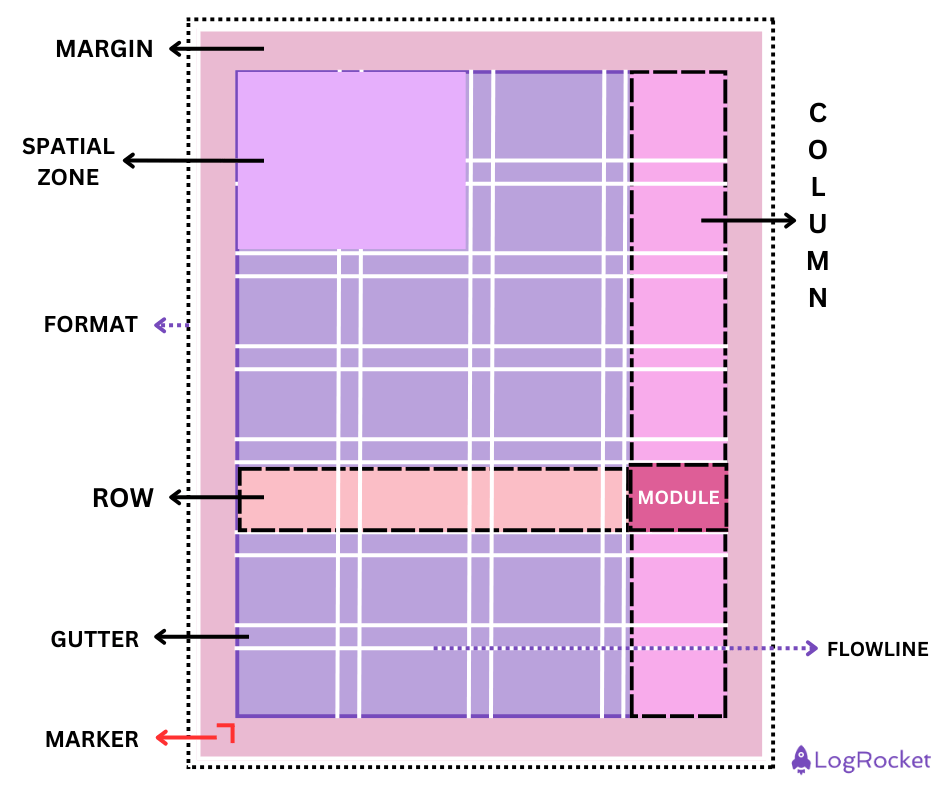
I’ve mentioned before how grids form the very foundation of a good UI/UX design. They provide structure to chaotic UX. And they ensure your users feel a consistent rhythm across interfaces so they can navigate content intuitively. I’ll now talk about the different types of grids.
Your choice of grid type will depend on the goals of the project, the content the UX needs to accommodate, and the interaction patterns you seek to encourage.
Like I mentioned before, there are five key types of grids — column grids, modular grids, hierarchical ones, baseline grids, and manuscript grids. Each of these types of grids works for different sorts of use cases and design goals. Let’s get into those details now:
The column grid system consists of a set number of vertical rectangular fields separated by consistent gutters. They divide a layout into sections and ensure a clear visual hierarchy.
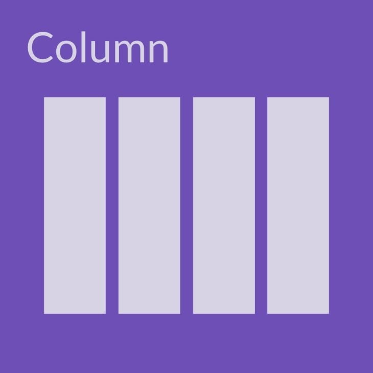
In my experience as a UX researcher, I’ve found that these column grids work best for structuring content-heavy designs, maintaining a clean and organized web layout, and enhancing the responsiveness and readability of a design across devices.
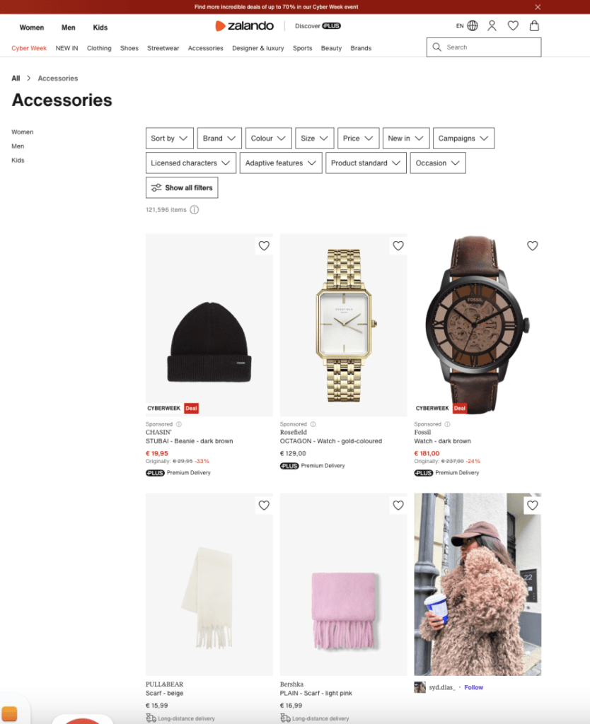
Column types of grids excel particularly well for use cases like:
Modular types of grids are an evolution of column grids. Column grids were all columns — modular grids add horizontal rows to the columns. So, with a modular grid system, you end up with modules where the columns and rows intersect.
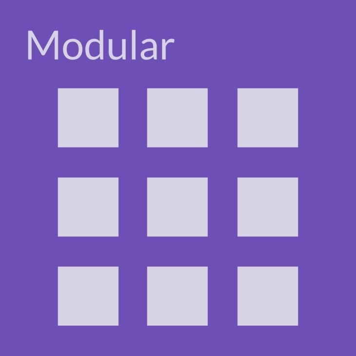
A seasoned UX designer would recognize how well modular grids would work for designs that require flexibility in content placement. Modular grids work well when you need to balance text, imagery, and interactive elements. Ooh, and they also work well to create reusable layouts within a design system.
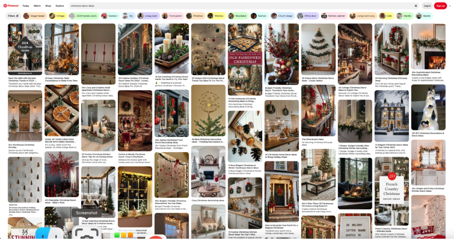
The most common use cases for modular grids are:
Think of the Swiss-style designs that I talked of before. Those are all hierarchical grids — they’re freeform grids that don’t follow strict rows and columns.
In the hierarchical grid system, we don’t see equal spaces between the modules. They adapt to content needs, and so they allow for more flexibility and variety.
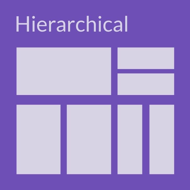
I’ve noted that these grids are used most commonly to highlight the primary and secondary elements in designs, especially for asymmetrical and creative layouts. The fact that these grids focus on elements over uniformity means that they can help build unique visual narratives.
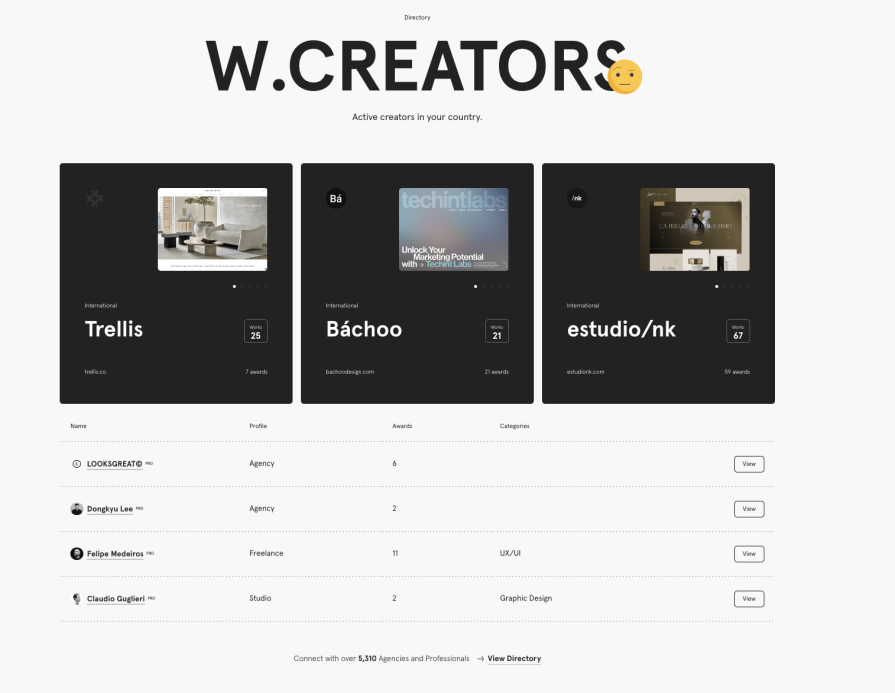
I believe hierarchical grids work best when you have to:
Baseline grids are for those who love typographic harmony. These types of grids focus on aligning the textual and typographic elements in a design to a uniform baseline — so there’s perfect vertical rhythm.
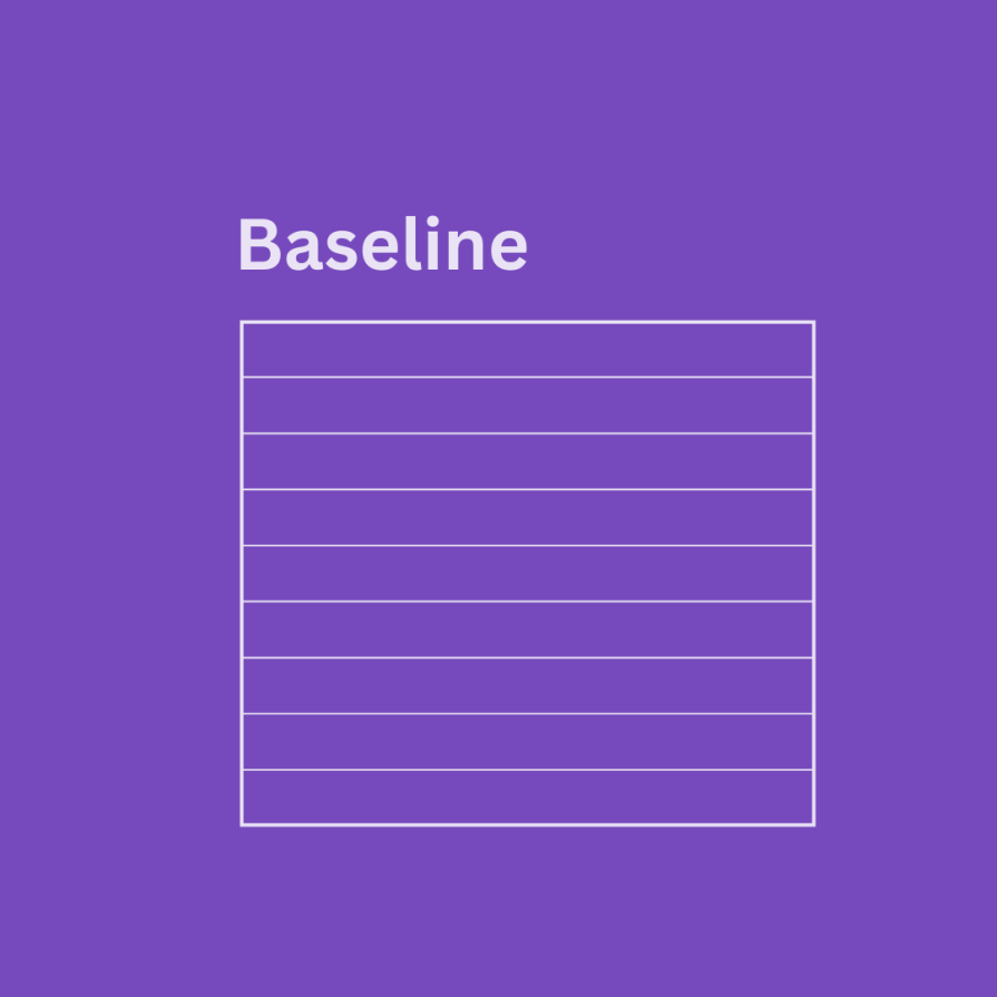
So, if your UI/UX content goal is to maintain a polished and professional visual appearance with perfect text readability and consistency in a typography-heavy layout, you’ll use baseline grids.
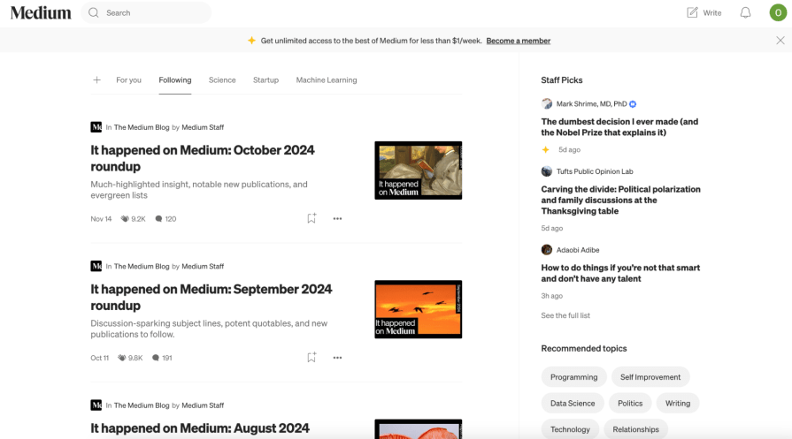
When I think of baseline grids, I think of a blog post layout where all text aligns with a baseline grid — and all headers, paragraphs, and captions are uniformly spaced.
The most common use cases for baseline grids would, then, be:
Manuscript grids are the simplest of all types of grids. They’re also sometimes known as block grids. They’re the default for all straightforward designs — they’re composed of one single rectangular column grid or multiple grids arranged vertically.
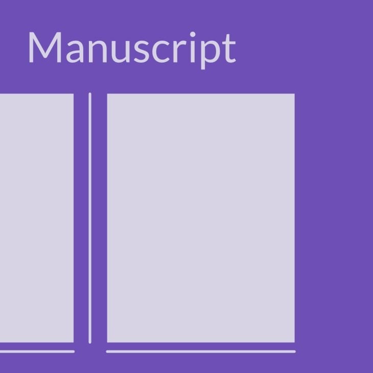
These ones are best for designs that are text-driven and have few visual elements. So, if readability is paramount in a design project, you’d want to follow a manuscript grid.
I see these manuscript grids working best for, say:
It’s apparent by now that grids provide structure, consistency, and an intuitive UI. But only when they’re used properly. In this section, I’ll talk about how you can best make grids work for you to design websites, mobile apps, and ecommerce products.
Your company’s website is a user’s first interaction with your brand, so there’s no negotiation about getting the design right.
For websites, specifically, I recommend using a modular grid system. That would reduce the chance of random design choices and help align elements — so you achieve an aesthetically pleasing result. To make the most of it:


When designing for mobile, don’t forget your brainstorming hat at the door. Responsiveness and empathy are critical for mobile devices. But you have grids to help ensure you have a functional layout, even on the smallest screens.
Here’s the down-low on designing a grid for an app:
When designing for ecommerce, using a mobile-friendly, responsive design is critical for conversion. A modular grid will come in handy when you need to guide users from discovery to purchase.
Here are some tips that’ll help your ecommerce design stand out:
When designing for the modern user, you have to balance function, style, and usability. But then, how do you make sure your design works across devices and resolutions and is clean and purposeful?
Below are some ways in which using the various types of grids mentioned in this post can help ensure your designs are fresh and intuitive for your users.
When you’ve just begun designing your grid layout and product interface, use tools that allow your team to work collaboratively.
Grids are your design foundation, and having a strong foundation will minimize rework. Using ideas from everyone on your team will help save time and keep the design cohesive from the ground up.
There are so many types of grids, and it’s entirely okay to not be sure of which one among the types of grids to pick. I recommend that you start by sketching out your ideas. Think along the lines of:
Use answers to these questions to sketch out a wireframe first. Throw your idea of what you want the end product to look like on paper. And when placing the content on your page, consider adding more visual weight to what’s more important. Stretch that design component across multiple modules, giving it a bigger presence.
And never end a design element in the gutter.
No design is perfect without testing.
Toyota encouraged workers to pull a cord to stop the assembly line if they had an idea that would improve the existing processes. In the same way, usability testing lets you gather real feedback on how users interact with your product.
With usability testing, your key objectives should be to understand:
Without usability testing, even the best grid can’t guarantee success.
So, what grid system will you implement in your next design?
The possibilities are endless, but with the right approach, you’re sure to create something both beautiful and functional!
The five types of grids are:
A few examples of grid systems include:
Grids keep things organized and easy to navigate. They help layouts feel balanced and make sure content flows in a way that’s super user-friendly.
A modular grid is a system of rows and columns forming evenly spaced blocks or modules. It’s commonly used for complex layouts like dashboards, ecommerce sites, or data-heavy pages.
LogRocket's Galileo AI watches sessions and understands user feedback for you, automating the most time-intensive parts of your job and giving you more time to focus on great design.
See how design choices, interactions, and issues affect your users — get a demo of LogRocket today.
A three-week mobile banking project taught me that the “proper” UX process is not always realistic. Sometimes, the better approach is to work with what you know, identify what you still need to learn, and make the strongest decision possible under real constraints.
A/B testing compares two versions of a design to see which performs better with real users. Here’s how UX teams can use it to test hypotheses, measure outcomes, and make smarter product decisions.

This case study shows how one ad experience redesign increased total ad exposure while lowering perceived friction, proving that timing and context can matter more than raw interruption.

As products evolve into ecosystems, navigation becomes a system-level challenge. This article explores how to align structure, context, and user journeys to create seamless movement across tools without confusion.