Organizations are seemingly starting to understand the role that design plays in building a successful business. That’s good news for us designers — whether it’s a mature company or a fast-growing startup, design-led organizations tend to see better performance.

One of the common success factors of design-led companies is being guided by a design system to develop products. Design systems give product teams, including designers and developers, reusable components and elements that they can leverage to build consistent, accessible experiences across products.
Development teams commonly use Storybook to build, test, and document UI components in isolation for their team’s design system. But it’s not just a great tool for developers to use — designers can also benefit from using Storybook for collaboration with engineering teams.
Storybook fills a gap in the component library space. If you synergize with your engineering teams and use Storybook, you’ll be able to integrate Storybook with Figma and ensure consistency across your team’s design system. Here’s how Storybook benefits you as a designer.
Storybook is a platform for UI development, testing, and documentation. It provides a frontend workshop to develop UI components and pages in isolation. Think of it like a sandbox, where you can experiment with building new UI components without it affecting your main application.
Storybook enables developers to test out different use cases for each component, such as various key states, that might be more difficult to reproduce in an app. Then, you can easily save those states as stories, which you can refer back to during testing and documentation.
Based on UX Tools’ 2023 Design Tools Survey, Figma is the most popular primary design tool for design teams when it comes to user interface design and prototyping.
One of Figma’s notable features is the ability to manage and publish libraries. You can create a library of design assets, such as reusable components, styles, and variables, which can then be selected to use in other design files. Storybook is similar to Figma’s library feature but for developers, in the sense that users can create, test, and document reusable assets for their design system.
Storybook’s stories capture the different rendered states of each component, such as primary, secondary, large, or small versions of a button. This enables the design system to cover all edge cases of a component.
In Figma, users can create component variants, which serve the same purpose as stories. Using variants, a Figma component can have multiple states, for example, such as default, hover, and active states. Users can easily switch between variants when using components in their designs:
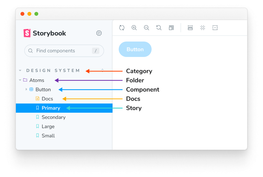
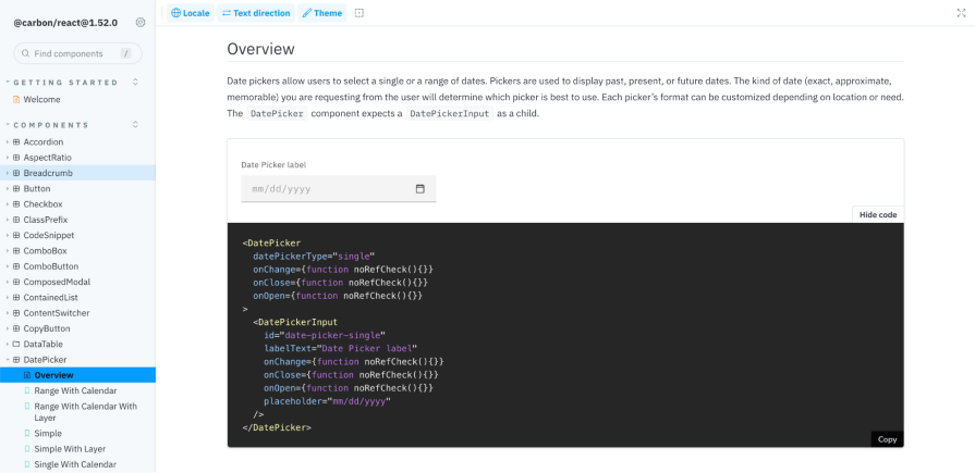
Storybook also displays code snippets for each component, enabling developers to copy and use the code for their applications. Similarly, you can dig into the layers of a component in a Figma library to understand how it was created, which you can then use in a separate design file:
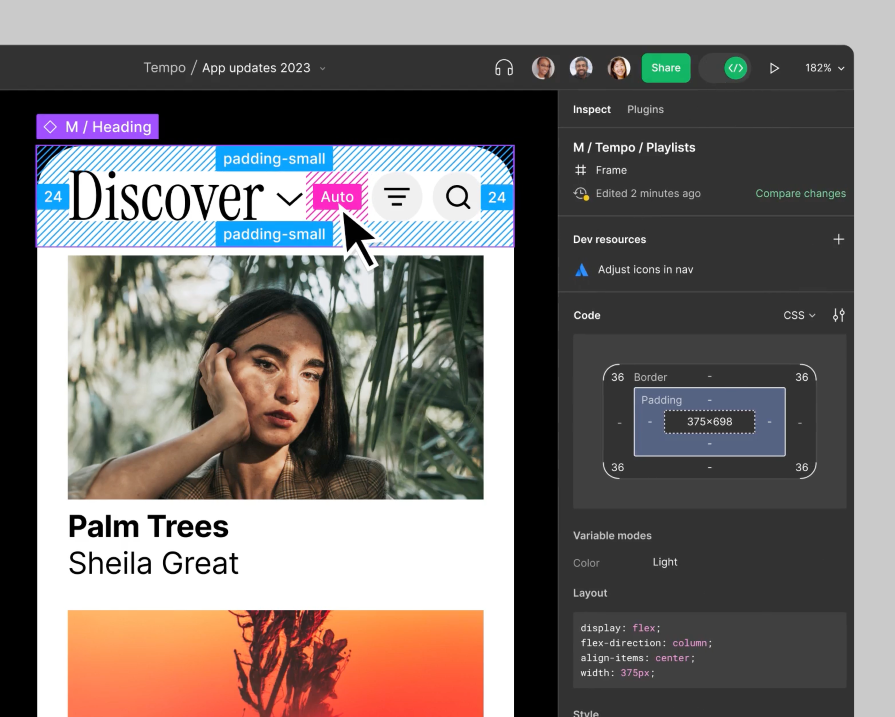
In product development, designs are first created in Figma before handing them off to developers. During the handoff process, both teams collaborate to communicate the goals of the design and technical constraints. Then, developers implement the designs into code, using Figma’s Dev Mode to inspect designs and gather the specific measurements and properties:
Each time a component is created or updated in the Figma library, this process is repeated all over again. In this scenario, designers and developers are often working in siloes without effective communication. This can lead to different results between designs in Figma and implemented code.
This gap between Figma and code is being filled by tools like Storybook. Inconsistencies in documentation between Figma and code can create two “sources of truth,” one for designers and one for developers.
Storybook brings both teams together, providing a platform for them to work together during the process of developing UI components. Designers can collaborate with developers to review components they’re building in Storybook, test edge cases, and write documentation from a design perspective. This can include when to use each state of the component and how to ensure that it maintains accessibility standards in its usage.
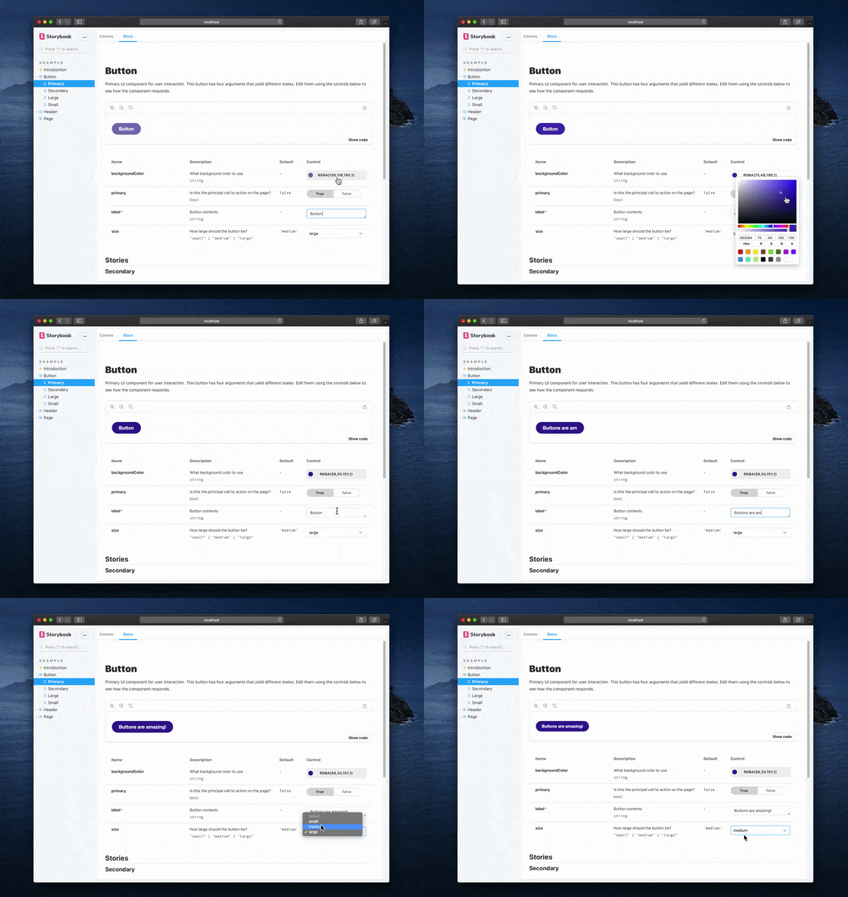
Designers don’t need to know how to code to live edit components using Storybook. Each story, or rendered state, of a component includes Controls, a function that enables users to edit a component’s inputs from the Storybook interface. Controls leverage types used in type systems, like TypeScript, to auto-generate a graphical control.
Storybook dynamically generates the Controls, making it easier for users to interact with and customize components. You can simply adjust the Controls, for example by toggling a Boolean switch, editing a label, or selecting a different color for the component story and watching the preview of the story update in real time.
This simple process of live editing components in Storybook enables designers to collaborate closely with developers to create and maintain design system components. Using Controls, you can test out components to ensure that they adhere to the design specs or can handle edge cases.
Having a shared platform to edit UI components reduces the possibility of miscommunication and ensures that both your teams are aligned. This allows for a true single source of truth to exist because both teams can contribute and refer back to the components in Storybook:
A design system seems intimidating to someone who isn’t involved in its creation or familiar with what it is. Design systems should be welcoming! Do this, and you increase the likelihood of adoption by your team members.
As a designer, think of your target audience, including developers, product managers, and other designers, and cater the experience of the design system to them. In Storybook, you can organize your design system so that users can easily understand its purpose, how to get started, and how to contribute back to it.
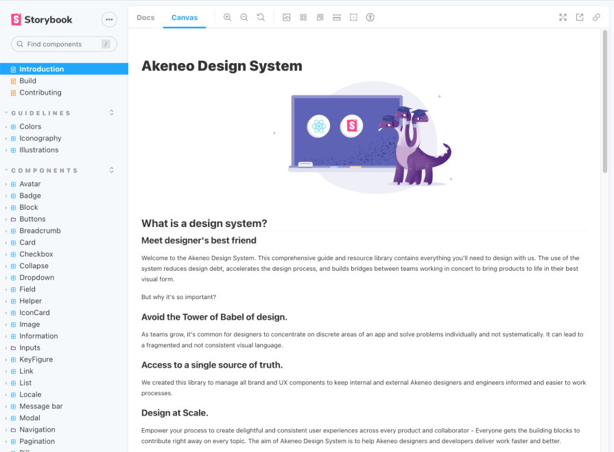
Just like a good website, create an overview page that welcomes your users into your team’s design system. In the overview, you can communicate your team’s vision for creating the design system and what its purpose is within your organization.
Use this space to educate users that may not be familiar with what a design system is, how it benefits your team, and what they can expect to find in Storybook:
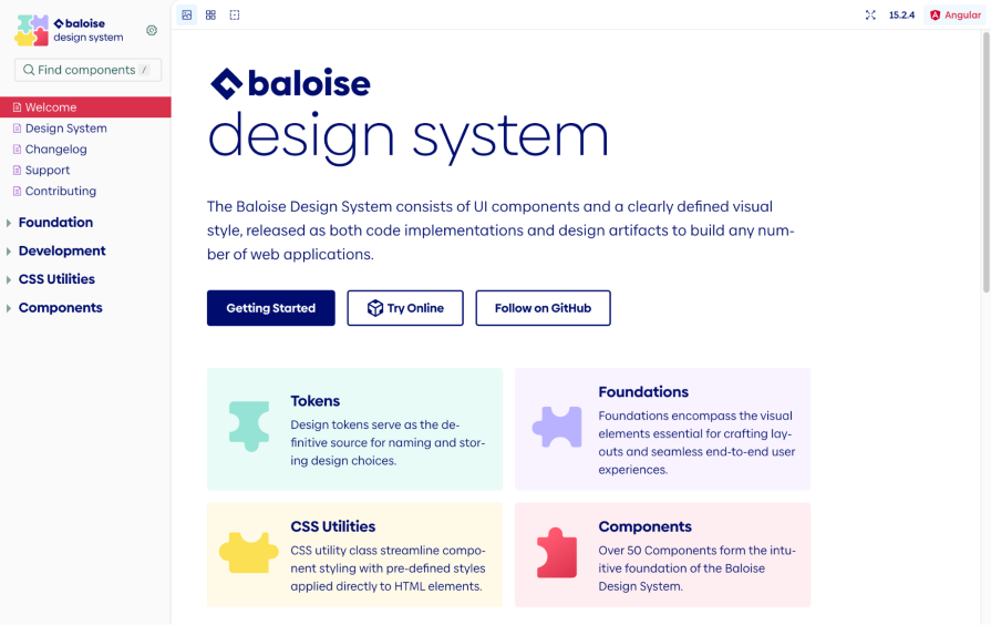
Help your users get started by providing a few call-to-actions (CTAs) that lead to each section of the design system in Storybook, such as design tokens, foundations, or components, with a short description for each. You can also link to external supporting pages, such as your team’s GitHub repo:
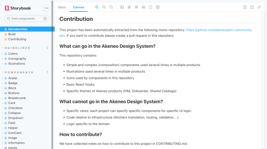
Design systems are a collaborative effort to maintain, involving both the design system team and contributors. Include contribution guidelines that offer information on how to submit feedback, report issues, or propose new components to your design system. These instructions empower your team to contribute back to the design system and continuously improve it as your products evolve. It also helps foster a sense of ownership and community, as it enables anyone on your team to submit contributions:
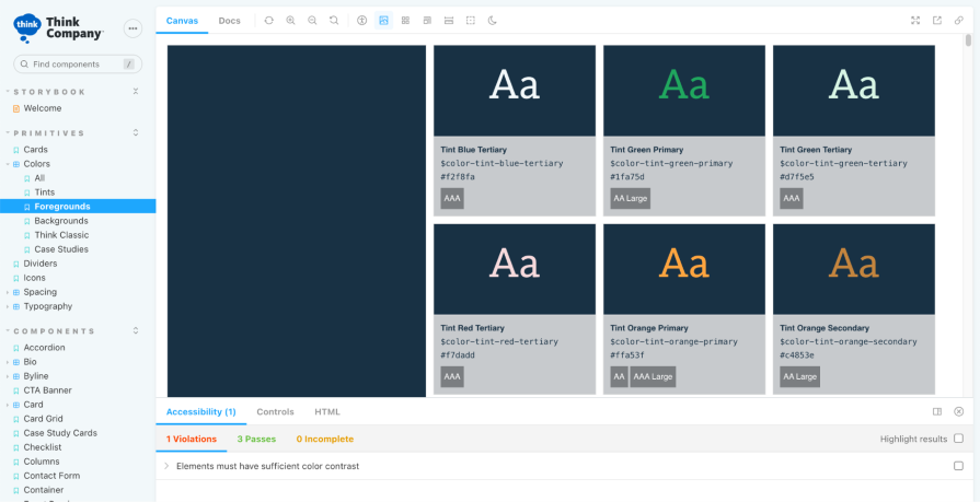
The foundation of a design system defines the style, look, and feel of your company’s products. Design tokens replace hardcoded values and allow for easy maintenance, as updating the value of a token will apply to all applications of that token.
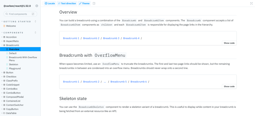
In this section, include design tokens for elements like colors, typography, spacing, elevation, icons, and any other tokens that your design system needs. This section should also include guidelines on how to properly use tokens in application to ensure that accessibility standards are met:
Following the design tokens, this is where your design system’s components and patterns live. Each component contains stories representing the different states available to use. Designers can provide usage guidelines for each story to ensure that they are applied properly in implementation and design:
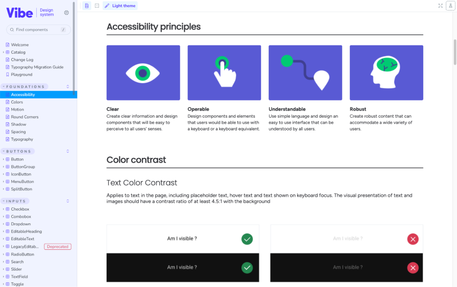
A design system should have accessibility embedded into its design tokens, components, and patterns. Start by defining your team’s accessibility principles to communicate a clear vision for how accessibility should be approached in product design and development. This should include your organization’s minimum accessibility compliance level, as well as links to further resources, such as the Web Content Accessibility Guidelines (WCAG) international standard.
For each element in your design system, include specific documentation to ensure that they comply with the minimum standard level of accessibility. Often, elements or components may be accessible on their own, but can be made inaccessible when combined with others in a larger, complex design. Offer guidance on how to apply each element in designs and development while maintaining accessibility:
Now that the design system has established Storybook as its source of truth, there’s still the task of maintaining consistency with your team’s Figma design library. With a complex product and a distributed team, it can be quite a challenge to create and maintain consistency across products and tools. Luckily, tools exist to integrate Figma and Storybook to provide a more seamless experience while managing your design system.
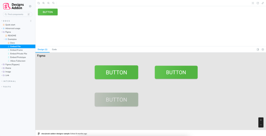
Once your design system components have been created in Figma, don’t let them stay hidden there. The Designs addon allows you to embed Figma designs into Storybook for a better design and development workflow.
With this addon, when users view a component in Storybook, a Design tab will appear under the story to show the embedded Figma designs. This can be useful for identifying discrepancies between the design and implemented component as well as providing additional usage examples from your Figma file:
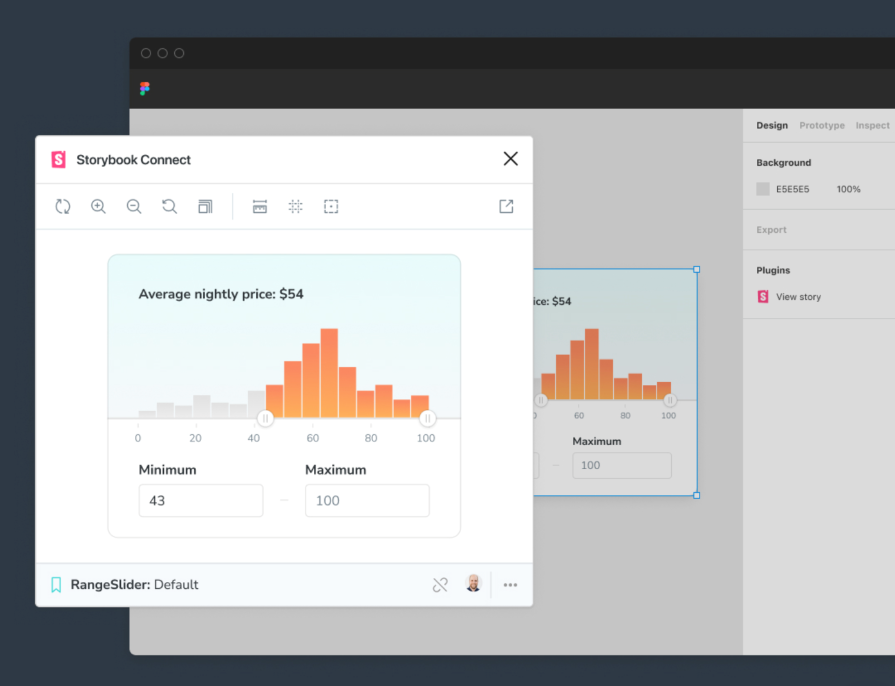
Using Storybook Connect, a plugin for Figma, you can embed stories of your components into your Figma library. Similar to the Storybook design addon, you can use the Storybook plugin for Figma to cross-reference your coded components with your designs.
You can interact with your stories directly in Figma and conveniently compare the implementation to the design. It can be used in both Design and Dev mode in Figma:
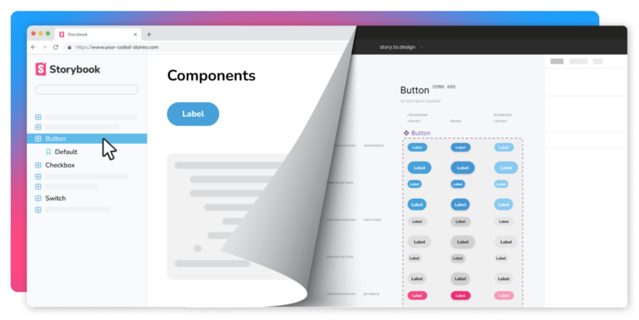
For teams that find it hard to keep their Storybook components in sync with their Figma library, tools such as story.to.design or Anima can automatically generate Figma components using your Storybook stories.
This can significantly speed up the time it takes to create an initial design library in Figma or update existing components to match what’s already implemented. The great thing about these tools is that they can translate the code, such as CSS props, into Figma auto layout so that your design components are flexible and ready to use:
Design systems are the foundation for delivering consistent and accessible product design. But there’s often a disconnect between the components that are designed and implemented in code.
The design handoff process can be time consuming and filled with miscommunication. With Storybook, designers and developers can easily collaborate together to build, test, and document their team’s design system assets, including design tokens, components, and accessibility guidelines.
And the best part is designers don’t need to know how to code. Storybook provides tools like live editing with Controls so that anyone can test out components. With addons and integrations, both teams can view both designed and coded components in Storybook and Figma, ensuring alignment across the board.
If your team isn’t using Storybook to organize and maintain your design system, it can be a powerful tool to explore further. The platform bridges the gap between UX designers and developers, empowering them both to create a design system that can be used as a single source of truth for their organization. Streamline your design system process and spend more time building great products for your users.
LogRocket's Galileo AI watches sessions and understands user feedback for you, automating the most time-intensive parts of your job and giving you more time to focus on great design.
See how design choices, interactions, and issues affect your users — get a demo of LogRocket today.
Figma’s AI features have exploded in 2026 — from text generation and image editing to full UI drafts and code handoff. But speed isn’t the same as quality. This guide breaks down every major feature, what it’s good at, and where human judgment still does the heavy lifting.

Zero UI works well for screenless, voice-first experiences, but most digital products still require visual interaction. Here’s why multimodal UX offers a more scalable foundation for the future of design.

Multimodal UX goes beyond designing for screens. Learn how context-aware systems, progressive modality, failover modes, and accessibility-first design create better digital product experiences.

Learn how context-aware mode prioritization and seamless transitions improve multimodal UX and reduce mode confusion.