In an age of instant downloads, real-time access, and on-demand everything, it’s easy to believe that giving users more features, faster access, and immediate gratification is the way to satisfy them. But contrary to popular belief, some of the most memorable and successful product experiences are intentionally limited — and that’s what makes them valuable.

This is the basis of scarcity design: intentionally restricting availability, time, or access to affect how users perceive, use, and navigate interfaces. Through visual indications like waitlists, countdown timers, locked buttons, or badges for exclusive features, scarcity impacts user experience (UX) at the screen level. When applied intelligently and ethically, scarcity becomes more than a marketing gimmick — it’s a powerful UX and product strategy that can drive growth, loyalty, and long-term value.
In this article, we explore the psychology behind scarcity, how it translates into user experience design, the different models of scarcity used in digital products, and real-world examples that show how less access can indeed be more delightful.
Scarcity works because it appeals to underlying human instincts. When something is rare, temporary, or hard to get, we assign it greater value — even if the thing itself hasn’t changed. Behavioral economics and neuroscience offer several explanations for why scarcity attracts attention and motivates action.
FOMO, the fear of missing out, is one of the most well-known psychological drivers of scarcity. It stems from loss aversion — the idea that people experience the pain of losing out more acutely than the pleasure of gaining something.
Limited-time deals, beta access windows, and exclusive product drops create urgency by emphasizing what users stand to lose if they don’t act. FOMO is especially effective in social contexts, where users witness others participating in something they’ve been excluded from.
FOMO results in practical UX choices that influence user behavior in subtle but significant ways. Designers frequently use time-sensitive CTAs (“Join now before spots fill up”), urgency-driven microcopy (“Offer ends in 3 hours”), or limited-time interface states like countdown timers and disappearing deals to evoke it. These cues encourage users to make decisions more quickly by making them feel as though time is running out.
Humans crave status and belonging. Being part of an exclusive group — especially one that not everyone can join — satisfies both of those needs. This is why invite-only products and VIP access work so well. They say, either quietly or loudly, “You’re exceptional. You’re in.”
Exclusivity doesn’t just attract users — it also increases commitment. People who feel chosen are more likely to invest in, advocate for, and stick with a product. Designers reinforce this visually by using distinct color schemes, badges, or other UI elements to distinguish “insiders” from regular users.
Scarcity also works on a neurological level. Research shows that dopamine — the neurotransmitter associated with reward — spikes before we get something, not after.
Scarcity draws out that moment of “almost,” allowing excitement and curiosity to grow. Waitlists, coming-soon pages, and unlockable features make the experience more engaging — even before the product is fully in hand.
Scarcity isn’t just about growth hacks or conversion tricks. When built on user-centered thinking, it becomes a strategic design tool for deepening user interactions and guiding behavior in meaningful ways. Some UI patterns and components that effectively communicate scarcity in digital products include:
Scarcity design often results in more intentional experiences. When access is restricted or involves effort, people are more likely to appreciate the product, form emotional connections, and make it part of their identity.
Consider Superhuman, where users go through a live onboarding interview. That friction was intentional — it made the product feel more personal and premium.
Superhuman’s onboarding experience felt premium due to its concierge-style approach, where users were invited, scheduled a one-on-one onboarding call, and received a personalized walkthrough tailored to their workflow. The smooth, responsive interactions created a sense of polish and exclusivity.
Emotional connection leads to increased retention, word-of-mouth, and readiness to pay.
Scarcity prompts users to act. Whether it’s signing up early, referring a friend to skip a waitlist, or upgrading to access premium features, well-designed scarcity aligns user motivation with product goals.
The key is to frame it as an opportunity, not an obstacle. When scarcity feels like a privilege rather than a punishment, it fosters healthy habits and improves engagement — without eroding trust.
Not all scarcity is the same. Depending on your product stage, audience, and goals, different models of scarcity can be applied strategically:
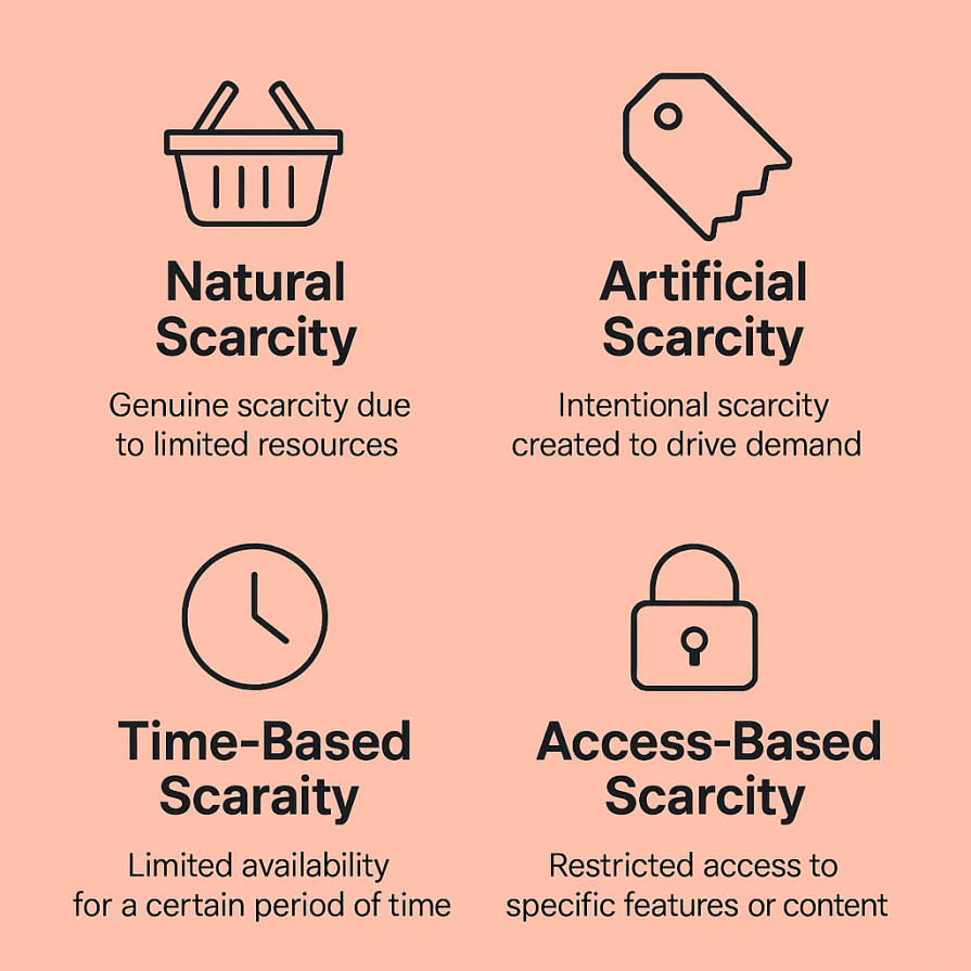
This occurs when real limitations exist — whether it’s server capacity, support bandwidth, or content volume. Instead of overpromising, products like Hey.com and Readwise Reader have been open about their gradual rollouts, winning user trust and increasing anticipation.
Natural scarcity is especially effective in beta or early-access periods. When users understand why something is limited, they’re more willing to wait — more delighted when they finally get in.
In contrast, artificial scarcity is created by product teams to shape behavior — even if the technical capacity exists. Superhuman is a classic example. Invite-only access and customized onboarding improved the product’s exclusivity and quality, despite the fact that the app could potentially accommodate more users.
Done well, artificial scarcity generates demand, concentrates attention, and enables teams to manage development. Done poorly, it feels manipulative.
The distinction is whether the limitation adds genuine user value (like better onboarding or feedback loops) or simply frustrates users.
Time-based scarcity provides a temporal component to the user experience. Features or materials are only available for a limited time, urging users to act quickly and return often.
Spotify Wrapped is an excellent example — a once-a-year event that users excitedly anticipate, share, and revisit. Its temporary nature amplifies emotional resonance, turning it into a digital ritual.
This model is ideal for seasonal content, countdowns, challenges, and flash sales. When paired with thoughtful design, it improves re-engagement and user retention.
Access-based scarcity restricts certain features to specific user segments — often tied to pricing, roles, or usage.
Tools like Notion AI roll out new features gradually, often prioritizing premium subscribers or waitlisted users. This serves two purposes. It nudges users toward paid plans and helps teams test adoption at a smaller scale before going wide.
Access-based scarcity works particularly well for SaaS tools, where tiered access can drive upgrades and tighten feedback loops.
Scarcity is a design element that UX designers must intentionally define and convey to product teams; it is not merely a psychological concept. Scarcity elements, like any other UI pattern, appear in design systems and Figma files when implemented properly. To indicate where and how scarcity is used, designers can label them with tags like “locked state,” “limited-time banner,” or “early access flow.”
Microcopy instructions (“Only 5 invites left!”) or interaction notes (such as countdown timers or blurred-out features) can be included with these components during handoff. Product managers and engineers can better understand who sees what and why these limitations are strategically positioned to encourage engagement, curiosity, or conversion by mapping access-based user journeys.
Hypefury, a Twitter automation tool, limits its more powerful automation features (like unlimited queuing) to paid subscribers. The free plan is useful, but the most desirable functionality is just out of reach:
This access-based scarcity drives upgrades by clearly demonstrating value. It’s a wise move for a bootstrapped tool that can’t rely solely on broad adoption, leveraging scarcity to drive high-quality conversions.
Hypefury visually communicates scarcity through a combination of locked icons, grayed-out UI elements, and subtle upgrade nudges. Premium-only features are marked with lock symbols and are often visually muted to differentiate them from accessible tools. When users hover over or attempt to click these restricted features, tooltips appear explaining what the feature does and prompting an upgrade.
During the pandemic, Clubhouse launched an invite-only model that turned access into a status symbol. Screenshots and conversations became social currency. The exclusivity elevated it from simply another audio app to a cultural phenomenon:
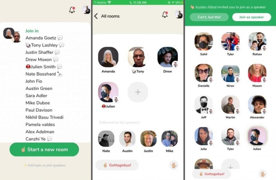
While it subsequently opened to the public, the early artificial scarcity helped Clubhouse scale thoughtfully, manage moderation, and build hype.
Arc, built by The Browser Company, also launched with an invite-only model — but for a different reason. The goal wasn’t hype; it was also product development. By restricting access, they maintained tight feedback loops and built a dedicated user community that helped shape the product:
During Arc’s invite-only period, the UX centered on exclusivity and anticipation. New users encountered a minimalist waitlist screen with smooth visuals, while invited users experienced a guided onboarding flow with personalized touches and early-access labels, reinforcing a sense of being part of something special from the very first interaction.
Arc’s approach serves as a reminder that scarcity can be leveraged to enhance product governance and community building, rather than solely for sales purposes. Currently, it is available for download to everyone.
Scarcity is powerful — but it’s also easy to misuse. Tactics like fake countdown timers, exaggerated stock levels, or FOMO-inducing strategies can backfire. They may increase short-term metrics, but they damage trust in the long run.
Here are some ethical UX design patterns that support transparency, trust, and clarity when applying scarcity:
In summary,
The best scarcity design invites users into a better experience, not a more restricted one.
In the end, scarcity isn’t about denial, it’s about delight.
As seen in Hypefury, Clubhouse, Arc, and Spotify Wrapped, scarcity isn’t just a growth trick. It’s a high-leverage design decision that aligns user psychology with product strategy. It supports key product goals, such as engagement, retention, and monetization, while also leveraging strong psychological motivations and creating emotional resonance.
For early-stage products or resource-limited teams, scarcity can become a superpower. By limiting access, you don’t just exclude — you invite deeper interaction.
Because in product design, sometimes less really is more.

LogRocket's Galileo AI watches sessions and understands user feedback for you, automating the most time-intensive parts of your job and giving you more time to focus on great design.
See how design choices, interactions, and issues affect your users — get a demo of LogRocket today.

Research is becoming more democratized, product cycles are accelerating, and AI is transforming synthesis and ResearchOps. Here are the three trends shaping UX research in 2026.

AI tools can generate beautiful UI concepts in minutes, but most teams struggle to integrate those outputs into real design systems. This guide explores why AI drifts toward generic patterns and how to build governed workflows that keep speed without sacrificing brand consistency.

Adaptive interfaces personalize experiences using behavioral signals and machine learning. But when personalization becomes autonomous, systems can reinforce patterns, limit discovery, and shape user behavior in ways designers didn’t intend.

Security requirements shouldn’t come at the cost of usability. This guide outlines 10 practical heuristics to design 2FA flows that protect users while minimizing friction, confusion, and recovery failures.


