Figma created major waves among the design community last month when they announced a groundbreaking new feature: variables. This was a long-awaited feature among many design systems looking for a closer link between design libraries and code libraries.
But variables also go beyond that utility; they also enable designers to create more sophisticated interactive prototypes and reduce bloat in the process. Regardless of how you use Figma in your everyday design work, variables can improve your workflow. But if you’re a beginner with Figma, it might seem challenging at first to grasp such a robust feature. Continue reading for a crash course.
Variables in Figma are a lot like variables in code. Simply put, a variable is a way to link the characteristics of an object to a simpler or more structured name. In code, you might say, “Let x = the number of items in this list.” In Figma, you might say, “Let my-favorite-color = #009C2C.” Now any time you reference “my-favorite-color” in your design file, it will set that color to #009C2C.
The nice thing about using variables is that you only have to define them once and you can reference them in many places. My favorite color changes all the time, but if I decide that this week my favorite color is now #18A2B5, I only need to redefine my-favorite-color to that new hex value, and everywhere that references it will update automatically.
If you’re familiar with design tools, you’re probably thinking, “But that’s what a color palette is for.” That’s true. But there are many other applications for variables, and when you use them alongside an existing color palette, they will make your life easier.
There are four main types of variables in Figma: colors, numbers, strings, and Booleans.
Much like in the previous example, color variables allow you to define the name of a color and link it to a solid fill color. You can build out your existing color palette using variable names and then create multiple “modes” for each of those variables, allowing you to maintain a light theme, a dark theme, and other additional themes if you desire. Then it becomes easy to toggle between light theme and dark theme without having to build a second copy of your design file. Note that, for now, color variables are limited in that they don’t support gradients.
Number variables are exactly as they sound: a way to attach a name to a numerical value. They can be applied in a few different ways, but one key use case for number variables is to define common number values in your design system.
If you want every button to have a corner radius of 16 and every input field to have a corner radius of 4, you can define them as such. Or, if you’re designing for multiple screen sizes, you can define button-radius-desktop and button-radius-mobile and easily switch between the two. You can also use these variables to define spacing between objects, minimum and maximum sizes for auto-layout containers, and you can also apply them to a text layer so that the number shown in a text string can change dynamically.
String variables are a little bit simpler than the previous two. They allow you to store a string of text behind a variable name and then apply some logic to update that string dynamically in your design file.
One particularly helpful use case for this is to set different language modes for a string of text in your design file. For example, you can create a string variable named button-text and set modes for English, German, and Korean. If you apply these variables to all the text on your page, it becomes easy to swap your prototype from one language to the next.
Boolean variables are similar to the Boolean properties that were introduced to Figma last year. They are used for objects and layers that you wish to be visible in some situations and hidden in others. Boolean variables, as their name implies, can only be set to values of True or False.
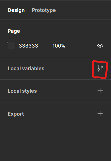
To begin using variables in your design file, you first need to define those variables. To start creating variables, click on the Local Variables button, which was recently added to the right-hand design panel:
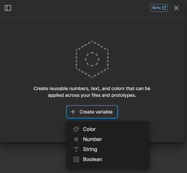
From there, select which of the four types of variables you wish to create:
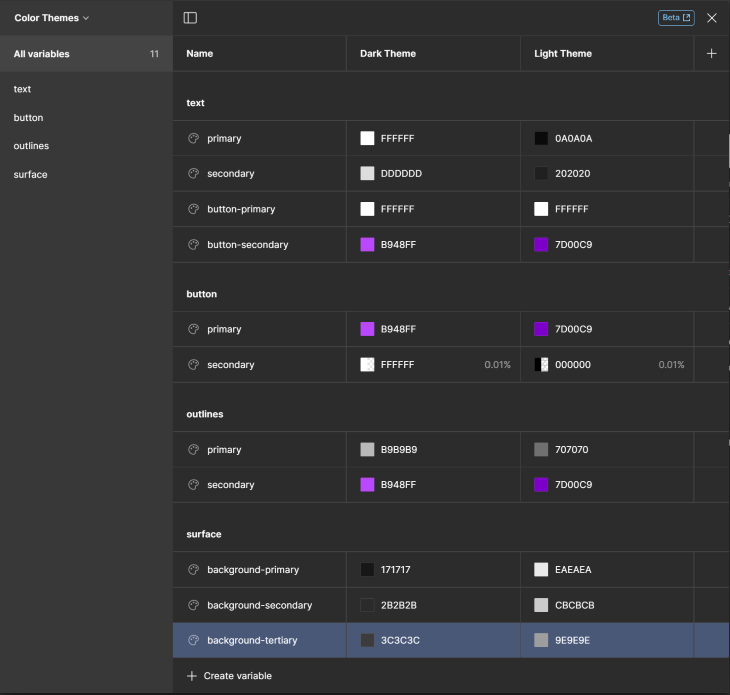
And then start filling in variable definitions. Once you’ve filled in rows that correspond to all of your colors, you can add one or more columns to define additional theme colors.
The variable table also supports the same slash notation that you can use in your color palettes, so if you name a variable text/primary, it will automatically create a hierarchical grouping with all other colors with the root text/…. This makes organization extremely easy:
Once your colors are in order, start defining some numerical variables, such as corner radii. Give yourself some different options for various scenarios you might encounter:
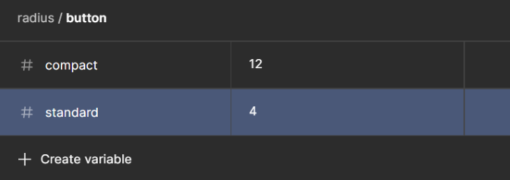
To apply number variables, hover over the input field for corner radius. You’ll see the new hexagon icon, which indicates that this value can be set to a variable. When you click it, you’ll see a list of available number variables from your library:
![]()
Now that you have some color variables and radius variables set up, you can start applying them to UI components. Here are a couple buttons which are defined by color variables as well as size variables:
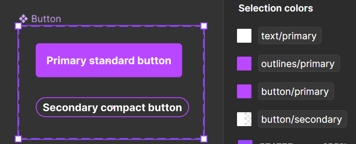
These are some simple examples to get you started with the many variables you might set up for a larger project. Continue on to see what you can do with them.
If you’ve been following along, you might feel like you just spent a lot of time and effort to set up your first variables. The following examples are just a few ways that your initial effort will begin to pay off quickly.
One of the coolest applications for Figma’s color variables is that you can designate certain parts of your screen to apply one color theme or another. Apply a section (not a frame) and place inside of it a frame that contains one or more color variables. When you do this, that hexagon icon will appear in the Layer section of the right hand panel.
This allows you to select a theme to apply to that frame. Repeat the process in a second frame, but this time assign it to your Light Theme:
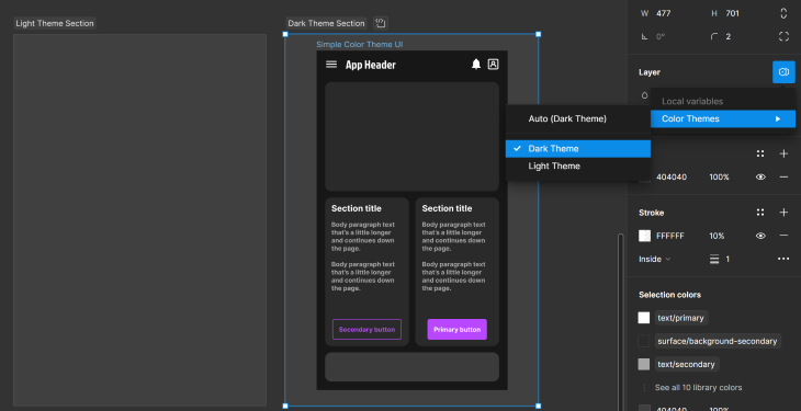
Once you do this, now you can drag a single frame from one section to the other and it will apply the theme color switch automatically.
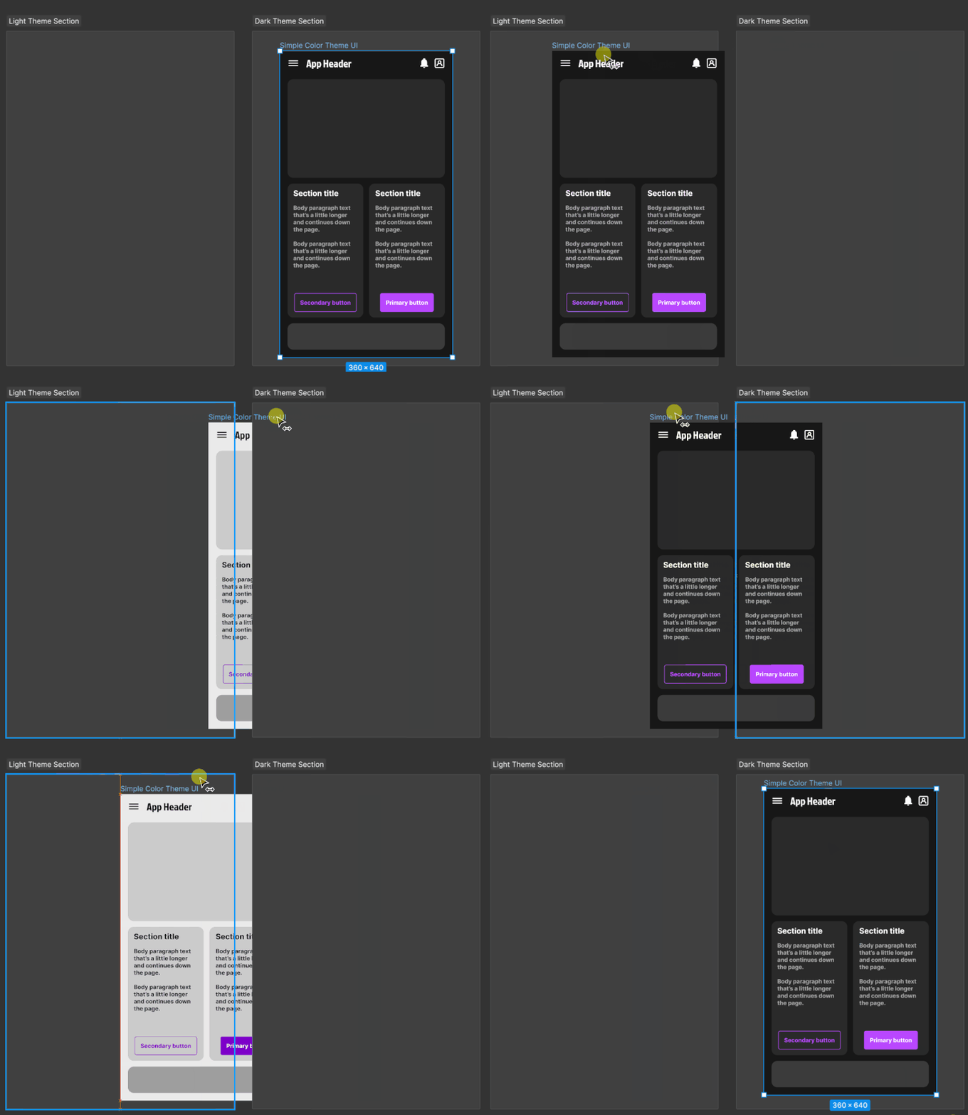
In the past, designers needed to spend tedious hours creating multiple versions of the same UI screens and replacing each color token with a parallel theme token. Now designers only need to keep their variable tables up to date and design one version.
Just like swapping color themes, you can do the same thing with languages by setting up text string variables and creating a mode for each language. It’s now so much easier to test your screens for localization.

Now let’s explore what you can do with those number variables in prototyping mode. If you have numbers in your prototype that you want to be dynamic, create number variables and assign them to each of those text layers. When you set up prototyping interactions, you now have the option to trigger variable changes upon clicks.
To demonstrate this in an overly basic way, I created a simple “add to cart” screen. I created a variable for the quantity shown in the input field and a second variable for the quantity shown in the cart icon. I linked the plus and minus buttons to increment and decrement the value shown in the input.

Then I set a simple equation for the Add to cart button to increment the cart quantity by the number shown in the input.
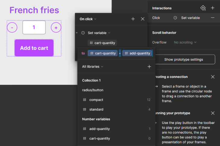
The result, shown below, is an interactive prototype where there is actual logic behind the content shown on the page. I can click the buttons as much as I want and they will respond with the appropriate arithmetic:
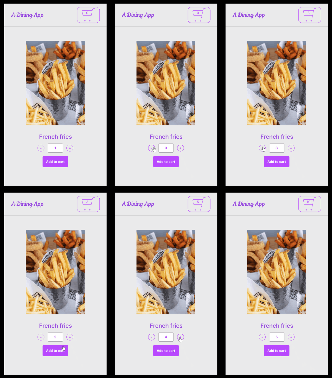
In the past, prototype screens would require each possible button combination to be considered as a separate flow of screens. For a more complex use case, that might have required hundreds of unique screens to be developed just for prototyping purposes. Dynamic logic with variables saves you from all of that extra work.
Many feature releases claim to be game changers, but it’s rare that a single product update packs this much punch. The examples above are only the tip of the iceberg in terms of how you can use variables in Figma.
The community response to Figma variables was overwhelmingly positive and it’s clear that this feature will only continue to grow and shape the future of how designers work. By letting variables take care of your tedious pixel pushing tasks, you can spend more of your time actually designing.
LogRocket's Galileo AI watches sessions and understands user feedback for you, automating the most time-intensive parts of your job and giving you more time to focus on great design.
See how design choices, interactions, and issues affect your users — get a demo of LogRocket today.
Documentation may not be your favorite part of the UX design process, but it’s crucial to the success of any design project.

I’ve spent enough time designing with WCAG 2.2 to know it’s not enough. Here’s why I’m skeptical and cautiously hopeful about WCAG 3.0.

I learned this lesson the hard way. Good UX doesn’t survive endless approval loops. Here’s what went wrong — and how to protect your vision.
I’ve reviewed “final” designs more times than I can count — and the copy almost always gives users a reason to hesitate.