To create great products, you need a solid product development team, and UX writers are critical for that. They are responsible for all of the words in the user interface and contribute to the overall user experience of a product.

Contributing to the overall UX means that UX writers need to be involved from the very beginning of a product being conceptualized. They are not relegated just to words; they should also be involved in making decisions about behavior, logic, different UIs, and more.
So it only seems fair that non-writers on a product development team are also involved in the content creation process. One of the best ways to do this is to hold UX writing reviews regularly with other stakeholders.
A UX writing review is a session for the UX writer to go over the copy for a specific feature or project with the other product stakeholders, like product managers and UX designers. The goal of the session depends on when in the process you’re having it. It will likely either be to check in about a content direction and help troubleshoot problematic areas, or to finalize content so it can be handed off to developers.
Whatever the goal is, be sure to state it at the beginning of the meeting so everyone is aligned.
Depending on the size of the product, these sessions should be scheduled for anywhere between 45 minutes to 1.5 hours.
You and whoever else is defined as the “product team” should be in this session. For example, this could be a product manager and a UX designer. If the project is particularly high profile, you can also invite any other management stakeholders, like the leads of design, content, or product.
Don’t invite the technical players, like developers and business analysts. It’s just not usually relevant for them. They don’t need (or want) to be involved at such a granular level. If developers have feedback about copy, they can let you know about that specific piece of text. They don’t need to sit through every single screen.
Perhaps even more importantly, though, you don’t want these sessions to become too big. The bigger they get, the more opinions there are, which can make it really hard for you to filter through if people disagree. The more people that get in the room, the more likely it is to feel like people are ganging up on you, which will lead to an unproductive session.
Don’t forget: you are leading this session.
There are two different times when it’s good to do one of these. If you’re working on a really big project, they can be a really helpful check-in point to make sure that everyone is aligned with the direction you’re taking. It can also be a great opportunity to get help trying to solve a problem you’ve been stuck on; you might even discover together that the problem can’t be solved with words.
If you’re doing a UX writing review at this stage, it’s up to you if you want to do it before or after looking over it with an editor or fellow writer.
It’s more common to do a UX writing review when you’re done with the copy on every screen. Doing a review at the end of the copy creation process helps everyone get on the same page about what will be in the product. That way, there are no surprises or last minute messages about something that’s about to go live.
If you work with people physically, it’s helpful to do these face to face. If you work remotely, a video call can definitely do the trick. But the video part is important! Body language is really important when opening your work up to critique, and if you do a call without video, feedback could be misconstrued.
If you’re doing the session in person, try to book a meeting room or do it in a private area. If there are no distractions around, you’ll cover what you want much quicker.
For starters, make sure you’re organized. Don’t just show a messy content drafts page in Figma or seven million versions in Google Slides.
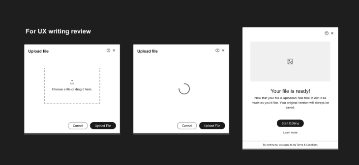
Just like writers need to see the whole flow to make the best content decisions, your colleagues need to see the whole flow to understand the choices you made. So make sure that you’re showing the flow as much as possible. Hide other versions that you’re not planning on showing so that it’s not distracting.
Here I’ve organized all the content for review under one header:
It’s not a bad idea to prepare others as well. Not everyone reads or processes information at the same speed, so sending the copy a day in advance can help ensure that everyone is able to participate in the session itself.
It might sound basic, but how you present your copy can make a world of difference. Whatever program you’re using, make sure you use it in display or present mode.
In a presentation deck, this just means putting it into presentation mode. In Figma or Sketch, be sure to hide the side toolbars (CMD + . or CMD + \). In design tools with comments and annotations, hide them unless you’re actively using them, so that none of the content is hidden underneath them.
Be careful how much you zoom around on the screen if you’re using a program with an infinite canvas. It can be really disorienting and even induce motion-sickness if you’re zooming in and out or scrolling around the canvas at breakneck speed.
Most programs with an infinite canvas have a way to simply jump from screen to screen. In Figma, for example, you can do FN + →, FN + ←, or N on your keyboard to go from frame to frame (the same shortcut works with artboards in Sketch). If you need to do a lot of maneuvering, sometimes it’s best to stop sharing your screen while you get to the place you want.
If you’re presenting on a video call, keep in mind that there is often a delay between what you do on your screen and what participants see. Going from frame to frame as described above can help with this, as it takes less processing. But if you can’t go from frame to frame, just be sure to wait a few seconds before diving into the next screen.
This is a UX writing review, so you as the UX writer are in charge of guiding the conversation. Start by making it clear upfront what you’d like to cover.
That doesn’t mean, though, that you should have a set agenda, like, “I just want to finalize these three tooltips and this subtitle, everything else is final.” Remember, you’re doing this review because you welcome and value everyone’s feedback. Your colleagues might have feedback on a screen that you felt confident about, and maybe you all working together on it makes the product even better.
It’s easy to get stuck on one screen or element, so it’s your job to move things along when needed. If you know that this little piece of text that everyone has fixated on is trivial, allow a minute for discussion and then gently say that you’d like to move on. Hopefully, all of your work is transparent and available to others, so you can encourage others to leave comments after the session if they have more thoughts.
If you don’t have a place for all your stakeholders to include their thoughts, you can try our downloadable template for UX writing feedback.
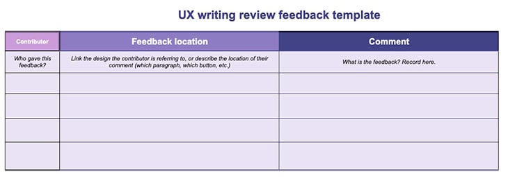
You can use this template to track who’s making feedback, what they’re giving feedback on, and their comments. This can work well for general points or if you’re working with software that doesn’t offer comments.
While these sessions are meant to be collaborative, any writer knows that crafting the perfect sentence takes time. It can be really tempting to work together on every single word of a sentence, but this often isn’t the best use of everyone’s time.
Sentence structure, syntax and grammar are all important parts of the development process, and are ultimately what lead to great text. When you’re in a room with other people, you won’t have the time or space to think about these things. Whatever you end up writing will likely need to be finetuned still, so don’t get hung up on each and every word in these sessions. Focus on just capturing the main ideas.
You should present the version that you think works best, which might mean you’re presenting the final screens page. If there is discussion about a piece of text, it can be tempting to just edit the content directly on the screen you’re looking at. But this can be a big mistake!
For starters, you should always make a copy of your work before you make changes. How many times have you written and rewritten something, only to go back to your first draft from an hour ago? Don’t lose your first draft, and don’t lose the version you like the most at this point in time.
Updating content directly on the final screens can also mess up the source of truth for everyone else. To keep this page clean, it’s best to do any drafting on your own drafts page.
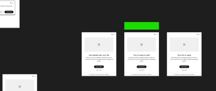
Of course, this can then lead to your own drafts page getting messy. So find some way to leave a note for yourself on final content during these sessions. One way is to draw a green rectangle above the content that was finalized, so you can easily spot it when you come back to the page later.
For example, here I’ve used a green bar to indicate the final version:
It’s likely that a lot of conversation will happen during this session. This conversation should be (hopefully) super constructive and helpful…but only for as long as the meeting lasts.
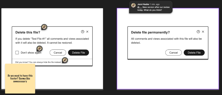
Once it ends and you’re off to the next meeting, the ideas and thoughts you had will probably get lost. That’s why it’s really critical that you take clear notes in the context of your copy. This could be in the form of comments or virtual sticky notes. It can even be helpful to say who made the comment, so you can check back in with them later if you have more questions.
Doing a UX writing review session with non-writers is a great way to include all stakeholders in a product team and can really help elevate the quality of text within a product.
It’s a great way to build relationships and make everyone feel their voice is being heard. There are no surprises when the product is released, and you might even find that the trickiest of sentences can be solved with a little help from the rest of the product team.
Opening up your work for any kind of feedback can be scary, especially when the people reviewing your work are not in your discipline. So take a deep breath and remind yourself that the people in the room with you all want the same thing: to create great products for your users.
LogRocket's Galileo AI watches sessions and understands user feedback for you, automating the most time-intensive parts of your job and giving you more time to focus on great design.
See how design choices, interactions, and issues affect your users — get a demo of LogRocket today.

Multimodal UX goes beyond designing for screens. Learn how context-aware systems, progressive modality, failover modes, and accessibility-first design create better digital product experiences.
Learn how context-aware mode prioritization and seamless transitions improve multimodal UX and reduce mode confusion.

Research is becoming more democratized, product cycles are accelerating, and AI is transforming synthesis and ResearchOps. Here are the three trends shaping UX research in 2026.

Voice support is not the same as multimodal UX. Here’s how to design systems with true mode continuity and context-aware interactions.