The days of one-size-fits-all design are long gone. Today, our focus is on crafting experiences that seamlessly adapt to a diverse range of screens, from the compact displays of smartphones to the expansive monitors of desktop computers.

In this article, we will delve into the pivotal concept of responsive design and provide you with a step-by-step tutorial on creating responsive designs using Figma. Crafting designs that cater to different devices requires a comprehensive understanding of the architectural elements within the canvas. With this article, we will introduce a glossary of key terms to enhance your comprehension of the framework.
A layout grid, in simple terms, is the framework that organizes design elements such as images, text, and components within a canvas or frame. It ensures these elements fit neatly within the available screen space.
As the screen size changes, these elements can dynamically adjust by either repositioning themselves or remaining fixed in place. To create a layout, think of the canvas as having two essential components: empty spaces where no content resides, and columns or rows where your content is displayed.
A responsive layout grid is characterized by elements on a screen that adapt dynamically to changes in screen size. This behavior guarantees that websites can be viewed effectively on various devices and screen sizes, offering a consistent and user-friendly experience. Depending on the screen size, the number and size of the columns will change to adapt to the available frame at any given time.
The opposite of a responsive layout grid would be a static layout grid where the elements on a screen don’t adapt to changes in screen size. Therefore, the layout would remain fixed all the time even if the user resized the web browser.
A grid is a fundamental tool in design, especially when working in design software like Figma.
In the context of design, “grid spaces” refer to the defined distances or intervals that separate elements within a grid layout. These spaces are used to establish consistent and precise alignment between various design elements, such as text, images, or components on a canvas or frame.
Grid spaces play a critical role in maintaining visual harmony and structure in a design, ensuring that elements are evenly distributed and well-organized. Designers often use specific measurements, like 8px or 16px, to create these spaces, which can vary based on the design’s requirements and the target screen sizes.
The 8px grid, in particular, is widely favored because scaling by 8px promotes harmony and consistency in design layouts. However, in some cases, a 4px grid might be more suitable, especially when creating designs for smaller screens where space is limited. This is particularly valuable when dealing with tasks like icon creation or typography that require minimal spacing:
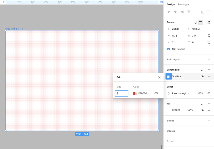
A layout within a frame in Figma consists of several key components. It consists of a series of columns separated by described gaps, known as “gutters.” The outer boundaries of this grid are called “layout margins.”
Within this layout framework, you’ll find what is often termed the “layout anatomy.” These are distinct content blocks, such as the header, navigation elements, or the footer.
Columns and rows can be positioned in different parts of the frame. Typically, they span the entire space, but you can choose to center them or position them at the top or bottom as needed.
The number of columns or rows often extends up to 12, but for smaller screens, you’ll likely see a four-column layout. The width of these columns or rows adapts to the screen size while maintaining a consistent gutter or space between them.
It’s important to note the concept of static and fluid layouts. In the case of a fixed layout, the content remains a fixed size and won’t expand at certain breakpoints.
In contrast, a fluid layout adjusts the size of columns or rows dynamically based on breakpoints. Typically, layouts become fixed at a certain size, and the margins increase as the screen size grows:
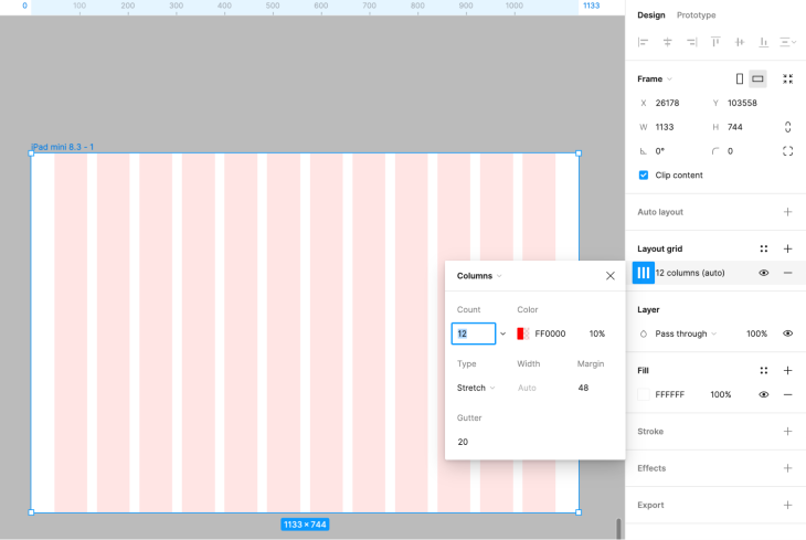
When configuring a layout, you have the flexibility to choose between a vertical or horizontal rhythm. In essence, you can establish vertical columns or horizontal rows within the frame.
The choice between vertical and horizontal layout is a critical decision. For horizontal layouts, designers arrange the rows, gutters, and margins from left to right, which we often prefer for touch platforms like mobiles and tablets.
On the other hand, vertical layouts are the standard, where columns, gutters, and margins are arranged top to bottom across the frame. It’s crucial to consider the platform and user experience when selecting the appropriate layout orientation.
All the content of a website or app are organized within these columns or rows. This content can expand across any number of columns, and it resizes in harmony with the columns.
Groups of columns or rows are named “spanning columns” or “spanning rows.” For example, if you have a layout with 12 columns and three spanning column groups of 4 columns each, the content will span across these groups. You don’t need to use all the columns or rows; any unused ones can be called “offset,” allowing you to create layouts with specified gaps or offsets.
Margins within a layout refer to the spaces surrounding the edges of the design canvas or artboard. These spaces can be categorized as either “fixed” or “fluid,” depending on how they adapt to changes in screen size:
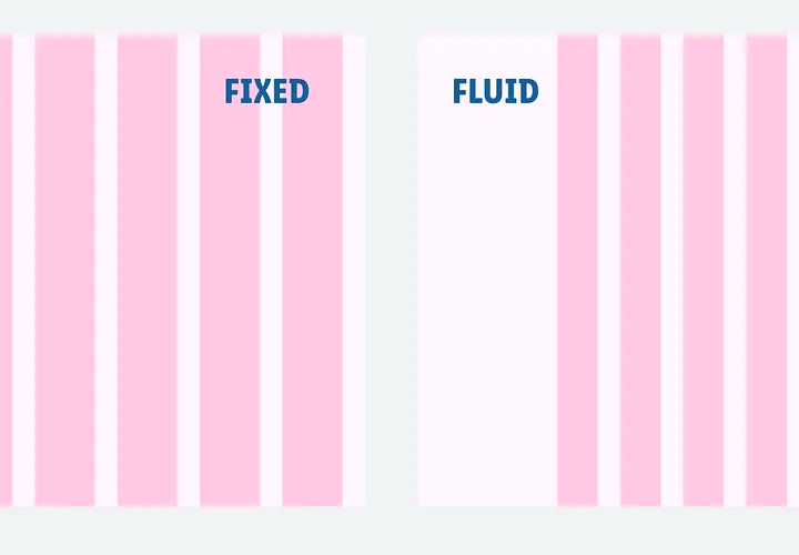
These are typically used on larger screens where the content remains static in the center. As the screen size increases, the margins expand, maintaining the content’s central alignment. For instance, on a 1920px wide screen, you might apply a fixed grid with a size of 1264px.
In contrast, fluid margins adjust their size dynamically based on the screen size. To calculate the size of a fluid margin, you simply subtract the fixed grid size from the screen size and divide the result by 2. This approach ensures that margins change in proportion to the screen’s dimensions, providing flexibility for various screen sizes.
I’ll walk you through calculating fluid margins with a simple example. Imagine you have a screen size, and you’ve set a fixed grid size. To calculate a fluid margin, subtract the fixed grid size from the screen size and divide the result by 2. This method ensures that margins dynamically adjust in proportion to the screen’s dimensions, offering flexibility for varying screen sizes.

The gutter is the space between columns or rows. This space adheres to a grid value, such as 8px, 16px, or more. The size of gutters can vary depending on the screen size, with smaller screens typically having narrower gutters compared to larger websites.
Breakpoints, in the context of responsive design, are specific screen sizes or resolutions where your design layout transitions to a different configuration. Think of them as key moments in your design journey where you need to customize the layout to suit various screen sizes. These breakpoints are pivotal in ensuring a user-friendly experience on different devices:
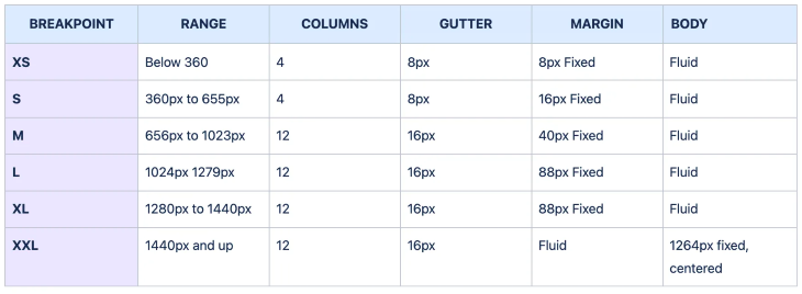
This is the layout I’ve devised for the websites and products I’m involved with. It’s worth noting that this is merely an illustration, and you’re free to modify this concept to align with your specific design preferences:

In this tutorial, we will guide you through the process of creating a layout grid tailored to a 1024px-wide frame (size L). The grid will consist of 12 columns, each separated by a 16px gutter, surrounded by an 88px margin and with a grid spacing of 8px.
You can create a frame for each breakpoint. The following one is an example of creating a frame for an L size.
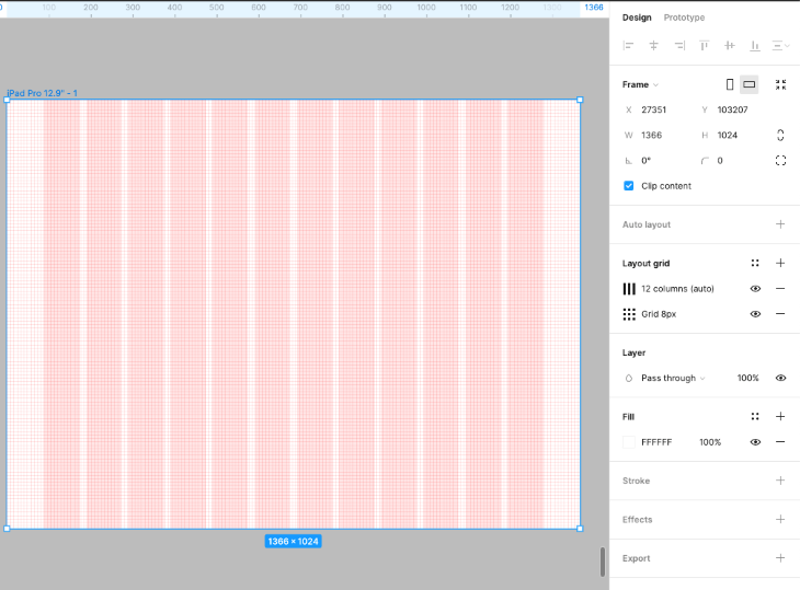
In today’s dynamic digital landscape, responsive design is crucial for delivering exceptional user experiences across a variety of devices. Figma, with its powerful design capabilities, allows you to craft responsive layouts with ease. The layout provided here serves as a starting point, adaptable to your specific design needs. Remember, responsiveness is about tailoring layouts to your project’s requirements, considering diverse screen sizes.
To further enhance your responsive design journey, consider exploring well-documented layouts from other companies:
In addition, Figma offers a range of plugins to streamline your responsive design process. Some notable plugins for creating responsive layouts include Anima, which assists in creating responsive designs and code-friendly prototypes, Auto Layout, a powerful plugin for handling responsive components within frames, and Stark, a valuable plugin for ensuring accessibility and contrast in your responsive designs.
By utilizing the tools and knowledge gained from this article and exploring these Figma plugins, you can be well-equipped to meet the demands of modern, responsive design, ensuring that your digital creations look fantastic on screens of all sizes.
LogRocket's Galileo AI watches sessions and understands user feedback for you, automating the most time-intensive parts of your job and giving you more time to focus on great design.
See how design choices, interactions, and issues affect your users — get a demo of LogRocket today.

Multimodal UX goes beyond designing for screens. Learn how context-aware systems, progressive modality, failover modes, and accessibility-first design create better digital product experiences.

Learn how context-aware mode prioritization and seamless transitions improve multimodal UX and reduce mode confusion.

Research is becoming more democratized, product cycles are accelerating, and AI is transforming synthesis and ResearchOps. Here are the three trends shaping UX research in 2026.

Voice support is not the same as multimodal UX. Here’s how to design systems with true mode continuity and context-aware interactions.