Apple released a video highlighting the design principles behind great UI. Inspired by that, I decided to apply those principles in a project where I was invited to join a team redesigning an iOS app. Since it was for iOS, Apple’s Human Interface Guidelines (HIG) were my go-to resource. They helped me keep the design minimal, accessible, and perfectly aligned with what iPhone users expect.

But then I asked myself, we’re in an AI era, so why not combine the two? I brought AI into the process to help identify hierarchy issues and refine the UX writing, all while referencing Apple’s HIG. The result? Let’s dive in to find out.
Apple’s Human Interface Guidelines (HIG) are a treasure for designers building iOS apps. They explain how to craft interfaces that feel natural on iOS devices, from spacing and typography to navigation patterns and visual style.
In their video, Apple summarized four design foundations every app should follow:
Together, these four principles are the backbone of designing clear, intuitive apps.
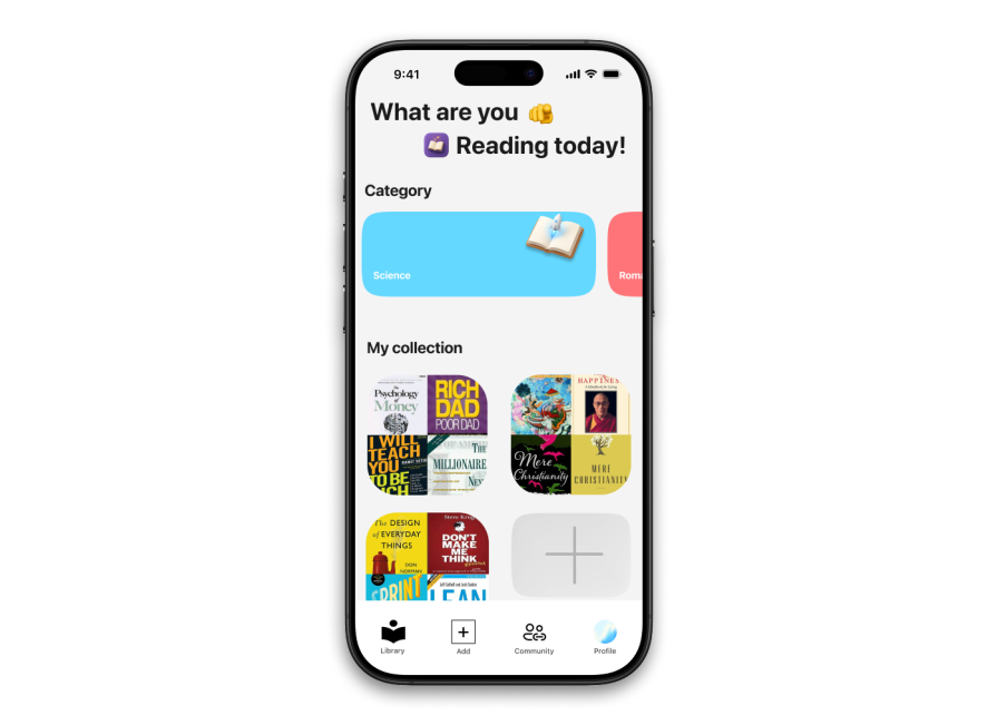
The book library app I worked on lets users scroll through their collections, add books, and browse for books based on their categories. It looked deceitfully appealing. But it suffered from common design issues like visual clutter and unclear navigation:
To guide my redesign, I kept Apple’s three essential user questions front and center:
Where am I? – Does the app clearly tell users what screen they’re on?
What can I do? – Are available actions clear and relevant?
Where can I go? – Is the next step obvious and frictionless?
To make the redesign easier to follow, I broke the analysis into four key sections:
Rather than immediately fixing issues, I started by carefully analyzing the app’s structure. Understanding the problems clearly first would guide the solutions later.
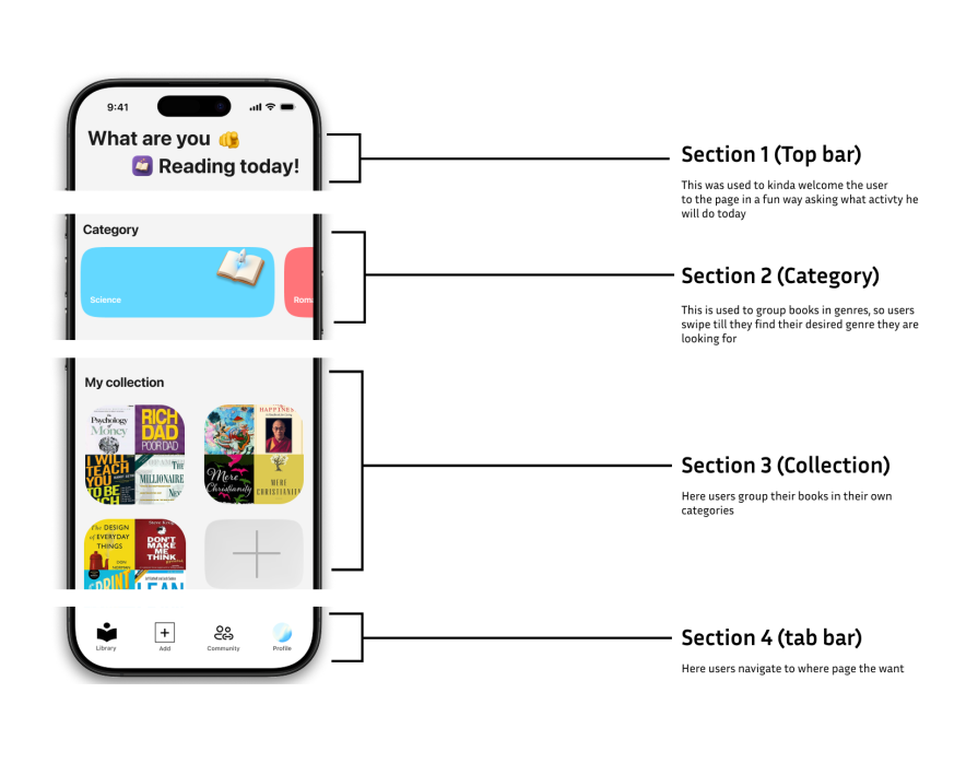
The original version tried to greet the user with something like, “Hey, what are you reading today?”. Yeah, it’s kind of fun, but it really eats up space without adding much value. Following Apple’s lecture, when a user opens an app, they wanna know where they are and what to do next. And this doesn’t help:
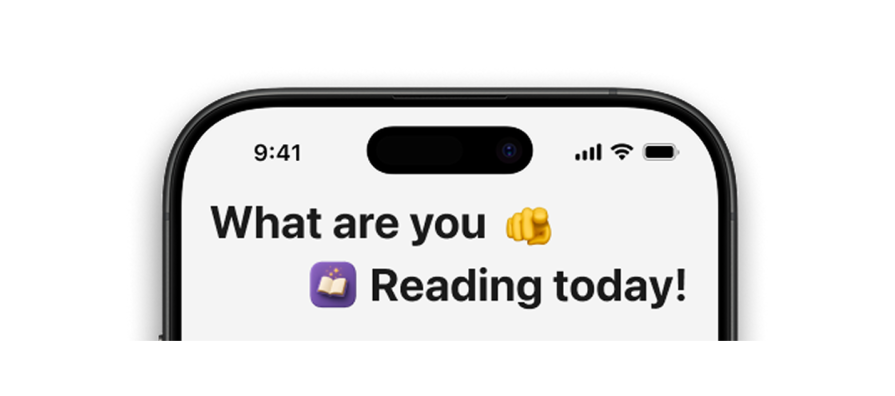
What would be better is a top bar that straight-up tells you what screen you’re on — no guessing. Like, if you’re in your library, just say “Library” clearly. And then maybe add a handy action up there that actually helps you navigate or do something relevant on that screen, instead of a big friendly message that doesn’t guide you.
The goal of the Category section is to help users browse books based on genres or themes. While the current design technically supports this, its structure feels unintuitive — it displays only a single category at a time. This makes it easy for users to miss that more options are available, reducing discoverability and engagement:
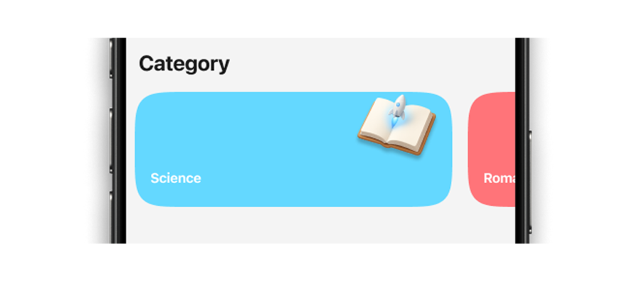
What could be better: A more visually balanced Category section that shows at least four categories upfront, with a partial “peek” at the next row to signal there’s more to explore. This would create a sense of abundance, encourage scrolling, and make the browsing experience more inviting and efficient.
I like that the current Collection section visually groups books so users get a quick glimpse of what’s inside each collection through the thumbnails. This gives a nice at-a-glance overview. However, it feels incomplete — users have little control over how collections are labeled or organized.
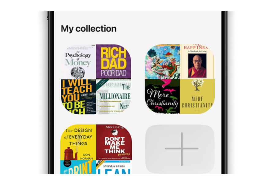
User experience on the app would be better if users had the ability to name or rename their collections so they can personalize how their books are organized. This makes the section feel more like their space. Also, to help with “where am I”, I thought it would be a great choice to change the word collections to something more book-centric.
The tab bar does a good job of showing the user where they are, which is great for orientation. However, it also contains an “Add” button for creating new collections — and this is problematic for two reasons.
First, according to Apple’s HIG, tab bars should be reserved for navigation only, not actions. Second, there’s already an “Add” button in the Collections section itself, making this redundant and visually noisy.
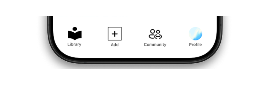
To keep this clean, we have to keep the tab bar strictly focused on navigation. Actions like “Add” should live in contextual toolbars or floating buttons where they’re directly tied to the content the user is working with.
To address the issues I discovered in the structure phase, I needed to make sure this redesign follows the four principles and answers three questions:
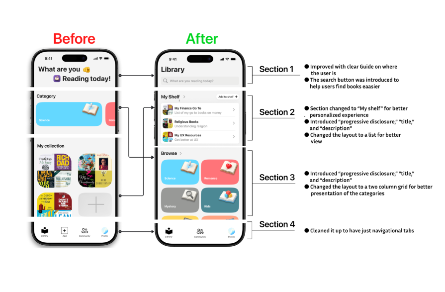
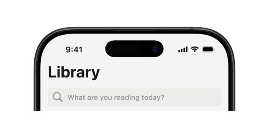
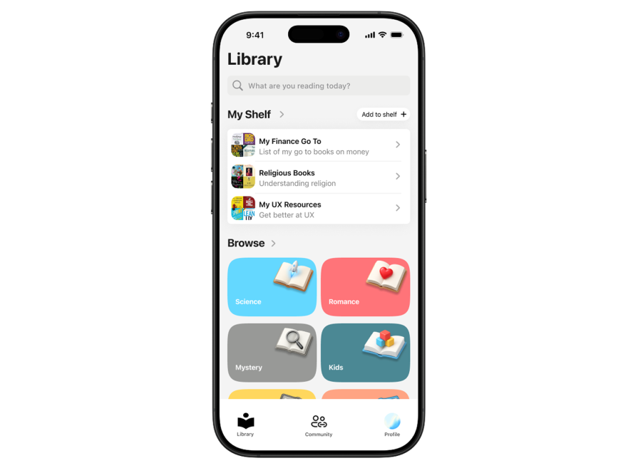
The original design opened with “What are you reading today?”. It was friendly, but it left users guessing where they were. I swapped it for a clear title, “Library,” so they instantly know where they’ve landed. To keep the personality, I moved the playful copy into the search bar placeholder. This keeps the warmth, cleans up the layout, and gives users an immediate way to navigate the library:
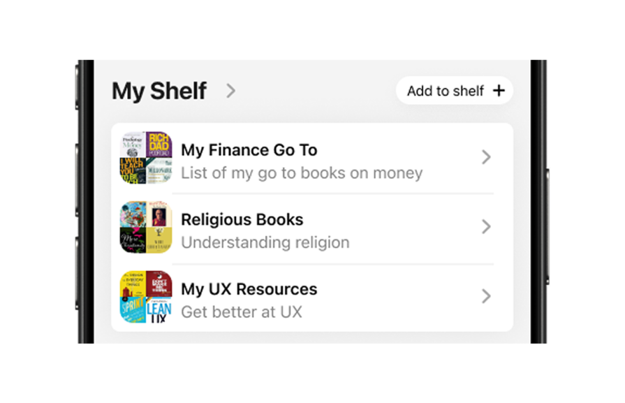
“My Collection” used a two-column grid, functional but cramped and impersonal. I reimagined it as “My Shelf” to make it feel book-centric and more real. Switching to a single-column list gave breathing room for longer shelf names and subtitles, allowing progressive disclosure. Now users can scan shelves easily, see full titles, and add new ones right where they are. I also moved the Add action from the tab bar to this section, so adding new shelves happens in context, where users expect it:
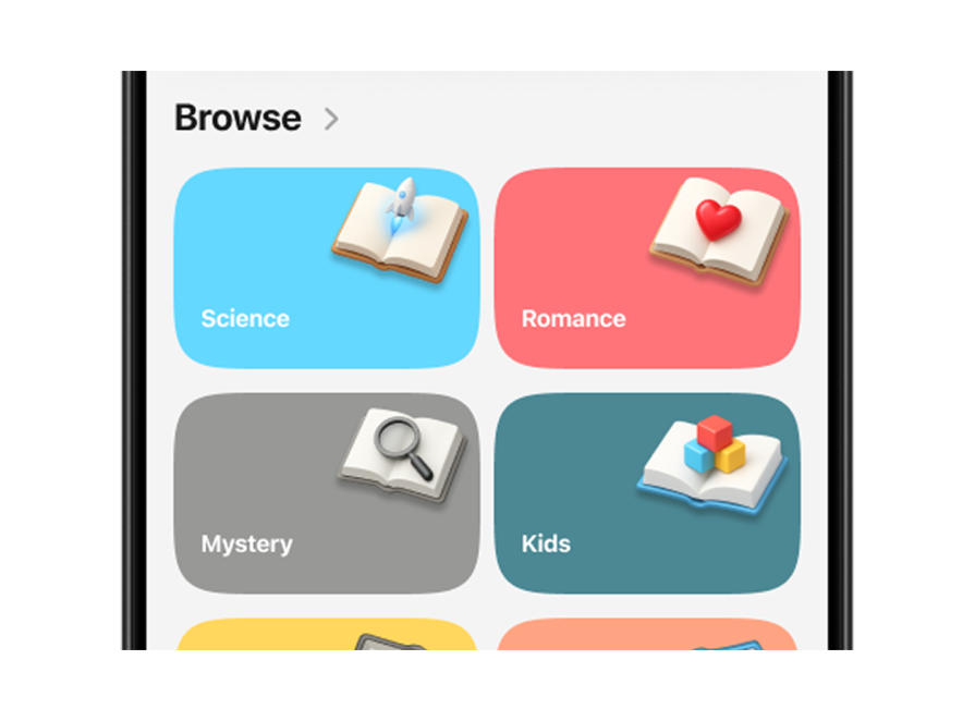
The original category section only displayed one category at a time, which meant users had to swipe blindly to discover more. This design risked users never realizing how many categories were available, hurting discoverability. In the redesign, I surfaced four categories right away and added a peek at the next row below the fold. This subtle cue creates a sense of abundance and naturally invites users to scroll, explore, and interact with the section:
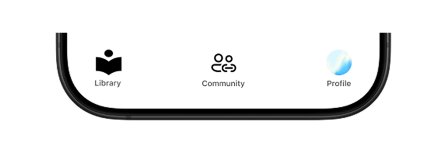
The original tab bar was doing its job of showing users where they were — but it also contained an Add button, which mixed navigation with actions. Apple’s HIG is very clear: tab bars are for moving between destinations, not performing actions. Plus, the Add button was already present in the collections section, so this felt redundant. I simplified the tab bar to focus purely on navigation:
Of course, AI wasn’t perfect. It sometimes ignored Apple’s latest HIG updates, for example, suggesting that I keep an action in the tab bar, which I knew went against best practices. Still, I won’t underplay that it did a great job in other areas, like helping me rework the search bar placeholder copy and rethink some of the layout options.
I include AI in nearly all my projects, and one tip I share for getting better results is to use the RCTT (Role, Context, Task, Tone) framework when prompting. Defining the role (e.g., “act as a Senior UX designer …”), giving context (what app or feature you’re working on), stating the task clearly, and choosing the tone you want make the suggestions sharper and easier to act on.
The key was always treating AI as a collaborator, not an authority. Its input shaped the redesign, but the final decisions came from design intuition, Apple’s guidelines, and user feedback. That balance kept the process creative and ensured the end result actually solved user problems — not just followed whatever the machine suggested.
The redesigned app feels lighter, clearer, and more personal. Users no longer have to guess where they are or scroll endlessly to find what they need:
The new structure answers all three guiding questions from Apple’s HIG:
When we shared the redesign with users, their feedback was clear: navigation felt faster, the shelves felt like “their own space,” and they loved that the app felt less cluttered. Internal testing showed fewer navigation errors and higher engagement with category browsing.
The best part? The redesign didn’t just look better; it helped users read more. By making the library feel approachable and easy to navigate, we saw users adding more books to their shelves and exploring genres they hadn’t before.
Redesigning this book library app using Apple’s HIG principles showed me how powerful these foundations can be. By focusing on structure, navigation, content, and visual design, I turned a confusing interface into one that answers those three key questions (where am I, what can I do, and where can I go) at every step. Whatever IOS app you’re building, HIG gives you a framework for making your users feel oriented, confident, and delighted.

LogRocket's Galileo AI watches sessions and understands user feedback for you, automating the most time-intensive parts of your job and giving you more time to focus on great design.
See how design choices, interactions, and issues affect your users — get a demo of LogRocket today.
Learn how context-aware mode prioritization and seamless transitions improve multimodal UX and reduce mode confusion.

Research is becoming more democratized, product cycles are accelerating, and AI is transforming synthesis and ResearchOps. Here are the three trends shaping UX research in 2026.
Voice support is not the same as multimodal UX. Here’s how to design systems with true mode continuity and context-aware interactions.
AI tools can generate beautiful UI concepts in minutes, but most teams struggle to integrate those outputs into real design systems. This guide explores why AI drifts toward generic patterns and how to build governed workflows that keep speed without sacrificing brand consistency.

 Learn more →
