The product page is the most important page for any e-commerce business. Whether your customers browsed through your category pages for hours or just landed on your page from Google, most of the decision-making happens on the product page. And a great product page design helps achieve the following goals:
Those are a lot of objectives for a single page, right? This demands that we be very deliberate with every element and design decision we make.
In this article, I’ll review a few fine examples of product pages from e-commerce websites and explain what elements make them so effective. I’ll then recap a few best practices we can derive from those examples.
Zalando is one of the most successful fashion e-commerce stores and is a great benchmark for any clothes shop to compare. They did dozens of A/B tests a year, and they nailed a design that works for the masses.
Let’s break it down.
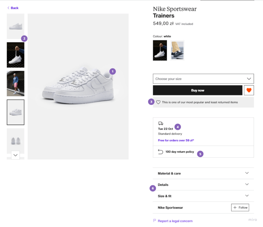
1. Prominent key visual — When shopping online, pictures are everything. The higher the quality, the better. The goal is to make the offer feel tangible, rather than just asking for money for a promise of an item
2. Images carousel — Other images shouldn’t be hidden behind arrows or other CTAs. Make it easy for customers to spot other pictures at a glance. This dramatically increases the chance of visitors actually looking at other images. The more images they see, the more attached they get to the item and the higher their willingness to purchase
3. Credibility signal — The line “this is one of our most popular and least returned items” gives two powerful credibility signals in one sentence. Being the most popular reinforces buyers that it’s a good choice. If everyone buys it, then it must be great, right? Since it’s the least returned item, the quality is probably high, too
4. Answering common questions — By clearly communicating the delivery date on the product page, Zalando reduces the chance that users will bounce back from the product page to search for delivery information elsewhere. If visitors have to do the latter, there’s a chance they’ll never return
5. Addressing anxieties — Buying shoes or other clothes online is a bit stressful; you never know whether they will fit well. The clearly communicated 100-day return policy helps address that anxiety
6. Easy to dig deeper — Instead of throwing details at you, Zalando gives you almost no information about the item but allows you to easily see the details that are most important for you in a separate section
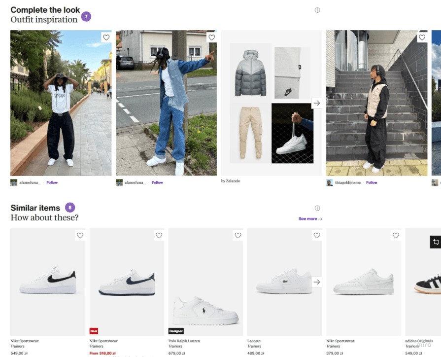
7. Complementary items — The “complete the look” serves as a well-integrated upsell mechanism and helps showcase how the product looks in a real-life setting
8. Similar items — For those customers who almost found the right pick, but there’s something off about the item, Zalando shows similar yet different items that might hit the mark
Nailing a product page design for a company that sells literally everything — from fast-moving consumer goods to clothes to electronics — is quite a challenge.
Amazon had to make many compromises to design a universal yet well-converting product page. Yet, they managed to handle the challenge and build a multi-billion dollar e-commerce business.
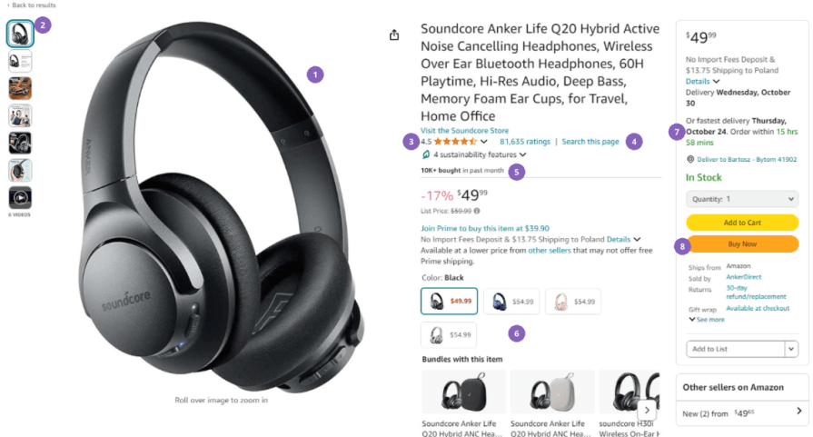
1. Prominent key visual — Whether you are selling headphones, shoes, or a chocolate bar, you can’t go wrong with a well-exposed key visual
2. Images carousel — Easily clickable image previews increase the chances that visitors will go down the visuals’ rabbit hole
3. Credibility via ratings — Amazon leverages its benefit of being a high-traffic website and displays how many ratings the product gets. If someone has 81000 ratings with a 4.5 score, it must be both popular and quite a good product
4. Search this page — Different products have different relevant details. To cater to this diversity with a single page, Amazon opted to have a “search CTA” that allows visitors to scan the product page for relevant information, making it easy to check if the product is right for you
5. Credibility via recent purchases — Showing that other people are buying the product helps ensure visitors that they are not buying a crappy product
6. Easy to switch variants — If you are looking for a different variant, e.g., a different color, you can switch it with one click without returning to the category page. In 2024, this is a must-have for multi-variant products
7. Delivery date counter — Counters of any sort tend to improve the conversion rate on a product page, and a delivery date counter is a great way to nudge people not to delay the purchase without causing too much anxiety
8. 1-click purchase — Creating (and patenting) the ability to purchase items with literally one click is one of the biggest e-commerce inventions of recent years. The shorter the sales journey, the better
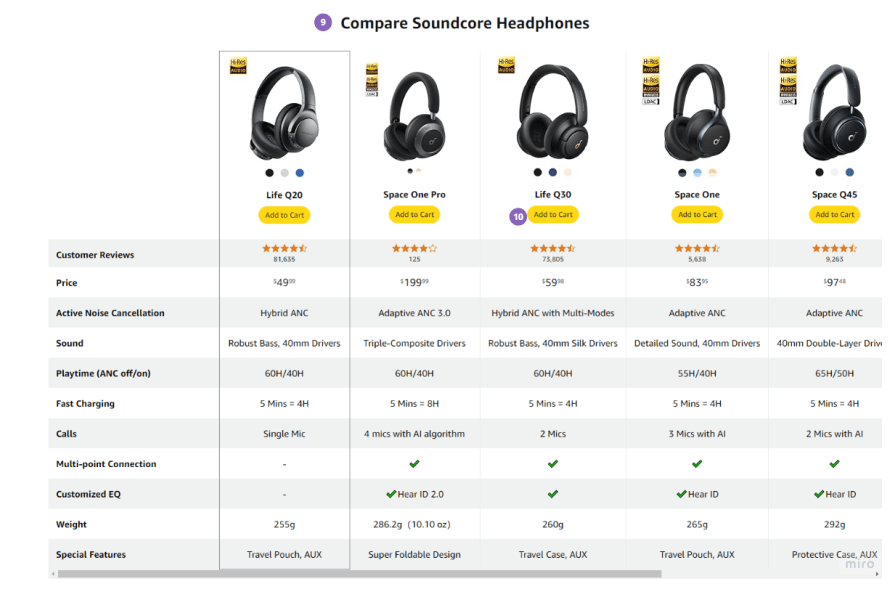
9. Comparison table — The ability to compare items to similar alternatives is often crucial for customers, so make it easy and navigable. Most importantly, don’t force them to leave the page
10. Add to basket for alternatives — If the customer prefers to buy an alternative, they can do that without leaving the page. Once again, the shorter the sales journey, the better
Amazon designers did a great job creating a product page layout that works for any category.
Walmart is my favorite e-commerce website for general user experience. If you are a casual buyer who just needs to find an optimal product for themselves without analyzing every single detail, Walmart is for you.
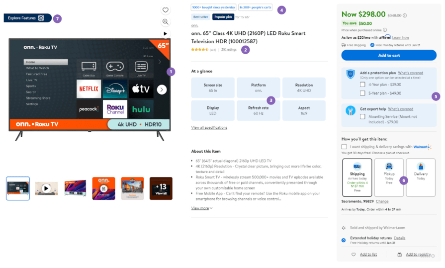
1. Prominent key visual — Once again, you can’t go wrong with that one
2. Ratings — Same thing as with Amazon. Walmart has tons of customers and gets tons of ratings. They make sure to highlight those numbers to strengthen their competitive advantage
3. Bird-eye overview — The “At a glance” section gives enough information for 80% of the buyers. No need to click any button or search for details; all key information is available, well, at a glance
4. Credibility via badges — Both numerical badges, such as how many people have the item in the cart, and generic ones, such as “best seller,” help strengthen the credibility of the product
5. Visible yet noninvasive upsells — On the one hand, buyers are one click away from adding an extra service or warranty, but on the other hand, you don’t get those annoying upsell modals or shouty messages
6. Different shipping options — No doubts about what shipping options are available or when the delivery will happen. Everything is available at a glance for buyers
7. Explore mode — The unique part of the Walmart experience is the Explore mode, allowing users to get more details in a fun and interactive way. No more boring text walls with detailed specifications!
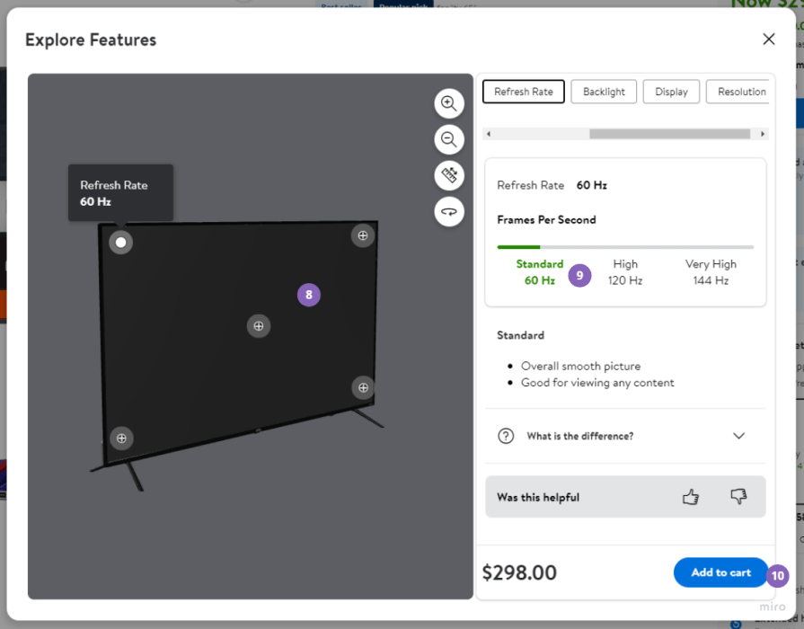
8. 3d preview — Makes the product more tangible and easier to inspect
9. Feature explanation — Buyers can clearly see how key parameters of the product compare to other products and get a quick description of what it means. There is no technical jargon so that a casual buyer can easily understand what they’re getting
10. Always available CTA — Even when the “Explore Features” modal takes over the page, buyers are still one click away from adding the item to the cart
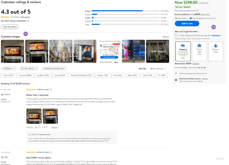
11. Customer images — Highlighting images provided by reviewers is a great way to boost trust [that these are not fake reviews] and makes the product even more tangible
12. Sticky CTA — When scrolling down the page, the main component with purchase call-to-action scrolls down and is always visible. Once again, customers are always just one click away
Walmart makes buying such sophisticated products like TVs an effortless and fun experience.
New Balance takes a slightly different approach to its product pages than Zalando.
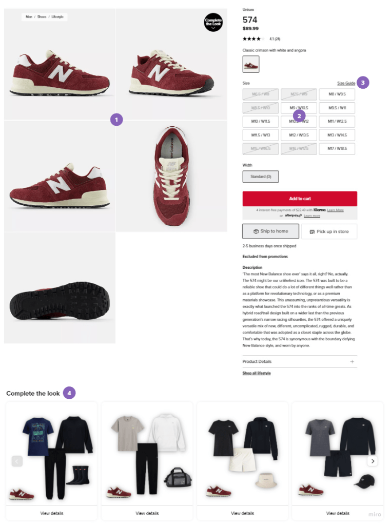
1. Images gallery — Instead of focusing on a single key visual, NB exposes the whole gallery. Although the item doesn’t look as sexy and premium, customers can quickly scan it from different angles and determine if that’s what they’re looking for
2. Size selection — Customers can understand at a glance if their size is available, making it easy to understand if there’s a product for them
3. Helpful tooltips — Some customers might not be aware of what different sizes mean. Instead of leaving them confused, NB provides clear instructions for those cases without leaving the product page
4. Native upsell — Although the “Complete the look” section doesn’t provide the benefit of seeing the product on an actual model (like Zalando does), it’s still quite an efficient way to upsell other products without being too sales-like
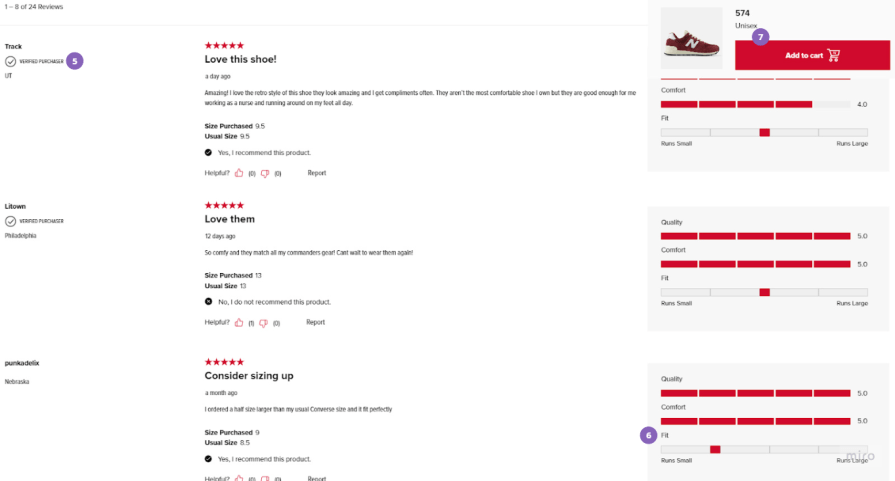 5. Verified opinions — Verifying the opinions helps boost their credibility by a mile
6. Categorized rating — Sometimes, a single number can’t adequately reflect one’s opinion about the product. By classifying the reviews per quality, comfort, and fit, NB makes them significantly more informative and further helps establish trust in the product (assuming it has good reviews)
7. Sticky CTA — Like in the case of Walmart, potential customers are always one click away from adding an item to the basket
New Balance’s product page design prioritizes finding the right product for buyers’ feet rather than pushing them to purchase asap.
You probably notice a few principles repeated in my analysis. Even though the reviewed pages differ significantly in UX and UI, they are also somewhat similar. It is because they follow a set of similar best practices. These are:
Things such as layout, information architecture, sections, and the broader UX/UI might differ heavily between product pages. But as long as they follow the key principles of product page design, they should get the job done.
LogRocket's Galileo AI watches sessions and understands user feedback for you, automating the most time-intensive parts of your job and giving you more time to focus on great design.
See how design choices, interactions, and issues affect your users — get a demo of LogRocket today.
A three-week mobile banking project taught me that the “proper” UX process is not always realistic. Sometimes, the better approach is to work with what you know, identify what you still need to learn, and make the strongest decision possible under real constraints.
A/B testing compares two versions of a design to see which performs better with real users. Here’s how UX teams can use it to test hypotheses, measure outcomes, and make smarter product decisions.
This case study shows how one ad experience redesign increased total ad exposure while lowering perceived friction, proving that timing and context can matter more than raw interruption.

As products evolve into ecosystems, navigation becomes a system-level challenge. This article explores how to align structure, context, and user journeys to create seamless movement across tools without confusion.