At the end of the day, sometimes your success simply comes down to user behavior. Your product isn’t broken. The design isn’t bad. Users simply aren’t ready to buy.
Because of this, you need to understand the type of product you’re selling. If you sell food, you expect people to buy it every day. But if you sell investments, where there’s always the fear of losing money, you can’t expect users to click “buy” immediately after signing up.
These were my exact words during a product performance review. However, it took my team building a robo advisor feature that dragged on for eight sprints (four months) to finally realize it (time we could’ve used to set up a simple behavioral/email automation flow to nudge users into investing).
You’d think that with all the tools and data we have today it’d be easy to build a feature that users would adopt. So how did we still miss the mark?
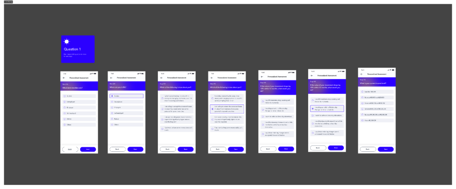
The product owner had one goal: get users to click “start investing” and actually buy a product. Users were onboarding just fine but no one touched that button. After a management meeting, the product leaders decided we needed a feature: a personality quiz that would recommend the perfect investment.
Sounds smart, right? Except they skipped the most important part: understanding the users. There was no user research and no real look at the anxieties, doubts, or behaviors of the people we were building for. The product managers rushed into user stories and acceptance criteria, and the design team only heard about the feature at the design sprint stage.
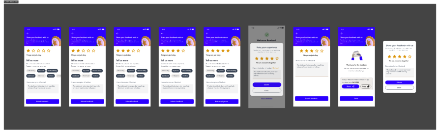
Here’s the reality: if the main goal was to get users investing, they needed to be taken on a journey. They needed reassurance, feedback loops, and a chance to tell us their concerns. At the same time, our design team was already working on an in-app feedback feature — one that would collect real-time feedback at critical moments. For example: if a user spent too long staring at a product page without buying, a gentle prompt could pop up asking, “Are you having any challenges buying your first product?”
See the difference? Instead of guessing, we could’ve been listening.
In this article, I’ll unpack our assumption-driven flop, show you how user research changed the game, and share practical lessons you can use to avoid the same mistake. By the end, you’ll see why UX research isn’t just another box to tick, it’s the foundation of building what users actually want.
The idea for a robo advisor didn’t come from our users. It came from our manager. They had seen the feature on a competitor’s app and were fascinated by it. In one of our weekly meetings, they hinted that it could help users decide faster on which product to invest in:
Our product owner, desperate for a win because we were behind on our numbers that quarter, jumped on it immediately. A week later, the product manager rolled out a detailed PRD with user stories and acceptance criteria.
The only meeting held was with the technical team to confirm if AI could power the logic. The answer was yes: if a user provided certain responses, the system could recommend a set of products. From there, the engineers were ready, and the design team was pulled in to “make it look good.”
During the design sprint, we raised a concern. Based on continuous feedback and research, our team was already working on a very different solution: an in-app feedback feature. The idea was simple but backed by solid data:
Our recent interviews showed that most of our users weren’t Gen Z or Millennials, as we had assumed early on. Over time, the user base had shifted to Gen X people far less tech-savvy. Many struggled with processes we thought were seamless. Some admitted they didn’t understand how to buy a product. Others were confused by the tiering system.
We believed usability testing had already validated the flows, but reality was different. Users’ expectations and anxieties had changed, and we needed a way to capture those insights continuously. Instead of leaning on that research, the team built a feature based on assumptions, competitor envy, and internal pressure.
The result? Four months of development, eight sprints, and countless hours of design and engineering, only to launch a feature that less than three percent of users even tried. Of those who started the quiz, fewer than one percent actually went on to invest. Adoption was flat, conversions didn’t move, and revenue remained exactly where it was.
Six months after launching the robo advisor — and seeing zero impact — the design team was finally given the green light to build the in-app feedback feature we had been advocating for. Unlike robo advisor, this solution was born directly from user research, not assumptions.
The feature itself was simple: a contextual prompt that appeared at critical points in the journey. If a user lingered too long on a product page without buying, a gentle nudge would ask, “Are you having any challenges making your first investment?” Users could respond instantly, giving us real-time insight into their pain points:
The results were immediate. Engagement with the feedback tool was far higher than we expected as over a third of users responded within the first month. But more importantly, the verbatim feedback completely reshaped how we saw our users.
We started seeing messages like:
These weren’t technical bugs, they were real behavioral insights. One piece of feedback even revealed a hidden friction point in our internal tier upgrade process that was silently delaying investments. With that knowledge, we were able to fix the flow and speed up approvals, removing a huge blocker.
Beyond improving product decisions, the feature also had a direct impact on perception. Our app store rating jumped from 3.0 to 4.5 stars, largely because we created a clever experience: if a user gave us five stars inside the app, they were prompted to share that same rating on the Play Store.
The in-app feedback tool didn’t just collect opinions, it gave us a continuous feedback loop that drove better products, smoother processes, and happier users.
And once we understood why users were hesitating, it became clear what we needed next: a way to guide them back into the journey after they dropped off.
When we introduced in-app feedback, we discovered that many users were curious but not yet ready to invest. Instead of assuming disinterest, we built an automation flow to re-engage users at every critical step.
Here is the flow we designed:
When we put the two approaches next to each other, the lesson becomes obvious:
| Aspect | Assumption-driven (robo advisor) | User-driven (in-app feedback) |
| Decision basis | Stakeholder guesses, competitor envy, no real data | Direct user interviews, real-time feedback, usability insights |
| Development time | Eight sprints (four months) wasted on the wrong problem | Slightly longer to build, but guided by research so every step mattered |
| User adoption | Near-zero engagement, less than three percent tried it | High participation, ~30-40 percent engaged immediately |
| Outcomes | Feature flop, no revenue impact, drained resources | Actionable insights, improved tier upgrade process, better product decisions |
| Risks | High misaligned with real user needs | Low (validated early) with continuous feedback |
| Long-term value | None, feature eventually shelved | Ongoing loop of insights driving future product evolution |
The difference is clear: assumption-driven design burns time and resources without solving real problems, while user-driven design compounds value with every cycle. One creates a dead end; the other creates a roadmap.
Looking back, the robo advisor flop wasn’t just a wasted feature, it was a wake-up call. It forced us to rethink how we approached product development and gave us some lessons we still use today:
This mindset shift changed our entire product strategy. Instead of asking, “What features can we ship next?” we now ask, “What problem do users actually need us to solve?” That one question alone has saved us time, money, and frustration across multiple releases.
So here’s my challenge to you: the next time your team gets excited about a shiny new feature, pause and ask: “Have we talked to users yet?”
Our journey from robo advisor to in-app feedback was messy, but it taught us the most important lesson in product development: skipping UX research is always a gamble.
We spent four months building a feature that nobody wanted, only to realize that a simple research-backed tool could deliver immediate insights, fix hidden process issues, and even boost our app rating from 3.0 to 4.5.
The difference wasn’t luck, it was listening. By putting users at the center, we moved from wasted sprints to building features that actually mattered.
Today, UX is non-negotiable on our team. We start with research, validate before building, and let our users guide the journey. And the best part? They’ve noticed, their feedback keeps shaping better experiences, and their trust in our product keeps growing.
If you’ve ever had your own “robo advisor” moment, you’re not alone. Comment your experience below.

LogRocket's Galileo AI watches sessions and understands user feedback for you, automating the most time-intensive parts of your job and giving you more time to focus on great design.
See how design choices, interactions, and issues affect your users — get a demo of LogRocket today.

Research is becoming more democratized, product cycles are accelerating, and AI is transforming synthesis and ResearchOps. Here are the three trends shaping UX research in 2026.

AI tools can generate beautiful UI concepts in minutes, but most teams struggle to integrate those outputs into real design systems. This guide explores why AI drifts toward generic patterns and how to build governed workflows that keep speed without sacrificing brand consistency.

Adaptive interfaces personalize experiences using behavioral signals and machine learning. But when personalization becomes autonomous, systems can reinforce patterns, limit discovery, and shape user behavior in ways designers didn’t intend.

Security requirements shouldn’t come at the cost of usability. This guide outlines 10 practical heuristics to design 2FA flows that protect users while minimizing friction, confusion, and recovery failures.


