Motion design is one of the most double-edged tools in a designer’s toolkit. If you do it the nice way, it can make the screen look better, help people know where to look, make the important stuff stand out, and even make moments that people will think about later. When executed poorly, it can distract, frustrate, and even push away the very audience you aim to engage.
I learned this the hard way when I used a parallax scroll effect that dazzled in prototypes but caused headaches in real use. It was not that the technique was bad in theory, as I was more interested in the fancy movements; it was that I deployed it without fully considering performance, accessibility, and context.
In this article, I’ll explore why motion design continues to hold a lasting place in the design world. I’ll also pick out some common pitfalls that trip up even experienced designers, detail out a real case study from my own work and what I learned from it, and share some practical best practices to make your motion design both engaging and user-friendly.
By the end, you will know how to keep motion as an asset, not a liability.
Motion has been something people use to talk to each other for a very long time, even before we had screens, phones, or computers. People waved their hands, made faces, and told stories with pictures that seemed to move in our heads. Our brains are made to see things that move, and moving things pull our eyes way faster than just pictures that stay still.

In short, motion taps into something primal. Without intention, it can overwhelm instead of enhance.
Even with its benefits, motion can easily turn against you. Here is where I have seen it and experienced it go wrong:
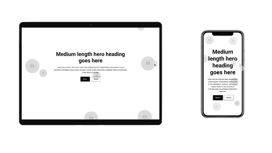
I was working on a project for a client launching a new online service. We wanted the homepage to feel dynamic and premium, so I proposed a parallax effect where the background and foreground moved at different speeds as you scrolled. In the design mockups, it was gorgeous. The imagery felt layered, almost cinematic:
During usability testing, it became clear that the problems were mostly on mobile. Desktop users experienced the smooth, immersive effect I intended. But on phones, especially mid-range models, it was a different story:
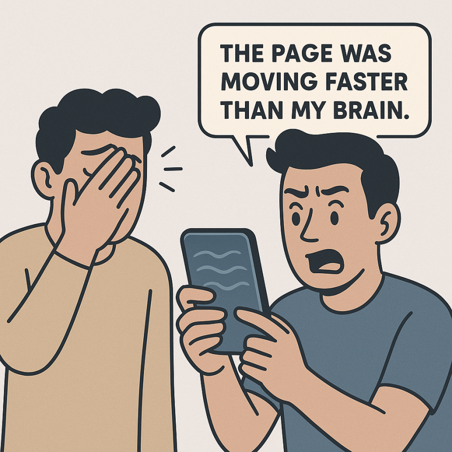
This was not a one-off problem. Studies back up these reactions. Parallax can cause motion sickness for a portion of users and often hurts perceived usability when overused.
Since the main issues came from mobile users, I had two clear options:
I ended up doing both. Why? Because the core issue was on mobile, desktop users had more screen real estate and stronger hardware, so the motion was less of a problem there. On mobile, I replaced most of the decorative parallax with fade-ins for headlines and gentle scale effects on key calls-to-action. These animations guided attention without slowing performance or causing discomfort:

The result — Testing after these changes showed fewer reports of discomfort, faster load times, and users noticing the main messaging more quickly.
Here is a distilled checklist of what works and why:
Motion design goes beyond simply making visuals attractive. It is about enhancing usability, communicating clearly, and reinforcing brand personality. “My parallax fail” taught me that motion without clear intent and careful execution can undermine all of those goals.
The takeaway? Treat motion as you would any other UX element. Test it, measure its impact, and be willing to dial it back if it is not serving the user. When it is done thoughtfully, motion does not just make a product feel alive; it makes it feel effortless.

LogRocket's Galileo AI watches sessions and understands user feedback for you, automating the most time-intensive parts of your job and giving you more time to focus on great design.
See how design choices, interactions, and issues affect your users — get a demo of LogRocket today.

Learn how context-aware mode prioritization and seamless transitions improve multimodal UX and reduce mode confusion.

Research is becoming more democratized, product cycles are accelerating, and AI is transforming synthesis and ResearchOps. Here are the three trends shaping UX research in 2026.

Voice support is not the same as multimodal UX. Here’s how to design systems with true mode continuity and context-aware interactions.

AI tools can generate beautiful UI concepts in minutes, but most teams struggle to integrate those outputs into real design systems. This guide explores why AI drifts toward generic patterns and how to build governed workflows that keep speed without sacrificing brand consistency.


