Minimalism is the art of finding beauty in essentials, simplifying complex solutions, and focusing on essentials. Minimalists believe that simplicity and clarity lead to a more impactful and meaningful experience.

This design movement emphasizes clean lines, limited color palettes, and the use of simple shapes to convey a message. In UI Design, simplicity means using fewer elements, which can make a stunning and effective design that draws users’ attention where we would like it. Let’s look deeper into minimalism, a concept every designer has heard, but few have mastered.
The less is more concept refers to simplicity and suggests that reducing unnecessary can often be more effective, aesthetically pleasing, and impactful than other approaches. Interior design with clean lines and a neutral color palette creates a sense of spaciousness. A logo created as a simple shape is clear and memorable. Lifestyle minimalism focuses on quality rather than quantity, providing real, lasting value.
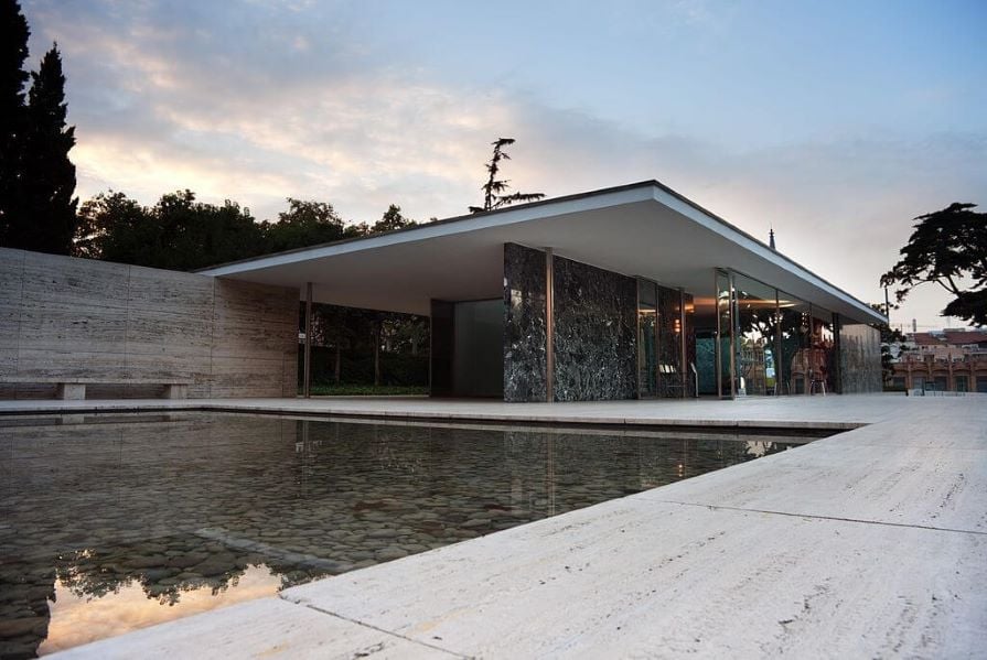
The quote “less is more,” which is often used as a design concept, an inspiring print on T-shirts, and even a name for a local cafe, is attributed to the German avant-garde architect Mies van der Rohe. His famous “skin-and-bone” architecture was constructed using “modern” materials: industrial steel and glass, emphasizing open spaces:
Now that we know the primary motto of minimalism, let’s examine how it formed to begin within. From noisy, loud art to the straightforwardness of minimalism seems like a major leap, but we’ve seen instances of the movement we call minimalism for well over a century.
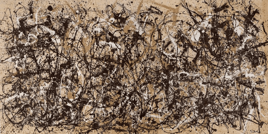
In the 1940s–1950s, abstract expressionism was popular in art in the USA. Artists creating in that style focused on expressing their feelings, emotions, and energy through their art. They used bold brushstrokes to evoke emotions on canvas:
Some artists felt that this expressive style with its chaotic nature had become too much. So in the 1960s in the USA, a new movement called minimalism appeared. The idea of minimalism was to create clean and simple art that gets back to the basics, creating artwork using simple shapes and forms to craft a visual language.
The philosophy of minimalism is to engage with the viewer’s direct perception of what he sees in front of him, rather than representing something imaginary or outside the reality. This concept is best expressed by Frank Stella, who used to say, “What you see is what you see.”
Aesthetically, this kind of art is a purified form of beauty. Minimal art objects do not pretend to be anything else; that’s why they maintain a direct connection between the viewer and the author.
The key drivers of minimalism influence how we use it in design today. You’ll probably recognize many of their concepts.
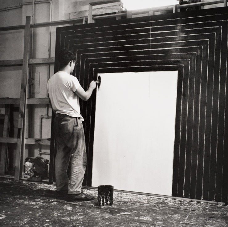
Frank Stella was a pioneer and a leading figure in the minimalist movement who is still working today. As an artist, he made his debut at the age of 23. His early artworks were in a monochromatic color palette using simple geometric forms:
In his words:
All I want anyone to get out of my works and all I ever get out of them is the fact that you can see the whole idea without any confusion. What you see is what you see.
—Frank Stella, 1964
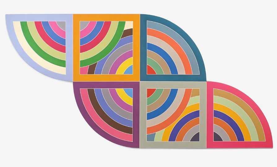
In 1967, Stella made a notable transition to color in his art through his Harran series. This artwork is characterized by a vivid color scheme and a composition consisting of rectangular shapes overlaid onto curving and circular forms:
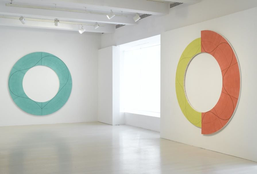
Another significant figure in the American minimalist movement was Robert Mangold. His paintings are distinguished by purity and a dedication to the fundamental components of visual art. One of his innovations was the “shaped canvas.” Instead of the traditional rectangular shape, these canvases featured distinct geometric forms:
There were also other important figures in the realm of minimalism who made a great contribution to this style of art. One instance is Malevich, a member of the Ukrainian avant-garde, along with artists such as Alexander Archipenko, Sonia Delaunay, Aleksandra Ekster, and David Burliuk, Ukrainian-born artists who worked first in Ukraine and later in Europe and America.
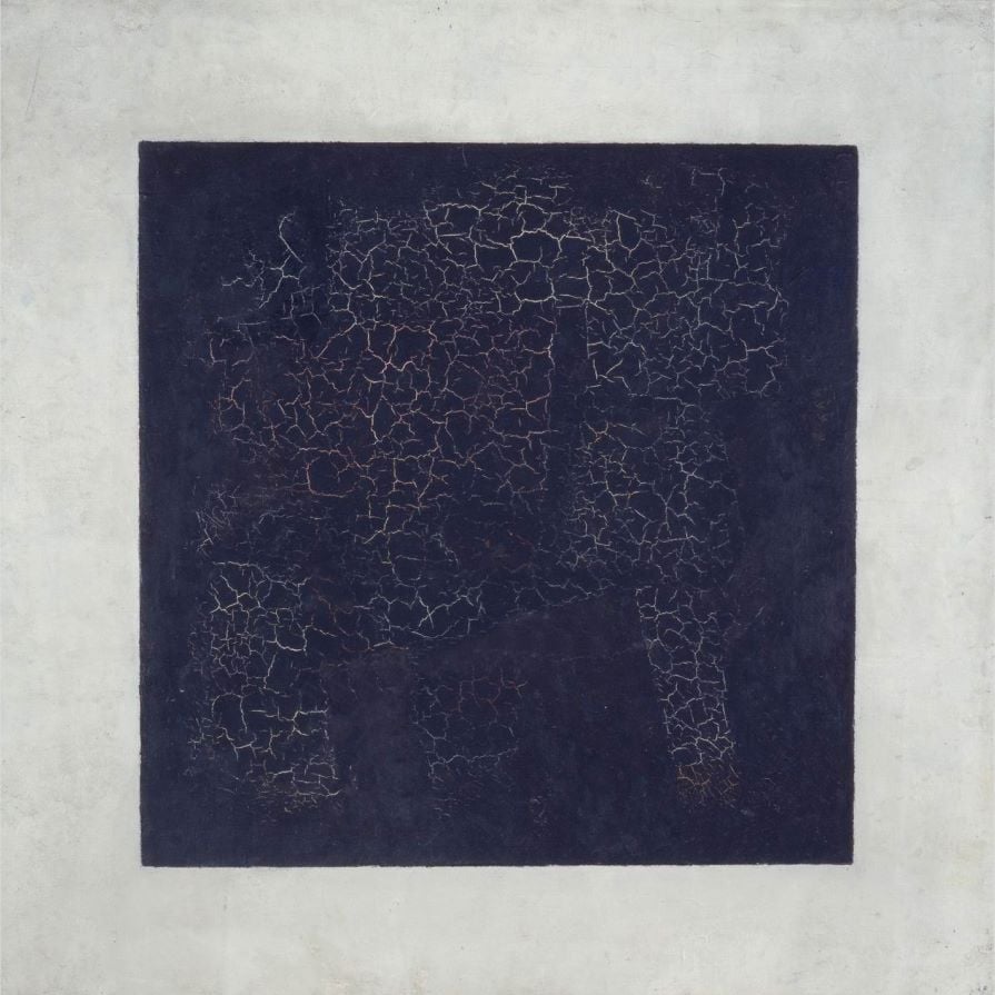
Kazimir Malevich, in 1915, introduced the iconic painting Black Square. This simple black square on a white canvas launched a new era in art, the main principles of which were abstraction, geometry, and emphasis on basic components:
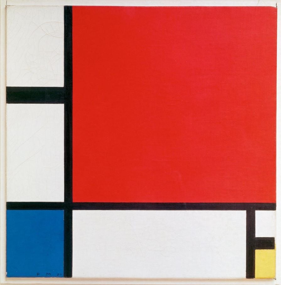
A Dutch painter Piet Mondrian played a huge role in the development of abstract minimalist art. The iconic artworks of Mondrian featured a grid of black lines creating squares and rectangles filled with primary colors —red, blue, and yellow.
The arrangement of these elements aimed to create a sense of order and harmony. His works inspired minimalist artists in the 1960s and 1970s with their simplicity and geometric precision. When you think “minimalism,” this is probably the first artwork that comes to mind:
“Form follows function” is a popular phrase of modern designers and architects. You can see it exemplified in the art we’ve showcased. This concept motivates designers across different fields to prioritize how their design is used over how it looks.
Firstly, the phrase was used by Louis Sullivan, an American architect, and one of the pioneers of modernist architecture. This famous quote was a part of the article published in the architectural magazine Lippincott’s Magazine in 1896:
Whether it be the sweeping eagle in his flight, or the open apple-blossom, the toiling work-horse, the blithe swan, the branching oak, the winding stream at its base, the drifting clouds, over all the coursing sun, form ever follows function, and this is the law. Where function does not change, form does not change.
Louis Sullivan believed that the design of the building is firstly purpose and function, rather than historical or ornamental styles. He aimed to create buildings that organically harmonize with their environment, much like the way a plant grows.
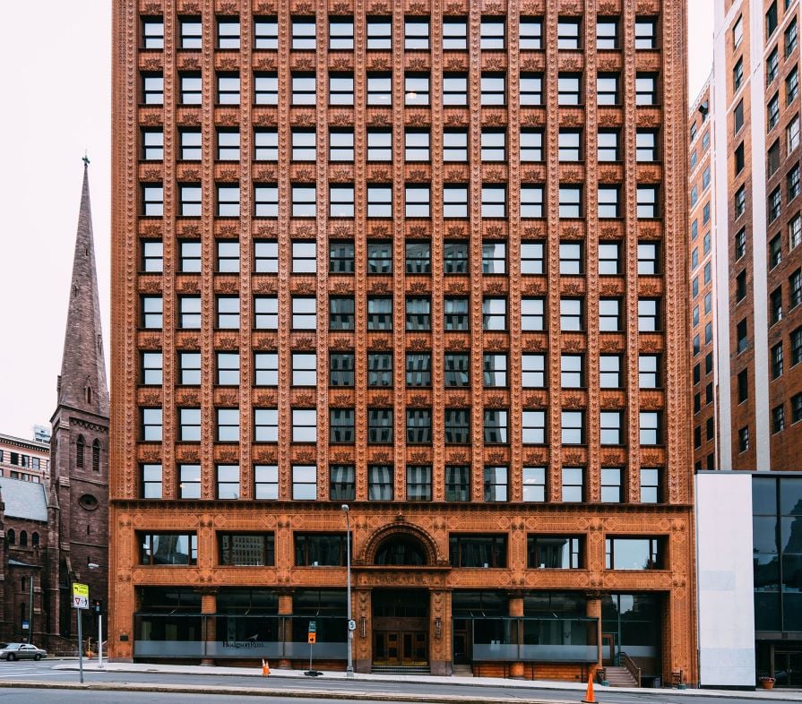
One of the most significant of Sullivan’s achievements is his innovative steel-frame constructions, which are considered to be among the earliest skyscrapers:
In the late eighteenth century and early twentieth century, the Industrial Revolution began. It had a great influence on manufacturing, transportation, and urbanization.
Cities grew, and we developed new technologies and materials. Buildings were designed more practically and efficiently than before. The focus shifted from making things fancy to making them function well.
Sullivan popularized the concept of organic architecture, aiming for harmony between human living spaces and the natural environment. Form follows function meant that the shape of the building should be related to its purpose.
The argument originated from industrialization, especially in architecture, emphasizing simpler forms, a key principle of minimalism. You could argue that the modern technology in web and app design can encourage minimalism, too.
Just as we developed new materials and technology that encouraged the path toward minimalism in the Industrial Revolution, so too have we created technologies that encourage minimalism in web design.
With the amount of information we need to convey in a single design, minimalism is instrumental. Let’s look at some of the hallmark characteristics of minimalism.
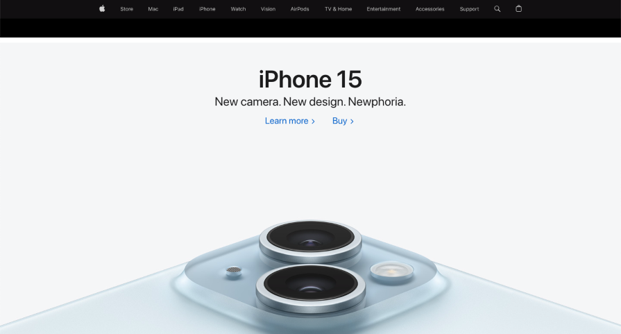
Using a white background provides a clean and simple layout that helps to accent the key elements. This is the same principle minimalist artists applied in their artworks using a white canvas to emphasize purity and simplicity:
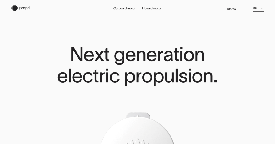
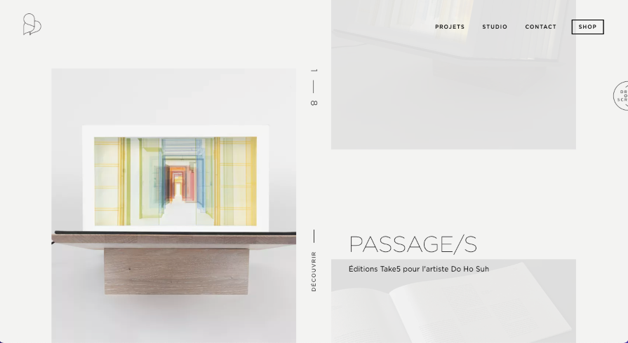
Using white or negative space helps to focus users’ attention on the message, increases readability, and prioritizes content. Negative space also helps to craft harmonious and balanced compositions:
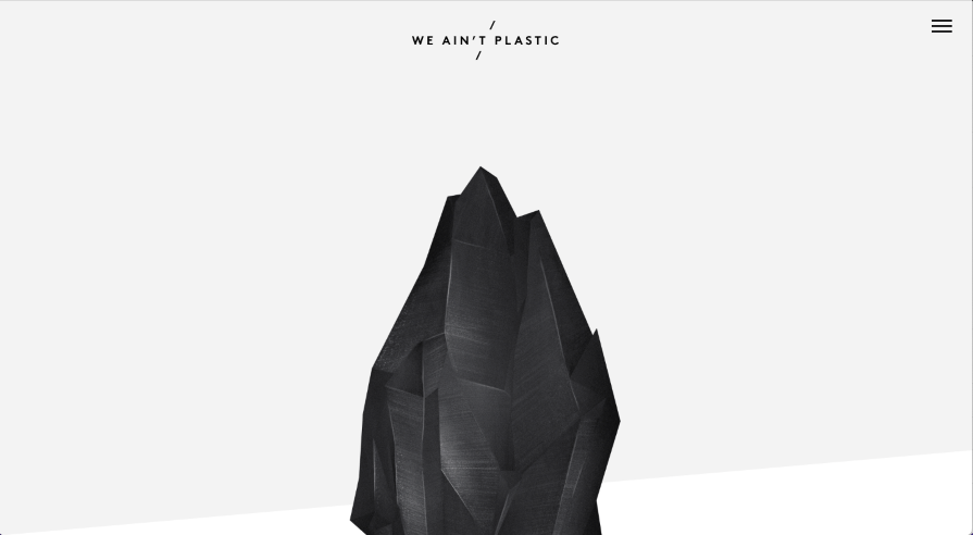
Bold, vibrant colors help draw users’ attention, evoke emotions, and emphasize key elements or visuals, such as call-to-action buttons, or important information:
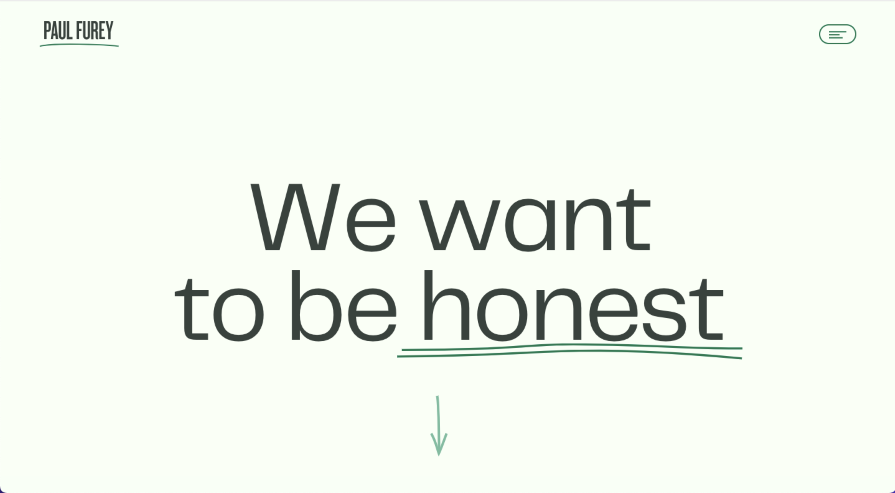
In minimalist design, text becomes a key element contributing to both aesthetic appeal and functionality. Designers often choose clean, uncluttered, sans serif fonts in minimal design, as they help to improve readability, creating a modern and visually appealing look for the webpage:
Minimalist design can influence user experience greatly. By reducing unnecessary elements and focusing on the task, minimalist design makes the user experience more intuitive. Simplicity achieved with fewer elements reduces cognitive load, making the user flow smooth.
Here are the steps that can help you simplify UI design for a better experience and create a design that aligns with the minimal concept in design.
If you prioritize tasks over the visual elements, you can reduce all unnecessary elements such as text, icons, and features that don’t contribute to the core functionality. Focus on user interaction and the tasks the user should complete.
To create an intuitive user experience, craft a clear hierarchy of information to guide users through tasks. Ensure an easy-to-navigate menu, maintain consistency in navigation elements such as buttons and links, reduce the number of clicks, provide feedback, and eliminate unnecessary steps. Apply a progressive disclosure approach, giving clear, step-by-step instructions.
According to Hick’s Law, reducing the number of choices enables users to make a decision quickly. Limiting options and focusing on the main action the user is expected to complete aligns with the fundamental minimalist principle that less is more.
Reducing visual noise means limiting the color palette to a few colors and avoiding unnecessary decorating elements, such as gradients, shadows, and icons. Less is more, remember? These steps will help you to create a clean and simple interface, focused on a core goal — to engage users. In addition, limiting the number of fonts and styles, and optimizing content to avoid overcrowding, will help you to create an exceptional, user friendly design.
While minimalism became popular in the 60s and 70s, its influence on art and design continues. The concept of “less is more” influences many fields: product design, interface look, art, fashion, and lifestyle.
Comparing minimalism to modern UI design trends like animated gradients, glassmorphism, and neubrutalism, minimalism prioritizes essential and timeless elements. Trends, on the other hand, bring in new visual elements, such as the semi-transparent effect of glassmorphism or the bold typography in neubrutalism, which are more based on user preferences, potentially resulting in a shorter lifespan.
I believe minimalism is a timeless philosophy because it avoids features that quickly become outdated. Its focus on functionality and purpose helps maintain the minimalist design’s timelessness and ensures understanding for every user.
You never get tired of essentials, as they stay clear and attractive over time. Minimalism focuses on functionality and allows users to interact with the interface easily providing a reliable experience.
Minimalism is a timeless concept, it can be applied to the various aspects of our life — design, environment and spaces, consumerism, and even decision making.
Implimenting minimalist principles to UX design can reduce complexity. Visual designers inspired by minimal art can craft clean, uncluttered, and timeless digital products. To study minimalism more deeply, I recommend reading these books:
Header image source: IconScout
LogRocket's Galileo AI watches sessions and understands user feedback for you, automating the most time-intensive parts of your job and giving you more time to focus on great design.
See how design choices, interactions, and issues affect your users — get a demo of LogRocket today.

Adaptive interfaces personalize experiences using behavioral signals and machine learning. But when personalization becomes autonomous, systems can reinforce patterns, limit discovery, and shape user behavior in ways designers didn’t intend.

Security requirements shouldn’t come at the cost of usability. This guide outlines 10 practical heuristics to design 2FA flows that protect users while minimizing friction, confusion, and recovery failures.

2FA failures shouldn’t mean permanent lockout. This guide breaks down recovery methods, failure handling, progressive disclosure, and UX strategies to balance security with accessibility.

Two-factor authentication should be secure, but it shouldn’t frustrate users. This guide explores standard 2FA user flow patterns for SMS, TOTP, and biometrics, along with edge cases, recovery strategies, and UX best practices.