Editor’s note: This article was updated on 11 November 2024 to discuss Midjourney’s advancements in 2024, provide a step-by-step workflow for creating UIs and UI components with Midjourney, update prompt examples and use cases, and add tips for working with Midjourney, along with a new downloadable resource containing sample prompts and more.
Midjourney is one of the top image generation models on the market. Besides creating images and illustrations for websites, blog post images, and other marketing materials, you can also use Midjourney to produce user interface images. Similar tools include Stable Diffusion, DALL-E, Leonardo, and Flux AI.
With Midjourney, you can only generate pixel images, not vector images, so editing them in Figma takes time. However, the tool is still an effective resource for generating inspiration ideas for UI design with minimal effort, enabling you to ideate and iterate more rapidly than traditional methods like sketching and wireframing. Using Midjourney to generate UI ideas vastly simplifies the process of exploring creatively and executing efficiently.
In 2024, Midjourney added some remarkable new features that help to generate more accurate and precise images. These features go beyond just the quality of generated images, which has also improved since models 6 and 6.1 were released:
In this post, I will touch on the basics of Midjourney and how every UX and product designer can get inspiration for creating user interfaces using this platform. You can also download this free cheat sheet of Midjourney UI design prompts and tips as a helpful resource.
Are you ready? Let’s start.
Midjourney is a product that generates images based on requests. You write a prompt that tells the AI what you want. Then, the artificial intelligence translates it into a picture, illustration, icon, or logo. Midjourney’s AI can generate almost any visual representation you need.
In addition to generating images, Midjourney has a website where you can manage your account, view your result history, and search for images that community members have generated to gain inspiration.
As with many online tools, you need to create a Midjourney account with your Google or Discord credentials. Upon registering, you will receive 25 free images, and to generate more, you must be a paid subscriber.
To create an image, you need to write a prompt, send it, and the machine will give you four results you can play with. The basic actions to play with an image are Zoom in, Pan, and Upscale.
If you are unsatisfied with the results, click on the Prompt button, and the prompt will copy to the input so you can generate another set of four images.
An advanced way to iterate the image is to click on the Editor button so you can make more detailed changes like inpainting, which entails filling in missing parts of an image with new content.
You can find all the available action variations on the Midjourney website, but you can achieve great results with basic commands:
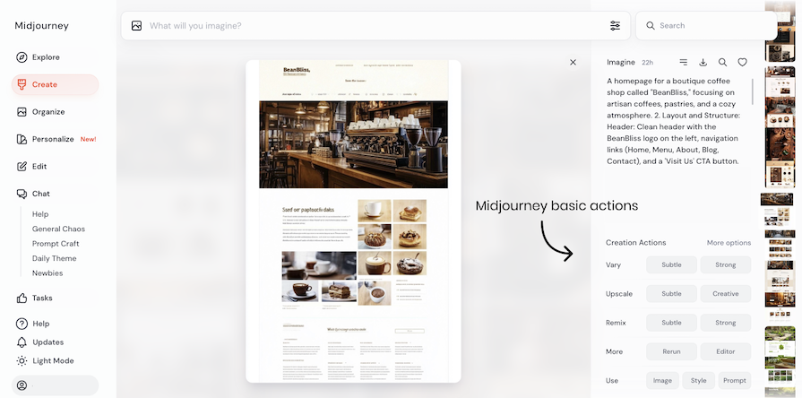
Here’s a simple process for using Midjourney to move from idea to final design. I’ll explain it for website design, but it works for any UI design or visual element. Treat this as a guide and tweak it to fit your needs.
More of a visual learner? Watch our TikTok video below:
@log.rocket Besides creating images and illustrations for websites, blog post images, and other marketing materials, Midjourney can also produce user interface images. Midjourney can only generate pixel images, not vector images. This means that editing them in Figma takes time. However, the tool is still an effective resource for generating inspiration ideas for UI design with minimal effort. #midjourney #uidesign #uidesigntips #uidesigntrends #aidesigntools #uidesigntools ♬ Relax – Neto0_0
Before leveraging Midjourney for UI design, we must clearly understand what we want to achieve with the tool by writing a brief to guide us in the creative process. A clear scope of the task helps guide your design process and focus you on the final result you want to achieve. For example:
“A website for a local Neapolitan pizza restaurant, with red, white, and green colors. The design should be minimal, with photos.”
You can use the ideas in the brief to write prompts to achieve the visual design of the website or application you are building.
Based on your brief, write a detailed prompt. Add as many specifics as possible, such as the number of sections, colors, and design style.
Play with the parameters to refine the output. For instance, increase the variety value to get different outputs per generation. For a full-page design, use a vertical aspect ratio (e.g., 1:2), while for a header, opt for a wider ratio (e.g., 9:16):
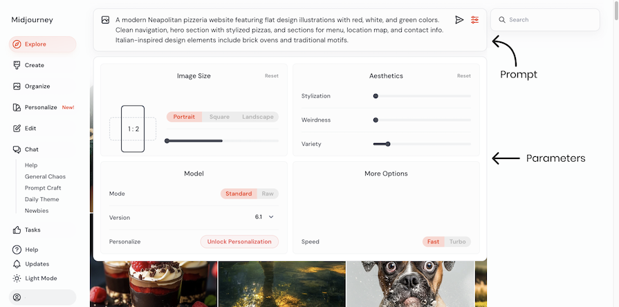
Prompt example:
“A modern Neapolitan pizzeria website featuring design with real photos with red, white and green colors. Clean navigation, hero section with stylized pizzas and sections for menu, location map and contact info. Italian-inspired design elements include brick ovens and traditional motifs”
Parameters: Variety: 15, ar 1:2, Version 6.1
Result:
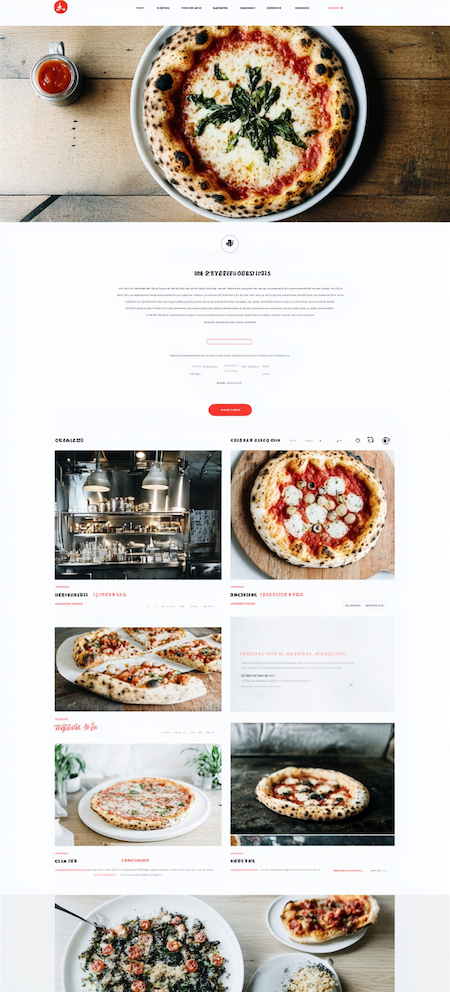
The true potential of Midjourney for UI design lies in its ability to generate numerous ideas for you in just one click. Unlike browsing websites for inspiration, you can input a prompt and receive results that align with your design brief. Previously, we relied on screenshots from various websites to gain inspiration.
You can generate multiple images and group them to create an inspiration board for your product’s visual design. Additionally, you can generate pages for both mobile and desktop devices, providing a more authentic feel. However, Midjourney will not be able to create the logic of the digital product, such as the flow of architectural information, just the visual design.
Adjust the prompt to get varied results. For example, change the style of the output. You can also add a reference image to align the generated visuals with your desired style.
Here’s a refined version of the prompt from before:
“A modern Neapolitan pizzeria website featuring flat design illustrations with red, white, and green colors. Clean navigation, hero section with stylized pizzas, and sections for menu, location map, and contact info. Italian-inspired design elements include brick ovens and traditional motifs.”
Parameters: Variety: 15, ar 1:2, Version 6.1
The updated result looks like so:
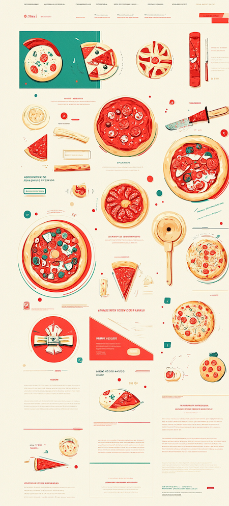
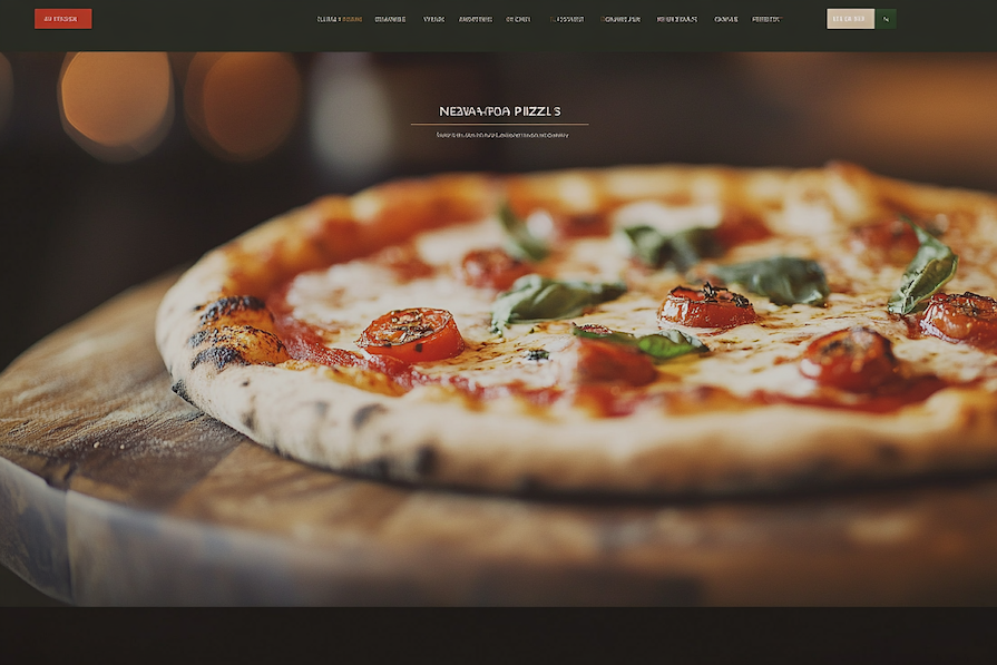
What’s more, if you focus on one part of the website, like an icon for your app or an image for your website, you can do so with Midjourney. For example, if you require a specific hero image for your homepage, you can generate multiple images and choose the most suitable one for the main page.
Prompt example:
“A hero section for a Neapolitan pizzeria featuring a full-width image of a rustic pizza with red, white and green accent colors. The section includes a bold headline and a clean navigation bar with traditional Italian design motifs.”
Parameters: Variety: 15, ar 3:2, Version 6.1
Result:
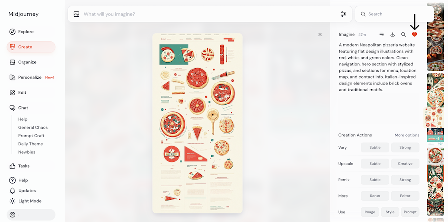
Save all images that you like. You can download them immediately or simply like them with the heart icon to easily revisit them later:
It is essential to note that Midjourney sometimes generates UI interfaces that are impossible to create or images that are not close to reality. For this reason, it is essential to learn from real apps and websites to understand where the limits are. Otherwise, you may create something that does not look real or cannot be developed.
Once you have enough inspiration, move these visuals into Figma (or any design tool). Create your designs based on this inspiration. Then, as usual, refine and present your work to the team.
With Midjourney, you can generate a wide range of visual assets: full UI designs for websites or applications, icons, hero section images, and branding elements like logos. Unlike traditional tools, you simply describe what you want, and Midjourney generates the image for you. Additionally, there are tools within Midjourney that make editing easier.
Here are some examples, along with prompts, to help you better understand its capabilities.
Example prompt:
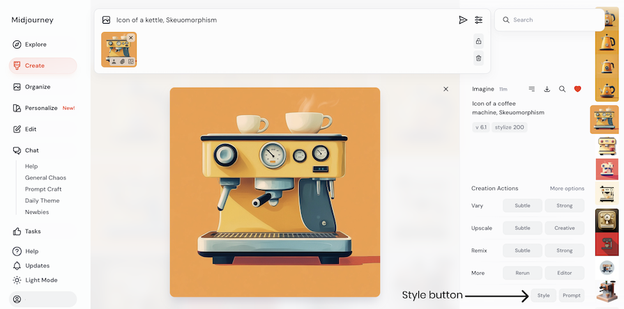
“Icon of a coffee machine, Skeuomorphism”
Parameters: Version 6.1, stylize 200
Result:
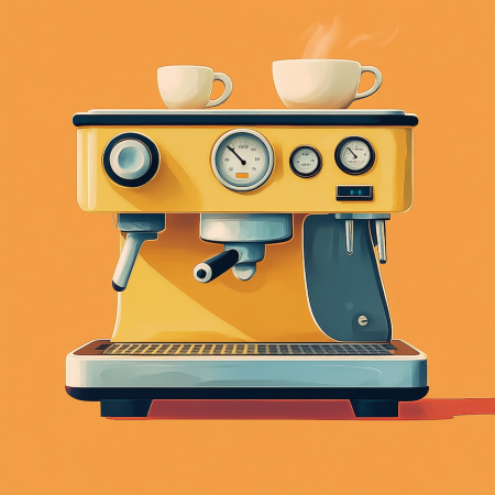
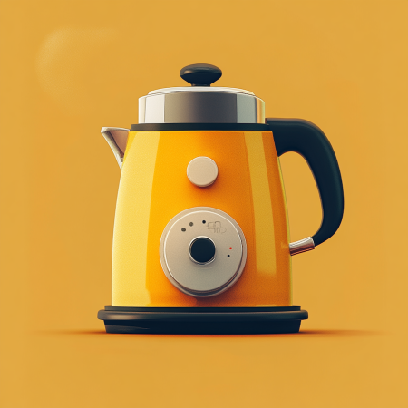
If you like the visual design and want to create a new icon, such as one for a kettle, you can use the generated image as a style reference. This allows you to generate a new icon with the same style. Simply click on the Style button at the bottom of the screen, add a prompt, and generate:
You can use this technique for any UI design asset. Here’s an example result:
Example prompt:
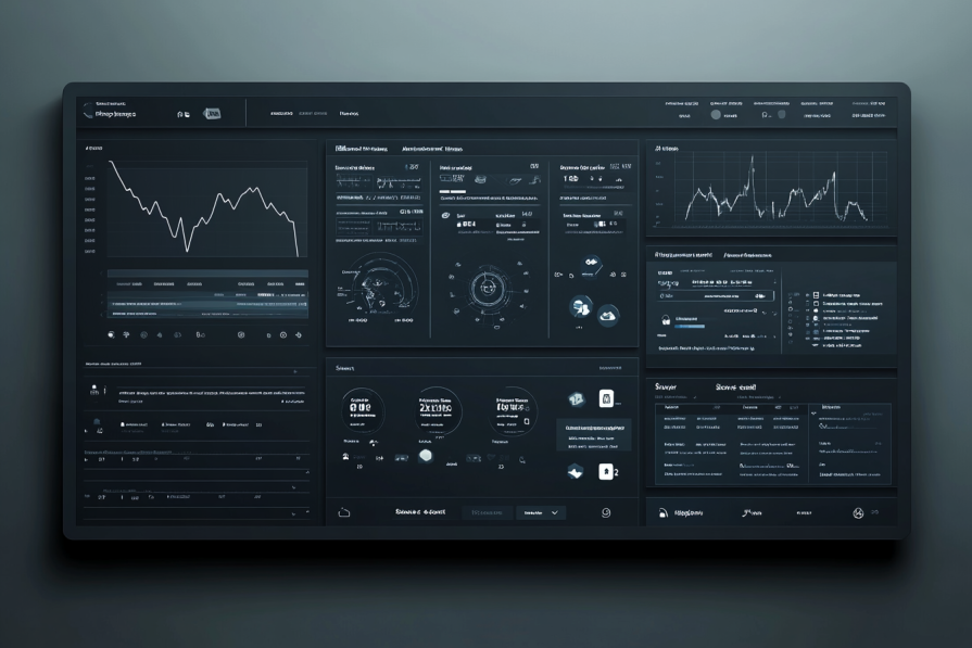
“A modern and minimalistic dashboard layout for a project management platform targeted at tech-savvy professionals and teams. The design features an intuitive navigation sidebar, a top bar with user profile and notifications, and key sections including an interactive calendar, task overview, progress charts, and team collaboration tools. Use a color scheme of cool blues, grays, and subtle accents of green to evoke trust, efficiency, and focus. The overall aesthetic should be clean, professional, and highly functional, with smooth transitions and hover effects. Exclude distracting elements like decorative images; instead, focus on simple icons, data visualizations, and clean typography.”
Parameters: Variety: 5, ar 3:2, Stylize: 300 Version: 6.1
Result:
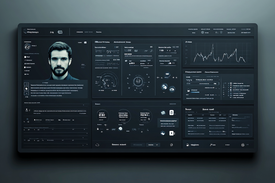
To make changes to the image, click the Editor button at the bottom of the screen. Then, remove the part you want to change with the Erase tool, write a prompt explaining what you want to do, and click Submit:
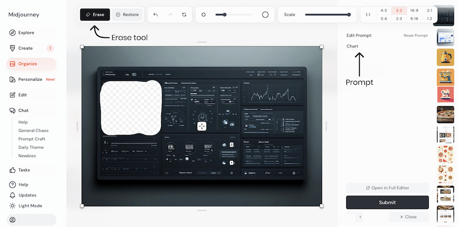
Here’s the updated result:
Example prompt:
“A clean mobile delivery app interface with quick-access buttons for restaurant search, order tracking, and history. Features include a live map, favorites section, and profile area, using vibrant orange and green accents on a neutral background for a sleek, functional design.”
Parameters: Variety: 5, ar 9:16, Stylize: 700 Version: 6.1
Result:
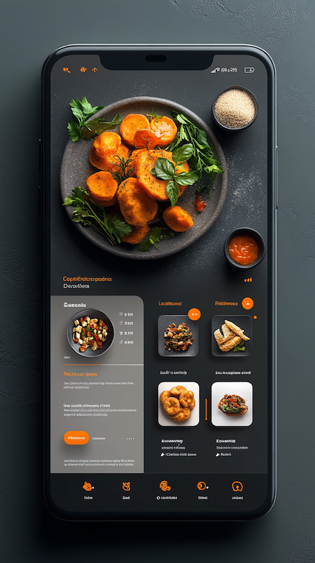
You can use the tips above to continue iterating on this idea, edit specific aspects of the UI design, or create other UI design ideas in the same style for other screens within the app.
Prompt example:
“A professional hero section illustration for a law firm, featuring the full team”
Parameters: Variety: 5, ar 16:9, Stylize: 200 Version: 6.1
Result:
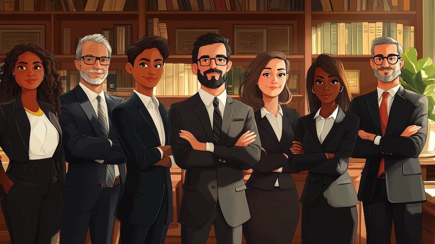
As before, you can update, refine, or further iterate on this example UI design using Midjourney until you land on an idea you like.
Midjourney is a tool that helps you get ideas for design, not create the final design. You should remember this when using it. While Midjourney won’t give you a complete design, it will give you inspiration that you can use to make your own designs in Figma or another design tool.
Refining your prompts in Midjourney will help you get as close as possible to a final UI design idea that you can easily execute. Let’s go through some tips for writing an excellent Midjourney prompt.
First, try to navigate in the search feature in Midjourney, using keywords to look for inspiration for your desired design. Starting with search will save you time and help you refine the keywords to use in your eventual prompt.
With so many images available in the search results, it’s even possible you’ll find what you are searching for right away, allowing you to use an existing image as a reference or basis for your prompt later:
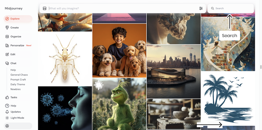
If you find an image you like using Midjourney’s search feature, you can click into the image to see the prompt used to create it. Instead of copying the image and iterating on it, copy the prompt and start to iterate from there.
For example, if you find a design of a website in dark mode but want this design in white mode, change the prompt and execute it to get the results you desire:
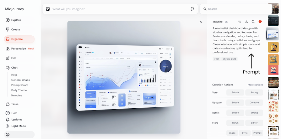
Templates make writing easier by giving you a structure to follow. You can create your own templates that fit your needs, or use websites that help you write prompts.
Here is a template I often use for UI design, so you can use it too:
A [design style] website layout for a [purpose/audience]. The design features [key elements and layout details], including [specific sections or features]. Use a color scheme of [colors] to express [emotions/brand identity]. The overall aesthetic should be [adjectives describing the look and feel]. [Include or exclude] [specific imagery or elements].
In addition, these websites can help you to write prompts:
If you want to start from scratch, or if you tried the above tactics and didn’t get the desired results, make sure you provide as many details as possible in your prompt. For example, if you need a full website landing page, describe every section, the color scheme, and the design style. Doing so will create the design element in your requested specific design style.
Additionally, set the aspect ratio to vertical for a complete page view. You can also write fewer details, but in some cases, you will not get a good result.
Midjourney offers various parameters. By changing them, you can customize AI results, so it’s a smart idea to know and experiment with them. Here are some common examples. To study them more extensively, please visit the Midjourney page on parameters. Here are the parameters I use the most:
Here is an example of the prompt as follows: “Website UI flat design for a local coffee shop, with a warm color palette -no cakes.
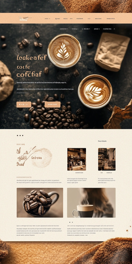
Beyond the tips above, here’s some general advice as you start writing prompts in Midjourney:
Let’s expand on that last point a little. To play with the Midjourney versions, add the prompt –v and the number of the version — for example, –v 4. Here is an example of the prompt “Website UI flat design with illustrations, for a local coffee shop, with a warm color palette” with the version parameter set to version 4:
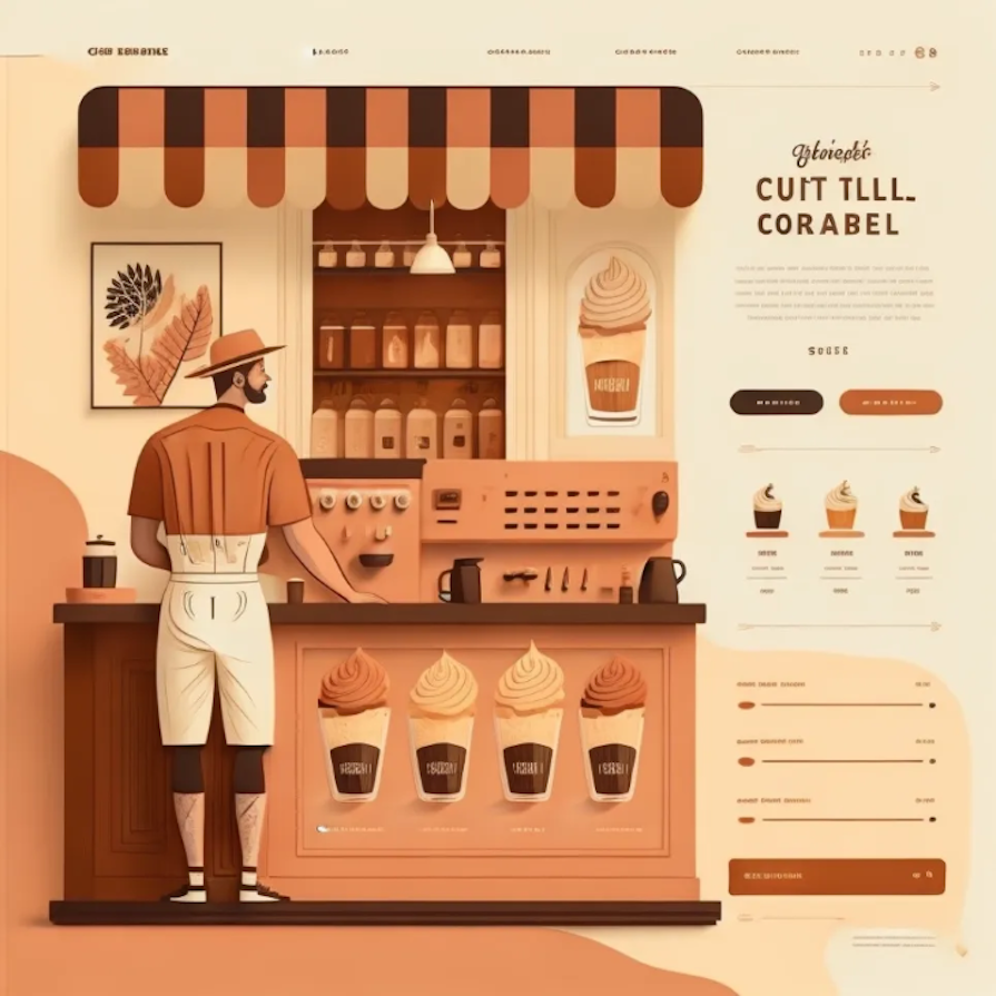
We’ve talked through a lot of steps, tips, and prompts so far. If you’re feeling overwhelmed, or if you want a helpful cheat sheet covering everything we’ve discussed at a high level, I’m here to help!
Download your free cheat sheet of Midjourney UI design prompts here.
Many AI tools are available today, and it can be confusing to understand their differences. Let’s focus on four key tools: Midjourney, Figma AI, Adobe Firefly, and DALL-E. I’ll explain the main differences first, followed by a detailed table below.
Midjourney, Adobe Firefly, and DALL-E are excellent for creating logos, images, and icons. While they deliver good results, you’ll need to make tweaks to achieve your desired outcome. If you want to work with vector files, you’ll need an additional tool like vectorizer.ai to refine or adjust the designs.
Figma AI can also create visual assets but is best for crafting detailed user interface (UI) designs. It allows easy editing of design components directly in the software and lets you use prompts for quick changes.
Be aware that these tools change constantly, and many capabilities are added to them sometimes every week.
These are the key differences. Check the table below for more details:
| Feature | Midjourney | Figma AI | Adobe Firefly | DALL-E |
|---|---|---|---|---|
| Visual fidelity | Depending on the asset, visual assets are more accurate than UI design | Good for visual assets, great for UI design | Depending on the asset, visual assets are more accurate than UI design | Depending on the asset, visual assets are more accurate than UI design |
| UI design | Great for UI design inspiration | Creates accurate UI designs | Great for UI design inspiration | Great for UI design inspiration |
| Visual asset capabilities (icons, logos) |
Creates creative visual assets in various styles | Medium visual asset design capabilities | Creates creative visual assets in various styles | Good visual asset design capabilities |
| Ease of use | Intuitive but requires prompt crafting | Simple to use with seamless integration into Figma | Simple interface with easy prompt writing due to inputs in the interface | Intuitive, but requires prompt crafting |
| Iteration speed | Fast | Fast for images, slower for UI due to more visual assets | Fast | Fast |
| Collaboration | Limited | Full collaboration. | Limited | Basic collaboration by sharing the results |
| Editing capabilities | Good editing with new generated images or uploaded images | Great editing possibilities after generation for UI design. More basic for images | A good editing tool with a wide range of options in the Adobe ecosystem | Minimal and basic editing tools |
| Free plan details | First 25 images free, then plans from $8/month (billed annually) | Available on Figma’s Free plan | 25 free generative credits every month |
Two free images per day |
As a popular tool, there are plenty of frequently asked questions about how to apply Midjourney effectively for UI generation. Here are some answers to questions I’ve had or been asked:
If you have other questions, feel free to comment below!
Firstly, I am not an expert in legal copyright issues, so the information provided should NOT be taken as legal advice. Because the technology is new and has a few years of experience, there are many areas for improvement regarding content use. Using the results cautiously is a smart idea until everything becomes clear.
For example, if you create an icon for your website, you can use the ideas the tool generates and create your icon; do not copy and paste it. Instead, you can use an element in the icon and iterate from there. Another thing people do today is add text below images created with AI tools to clarify to readers that the image is not real.
Because there are no clear rules, using common sense when working with this tool is smart. You can be on the safe side or consult an expert if there is any doubt.
In this article, we explored how to use Midjourney to assist with UI design. First, I explained what Midjourney is, how it’s been updated and improved in 2024, what a prompt is, how the tool works, and how it can help us brainstorm ideas more effectively.
Next, we walked through a step-by-step guide to help you understand how to generate UI design elements with Midjourney, from setting the scope to creating final results in Figma or another design tool.
After that, we looked at the types of assets you can design using the tool, such as dashboards, icons, and hero images for websites. Remember, Midjourney only gives you a draft, which you will need to improve or execute with another design tool.
We also covered how to write an effective prompt with tips and ideas to help you research and iterate until you reach the ideal outcome. It’s important to note that you shouldn’t stress about finding the perfect prompt because the tool will never give you a final solution. It’s all about experimenting and refining the results.
Finally, we discussed how to use Midjourney ethically, compared the different tools available today, and addressed additional questions you might have.
Now it’s your turn to get creative and experiment with the tool! Don’t forget to download this helpful cheat sheet of prompts and tips as you get started.
LogRocket's Galileo AI watches sessions and understands user feedback for you, automating the most time-intensive parts of your job and giving you more time to focus on great design.
See how design choices, interactions, and issues affect your users — get a demo of LogRocket today.
A three-week mobile banking project taught me that the “proper” UX process is not always realistic. Sometimes, the better approach is to work with what you know, identify what you still need to learn, and make the strongest decision possible under real constraints.
A/B testing compares two versions of a design to see which performs better with real users. Here’s how UX teams can use it to test hypotheses, measure outcomes, and make smarter product decisions.
This case study shows how one ad experience redesign increased total ad exposure while lowering perceived friction, proving that timing and context can matter more than raw interruption.

As products evolve into ecosystems, navigation becomes a system-level challenge. This article explores how to align structure, context, and user journeys to create seamless movement across tools without confusion.