Are you curious to find out more about magic links? In this article, we’ll be outlining exactly how and why magic links can enhance the overall user experience for visitors to your website or app.

We’ll be covering magic links’ role in user authentication, how to implement them, and the UX best practices you need to bear in mind when using them. Ready to learn more? Here’s exactly what we’ll be covering:

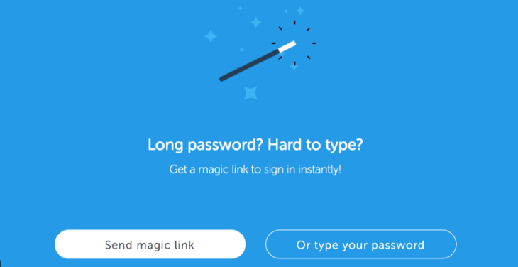
A magic link is a URL that authenticates a user when they click on it, without the need for additional information, passwords, or identification. With the popularity and adoption of this handy authentication device increasing in recent years, you’ll no doubt have already encountered magic links when registering or logging into different apps and services.
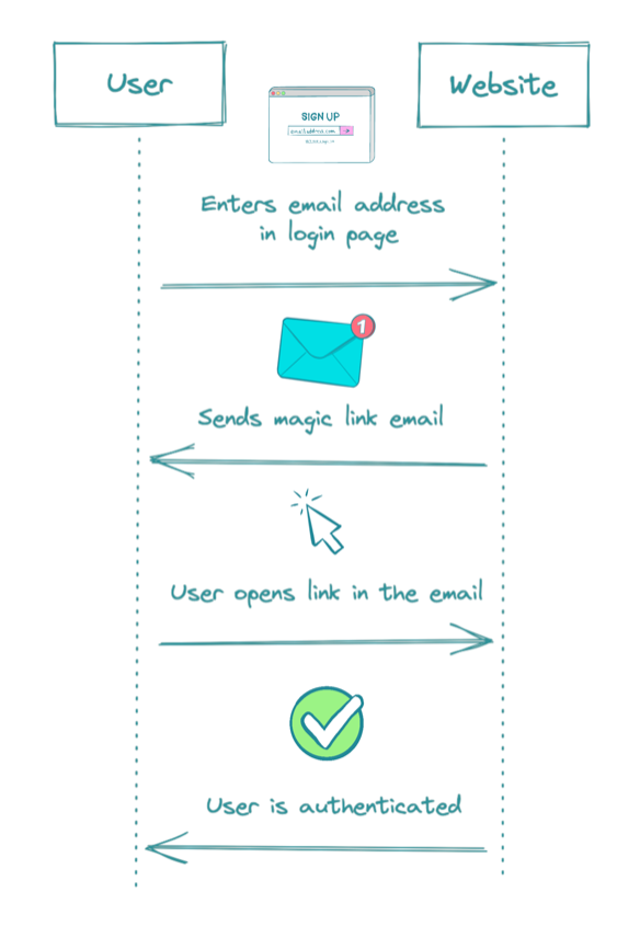
The most common use of a magic link is on the log in or registration page of a website or app to enable a passwordless login. Instead of being asked to provide an email and password (and then verify your email separately) the user simply has to:
This process ensures that users never need to set or remember a password, nor do they need to use a password manager to store their passwords. Resetting passwords (when forgotten) also becomes a thing of the past.
Magic links aren’t limited to this one use, however. Other uses include:
Let’s take a look at how magic links work from both the user end and the development end.

From the user end, magic links are very simple.
There are numerous benefits for businesses, development teams, and users when magic links are adopted, ranging from additional security through to convenience. Let’s dive into them in a bit more detail.
For businesses, magic links are a no-brainer. Studies show that a whopping 45 percent of all users leave a page when they are asked to create an account. And it makes sense. Creating an account is time consuming, and, if users want to use just one feature of a site, going to this effort may not seem worth it.
When businesses implement magic links they can retain and convert many more website visitors into account holders without hindering the user experience or taking up time. With instant registration, users are kept on the site, too.
As we have seen, magic links speed up the registration process and enable users to sign up without needing to remember or store a password. They also prevent users having to reset a password if it has been forgotten. Finally, they increase security, adding an additional layer of reassurance to users who may be concerned about sharing personal information as well as removing the insecurity of having an insecure password that might be vulnerable to attack.
All of these advantages contribute to a much more positive overall user experience which in turn sees users more likely to return to a site, recommend a service to others, and remain loyal to a brand.
Magic links can be used at various stages in the customer or user journey, not just on the registration page. Having the option to use magic links at different points provides UX designers and developers with increased flexibility in how an app or website is designed and built.
In UX design, curating the right experience for your users is paramount. This is no less true when designing the experience around magic links. Here are our top tips to ensure your users have a delightful experience with your magic links.
As many users will be using magic links for convenience and additional security, they need to be absolutely clear about what they need to do and what they can expect to happen as a result of their actions. This can be achieved through clear, concise, and comprehensive UX writing. Keep instructions simple, use specific verbs, and avoid jargon at all costs.
An intuitive experience means the user shouldn’t have to think about what they’re doing; it should come naturally. Although this should be the goal of your magic link messaging, it’s important to bear in mind that users don’t want to be surprised, either. Your instructions will need to be a delicate balance of managing user expectations with clear instructions (with the assumption that they have not used magic links before) while making the experience feel seamless and natural.
Responsive design in UX is when the website or app responds and adapts directly to the device it’s being viewed on. This promotes usability and seamless interactions, while enhancing navigation and helping users find what they’re looking for.
You’ll need to consider how your magic link and the app it takes users to respond and adapt to the device they’re being viewed on. Be sure to make adjustments to elements of the design to ensure that on a mobile it’s as seamless as on a laptop, and vice versa.
Magic links don’t come without their usability challenges. From email deliverability through to user familiarity, let’s take a look at some of the user experience issues you’ll need to bear in mind when implementing them into your user’s journey.
The email provider you choose to use for sending your magic links will play a big role in the success of this passwordless login method with users. You’ll want to be sure that users are actually receiving the emails containing the magic links when they click this option and that the mails don’t get relegated to a spam or promotions folder.
Additionally, if the email takes a long time to arrive in a user’s inbox this may cause them to lose faith in the process and abandon it altogether. For these reasons, make sure you choose an email delivery service you can trust.
Magic links are usually time sensitive. This means that after a certain length of time they cease to work and the user will need to generate another one (i.e., go through the same process again) in order to log in. Expiration times are actually a positive thing: they bolster security and reduce the chances of someone other than the user accessing the account.
In order to ensure users are aware that the link isn’t going to last forever, it’s important to be clear in your messaging. Explain that the link will expire at a specific time and provide simple instructions detailing what they can do if that happens.
While there are numerous usability advantages to implementing magic links, some users will be unfamiliar with the concept. To overcome this challenge, communication is key. Keeping it concise, explain in simple terms what the user can expect from the process and outline the key benefits. Be sure to offer an alternative to magic links for those who are more comfortable with a traditional password login.
Want to know how to implement magic links to ensure the most positive user experiences? Then, keep reading.
You don’t want magic links all over your site, so focus on the places where it’s logical and enhances the user experience. You can find this out by performing thorough user research before you start designing the user flow. For financial apps (or other apps that use particularly sensitive data), you may need to use additional authentication on top of the magic link to ensure a user’s data is fully secure.
Magic links are a more secure method of logging in partly because each one is unique and single use. If they could be used multiple times, users would be more vulnerable to hacking attempts. For this reason, ensure your magic links can only be used once.
Another factor which has an impact on user security is the duration that a magic link is active for. You should aim to keep your magic link duration short, particularly if the data that the user is providing within your app is very sensitive. Magic links are typically active for around fifteen minutes, however you may consider making this duration even shorter if your app hosts very sensitive data.
Once you’ve incorporated magic links into your design, you’ll want to test them with users before sending them through to the development team for implementation. You can do this by observing and interviewing users during usability testing to ensure your communication is clear and the process is seamless.
Make notes while you observe users go through each step of your magic link journey. While they’re performing these activities, observe how easily they find what they’re looking for and how effectively they can reach their goals.
When the process is over, ask them how they felt and check if anything was unclear or could be improved. With this feedback, you can tweak and enhance both the on-page communication and design as well as the look and messaging of the email they receive.
A/B testing is another effective way to compare and contrast the effectiveness of different designs and messaging. Create two versions of the on-site design and see which users respond better to. Perhaps one design sees users reaching their goals slightly faster than the other. You can perform A/B testing with the email copy too, analyzing which text sees faster response times or leads to higher open rates.
In this article, we’ve run you through everything you need to know about magic links from outlining the user and business advantages, to providing instructions for their technical implementation and UX best practices. With our tips and advice in mind, we hope you’ll have the confidence to implement magic links on your website for a more secure and seamless user experience.
LogRocket's Galileo AI watches sessions and understands user feedback for you, automating the most time-intensive parts of your job and giving you more time to focus on great design.
See how design choices, interactions, and issues affect your users — get a demo of LogRocket today.

A/B testing compares two versions of a design to see which performs better with real users. Here’s how UX teams can use it to test hypotheses, measure outcomes, and make smarter product decisions.

This case study shows how one ad experience redesign increased total ad exposure while lowering perceived friction, proving that timing and context can matter more than raw interruption.

As products evolve into ecosystems, navigation becomes a system-level challenge. This article explores how to align structure, context, and user journeys to create seamless movement across tools without confusion.

Figma’s AI features have exploded in 2026 — from text generation and image editing to full UI drafts and code handoff. But speed isn’t the same as quality. This guide breaks down every major feature, what it’s good at, and where human judgment still does the heavy lifting.