When collaborating on a design in Figma, it’s important that collaborators aren’t butting heads. More specifically, that they’re able to work within the same space as others, conduct user/UX tests, implement (develop) handed off versions, and generally work without interference.

This is where branching becomes useful.
Branching is the process of cloning a design at a particular moment in time. Branches run parallel to all other versions so that collaborators can work on their version without interference and then merge their changes into the ‘main file’ (if necessary) when they’re ready, a process referred to as ‘merging’.
The overall process of managing versions/branches is called “versioning,” and the overall timeline of events is recorded in the “version history.”
Figma comes with versioning features, which include branching. This enables collaborators to branch their main files, work on said branch, and then merge the changes when they’re ready. Similarly, other collaborators can do the same thing, so essentially there can be multiple teams working on multiple branches, and these teams can utilize all the same features that those on the main file can use, such as multiplayer and audio conversations.
All of Figma’s collaboration features together are what make Figma the best UI design tool for collaboration, which is key to helping product teams make progress without conflict.
Things can get difficult when two branches have conflicting changes; however, there’s a whole review stage designed to help teams resolve these conflicts before they’re merged. This sounds like a headache, but it’s not as bad as it seems, and it’s important to remember that branching makes collaboration (overall) easier, not easy.
Primarily, branching is designed to help teams implement a review process for design changes. Branching is also commonly used to ensure that collaborators can work without interference, especially if other collaborators want to work on the same thing. Remember, Figma enables teammates to collaborate in real-time, so even just the cursors moving around can be distracting.
Branching is also useful for developers too. Instead of having to ask: “Hey, are you still working on this?”, designers can hand off a branched version of the design to developers so that they can work in peace. This also provides a dedicated workspace for designers and developers to communicate using comments and audio conversations as needed, without interference from those in the main file.
Similarly, branching can be used for user/usability testing, providing testers with a version of the prototype that won’t accidentally be changed by another collaborator.
Let’s take a look at how it all works.
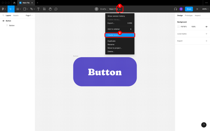
To create a branch in Figma, click on the down-arrow icon next to the file’s name in the horizontal toolbar, and then click on Create branch…:
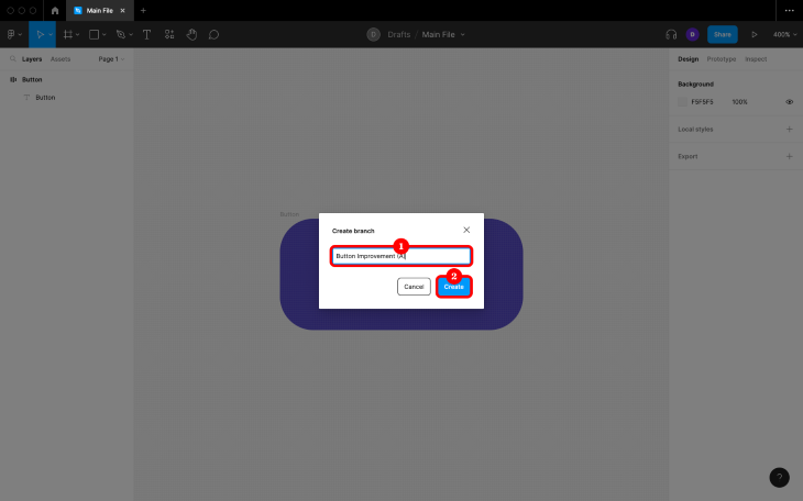
Next, give the branch a name, and then click on the Create button:
As you can imagine, maintaining branches could prove to be difficult if there are many of them, which isn’t uncommon in large teams. Plus, branching is used for a variety of reasons. Therefore, there comes a need to name them in a way that makes sense to everybody.
First, specify what the branch is for and whether the branch addresses an improvement, feature, or is just for the purpose of handoff. This lets others know what to expect of the branch later (the most likely outcome for each of those options are possible conflicts, simple merge, and archive respectively).
If there will be multiple branches as part of an exercise, experiment, or A/B test, be sure to name them clearly and consistently. Putting all this together, you might end up with something like “Button improvement (A)” and “Button improvement (B)”.
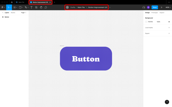
After you’ve named the branch, it should open in a new tab, where the horizontal toolbar should display the main file’s name, the branch’s name, and have a “branch” icon so it’s crystal clear where you are in terms of versioning:
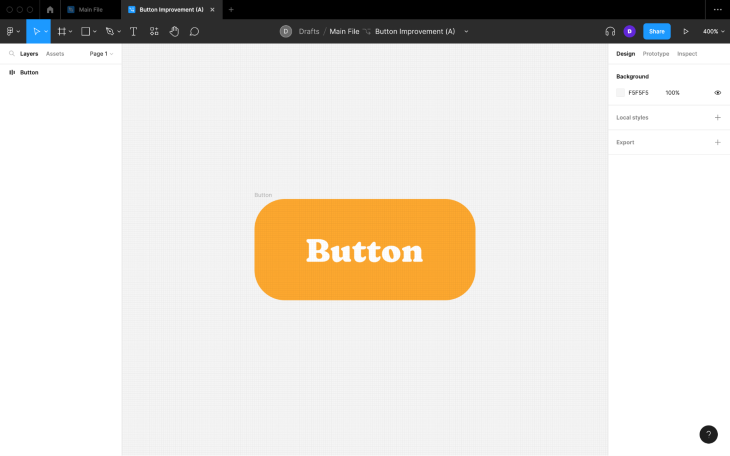
Next, make your changes. Remember that you have access to all of the same features as you would have in the main file. However, be mindful that this isn’t the main file, meaning that you must focus on what you set out to achieve with the branch. The more changes you make, the more likely you are to end up with conflicts, so no side quests (save them for another branch):
Branching can ensure that designs don’t change while conducting user or usability tests. Branches have a share link that’s different to that of the main file, so getting tests set up is simply a case of copying the share link and providing it to whichever tool you’re using for testing.
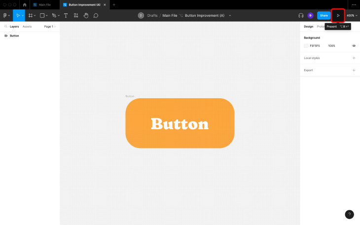
To copy a branch’s share link, click on the Present icon in the horizontal toolbar. Alternatively, you can use the ⌥ + ⌘ + delete / ctrl + alt + backspace keyboard shortcut, but note that this sometimes doesn’t work for non-US keyboards:
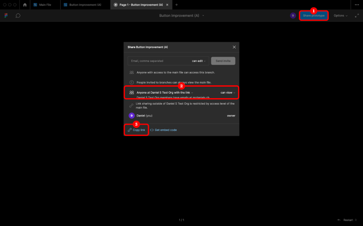
After the Present tab opens up, click on the Share prototype button in the horizontal toolbar, ensure that Anyone with the link can access the file, and then click on Copy link in the bottom-left corner of the modal window:
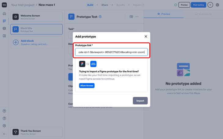
Once you have the link, simply provide it to your testing tool of choice when prompted. For example, to provide it to Maze, you would do so at the following screen:
You can also share this link with stakeholders to direct them straight to a specific branch, perhaps for stakeholder feedback.
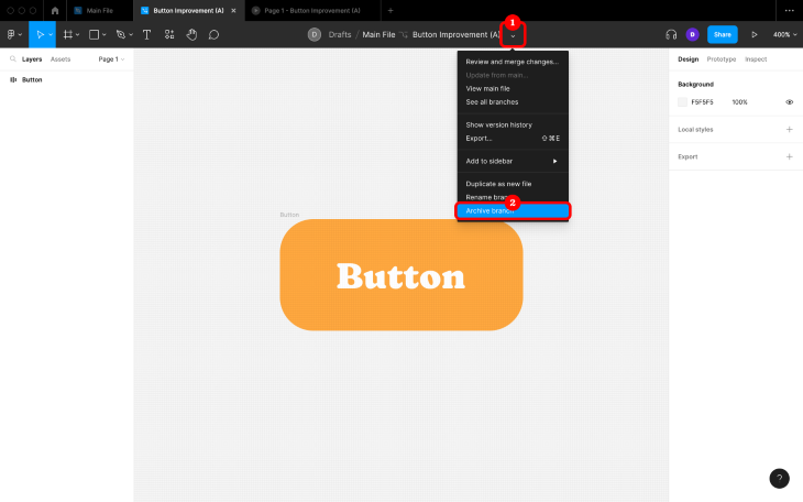
Now we merge…or do we? Keep in mind that some experiments won’t be successful, so you won’t want to merge their changes. For this reason, Figma gives us the opportunity to archive the branch, which doesn’t delete it but tucks it away just in case. To do this, click on the little down-arrow in the horizontal toolbar once again but choose Archive branch this time (super easy!):
If you do want to merge the changes, then you’ll need to choose Review and merge changes… instead:
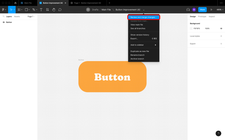
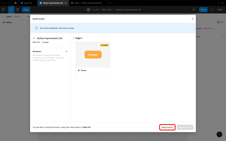
If you want to merge the changes without review, just go ahead and click on the Merge branch button:
However, if your team has a DesignOps workflow in place that includes a review process, then you’ll need to click on the + icon next to Reviewers before nominating any number of collaborators to review the changes. After that, you’ll be able to request a review by clicking on the Request review button (where you’ll get the optional opportunity to clarify which changes were made before confirming your action):
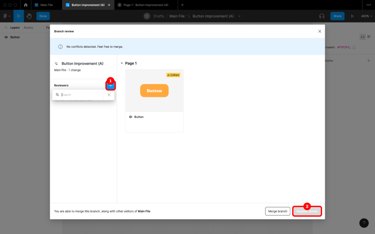
Reviewers will get a notification asking them to review the changes, which will take them to this exact modal window but with the ability to add their review.
The modal window will display the changes that were made, tagged as Added, Edited, Updated, or Removed:
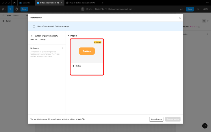
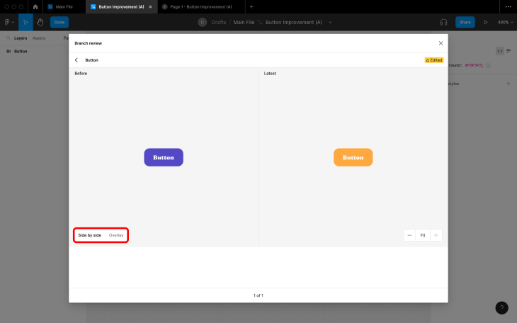
Click on a tile to preview the changes and see how the version compares to that of the main file using Side by side or Overlay view. These tiles are available to everyone, so designers can also use them to review their changes before requesting reviews from others:
After eventually clicking on Add your review, reviewers will need to choose either Approve or Suggest changes, and optionally provide some feedback before clicking on the Submit button.
If reviewers need to add any contextual feedback, they can close the modal and then leave their comments post-submission:
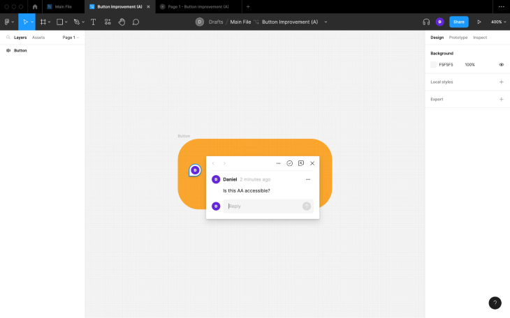
After this, the branch owner will get a notification taking them back to the branch review modal where they can address the comments and eventually restart the review process, or if the changes were approved, then merge.
Alternatively, reviewers can instant merge. Either way, the horizontal toolbar will say Approved, Changes suggested, or Merged depending on the outcome.
Once the changes have been merged, the branch will be archived and its tab will automatically close. A notification will confirm this at the bottom of the screen in the main file, and if you click on the Edit merge description button within it, you’ll be able to name and describe what was eventually merged.
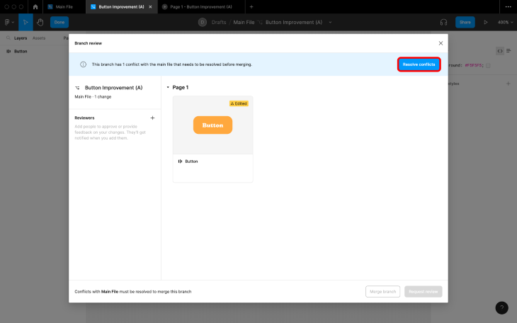
If there’s a conflict, meaning that a layer was changed in the main file and on the branch, Figma will make that clear in the modal and you won’t be able to merge until all conflicts are resolved. To do this, click on the Resolve conflicts button:
Next, pick either Keep main or Keep branch for each conflict before clicking on the Confirm picks button (you can also get to this interface via an alert that will appear in the bottom-right corner, similar to the notification you’ll get when there are changes to pull from a library):
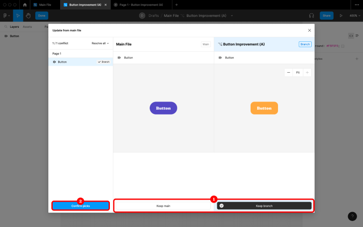
You won’t be able to keep the main file’s changes and your changes. Typically, you’ll want to choose Keep main (since those changes will have likely been reviewed and accepted), sacrificing your changes before going on to recreate them. This scenario obviously sucks, but it is very common.
However, there is a way to avoid this scenario. When there are changes in the main file (hopefully pulled from a different branch, as I would recommend never working directly in the main file and instead using branching to make, review, and merge changes), you’ll get an alert in the bottom-right corner as well as the opportunity to pull those changes into the branch, hopefully before you’ve made your own changes.
By being aware of main file changes as they happen, the likeliness of conflicts are reduced. To update, click Update from within the alert and then Apply changes from the modal window:
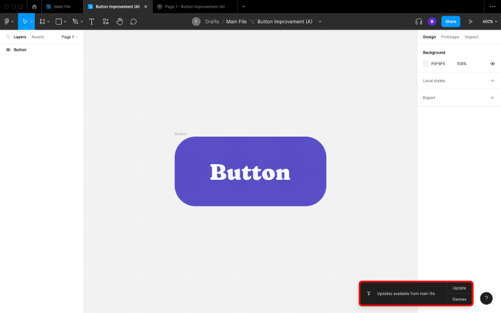
After that, just recreate your changes:
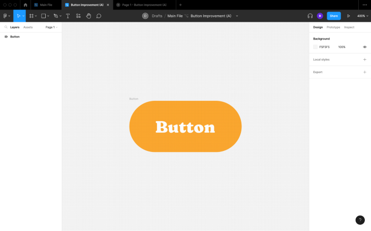
It’s also worth noting that if there are changes on a different branch, you won’t be able to pull them into your branch until those changes have been merged into the main file.
In any case, “little and often” is definitely the best way to utilize branching, and unless you’re correcting a small mistake or making a change that’s inherently a good idea, never work on the main file directly.
If developers are invited to review (even if they aren’t actually asked to review), they can use the visual regression feature (“Side by side” and/or “Overlay”) to implement the changes, providing that they’ve been approved of course. The problem is, this delays the merging process and thus other designers getting access to the changes in the main file.
For this reason, you might want to use a third-party design handoff tool rather than use what Figma offers natively.
In my opinion, Figma branching is underrated. It’s debatably the best tool that Figma has for streamlining DesignOps processes and it’s difficult to keep product teams organized without it. To add to this, branching is a feature that Figma offers natively, so there’s no need to use (or purchase!) external design versioning or design handoff tools, especially when those tools wouldn’t work with any of Figma’s other features, such as multiplayer or audio conversations.
If you have any questions about Figma branching, there’s some great documentation on their website.
Thanks for reading!
LogRocket's Galileo AI watches sessions and understands user feedback for you, automating the most time-intensive parts of your job and giving you more time to focus on great design.
See how design choices, interactions, and issues affect your users — get a demo of LogRocket today.

Multimodal UX goes beyond designing for screens. Learn how context-aware systems, progressive modality, failover modes, and accessibility-first design create better digital product experiences.
Learn how context-aware mode prioritization and seamless transitions improve multimodal UX and reduce mode confusion.

Research is becoming more democratized, product cycles are accelerating, and AI is transforming synthesis and ResearchOps. Here are the three trends shaping UX research in 2026.

Voice support is not the same as multimodal UX. Here’s how to design systems with true mode continuity and context-aware interactions.