Visual hierarchy provides a viewing order for the design elements on a page, more so design elements that are related (e.g., headings, grid items, buttons, etc.). It also conveys how important design elements are in relation to other design elements.

Without visual hierarchy, users are likely to be unsure about what to look at. They’ll also lack the necessary context for understanding information, especially in regard to how it relates to other information. As a result, users might find it difficult (or even impossible) to complete tasks, and this is exactly why designers must be able to craft perfectly understandable visual hierarchies in their designs.
In this article, we’ll take a look at the aspects of design that crucially need to convey a visual hierarchy and what we can do to make sure that happens.
Natural forms of visual hierarchy exist in the wild (i.e., web browsers implement them by default). Let’s start off by taking a look at those so that we can gain a better understanding of what visual hierarchy means in the practical sense.
On the web, web browsers apply what developers call “vendor styles” to lists (i.e., <ol>, <ul>, <dl>, and <menu> elements), which enable them to visually communicate their hierarchy right out of the box, without developers having to do anything. Specifically, they indent lists so that when lists are nested inside other lists (like in a table of contents for example), it’s easy for users to understand how the different points are further broken down into smaller points.
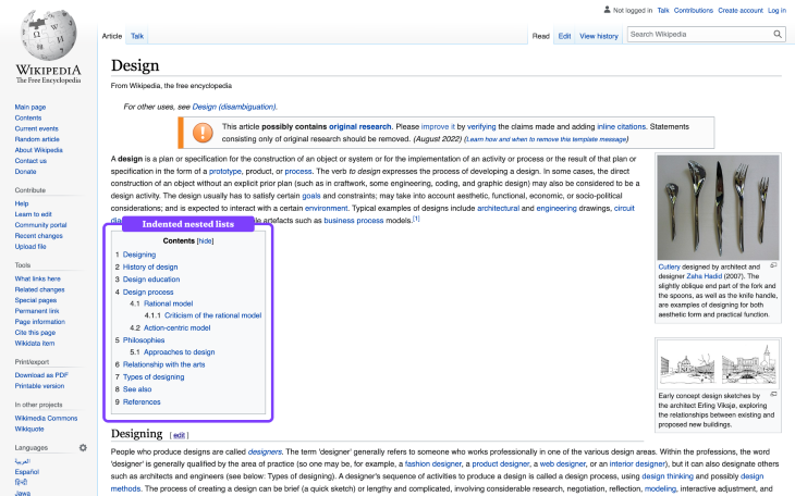
In terms of styling, there’s not much we can do to improve the visual hierarchy of lists beyond the indentations that web browsers already provide. That being said, a visual pattern that doesn’t get used enough is having different list markers for different “levels” of nesting — a small improvement, but an improvement nonetheless.
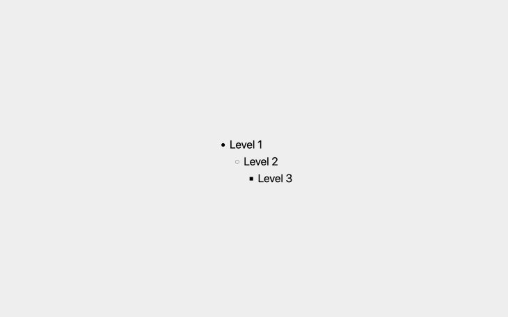
Web browsers actually provide these list markers by default too (as shown below); however, I wouldn’t say that they’re effective. In particular, level three list items (symbolized by square list markers) very poorly signify their relationship to their level two parents (symbolized by circle list markers rather than square ones) — squares are nothing like circles.
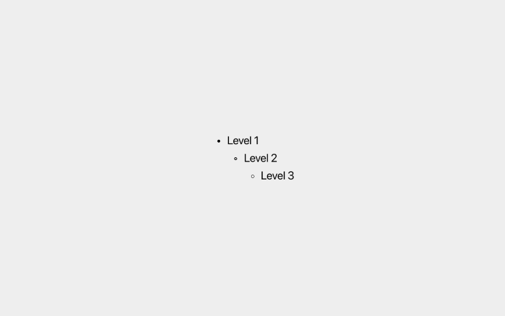
A better approach is to use borders and incrementally decrease the border width for each level. This way, all list markers have the same shape (showing that they’re related) and the importance of each list item is conveyed through the thickness of its border.
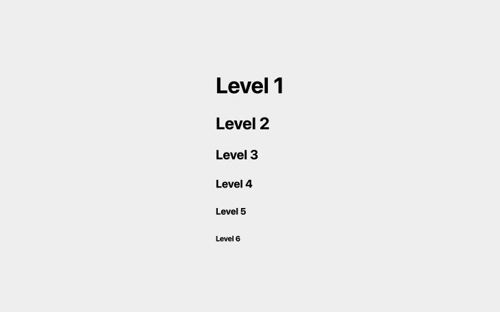
Headings are another natural (again, natural on the web at least) example of visual hierarchy. On the web, there are six different heading levels with <h1> being the primary/most important heading and <h6> being the least important. Naturally, <h1> headings are larger in terms of font size, whereas every other level is incrementally smaller. Visually, the hierarchy looks like this:
However, you’ll almost certainly want to overwrite the font sizes that web browsers provide. To create a sense of order though, it’s common to utilize a type scale, which is essentially a multiplier that generates different font sizes for different heading levels based on a “base” (or “body”) font size provided by us. For example, the Major Third type scale, which uses a multiplier of 1.25, would take a base font size of 16px (for example) and use it to generate the following six font sizes for six heading levels:
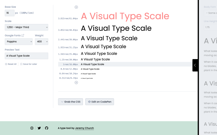
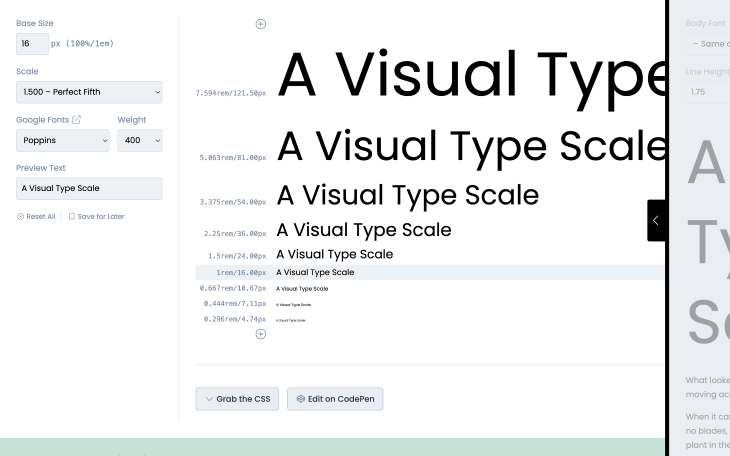
There’s no “best type scale,” just experiment with different type scales and choose the one that feels right for the design in question. It’s worth remembering that most designs have no need for headings beyond level three, which affords the opportunity to use more drastic type scales such as Perfect Fifth (1.5×), which results in more font size differentiation where the visual hierarchy is more prominent.
Fun fact: on the web, headings are good indicators of what pages are about, so they impact search results significantly. <h1> headings have the most impact because they’re primary headings that (should) describe the overarching topic/purpose — this is one of the ways that hierarchy plays an important role beyond visuals.
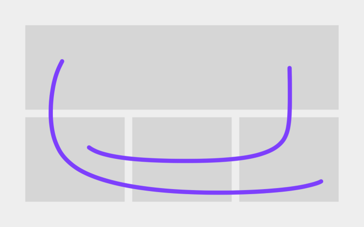
A popular web design trend today (especially on ecommerce websites) is getting creative with grids. This is because web browsers now support modern layout properties such as those related to flexbox and grid layouts. These properties make it easy for developers to make some grid items larger/span multiple rows and/or columns, allowing for some pretty creative and aesthetically pleasing layout options.
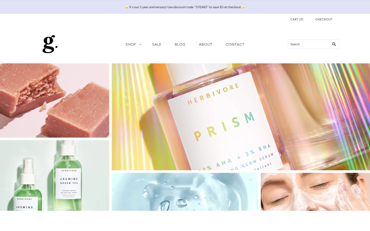
We can use size to make specific grid items stand out more than others, which in the case of ecommerce websites, for example, is useful for featuring specific products or offers. It’s not uncommon to see this UI pattern on blogs either, bringing extra attention to new or popular articles.
Unlike with lists and headings though, the use of visual hierarchy in these examples is purely about drawing attention to specific areas of interest rather than about communicating how a specific snippet of information relates to another snippet.
Be careful though. Besides being difficult to adapt to different screen sizes, the visual hierarchy of grid items is also impacted by “reading” direction — it can be confusing for users if the natural reading direction takes users in one direction but the sizing takes them in another direction. The reading direction and the sizing should suggest the same visual hierarchy.
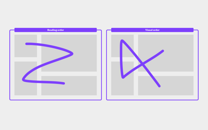
I recommend keeping your user’s demographics in mind, because where some people read left-to-right, others read right-to-left and even top-to-bottom. With this in mind, thinking vertically is often a better, one-size-fits-all approach.
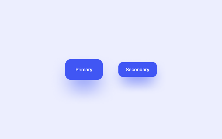
It’s not uncommon for websites to have secondary calls-to-action (CTA) buttons alongside primary CTAs and even other buttons (or links) of lesser importance. Visual hierarchy plays a critical role in determining which CTAs out of potentially many possibilities grab users’ attention the most, and in order to meet business objectives, it’s only natural to want primary CTAs to get the most attention.
CTAs have more style properties to customize — some of the common ones for creating a sense of visual hierarchy include size, color, borders, or simply designing them as links instead. Size is usually the best route to take because colors convey special meanings with CTAs (e.g., orange for warning, red for strong warning, and even gray/opaque for disabled buttons).
For more complex designs where many different sizes might be required, consider introducing variants with a border instead of a background if you believe that the different sizes aren’t distinguishable enough. There’s nothing wrong with using a plain link, either.
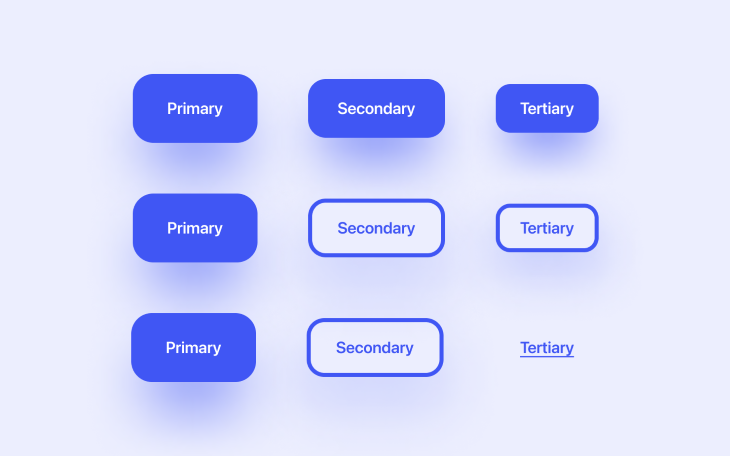
Using design systems to organize and document the design elements and components that we’ll reuse throughout our design (including the variations of headings, CTAs, and so on) is a fantastic way to be mindful of the style properties that we’re using and ensure that they convey a sense of visual hierarchy.
In fact, having a birds-eye view of everything at once can help us to remain mindful of how our designs communicate in general.
Visual hierarchy only works when the elements in question can be identified (even subconsciously) as being part of a group, so when visual hierarchy is conveyed using multiple style properties, its effect is less powerful. In fact, users might not even see the relationship between the elements at all.
For example, you’ll want to organize headings by size and avoid making them different colors, because this makes it more difficult for users to build a mental model about their hierarchy.
Similarly, you’ll want to design buttons in a way that the “levels” are clearly distinguishable from one another but still look like they’re part of a group (e.g., CTAs).
It can be tricky to pinpoint visual hierarchy flaws using user feedback because visual hierarchy isn’t really something that users are consciously aware of. When collecting user feedback, you’ll want to look out for these tidbits instead:
Or (slightly vaguer):
All of these tidbits suggest that there might be something wrong with the visual hierarchy, although it certainly doesn’t confirm it. If you suspect that the visual hierarchy could be improved, it might be worth just doing so and then A/B testing the before and after versions in a few usability benchmarking scenarios.
Visual hierarchy is incredibly powerful and we can implement it just by applying some pretty common style properties, but in a certain way. Specifically, in a way that helps users understand information more easily as well as understand the importance of design elements in relation to other elements. By influencing where users look, we can ensure that designs tell a coherent story.
If you’re interested, please share your design systems (or at least the aspects of them that convey visual hierarchy) in the comment section below.
Thanks for reading!
Featured image source: IconScout
LogRocket's Galileo AI watches sessions and understands user feedback for you, automating the most time-intensive parts of your job and giving you more time to focus on great design.
See how design choices, interactions, and issues affect your users — get a demo of LogRocket today.

The checkbox is one of the most common elements in UX design. Learn all about the feature, its states, and the types of selection.

Optimization fatigue is real. Here’s why designing only for metrics drains creativity, and how to bring the human back into UX.

Let’s explore why and when to use drag and drop, discussing real-world examples, platform-specific considerations, and accessibility tips.

We’re told to reduce friction, but sometimes friction builds value. This blog explores how scarcity, when designed well, sharpens focus and strengthens user trust.