Responsive design is an essential aspect of web development. Its purpose is to ensure that websites and apps translate seamlessly to all screen sizes, both in their visual design and user experience. One of the tools to help design responsive screens is a grid system.

With a powerful tool like Figma, designers can take advantage of its grid capabilities to create different layouts for multiple screen sizes while maintaining precise placement of design elements. In this article, we’ll talk about what grid systems are used for and the types of grids in Figma. Then we’ll walk through a step-by-step example of using Figma’s grid features to create responsive web pages.
A grid system is a tool that helps create the composition and layout of a design while keeping design elements consistently aligned and spaced evenly. You can use different types of grids depending on the context. Some common grids used in design include modular grids, column grids, and baseline grids.
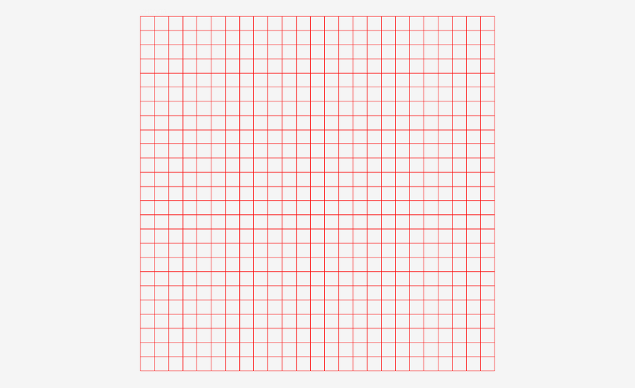
Modular grids are basic grids that consist of evenly spaced-out horizontal and vertical lines. This type of grid provides the freedom and flexibility to arrange design elements and structure them into any layout.
Modular grids are commonly used for website layouts, especially ones that display a lot of content:
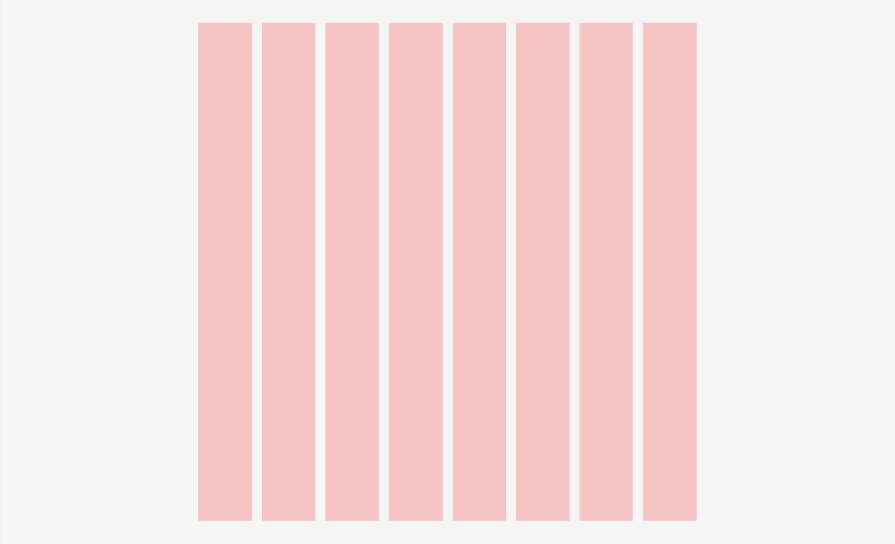
Column grids are exactly what they sound like: grid systems that organize content into columns. This type of grid consists of a number of equal-width vertical columns that help align and separate content.
Column grids are especially useful in designing responsive layouts for different screen sizes, as the number of columns can vary, which allows for content to be easily shifted around:
Baseline grids are useful for text-heavy designs, such as magazines or books. A baseline is the imaginary line on which the text sits. This type of grid establishes a vertical rhythm, which makes it easier for users to scan the page and creates a neat and organized visual design:

In Figma, there are three types of grids to choose from: Grid, Columns, and Rows.
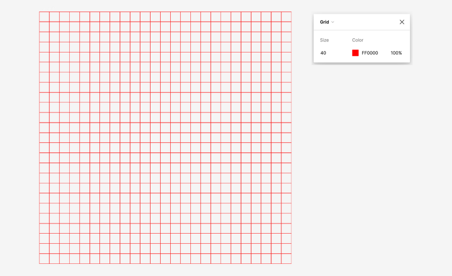
Grid is a uniform grid, or as we mentioned earlier, a modular grid. You can define the size and color of the uniform grid. This grid option is perfect for precise alignment, such as designing iconography or logos:
With column and row grids, you have more flexibility in the setup. You can define the position of the grid on the page.
Column grids can be fixed to the left, right, or center while row grids can be fixed to the top, bottom, or center of a frame. Both types of grids can stretch to scale to the frame size:
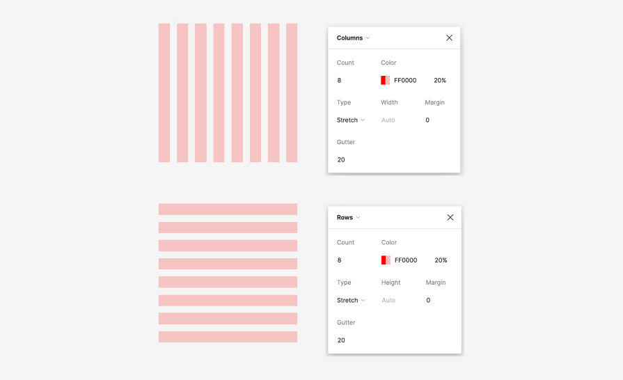
You can also define the width or height of the columns or rows, as well as the gutters (spaces between columns or rows) and margins (spaces between the ends of the grid and the edge of the frame).
Using these three grid options, you can leverage modular, column, and baseline grids in your Figma files. This will help you make quicker design decisions when it comes to defining layouts.
For more advanced layouts, you can combine these grids by nesting them within one another. This allows for you to have even better precision for aligning different sections within your layout, and added flexibility as to how you organize content on the page.
Now let’s walk through an example of designing a responsive webpage using Figma’s grid features. For this example, we’ll start with a desktop-size frame and then adapt the design to a mobile screen size.
A common example of a webpage type that is optimized for both desktop and mobile screens is an ecommerce website. Online shopping is more popular than ever, which is why webpages have been designed responsively so that users can shop from any device, not just a desktop computer.
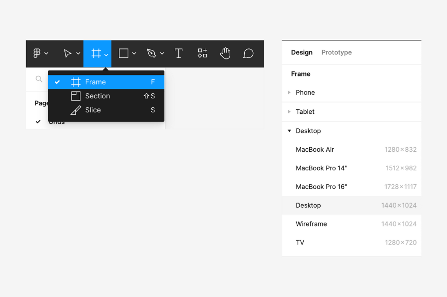
First, create a new frame for our design. Select the Frame tool in the top left toolbar. Then, in the right sidebar under Frame, select Desktop. A frame will be created with the dimensions of 1440 by 1024 pixels:
Let’s start by wireframing the initial design concept, focusing on the layout. The design will need a header and a content section that contains the items:
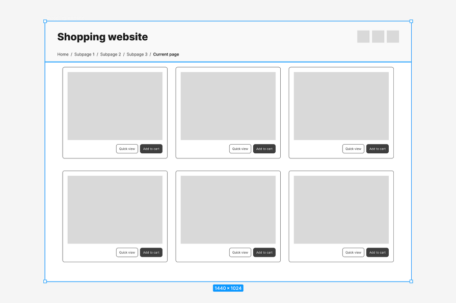
In the header, I’ve included the website name on the left, three buttons on the right (for a menu, search, and shopping cart), and a breadcrumb for secondary navigation underneath:

The content section lives below it, which features a three-column layout of cards. When choosing the design elements, we need to keep in mind their ability to scale to smaller screen sizes or alternatives. Cards are modular and can adjust their size as well as be rearranged to accommodate different screen sizes:
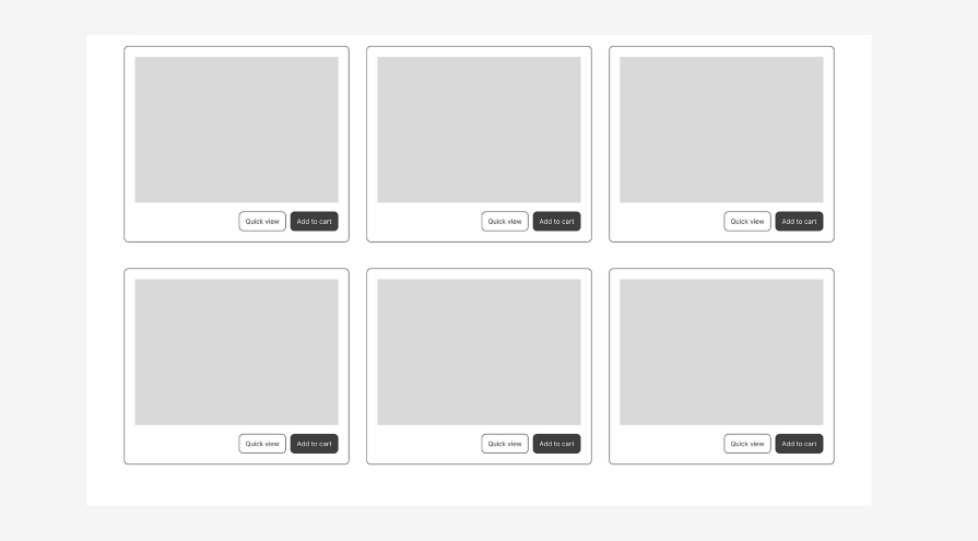
Now that we have our layout designed, let’s apply the grids to align our design elements, starting with the card component. Grids can be applied to frames or components, and they can be nested as well. This means we can use grids to align the content within the card component and also to align the cards within the webpage layout.
To set up a grid, select the frame and navigate to the Layout grid section in the right sidebar. Click the + button to add a layout grid to the frame. A default grid will be applied to your frame.
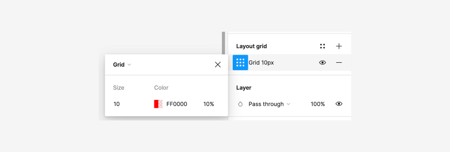
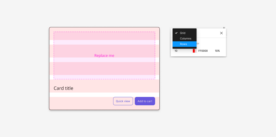
Click the grid settings to switch between Grid, Columns, or Rows, as well as change the size and color of the grid:
For this example, let’s create a row grid. In the Layout grid settings, change the type to Rows. A default row grid will be applied to the card. However, the content doesn’t exactly align with the grid:
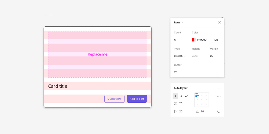
Let’s adjust the grid so that our content is neatly aligned. Set the Count to 6, Type to Stretch, Margin to 20px, and Gutter to 20px. This gives us six rows that stretch to fit the frame size using automatic column widths. We’ve also added spacing between each row and around the edges of the card to ensure that the content is aligned neatly.
A helpful tip is to use Auto layout on the component so that the content aligns exactly with the grid. Set your padding the same as the margin amount, and the vertical gap between items the same as the gutter amount:
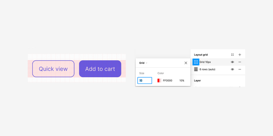
To take it one step further, we can use a 10px grid to align the buttons in a more detailed view. While the row and column grids are helpful with creating the layout of a design, the smaller-sized grid can ensure that your design elements are aligned to the pixel:
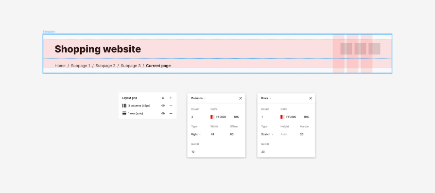
Starting with the header, apply a three-column grid. This column grid will align the three buttons on the right side of the header. Set the Count to 3 and the Type to Right. The width should be set to the size of each button, which in this case is 48px.
The offset spaces the grid away from the edge of the frame. Since we want our webpage to have side margins of 80px, set the Offset to 80. Lastly, set the Gutter to 10px, which is the space in between the columns.
Next, add a one-row grid to the header. This will align the title and breadcrumb navigation vertically. For this grid, set the Count to 1 and the Type to Stretch. This will stretch to fit the frame, given the Margin and Gutter settings, which we will set to 20px:
Now that the grids are applied to the header, we can see what content needs to be moved around in order to align with the grid. We can add a 20px modular grid to check the granular alignment of our elements:

Let’s apply a three-column grid to the content section. This will align the cards into three columns while maintaining the 80px margin on both sides of the page.
Set the Count to 3, the Type to Stretch, the Margin to 80px, and the Gutter to 20px. Notice that we’re using consistent spacing units, whether it’s for aligning the cards to the page or the content within the cards themselves.
Next, add a two-row grid to distribute the rows of cards evenly. Set the Count to 2, and the Type to Top since we want to anchor the grid to the top of the page as the content can cascade down. Set the Height to 360px, as that is the height of each card. Set the Offset to 40px and the Gutter to 40px:
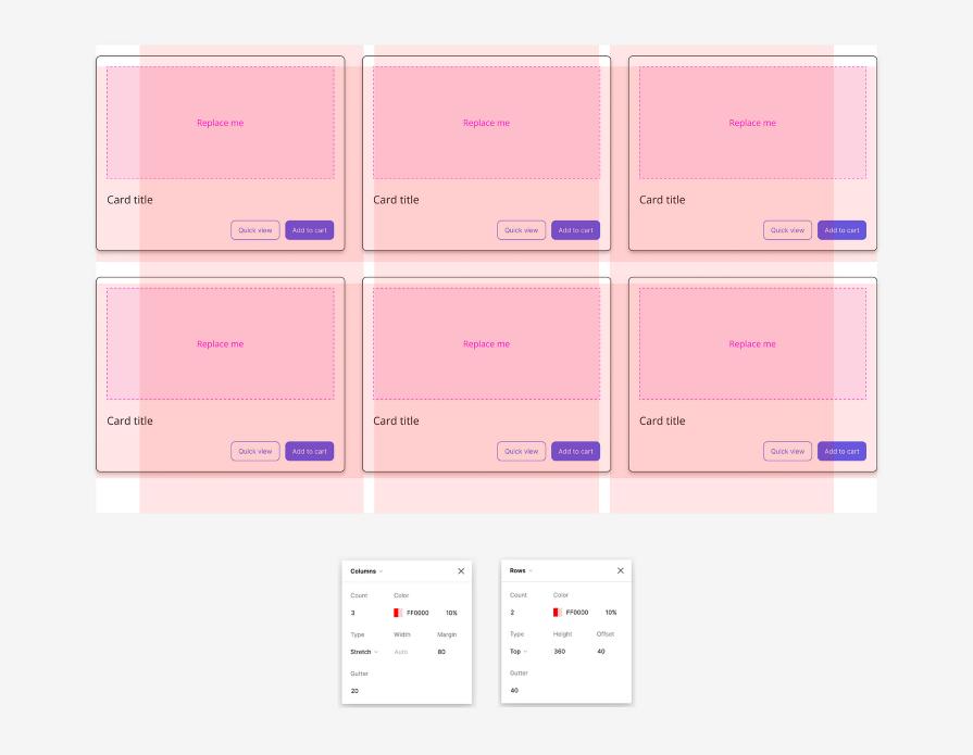
Auto layout helps align content much quicker and more accurately. Use the same measurements for the padding as the Margin and Offset values (80px for horizontal padding and 40px for top padding), and the vertical gap between items as the gutter value (40px). Now it’s time to put the header and content together to reveal our final webpage design:
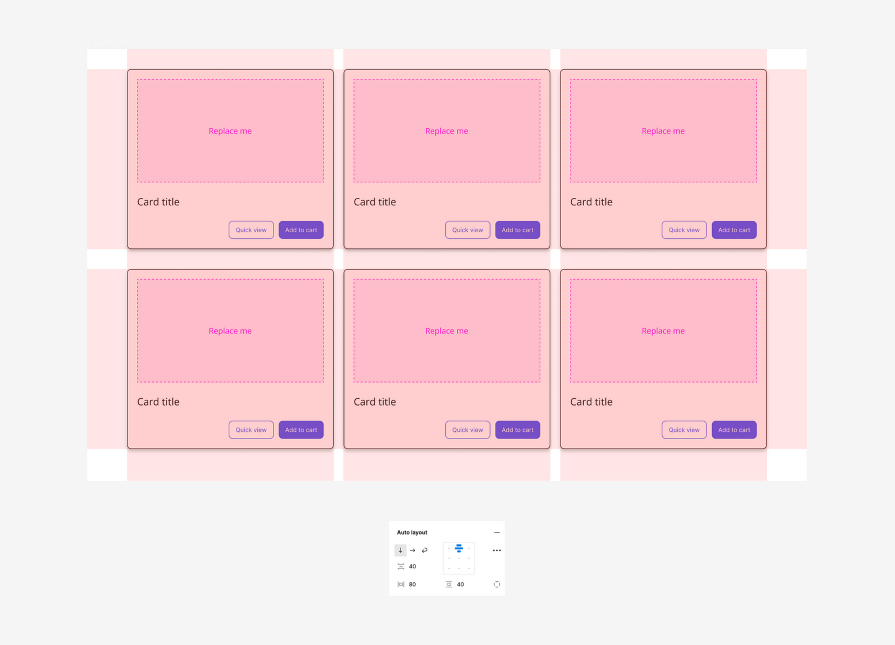
After adding in the final touches, our webpage design is complete for the desktop. By leveraging Figma’s grid features, we were able to create a webpage layout by evenly spacing out and aligning elements on the page:
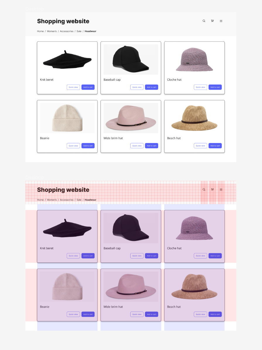
Now that we have our desktop design completed, it’s time to adapt it to a smaller mobile screen size. But responsive design doesn’t just mean shrinking it down and pasting it onto a smaller frame. It can involve rearranging, replacing, or hiding elements to accommodate for the limited screen space.
We’ll use grids to help restructure our layout and keep elements aligned and consistent with the desktop version. Let’s start by creating a new frame for our mobile design. Select the Frame tool in the top left toolbar. Then, in the right sidebar under Frame, select a mobile screen size, such as 430 by 932 pixels:
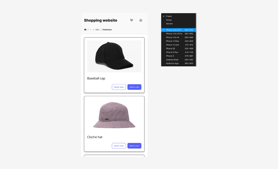
Notice a few changes to the mobile design. The first change is the removal of the search icon in the header. With limited screen space, we need to make tradeoffs, so we’ll hide the search function inside the hamburger menu:

The breadcrumb navigation has also been truncated, using an icon to represent the homepage and an overflow menu to hide several subpages. Without truncating the breadcrumb trail, it would take up multiple lines, losing its readability as well as taking up precious screen space:

Finally, the cards in the content section now take up one column instead of three. On mobile, vertical scrolling is a natural gesture used to navigate through a webpage, so repositioning the cards into one column will allow users to scroll through the page:
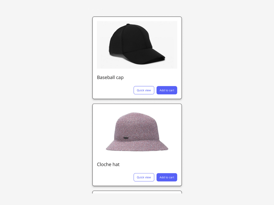
Since we’re dealing with one column of content, apply a one-column grid to the frame. Set the Count to 1, the Type to Stretch, and the Margin and Gutter to 20px. Align the content within the horizontal bounds of the grid:
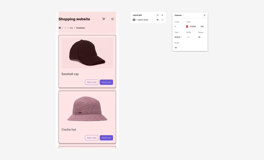
For our header, we’ll apply the same one-row grid as we did to the desktop version. Now that we’ve gotten rid of one of the buttons, reduce the column grid to two columns by setting the Count to 2. Also, change the Offset to 20px, as the mobile screen doesn’t have as much space for wide padding. We’ll keep a 20px horizontal padding around the entire design.
For the content, change the Offset and Gutter to 20px to bring the cards closer together. Then, align the cards to fit within the grid:
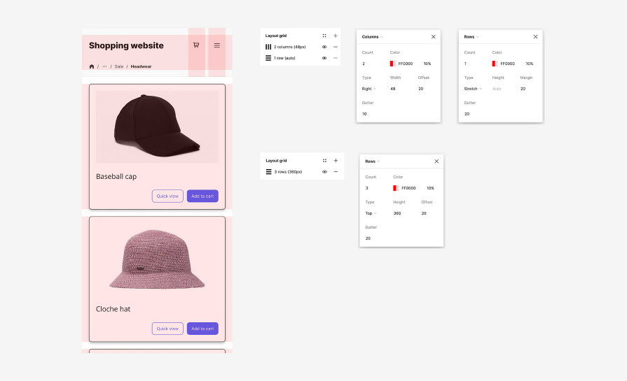
Using responsive design techniques and Figma’s layout grid features, we were able to adapt our desktop design to a mobile screen. Now our mobile design is complete:
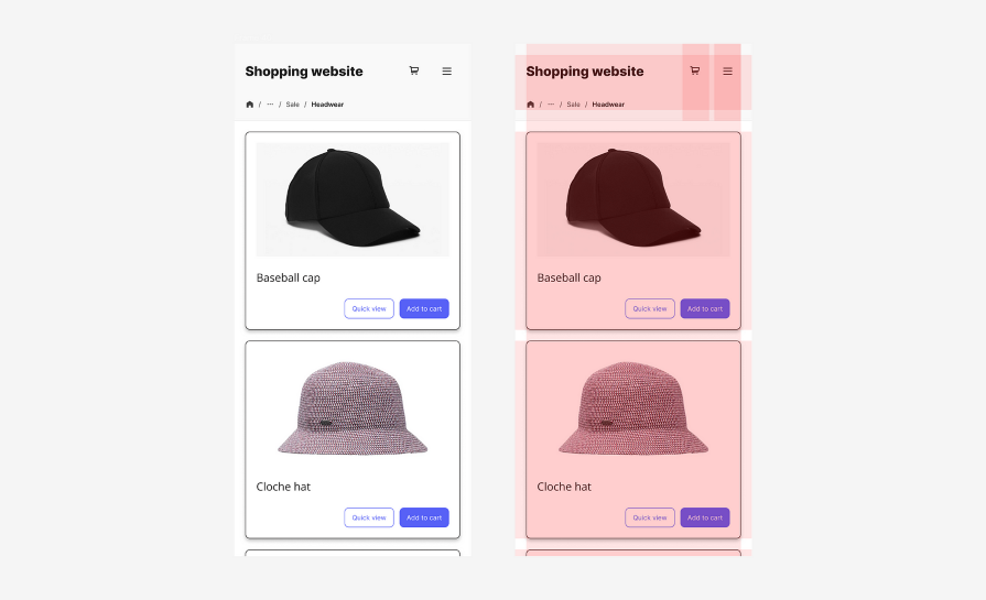
Figma is a leading design tool, known for its extensive features, including its grids. Using Figma’s layout grid features, designers can easily apply Modular, Column, or Row grids to their frames and components. This is especially helpful for creating responsive designs and adapting layouts to different screen sizes.
Grids ensure that design elements are aligned on the page and help designers organize their layouts. Figma’s auto layout feature can be leveraged in combination with grids for efficiency in applying spacing to your designs. Try applying these grid techniques in your next design project and soon you will master grid-based designs in Figma.
LogRocket's Galileo AI watches sessions and understands user feedback for you, automating the most time-intensive parts of your job and giving you more time to focus on great design.
See how design choices, interactions, and issues affect your users — get a demo of LogRocket today.

I’ve spent enough time designing with WCAG 2.2 to know it’s not enough. Here’s why I’m skeptical and cautiously hopeful about WCAG 3.0.

I learned this lesson the hard way. Good UX doesn’t survive endless approval loops. Here’s what went wrong — and how to protect your vision.

I’ve reviewed “final” designs more times than I can count — and the copy almost always gives users a reason to hesitate.

The checkbox is one of the most common elements in UX design. Learn all about the feature, its states, and the types of selection.