Have you ever walked through a busy flea market and noticed that none of the stalls show prices for their products? The absence of displayed prices can cause friction in a customer’s buying journey and lead to bargaining for what the customer deems a “fair price.”
When selling products or services online, your website becomes your stall in a much bigger market. To reduce friction in your customers’ purchasing process, it’s essential to have a pricing page to let them know how much things cost. This not only sets a fair price that is the same for everyone but also helps customers decide if they want to purchase your product or service.
In this article, we’ll explore the role of pricing pages in an online business, the key components of designing an effective pricing page for all screen sizes, and how they can create trust and reduce friction for your business.
When potential customers visit your website and consider buying your product or service, they’ll likely look for your pricing page. This page offers a straightforward view of the prices and what customers can anticipate when they make a purchase. If your business offers different product or service tiers, the pricing page displays the available choices. Ultimately, the pricing page aids customers in making informed purchase decisions by clearly outlining the features included with each pricing tier.
Some factors that affect the customer’s purchase decision can include their budget, the cost of alternatives, and whether the value of the product or service is worth the price to them. They will likely have expectations and questions, so designing your pricing page with answers in mind will help users feel more confident in purchasing from your business.
When visiting a pricing page, users expect to find clear and straightforward pricing information. An effective pricing page should be able to answer questions like “How much does it cost?” and “What is included in this price?”
Users shouldn’t have to look through the fine print to learn about hidden costs. Be transparent with your pricing and users will feel confident in trusting your business:
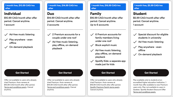
Aside from the obvious pricing information, users want to know what value they’re getting out of a purchase. They might be wondering “What features or services do I get with the purchase?” and “How will this benefit me or my business?”
Clearly communicate the features included with each pricing tier and how they can benefit from them. This can be in the form of time saved, advanced features, or a higher-quality experience.
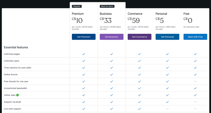
Not all products and services are one-size-fits-all. Users might want more flexibility than what’s being offered. Some questions they might have include, “Can I tailor the product or service to my specific needs?” or “Are there options to add or remove features?”
If your customers’ needs aren’t generic, consider offering a custom option that allows them to choose the features and services that work best for them. This could help improve conversion rates if customers aren’t buying from you:
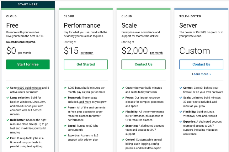
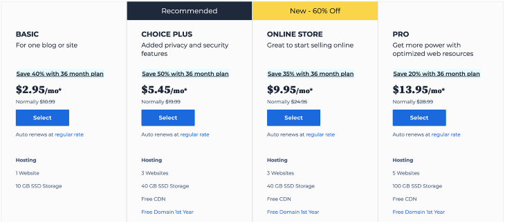
If your business offers different tiers of a product or services, users want to be able to compare the plans to choose one that best suits their needs. When comparing offerings, they might ask themselves “What are the differences between these plans?” and “Which plan is most popular or recommended?”
Use a pricing table to help users compare plans side-by-side, see which features are included in each plan, and evaluate which one would serve them best:
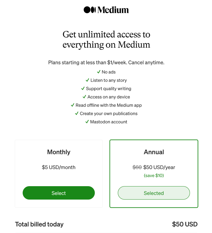
When making a purchase, users need to understand when and how frequently they will be billed, whether it’s monthly, annually, or some other interval. On the same note, they might want answers to questions like, “Is there a discount for annual billing?” and “When will I be billed?”
Clearly present the billing options, including how long the purchase is good for and how frequently the customer will be billed. This can help users decide if they can commit to the payments and if the product or service is worth the purchase:
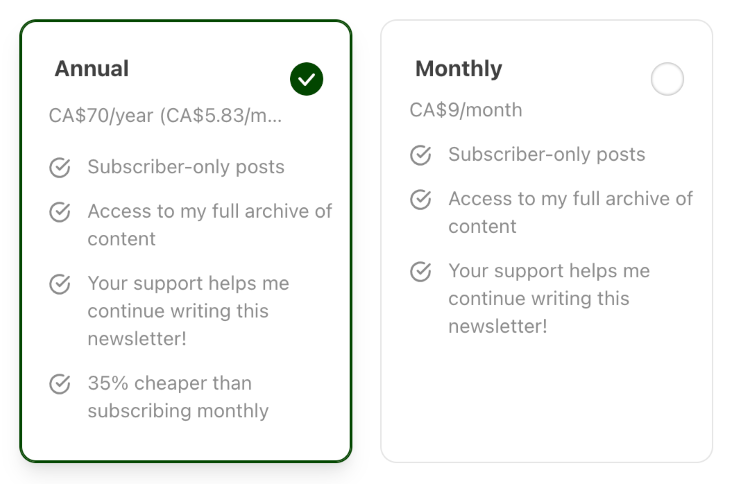
Who doesn’t love a good discount? Users often look for discounts or promotions when considering a purchase. It might be the last push they need to convince them to make the purchase. They might be wondering, “Are there any ongoing promotions?” and “Can I receive a discount?”
Some common approaches to discounts and promotions include offering a discount for annual payments instead of monthly ones or advertising a limited-time promotion to get them to purchase sooner:
Let’s talk about the key components that contribute to an effective pricing page. From pricing tiers to call-to-action (CTA) buttons, there are a few components that you should pay attention to. By optimizing these elements in your design, you’ll have a better chance of converting prospects into paying customers when they view your pricing page.
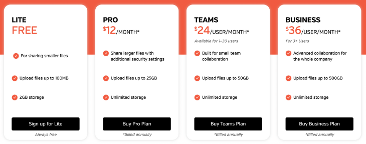
If your business offers different tiers of a product or service, labels can help distinguish the differences in value that each tier offers. Naming labels such as “Free,” “Growth,” “Pro,” and “Enterprise” can help users quickly identify which category most likely fits their needs and budget. It also simplifies their decision-making process and helps them move toward making a choice:
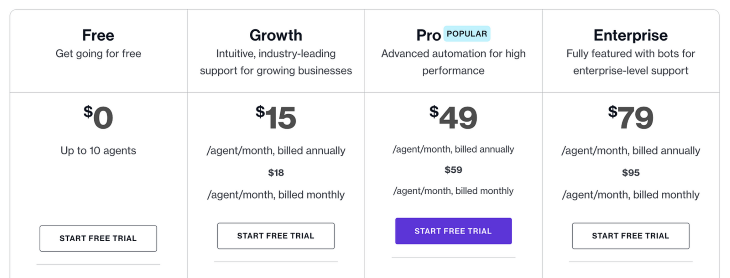
With each pricing tier, include a detailed breakdown of the features included. This essentially creates a comparison table for the user to assess the value that comes with each price point. For example, a “Free” plan might offer the bare-bones essential features for free, while a “Pro” plan costs a monthly fee, but includes advanced functionality.
Displaying both features that are included and not included in each tier can give a better overview of what users could be missing out on. This helps them understand the tradeoffs at each price point and make a decision based on their priorities and specific requirements:
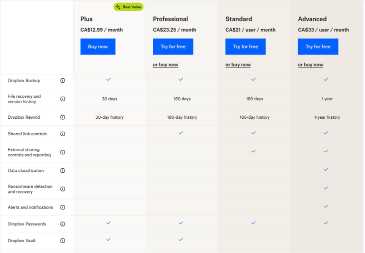
People don’t like to be confused when dealing with money. Confusion leads to distrust and can hurt your chances of making a sale. Pricing information should be clear and transparent without any hidden details. This means being transparent in the way you present pricing details, including the currency it’s presented in, the billing frequency (such as monthly or annually), and any potential extra fees or charges.
Being transparent with customers is the foundation on which trust is built. Users shouldn’t be surprised by unexpected costs when making a purchase from your business. By providing the full picture of what they’re paying upfront, you set the tone for a positive experience moving forward:
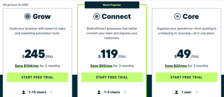
An effective call-to-action (CTA) button is designed to encourage users to commit an action. In the case of a pricing page, these actions could include purchasing a product, signing up for a subscription service, or contacting the business for more details.
The prominence and design of a CTA button can greatly affect whether or not a user clicks on it. The placement of the CTA should be somewhere that makes sense and is noticeable to the user. For example, a purchase button placed underneath each pricing tier encourages users to purchase the plan that it’s located under.
Using your brand’s accent color can add to the visibility of a CTA on a page so that it’s more noticeable. Lastly, the copy of the button should be compelling enough to convince the user to click on it, such as “Buy now” or “Sign up”:
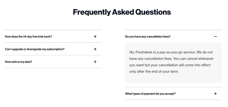
With the features listed in each tier, users still might have unanswered questions that are preventing them from moving forward. Below your pricing tiers, include an FAQ section to help address some common questions or concerns that users might have about your offerings. This can provide quick answers to their questions and avoid the need for users to contact support.
Common FAQs answer questions about return policies, free trials, hidden costs, discounts, or switching between plans. The key is to understand your users’ needs and provide them with the answers they need to be able to confidently make a purchasing decision:
Now that we’ve talked about the key components, let’s explore how to design an effective pricing page that guides users through their decision-making process. The key principles to consider include visual hierarchy, a comparative layout, and readable and scannable content.
Pricing pages contain a lot of information, so applying a visual hierarchy to your design can attract your user’s attention to what matters most. Visual hierarchy is about arranging elements on a page in a way that emphasizes the most important and relevant parts. It also helps guide the user’s eye throughout a page in a way that flows seamlessly.
To incorporate visual hierarchy in your design, use visual cues, such as font size, color, and spacing to highlight important elements. For example, the prices of each tier can be emphasized with a large, bold font to make it stand out.
Additional features in higher-priced tiers can be listed in a different color to highlight the differences. Think about what details are critical, such as CTAs and pricing structures, so that they can be emphasized visually to help users understand the available options:
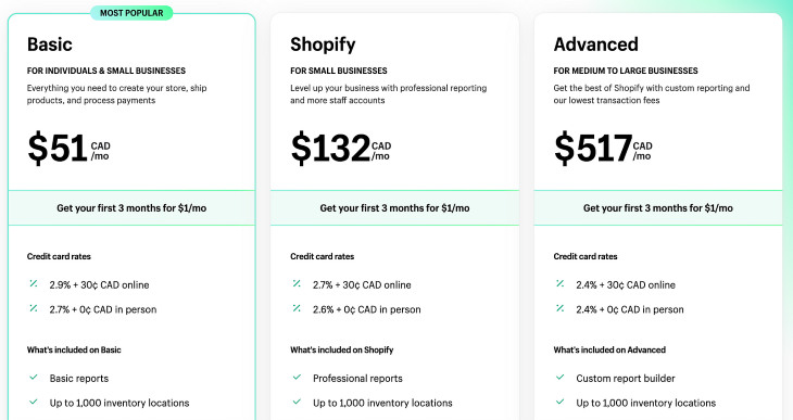
Optimizing the layout of your pricing page can allow users to be able to easily compare different pricing tiers side-by-side. When the features of each pricing plan are listed beside each other, it’s easier to distinguish and highlight the differences, making it easier for users to make their purchasing decisions.
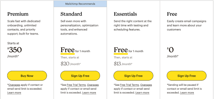
If you have a recommended plan, highlighting it will give users a place to start from. Then, they can compare other plans to your recommendation and form their own opinion about what’s best for their use cases:
Like any other webpage, spending some time to ensure that your content is readable and scannable can go a long way. When describing your pricing options and features, use clear and concise language that all users can understand. Avoid using technical jargon or complex terminology that might confuse users, as confusion will not help convince them to purchase from your business.
To enhance the accessibility of your content, break it up into sections using headings and subheadings. Formatting your content allows users to quickly scan the page and find the information they need. It also enables screen readers to identify and communicate the start of a new section to its users:
Trust is a foundational element when it comes to getting people to purchase your product or service. If your business doesn’t seem trustworthy, then people will not be encouraged to purchase from you. However, if you can build your audience’s trust, it reduces the friction to make a purchase and gives them a reason to buy from you. Here are a few ways you can remove those barriers and instill confidence in your customers.
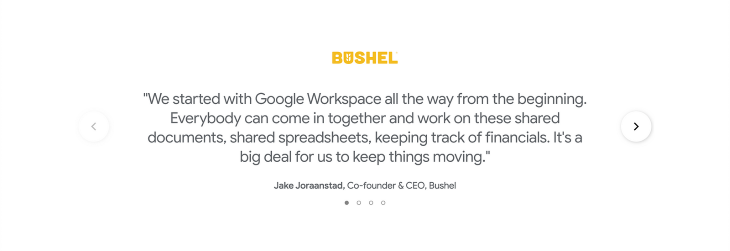
People are more inclined to purchase something when they read about success stories. A positive review or testimonial indicates that your business is credible and has provided value to others. Ask your existing customers to write testimonials based on their honest opinions. The authenticity of their words helps others make their purchase decisions.
A customer testimonial from a celebrity or public figure can have an even greater impact on your sales. If that person is generally well-received by society, their words can help shine a positive light on your business and further encourage people to make a purchase:
Selling products or services will usually result in some level of unsatisfied customers. To address the concerns of skeptical users, clearly communicate the refund policy on your pricing page. An example can be a money-back guarantee during the first 30 days of your purchase with no questions asked.
Having clear policies around refunds helps build trust with potential customers. By communicating your refund policy, users will feel like they can make a risk-free decision by purchasing from your business:

In addition to refund policies, provide a link to your website’s terms and conditions. This helps maintain transparency with your customers and ensures that they have access to important legal information.
Terms and conditions are often printed in small font and large blocks of text that no one wants to read. Consider summarizing key points that are relevant to the pricing and purchase process on your pricing page to create a more user friendly experience.
Your terms and conditions should be upfront about any policies regarding billing or cancellations. To maintain your company’s trustworthiness, avoid having hidden fees or complicated policies that might cause friction in a user’s purchase process:
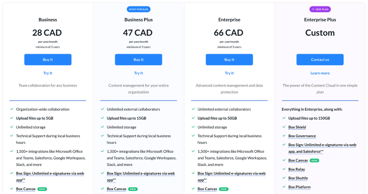
Customers can access your pricing page from a range of different devices, including desktop, mobile, and tablets. Responsive design ensures that user experiences are accessible and consistent from all devices. Accessibility enables users with disabilities to use websites and access pricing pages that anyone else can.
A pricing page that is hard to navigate on a mobile device can cause frustrated users and ultimately cost your business a sale. Inaccessible experiences lend themselves to user distrust and abandonment of the purchase process.
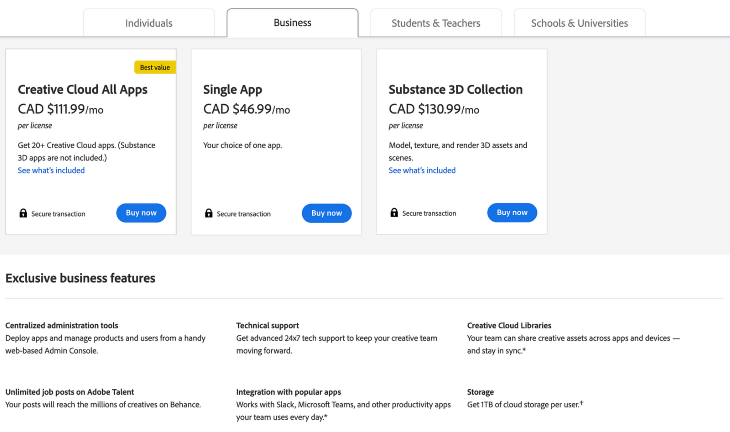
Users should be able to read your pricing details, compare plans, and complete actions like signing up or making a purchase whether on a desktop or smartphone. Mobile web pages can use cards to swipe through the different plans or list the plans vertically to scroll through them:
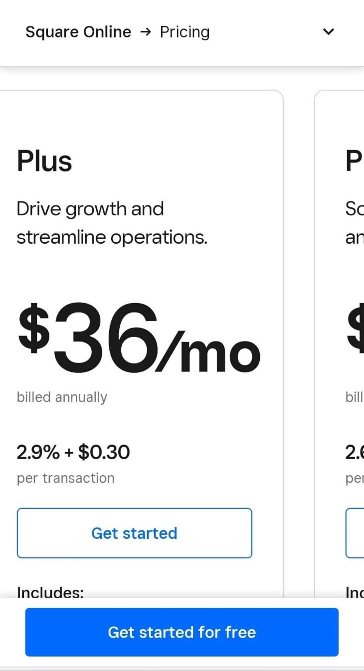
Take advantage of progress disclosure to allow users to view the information that’s relevant to them instead of trying to display everything at once on a smaller screen:

The user experience also shouldn’t have added friction depending on the device they are using. Regardless of platform, the content should remain clear, legible, and easy to read.
A well-structured pricing page is an important aspect of any business with an online presence. This is where potential customers can learn about your offered products or services and make an informed decision about whether to purchase from your business.
Prioritizing user-centricity in your design can help build trust and credibility with your users. Key components of an effective pricing page include clear pricing tiers, feature breakdowns, pricing details, CTA buttons, and FAQ sections. Incorporating these elements with customer testimonials, money-back guarantees, and transparent terms can encourage users to convert into paying customers.
If you currently run a business and are looking to create a pricing page, apply these principles to increase your sales and establish a foundation of trust. This is the first step to creating a long-lasting relationship with your future customers.
LogRocket's Galileo AI watches sessions and understands user feedback for you, automating the most time-intensive parts of your job and giving you more time to focus on great design.
See how design choices, interactions, and issues affect your users — get a demo of LogRocket today.
A three-week mobile banking project taught me that the “proper” UX process is not always realistic. Sometimes, the better approach is to work with what you know, identify what you still need to learn, and make the strongest decision possible under real constraints.
A/B testing compares two versions of a design to see which performs better with real users. Here’s how UX teams can use it to test hypotheses, measure outcomes, and make smarter product decisions.
This case study shows how one ad experience redesign increased total ad exposure while lowering perceived friction, proving that timing and context can matter more than raw interruption.

As products evolve into ecosystems, navigation becomes a system-level challenge. This article explores how to align structure, context, and user journeys to create seamless movement across tools without confusion.