When users interact with an app or website, they expect an immediate response — and in this context, “immediate” means as quick as half a second or even less. Delays can break a user’s flow, leading to frustration, disengagement, and abandonment. But what if interactions felt instant, even when they weren’t? This is where the Doherty Threshold comes into play.
The Doherty Threshold states that system response time should be 400 milliseconds or less to maintain a user’s flow of thought and engagement. This article explores what the Doherty Threshold is, why it matters in UX design, and how you can apply it to create seamless, high-performing digital experiences.
The Doherty Threshold suggests that when feedback occurs within this timeframe, users feel more in control and remain engaged. When the delay exceeds this limit, users become frustrated, distracted, or disengaged.
This principle was first introduced by Walter J. Doherty and Ahrvind J. Thadani in 1982. Their research into the relationship between computer response time and user productivity in those early days of computing revealed that faster system responses resulted in users staying engaged, working more efficiently, and perceiving UX in a more positive light.
Doherty emphasized this principal’s importance by stating,
“Productivity soars when a computer and its users interact at a pace that ensures the user is not kept waiting.”
This insight came from a deep understanding of human psychology — our ability to stay focused and engaged depends on minimal interruption.
Thadani further reinforced this by highlighting,
“The human attention span operates within these tiny windows of time. Beyond 400 milliseconds, delays are perceptible, and users lose focus, disrupting their workflow.”
So, if you adhere to this threshold, you can ensure users remain in a state of engagement and efficiency, significantly improving users overall experience.
Users expect smooth, near-instantaneous interactions when they’re on web and mobile applications. The perception of speed is just as important as actual speed, so you need to find ways to create the illusion of instant responsiveness (like skeleton screens or loading animations), even if the system processing takes longer than 400ms.
Also, page abandonment rates increase as response time slows. Research from SOASTA (The State of Online Retail Performance) shows that one-second delay in mobile load times can impact conversion rates by up to 20 percent. That’s a significant impact in just a second, showing why it’s important to make websites and apps fast and responsive to keep users from leaving.
The Doherty Threshold helps UX designers and developers:
While designing for the Doherty Threshold can significantly enhance user engagement, several challenges must be considered:
By acknowledging these limitations, you can create strategies to mitigate delays while still prioritizing user engagement.
To help you implement the Doherty Threshold, try using the following three strategies:
While optimizing actual performance is crucial, you also need to work with developers to reduce the perception of delay through microinteractions, animations, and skeleton screens.
To do this:

Speed optimization should be a top priority. While developers handle backend performance, you play a crucial role in ensuring the UI is efficient and lightweight.
Make sure that you:
Users expect an immediate response to their actions, even if the system needs more time to process them. This means designing interactive feedback mechanisms to keep users informed.
You can do this by incorporating:
Now, to help you better understand the Doherty Threshold in action, this section outlines real-world examples of its use by successful companies.
Google’s search engine starts retrieving potential results as soon as users begin typing, ensuring that once they hit “Enter,” the results appear almost instantaneously. This preemptive approach maintains the perception of a fast and efficient system:
TikTok preloads the next video in the background, ensuring near-instant playback as users scroll. This seamless experience prevents frustration and keeps users immersed:
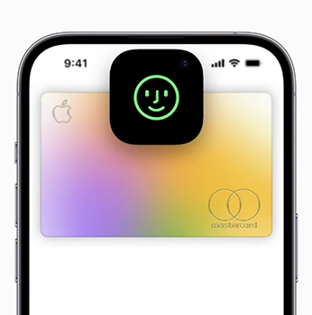
Face ID’s smooth animations and instant visual feedback make authentication feel immediate, even while complex processing happens in the background. This reduces perceived wait time and keeps users engaged:
The Doherty Threshold in UX reminds you that quick, seamless feedback keeps users engaged and in control. To harness this principle effectively, consider these points:
By thoughtfully applying these strategies, you’ll not only meet user expectations for speed but also you foster an engaging experience.

LogRocket's Galileo AI watches sessions and understands user feedback for you, automating the most time-intensive parts of your job and giving you more time to focus on great design.
See how design choices, interactions, and issues affect your users — get a demo of LogRocket today.

After five years in UX, I revisited the Daily UI challenge to reconnect with hands-on design. Along the way, I learned that great interfaces come from thoughtful briefs, sound judgment, and user feedback, not just better AI tools.

Learn what makes a great login screen through real-world examples and UX best practices for creating secure, accessible, and low-friction authentication flows.

Skeuomorphism helped define early digital interfaces by mimicking real-world objects to make technology more intuitive. Learn how it compares with flat design and neumorphism, why it declined, and where it still has a place in modern UX.

Memos don’t have to be complicated. Just keep them clear, concise, and focused on actionable items. More on that in this blog.


