The design to developer handoff is a crucial stage in software development that can be a source of frustration and inefficiency. In the past, designers and developers would have to rely on lengthy email chains, manual measurements, and guesswork to communicate design specifications.

However, with the advent of design collaboration tools like Figma, the process is infinitely more streamlined and effective. Most designers and developers are already acquainted with Figma, but to some it’s a source of stress and to others a tool that relieves their workload.
In this blog post, we will explore how Figma can help bridge the gap between designers and developers during the handoff process, creating a more efficient handoff for both sides of the equation.
Figma is a cloud-based prototyping and design collaboration tool that enables designers, product managers, developers, and stakeholders to work together in real-time.
One of its standout features is its capacity for generating CSS code that developers can copy-paste into their codebase — eliminating the need to manually measure design elements or guess at spacing or typography. With Figma, users simply select an element, view its properties, then copy its CSS code for use elsewhere in their application.
One of the key advantages of Figma is its capacity for collaboration between designers and developers. Designers can easily share their designs with developers and stakeholders, providing direct feedback on each design.
Conversely, developers are also able to view these designs and leave comments, ensuring everyone stays on the same page.
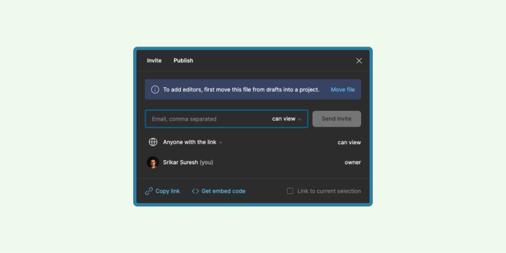
Figma’s collaboration features are not just for designers and developers: other stakeholders, like product managers, can also be included in the design process. Figma allows stakeholders to provide feedback, make changes, and approve designs instantly in real-time — helping ensure everyone is on board with the design vision and that everyone’s needs are met in the end product.
Collaboration is key for any project, especially design. When multiple designers work on a venture together, keeping files organized is paramount for efficiency, productivity, and accuracy. So to start, keep Figma files organized so your team can work more efficiently together.
Organizing files is essential for designers and developers because it enables them to locate and access necessary files quickly. File organization also makes the project’s workflow streamlined and more efficient.
By organizing your files properly, you can save time searching for them, reduce errors in production, and enhance product quality. Let’s get into how easy file organization can be in Figma, provided you begin with organization in mind.
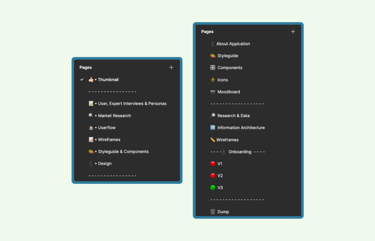
When working on a project, it’s essential to establish a naming convention for your files. A naming convention is simply a set of rules that dictates how your files are labeled.
For instance, including the project name, designer’s name, and date in the naming scheme helps teams locate necessary files quickly and eliminate confusion.
Adhering to consistent naming standards throughout the development cycle helps everyone stay organized and increases efficiency throughout the entire process.
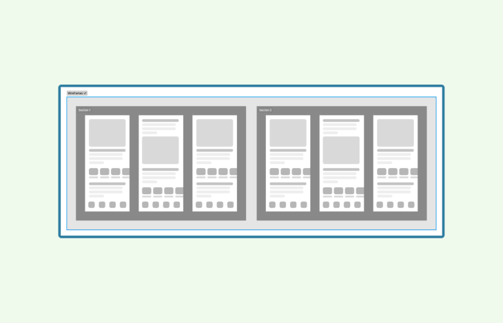
When working on a project, it’s wise to use pages and sections for file organization. Pages act like tabs in a web browser, while sections act like windows within those tabs.
By using pages and sections, you can keep your documents organized while making it simpler for team members to locate necessary files. For instance, create one page per section of design or user flows within the design as sections.
When working on your project, use colors and styles for the organization of your files.
Think of colors and styles like tags that label files; by doing this, you can quickly identify necessary files without creating confusion. For instance, use different shades for each section of your design or different color tags across all pages.
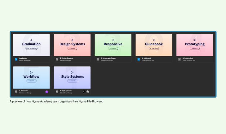
Custom thumbnails are visual representations of a file’s contents, making it simple to identify files at a glance.
Other advantages of using custom thumbnails include reduced time spent searching for files, improved workflow efficiency, and enhanced collaboration among team members. You could have fun with your team deciding on the color scheme or templates for your thumbnails.
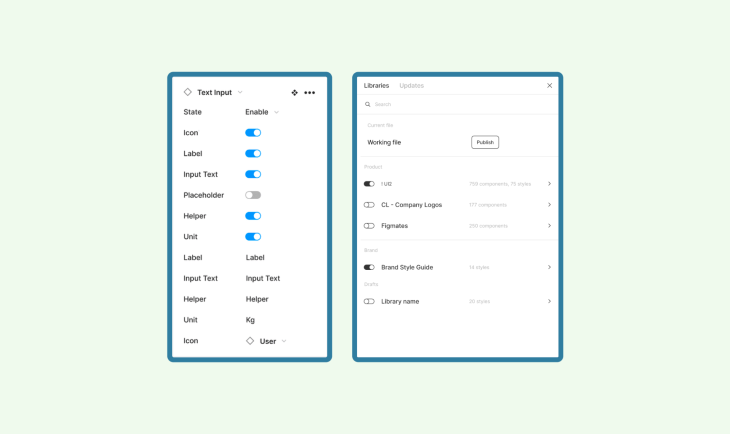
Components are self-contained elements that can be reused throughout a design. By using components, designers can create an organized visual language and guarantee each element on the page has an objective. This simplifies the handoff process for developers by providing them with clear instructions on how each element should operate.
Components can save designers a considerable amount of time during the design phase. Instead of creating every element from scratch, you can utilize prebuilt elements and focus on creating new elements specific to your design.
To maximize the efficiency of components, adhere to several best practices:
Figma’s Code Panel is an invaluable feature that enables developers to extract CSS, iOS, and Android code from designs. This means they can quickly inspect a design’s codebase for implementation needs and access all pertinent details without leaving their workspace.
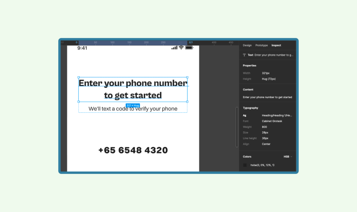
Using the Code Panel is a breeze.
First, select the element you wish to extract code from and click Code in the right-hand panel.
You’ll have options for CSS, iOS, and Android; select your platform of choice and copy away!
It’s that easy. With Code Panel, you can extract accurate code that adheres to design specifications with minimal effort — saving developers valuable time and energy in the process!
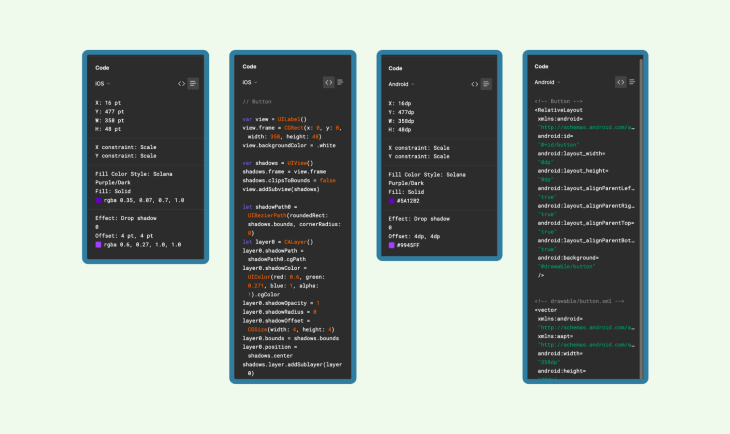
The Code Panel in Figma is an invaluable resource for developers, helping them simplify their work.
Through the Code Panel, designers can quickly extract CSS, iOS, and Android code from designs with ease — making it simple to incorporate it into their codebase. This frees developers up to focus on more important tasks like improving application functionality instead of spending unnecessary time extracting code for their design.
Figma’s Code Panel is remarkably accurate, guaranteeing that code extracted from a design matches exactly. This level of precision makes it especially helpful for developers working on complex designs since the Code Panel simplifies code extraction — saving both time and effort in the process. With confidence in their output, developers can trust it matches precisely the design at hand for a more effective development process.
Handing off your design to a developer can be a daunting task, especially if you don’t have technical knowledge. However, effective communication with them is critical to successfully translating your designs into usable products. These are some tips to make the transition smooth:
Figma is a great tool for handoff, and part of what makes it more powerful are the plugins. But designers still have to rely on other communication tools to communicate with developers and stakeholders.
A dedicated handoff tool can make coordination so much better. Additionally, this can help developers because any mistakes that occur can be rectified at an early stage of the handoff process.
Now let’s take a look at handoff design tools and plugins that will make the handoff more effective.
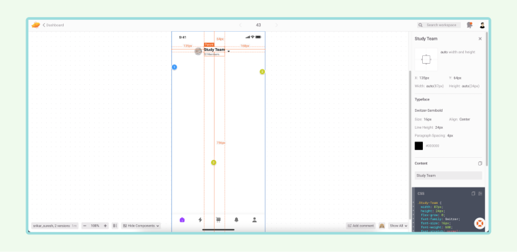
Zeplin can be integrated with Sketch, Figma, Photoshop, and Adobe XD. Designers can easily translate his designs into code.
Additionally, developers can download marked assets from the designs with ease. Zeplin also has an integrated collaboration tool with Slack, Jira, and Trello.
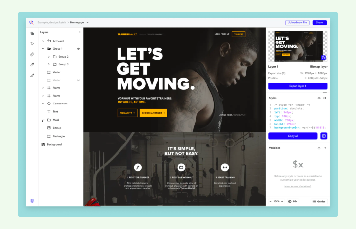
Ceros is a useful handoff tool, but it does not support Figma and is widely used by Sketch and Adobe XD users.
However, Ceros can still help you even if you prefer Figma with version control; it can easily be integrated with Slack and help teams communicate better. One of the most notable features in Ceros is the CSS code, image, and SASS style export.
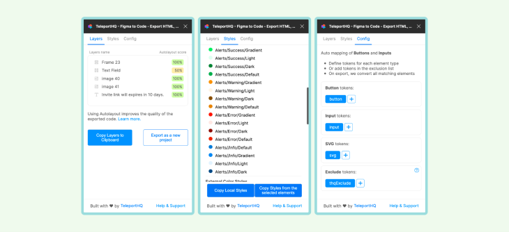
TeleportHQ is a Figma plugin that helps designers export components and design systems, integrate the generated code into the web application codebase, and publish the website with ease.
TeleportHQ can also export code in React, Next, Vue, Nuxt, Angular, and HTML/CSS. Nevertheless, there are a few limitations, such as the inability to export complicated styles such as background blur, layer blur, and others.
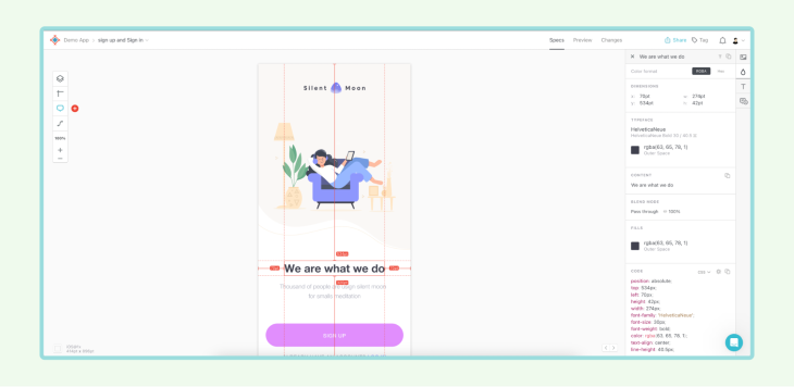
Sympli is among the most efficient handoff tools. It is compatible with Figma, Adobe XD, and Sketch. Sympli may also be combined with Slack, Trello, and other project management systems to streamline the handoff process.
Using inline comments, Sympli allows designers and developers to review and collaborate. The design system element of Sympli is one of the key features that simplifies even the most complex handoffs.
Collaboration is essential in any project, but especially so in design and development. When designers and developers come together, they bring their unique perspectives to the table and identify potential issues early in the process — saving both time and resources by making necessary changes before the project progresses further along.
Furthermore, by working together, designers and developers build trust in one another’s abilities, which facilitates higher-quality final products. This trust translates into better decision-making, more effective problem-solving, and ultimately superior end products.
LogRocket's Galileo AI watches sessions and understands user feedback for you, automating the most time-intensive parts of your job and giving you more time to focus on great design.
See how design choices, interactions, and issues affect your users — get a demo of LogRocket today.

Multimodal UX goes beyond designing for screens. Learn how context-aware systems, progressive modality, failover modes, and accessibility-first design create better digital product experiences.

Learn how context-aware mode prioritization and seamless transitions improve multimodal UX and reduce mode confusion.

Research is becoming more democratized, product cycles are accelerating, and AI is transforming synthesis and ResearchOps. Here are the three trends shaping UX research in 2026.

Voice support is not the same as multimodal UX. Here’s how to design systems with true mode continuity and context-aware interactions.