Design friction, when a user is slowed down or hindered during an interaction with a digital interface, is often associated with a bad user experience, a bad design, or both.
However, recently more and more designers are using friction to improve the user’s experience. Although this might sound counterintuitive, using friction in a selective and targeted way can be an extremely effective method for making a user’s digital interactions more pleasant and a helpful tool for improving the alignment of expectations regarding a product or service.
In this article, we’re going to dive into design friction and how it can actually be used to boost user engagement and enhance the user experience.
Here’s a list of what we’ll be covering:
Are you ready to learn more? Then let’s go!
In UX design, design friction (also known as “user friction,” “user experience friction,” or “UX friction”) is a term used to describe when the user of a website, app, or other digital interface is hindered or slowed down by the design of the interface when trying to complete a task.
In the same way that the friction on a pair of boots will prevent you from sliding on a slippery surface, friction within a design will stall you from getting where you want to go. Although this sounds like something to be avoided, as we will discover, there are times when friction within a design can be a useful tool.
Causes of user friction vary. In some cases, it’s simply that the website you interact with has an unintuitive design and therefore does not live up to the expectations of the user. In other cases, there’s a technical fault at play, for example a bug, which is preventing an otherwise frictionless experience, causing the user a delay or preventing them from completing their task altogether.
Bad design is frequently the cause of friction, when the text, images, buttons, or interactive elements aren’t clearly labeled, are too small to be read easily, or have been placed in locations on the site that aren’t obvious or familiar to the user.
Friction is also caused when elements or sections of a website aren’t consistent with the design of other, similar pages.
Slow page loading times — another cause of design friction — can lead users to abandon an action halfway through and go elsewhere.
Finally, any action or goal that requires an unexpectedly high number of steps to complete will cause users frustration and lead them to giving up before they have achieved their desired objective.
Most of us have experienced bad friction when interacting with websites, apps, dashboards, and other digital interfaces. Here’s a list of some of the most common types of bad friction in design.
Rage clicks is the term used for when a user clicks on an element of an interface repeatedly. Although the action itself is a sign of user frustration (rather than design friction), the cause of it typically lies in design friction. Rage clicks can be a sign that the user doesn’t realize that the element is not actually clickable (indicating poor design or poor labeling). Other times this happens because the button should be clickable but isn’t (indicating a technical malfunction).
When the design of a site or app is unattractive or confusing to the user, they are much less likely to explore the site further or attempt to complete their intended task. It will also taint their overall impression of a brand, hindering any future customer-brand relationship. Examples of an unappealing UI design are when a site has too much text, the style of the site is inconsistent, or there are too many images or colors thrown together.
We’re all much happier when a task can be completed quickly and with the fewest number of steps. When there are too many steps — especially unnecessary ones — to reach a goal, users become impatient and can quickly lose faith in the brand altogether.
Not only does it take up more of their precious time, but completing numerous steps also requires more energy and decision-making power from users. They are also further away than anticipated from experiencing the benefit of the product or service that they originally came to the site for.
Dead clicks are when a user clicks on an element but nothing happens (at least within a reasonable length of time). Dead clicks are a surefire way of measuring a poor user experience because they imply the user has misunderstood the purpose of the text (i.e., they think it’s clickable when it isn’t), the link itself is broken, or they expect an image can be zoomed into when that’s not the case.
Long paragraphs of text require concentration, energy, and engagement from a user. If the user is coming to your site to perform a specific task, too much text can be very off-putting and lead them to seeking out a competitor. Users want to know the actions they need to take simply and quickly which can be communicated more effectively through a combination of images, video, and text.
Offering users too many instructions or possibilities can be both confusing and overwhelming. When the user has a simple goal in mind, providing multiple options or prompts is also unnecessary. Remember, the more text, options, questions, or decisions to consider on each page, the more additional time the user will need before they can take the next step towards completing a task and reaching their desired outcome.
Despite the numerous ways design friction can confuse and irritate users, when implemented properly, friction can be a very useful tool for designers because they build high-quality and intuitive experiences. This may seem counterintuitive — after all, friction slows down users and hinders task completion.
However, there are numerous examples of how friction can actually add value to a design and improve the user experience. We’ll be looking at some of the tangible ways you can implement user friction to create a better UX in the next section, but first let’s look at some of the ways friction can actively help improve your design, and in turn your users’ experiences with your brand.
Researchers found that when customers partially create products themselves (and the end result is successful), they value those products significantly more highly than those they buy fully completed. They called this The IKEA effect due to the business model of the Swedish manufacturer being based around customers building (or at least putting together) their own furniture.
The IKEA effect can be true of digital experiences too. When a user invests time and energy into the creation of something, they place a higher value on it. What we can learn from this is that although initially having to create something takes more time and incurs more friction than simply purchasing the same item, the long-term outcome for users can be much more positive.
In the digital world, the IKEA effect — when users invest time and energy into the creation of a product or service — might be when a potential customer is asked to take part in a short quiz, with their answers used to personalize the end product. Function of Beauty provides a great example of this. Potential customers are invited to complete a quiz that informs their perfect hair formula. After making a time investment in the quiz itself, according to the IKEA effect, users are more likely to purchase (and value) the product.
Slack, the instant messaging app for teams and businesses, found a novel way to give the impression of a shorter waiting time to users. While the app is loading, users are given an interesting quote to read. Although takes up a few moments of their time — causing an element of friction — it simultaneously distracts them from the app loading time and gives them something of value to think about.
UK online bank Monzo designed a feature to curb unnecessary nighttime spending after research by the Money & Mental Health Policy Institute found that bipolar users tended to overspend during the night. When the feature was enabled, the user would be asked the next day to review all of the purchases they had made during the night before being given the option to cancel them.
Although this was an extra step — and therefore more “friction” for users — it was a simple way to help users stay in control of their spending.
In video games, developers frequently use tutorials or starter levels as a positive type of friction to improve the overall gaming experience for players. Frequently, games request that players begin their gaming journey at a starter level in which tools, accessories, advantages, and rules can be introduced gradually, allowing the player to slowly familiarize themselves with the game before jumping into full access mode.
Although this slows the player down from going straight into the game, their experience is ultimately improved as they can utilize each accessory fully and understand how best to succeed when they do start playing properly.
Now that we’ve got a clear understanding of what we mean by “friction,” as well as where you might expect to experience it, let’s take a look at some of the tangible ways friction can be utilized on a website, app, or digital interface to enhance the user’s overall experience.
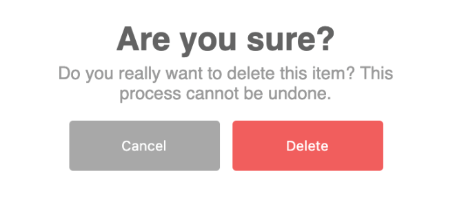
One of the most common examples of using design friction that improves a user’s experience and reduces errors is in the implementation of notifications that double-check a user’s action.
An example of this would be when a user takes an action to delete a number of files or documents and a pop-up appears with the text: “Are you sure?” This gives the user an opportunity to consider their action again as well as what the consequences of taking that action will be.
The pop up causes friction — it slows the user down — but by doing so saves further inconveniences down the road that may be irreversible.
Smart validation is another method for spotting potential user errors and correcting or validating them with user input.
An example of this might be when a user is putting in the dates of an upcoming journey into a train ticket booking website and instead of putting in a future date, they accidentally put in a date from the past. The website informs the user that only dates in the future can be booked and the user is therefore prompted to input new dates in order to complete the booking.
In other cases, it might be that the user has put in certain data correctly but it is perceived as a potential mistake from the site. When this is the case, they are nevertheless prompted to confirm it.
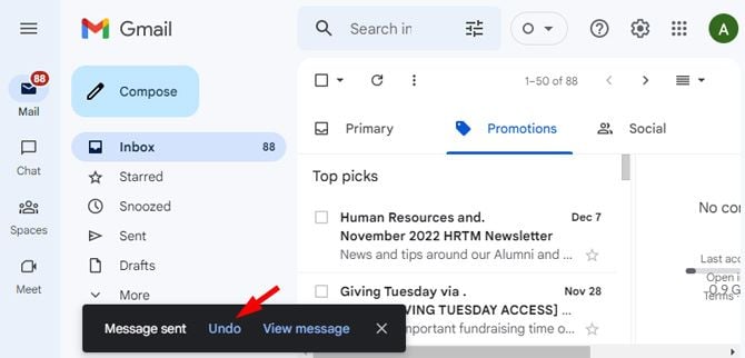
Ever noticed the unsend option when you first send an email with Gmail? Ever gratefully clicked it? The unsend button is just one example of giving users a few extra moments to reverse an action even after they’ve taken it.
Nobody likes waiting around. Increasing numbers of websites and apps are now providing users with some light entertainment while pages are loading or actions are being fulfilled so that the user is less likely to notice how long the process is taking.
It may feel like friction, but it’s actually an effective distraction technique that eases the feeling of friction for users while giving them something to do.
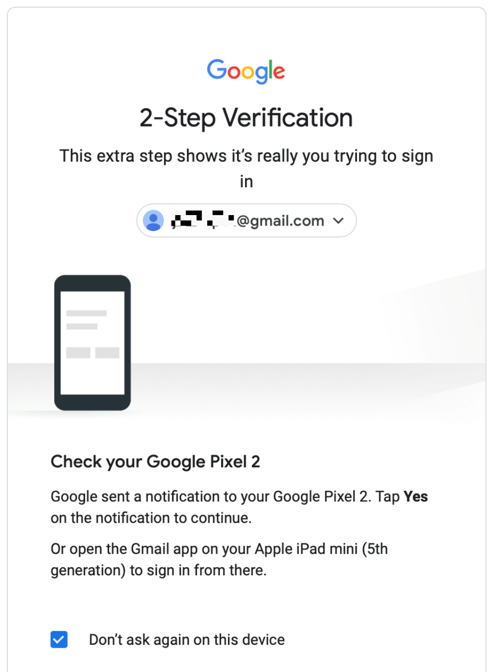
Many of us are now familiar with two-factor authentication, when a company such as Google or Yahoo sends a verification text to a phone or other device when you log into an email account from an unfamiliar device.
This additional security step definitely slows users down (which is why we’re labeling it “friction”), but in return it provides protection of user data and reassurance that others can’t easily hack into an individual’s personal accounts.
Another effective tool for decreasing perceived waiting times is to show the elements of the page as it’s loading or to install a progress bar that users can watch while they wait.
The human brain is a funny thing. Make a process too quick or efficient and users doubt its value, reliability, or efficacy.
In cases such as these, friction is really the designer’s friend. If you slow down such processes and make it appear as though the website, machine, or tool has had to work hard to achieve a result, you’ll soon find that users are more likely to trust it than when it was able to do the same thing at half the speed.
As we have seen, there are some clear and tangible ways in which friction can assist and support the user as they navigate a website. However, there may well be instances where you are unsure of how effective your use of friction is in enhancing the user experience or improving your service.
When this is the case, there are some basic UX design methodologies that can assist you in assessing its effectiveness.
User research is a tool for studying users and gaining insights regarding their preferences, needs, goals, and behavior. Before implementing friction into your website or app, it would be valuable to first collect research on what users are hoping to achieve on your website, where they are currently facing challenges, and what your direct competitors are doing. Research can be carried out in numerous different ways, from interviews and surveys, through to usability testing and user observation. With direct feedback from your target users on what irritates or hinders them on your website, you’ll be better placed to know if friction could provide a valuable solution.
While user research typically takes place before the implementation of a design feature, user testing is a tool used by designers once that new feature is in place. In the case of design friction, user testing is crucial to knowing if the friction successfully solves the problem it set out to or if it in fact makes it worse.
User testing traditionally involves the observation of users while they are directly interacting with your app or website, in some instances with UX researchers asking the user to perform specific tasks.
When user testing has been successful, the UX team should have a clear idea of what the user’s experience of the product really is and if design friction has enhanced or hindered it. Types of user testing include A/B testing, usability testing, heat map analysis, and card sorting.
In this article, we’ve covered what design friction means and provided examples of what bad friction looks like when experienced by users on websites, apps and other digital interfaces. What we’ve also seen, however, is how, when used in a selective way, friction can actually enhance the user experience and improve outcomes.
We’ve provided hands-on tips for implementing friction into your website to improve specific elements such as security, decision reversal, and perceived value, and how it can be used effectively to foresee, double check, and prevent potential errors.
LogRocket's Galileo AI watches sessions and understands user feedback for you, automating the most time-intensive parts of your job and giving you more time to focus on great design.
See how design choices, interactions, and issues affect your users — get a demo of LogRocket today.

Multimodal UX goes beyond designing for screens. Learn how context-aware systems, progressive modality, failover modes, and accessibility-first design create better digital product experiences.
Learn how context-aware mode prioritization and seamless transitions improve multimodal UX and reduce mode confusion.

Research is becoming more democratized, product cycles are accelerating, and AI is transforming synthesis and ResearchOps. Here are the three trends shaping UX research in 2026.
Voice support is not the same as multimodal UX. Here’s how to design systems with true mode continuity and context-aware interactions.