How many times have you deleted one thing while using a product, only to realize five other things suddenly broke? Or made a small change that caused something else to stop working, only to discover it hours later, because the product never told you?

This is the experience for many users of today’s software. Every product is a network of files, rules, automations, and relationships. As designers, we tend to focus on making each feature intuitive and user-friendly on its own, but when features depend on one another, keeping the overall experience seamless becomes a much bigger challenge.
This topic of dependency management came up during a recent discussion with my design team. We realized our platform handled dependencies inconsistently. Some actions blocked users until they resolved related items, others showed vague warnings, and a few made changes behind the scenes without any notification. This resulted in confusion, loss of trust, and a steady stream of support tickets from users who couldn’t understand why something had changed.
Dependency management is a core UX challenge that shapes how users perceive control, predictability, and trust. In this article, we’ll explore how to design for dependencies in a way that feels safe and seamless, including when to block, when to warn, and when to handle things silently.
Before diving into design patterns, it’s important to understand the differences between direct and indirect dependencies. Each requires a different UX approach.
Direct dependencies are visible and expected. These are straightforward, immediate cause-and-effect relationships. Users can often predict them because they’re within the same mental container. When users perform an action, they tend to reason within a mental container, which is the visible boundary of what they believe their action will affect.
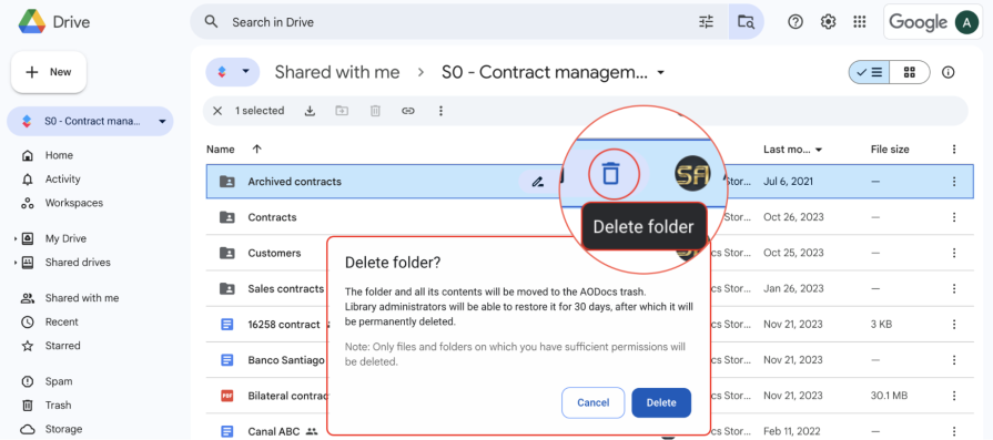
For example, when deleting a folder in Google Drive, users naturally assume everything inside that folder will be deleted. A clear confirmation modal warns you that the folder and all its contents will move to the trash. That’s the expected boundary of the container. But they don’t expect that action to also break shared links or embedded references elsewhere, because those connections live outside their mental model.
When dependencies stay within a user’s mental container, the outcome feels predictable and fair. When they extend beyond it, the product feels unreliable even if it’s technically working as designed. A big part of designing for dependency management is closing that gap between how the system behaves and how users expect it to behave.
These are trickier to design for, as indirect dependencies are hidden relationships that aren’t obvious to the user. They can cause the biggest UX headaches because users can’t see the connections. The effect isn’t clear until something breaks.
For example, when renaming a sheet in Google Sheets, the change feels simple and contained to the current sheet. The new name appears instantly in the spreadsheet, and everything seems fine, as the dependency here is direct. The action affects only what’s visible within the user’s current view.
But that sheet name might also be referenced in formulas in other spreadsheets that pull data from the sheet. Those links don’t automatically update, leading to broken formulas or missing data in other systems.
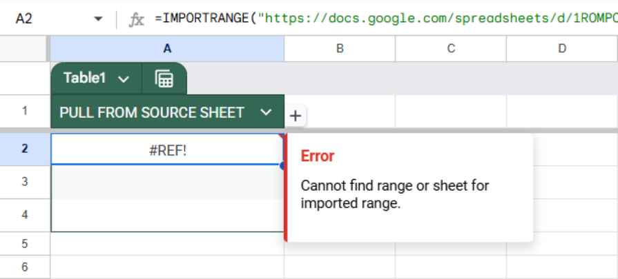
The indirect dependency between renaming a sheet and having reports stop working is a hidden ripple effect that users often don’t see until much later. From a UX perspective, this is exactly where confusion begins, and trust begins to erode. The less visible the dependency, the more careful the design needs to be in surfacing impact.
Whether you’re faced with a direct or indirect dependency, you’ll have to decide on the pattern to address the action and dependencies. Ultimately, this decision comes down to two questions:
Together, this creates four possible patterns to consider, each with its own strengths, tradeoffs, and ideal contexts. Each has a different balance of control, clarity, and friction. Choosing the right one can make the difference between a trustworthy product and one that constantly frustrates users.
This is the most protective and disruptive pattern. The system prevents the user from completing an action and explains the reason. This lets them know that something else depends on the object that is being acted upon, why the action cannot be performed, and what the user must do in order to try the action again.
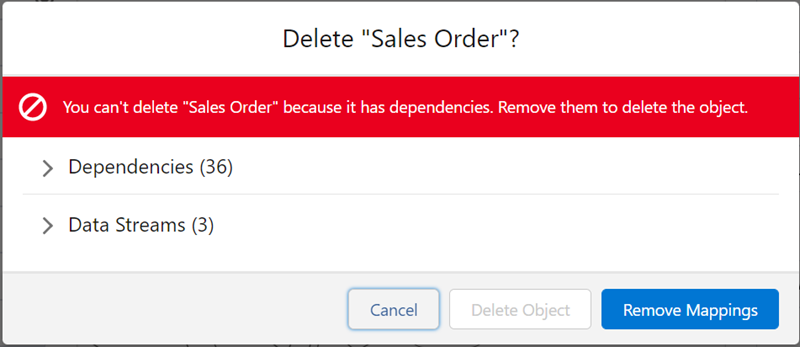
You’ll often see this in tools where irreversible actions can impact others. In Salesforce, when deleting a field or workflow rule used by another process, the system stops the action and shows a modal explaining that dependencies exist and what needs to be removed before continuing. The message is clear, the reasoning makes sense, and the user is guided toward a fix.
However, the downside of using this pattern is that it interrupts the flow. Too many blocking moments make a product feel rigid or overly cautious. Use this pattern when the stakes are high, such as actions that involve shared data, irreversible deletion, or breaking other users’ workflows, but not for routine operations.
This is generally the most balanced approach. With this pattern, the system allows the user to commit the action but provides enough context to make an informed decision, usually in the form of a confirmation modal.
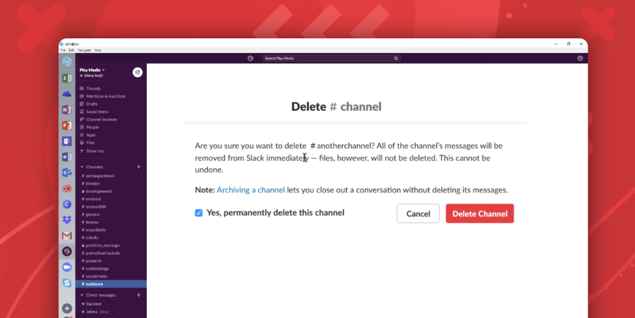
For example, Slack allows you to delete a channel, but warns that all of its messages will be removed, while any files in the channel will remain. You’re still allowed to delete the channel, but you’re made aware of the risk. This pattern respects your autonomy while still communicating the impact.
The challenge with this pattern is using it sparingly. If every small action triggers a warning, users quickly develop alert fatigue and stop reading them altogether. At that point, the warnings lose their purpose. The most effective ones are specific, timely, and proportional to the risk. Telling users which dependencies will be affected is helpful, but showing a confirmation modal for every minor action is just noise.
This pattern stops the user from taking an action but doesn’t explain why. You’ve probably seen this before in the form of a grayed-out button or disabled option without an explanation of what’s wrong. Maybe an action button is inactive because another process is still running or the user lacks permissions, but there’s no tooltip or message to tell you that.
In Atlassian’s Bitbucket Cloud, you can see this pattern when trying to delete a protected branch. The “Delete” button is visible but grayed out, with no clear message explaining why.
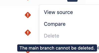
Behind the scenes, the system is enforcing dependency rules that restrict the branch, restricting it from being deleted. The restriction makes sense technically, but without a clear explanation, it just feels like the button is broken. Only by hovering over it does a small tooltip appear, revealing that it cannot be deleted, but not explaining why. Without an explanation, people might assume it’s a bug or think they did something wrong.
Finally, this pattern allows the action and handles dependencies silently. This works best when the relationship between actions is predictable and safe, as users can reasonably assume the system just handles it automatically.
When you add a new event to Apple’s Calendar on one device, it syncs automatically across all others. Although users aren’t informed, they expect that instant continuity. There’s no modal or prompt that alerts them of the syncing. The behavior matches user expectations perfectly, so they don’t even think of it as a dependency.
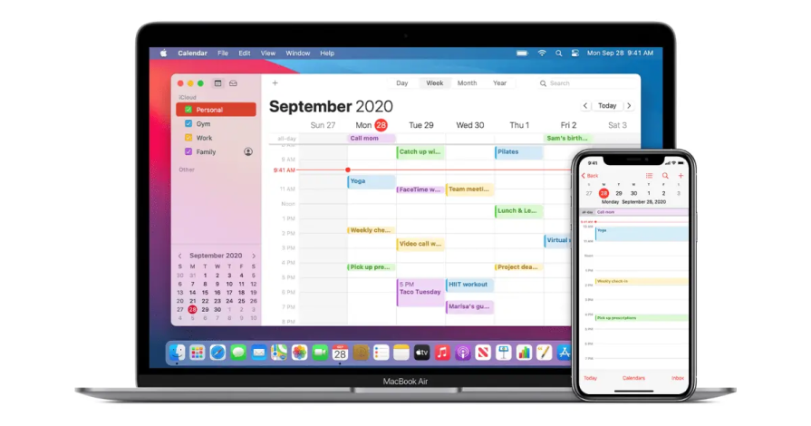
This pattern keeps the experience quick and fluid, but it can be fragile. If the automation ever fails or behaves inconsistently, such as if one linked device doesn’t update, then users might feel blindsided, since they’re not provided with an explanation. Silent handling only works when the logic is both predictable and trustworthy.
Most products rely on a mix of these four patterns. Critical, irreversible actions should be blocked and explained to protect users from making costly mistakes. Recoverable but risky actions can be allowed with clear warnings of the associated risks to balance safety with a sense of control. Low-risk, frequent interactions are best handled silently, as long as the behavior is consistent and reliable. This keeps users in flow while minimizing unnecessary friction.
The only pattern to usually avoid is blocking actions without explanation. It protects the system at the expense of the user experience. Ultimately, the goal isn’t to eliminate friction altogether. Friction can be valuable when it prevents irreversible mistakes. The key is to introduce friction where it matters most in moments that make users feel safe, not slowed down.
Once you’ve decided how to handle a dependency, the next step is choosing the right UI pattern to communicate it. Dependencies should be made visible without overwhelming users to surface enough context so that your users feel confident. The key is to choose the pattern that matches the level of risk taken by the user. When users understand the impact of their actions or can easily recover from them, dependency management becomes much simpler.
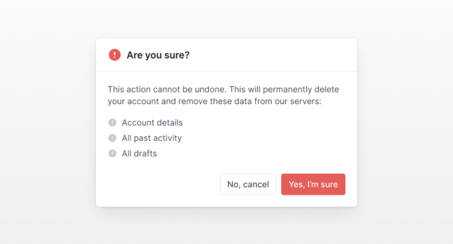
Confirmation modals are the most direct way to handle high-impact or irreversible actions. They pause the flow just long enough to show what will be affected and what the consequences are, while still letting users decide whether to proceed. In the modal, include a list of dependent objects that will be affected by the action. When used thoughtfully, this pattern provides clarity and prevents costly mistakes without feeling overly disruptive.
Inline messaging offers a subtle way to surface dependency information without interrupting the user’s workflow. It works best in edit states or settings, where users benefit from seeing additional context directly on the page.
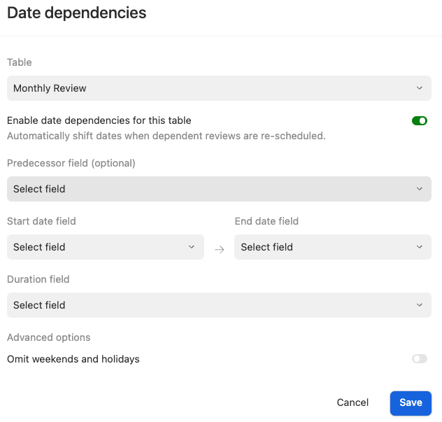
For example, in Airtable, an inline message appears below the Date dependencies toggle in the table settings. It informs users that enabling this control will automatically adjust related dates across linked records. This gives users clear visibility into what will change without requiring a confirmation modal. The feedback is lightweight, contextual, and keeps users informed while allowing them to stay focused on their task.
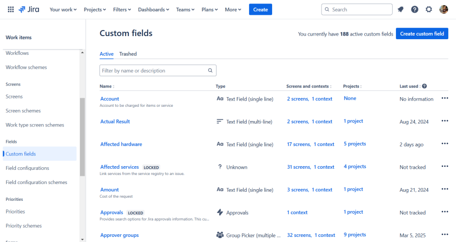
Reference indicators give users upfront visibility into where an object is used or what objects reference it before they make a change. In Jira’s custom fields view, each field lists the screens, contexts, and projects it’s associated with. This gives the user information about each object’s dependencies without opening another menu or triggering an error. By surfacing relationships directly in the table, Jira helps users make safer, more informed decisions. This proactive UX pattern reduces the need for disruptive warnings later on.
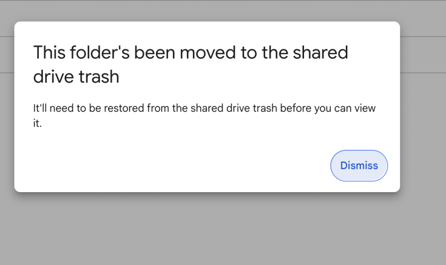
Recovery patterns such as undo, soft delete, or version control act as a safety net that makes silent handling possible. When users know they can easily revert mistakes, they feel more confident taking action and worry less about making irreversible errors. In Google Drive, when a shared folder is deleted, users see a clear message that it’s been moved to the shared drive trash and can be restored at any time. Providing a clear, time-bound way to undo actions helps maintain trust, reduces hesitation, and keeps users in flow without unnecessary interruptions.
Dependency management is complex because dependent features are often built independently and rarely considered as part of one experience. Teams usually treat it as something to fix after users start breaking things, but most issues come from a few predictable mistakes.
The first mistake is inconsistency with the patterns used for handling dependencies. One action blocks and informs users, while another handles changes without letting users know of the impact. Users can lose trust because they can’t predict how the system will respond.
To address the inconsistency in your product, define clear rules for when to block, when to inform, and when to automate, and apply them consistently across the product. Build these patterns into your design system by defining guidelines so that dependencies are treated consistently, based on their level of risk.
Another common mistake is overprotecting the system instead of empowering the user. Teams often default to blocking actions that make sense from a backend perspective but create unnecessary friction for users. Too many confirmation modals lead to fatigue, as users start second-guessing themselves and lose confidence in their actions.
Instead, provide a balance of contextual information and automation. Surface dependencies upfront so users aren’t caught off guard. Warn them only when the risk is high, and automate the rest if it’s reversible. This approach will keep users informed, confident, and moving forward.
Finally, many teams deprioritize recovery because it requires technical investment to store and manage previous states. Building undo systems or version control takes time and infrastructure that often compete with new feature work. When systems don’t provide a way back, users become afraid to take action. However, not every action should be recoverable because if everything can be undone, it weakens trust in what’s meant to be final.
For low-risk actions like small edits or updates, build in an undo option to let users recover quickly from mistakes. For larger-scale changes, use version history or rollbacks to restore stability without losing data. Recovery patterns make products feel safer and more forgiving.
Good dependency design isn’t about controlling users’ every action. It’s about building trust and support into the experience by looking out for their best interests. Warnings and automations should guide the user rather than make them feel restricted. When dependencies are handled well, users should stop worrying about what might break and start trusting that the system will catch them if something does.
Designing for trust means adding friction only where it matters. Confirmations have value when they help users make better decisions, but otherwise, the experience should feel predictable, reliable, and seamless. When combined with a strong recovery model, thoughtful dependency management gives users the confidence to take action without fear of irreversible mistakes. In the end, dependency management isn’t about preventing users from breaking things, but designing systems where they never have to be afraid to try.

LogRocket's Galileo AI watches sessions and understands user feedback for you, automating the most time-intensive parts of your job and giving you more time to focus on great design.
See how design choices, interactions, and issues affect your users — get a demo of LogRocket today.

AI tools can generate beautiful UI concepts in minutes, but most teams struggle to integrate those outputs into real design systems. This guide explores why AI drifts toward generic patterns and how to build governed workflows that keep speed without sacrificing brand consistency.

Adaptive interfaces personalize experiences using behavioral signals and machine learning. But when personalization becomes autonomous, systems can reinforce patterns, limit discovery, and shape user behavior in ways designers didn’t intend.

Security requirements shouldn’t come at the cost of usability. This guide outlines 10 practical heuristics to design 2FA flows that protect users while minimizing friction, confusion, and recovery failures.

2FA failures shouldn’t mean permanent lockout. This guide breaks down recovery methods, failure handling, progressive disclosure, and UX strategies to balance security with accessibility.


