A heuristic evaluation is a simple method UX teams can use to assess user interfaces, uncover issues, and enhance designs for greater overall usability.

You can evaluate your UI design against whichever set of usability heuristics aligns best with your UX practices, but the most common criteria is a set of ten principles coined by Jakob Nielsen in 1994 that provide a foundation of effective UI design.
In this article, we’ll see how Nielsen’s ten usability heuristics connect to real-world examples and explore how to evaluate a UI based on these principles. We’ll also go through a simple four-step process for conducting a heuristic evaluation, providing a sample heuristic evaluation template with guidelines for assigning a severity score to each principle.
Editor’s note: This article was rewritten by Bart Krawczyk on 10 March 2025 to connect Nielsen’s ten usability heuristics to real-world examples, break the heuristic evaluation process into four clear, actionable steps, include visual aids, and introduce an example severity ratings scoring system along with a sample evaluation template. Special thanks to the original author, Rosie Allabarton, for her contributions to the first version of this post.
A heuristic evaluation in UX is a method of assessing user interfaces against a predefined set of usability criteria to uncover issues and opportunities to enhance the design.
A heuristic evaluation is one of many tools that can be used to perform a UX audit. It offers a snapshot of the design’s usability as measured against a set of heuristics. A UX audit is more comprehensive, providing a holistic view of the user experience.
You can use any set of heuristics in your evaluation, as long as they align with your current UX practices and are agreed upon in advance by the UX experts performing the heuristic evaluation. Nielsen’s ten usability heuristics are commonly used, but there are others you may wish to explore, or you can define your own set.
Usability heuristics provide a clear, structured framework on how to assess an interface’s usability against predefined criteria, helping us prevent or fix usability challenges with ease.
Nielsen’s ten usability heuristics include:
Users should always be aware of what’s going on in the product. For example, if they download a file, they should clearly see if it’s progressing, how fast it is progressing and what’s the estimated completion time:
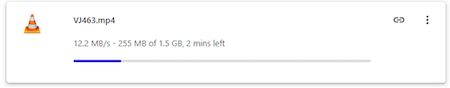
Never leave users confused as to whether something is happening or not.
The more closely a product and its features resemble the real world, the easier it is for people to comprehend.
For example, Amazon’s shopping cart needs no explanation. People can immediately understand what it represents since it matches its real-world counterpart:

Don’t invent new terms or representations if it’s not absolutely necessary. People don’t have time or energy to learn new things just to use your product effectively.
There’s hardly a worse feeling in the world than feeling trapped. We crave freedom, independence, and control. Your product should hand users the reins, letting them take control of their experience while guiding them so they never feel lost or unsure of their next steps.
Take a look at Reddit, for example:
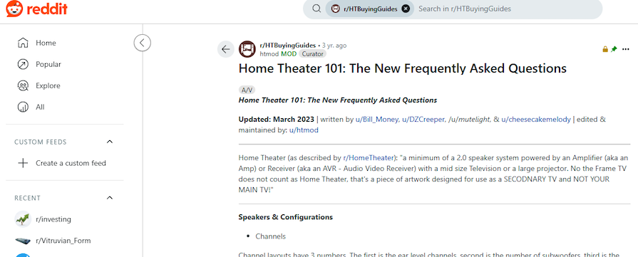
On one screen, there are nine dedicated buttons to navigate through the website, from back buttons to main feeds to recent subreddits. Although it adds some visual clutter, it also gives people a sense of freedom psychologically — they can easily go wherever they want, whenever they want.
Learning new things is time-consuming for users, so use common patterns rather than reinventing the wheel.
For example, if you’re unsure how to design an online podcast experience, you can start by looking at a few of the most popular ones and see how they design the experience. Of course, you shouldn’t copy the work of others, but you don’t need to innovate too much.
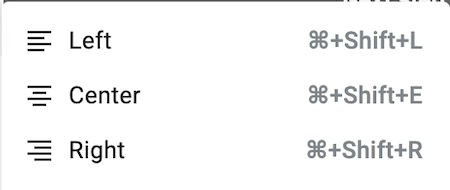
Also, make sure you are consistent with whatever you do. Your app should feel similar to your web product, and your ads should reflect how the whole product experience feels:

Don’t ever make users doubt whether they landed on the right page.
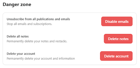
If a user makes an error, it’s on you. Great products are designed in a way that prevents expensive mistakes.
Take a look at Substack. Error-sensitive options like deleting notes or accounts are clearly marked in a distinct ”Danger zone,” and buttons are in red, further reflecting the operation’s anger. It’s a great way to catch users ‘attention and avoid accidental clicks:
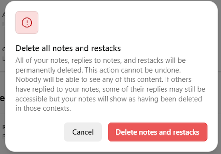
Even after the click, there’s yet another warning modal indicating the consequences of the action:
With these mechanics in place, the chances of someone accidentally deleting their account or notes are rather slim.
We have a short memory, so don’t force users to remember their previous actions. Make it visible or remind them whenever needed.
Take a typical ecommerce experience as an example. Users don’t have to remember what items exactly they put in the card or what’s their price. They can quickly check it in their cart at any time:
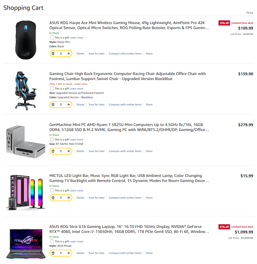
That’s a rather extreme example, but the same principles apply in other areas, such as informing users what subscription they are purchasing on the payment details screen or summarizing what data they put during onboarding.
There are two types of users:
Your product should cater to both. Take Microsoft’s products as an example — they’re shortcut-heavy. You can do almost everything without even using your mouse:
This way, they optimize the product for power users without harming the casual user, as relevant options are still accessible by manually exploring the topbar.
Less is more. Or, in the case of product design, a minimalistic product design is easier to navigate, making it significantly more usable, especially for new users.
Make each element on the screen fight for its life. Is it truly necessary? Does it convey meaning in a simple, but effective way? Can you replace it with something even simpler to make the experience more intuitive?
Although you may opt to include maximalistic elements in your design to stand out, guide user focus, or make a bold brand statement, it’s important to never compromise on usability.
Even with great error prevention mechanics, mistakes will still occur. Whenever it happens, make sure it’s clearly visible to users and that they know how to fix the error:

Clear error messages are a great example of that. Your error messages should help users understand and correct the problem without putting blame on their shoulders.
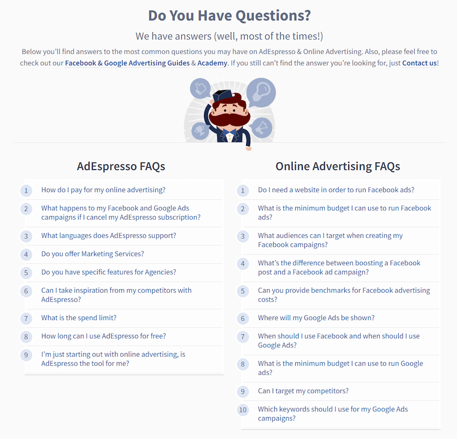
Some users need more help than others, either because they are newbies to the topic or power users with advanced questions. Ensure both groups can get the support they need effortlessly.
FAQs are a great example of that. They allow users to get answers to all kinds of questions without the need to contact customer support:
Here are some alternative usability heuristics that you may wish to explore:
Now that we have covered all the heuristics, let’s take a look at how to conduct a heuristic evaluation of your or competitors’ products.
Ideally, you should get at least three evaluators. It helps iron out biases and sparks interesting conversations.
They also should be experienced UX designers. Although technically anyone could participate in the heuristic evaluation, people who truly understand user experience tend to have better judgment in that area.
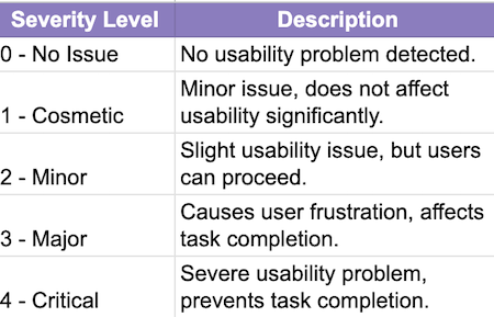
Each evaluator should review the interface independently. Although not mandatory, I recommend scoring each of the heuristics from 0 (no issue) to 4 (critical issue) and leaving a comment whenever necessary.
Discuss individual findings in a group of evaluators. Focus especially on areas in which your scores differ significantly.
The outcome of the discussion should be a report that consolidates the evaluator’s findings. I usually focus on a minimalistic report with scoring and comments only in areas that might need any improvement:
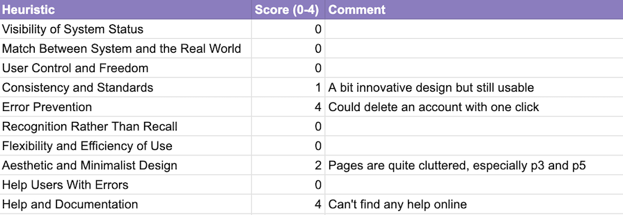
You can copy the above template and adjust it to your needs. The exact scoring itself is rather subjective, but I use the following guidelines:
Based on this report, you, as an evaluator or a separate design team, can write up recommendations on how to improve the most severe usability issues.
Unlike other UX design methodologies, a heuristic evaluation is lean, fast, and requires minimal resources, external input, or team members, making it a popular choice among smaller companies and teams. Its many benefits include:
Like any other expertise-based evaluation method, heuristic evaluation is quite subjective and imperfect. You are not your user, and your assessment of the product will be different. Heuristic evaluation does not replace testing with users.
Still, it’s an effective way to quickly and cheaply identify basic usability issues. For a simple product, heuristic evaluation takes less time than recruiting a single participant for a usability test.
The sweet spot? Employ both.
Focus on heuristic evaluation early on to fix obvious usability issues. Once you stop seeing issues yourself, present the product to the user for further evaluation. This way, your evaluation will be both efficient and effective.
Header image source: IconScout

LogRocket's Galileo AI watches sessions and understands user feedback for you, automating the most time-intensive parts of your job and giving you more time to focus on great design.
See how design choices, interactions, and issues affect your users — get a demo of LogRocket today.

Explore the core principles of GUI design and learn how consistency, simplicity, feedback, accessibility, and user testing contribute to better digital experiences.

After five years in UX, I revisited the Daily UI challenge to reconnect with hands-on design. Along the way, I learned that great interfaces come from thoughtful briefs, sound judgment, and user feedback, not just better AI tools.

Learn what makes a great login screen through real-world examples and UX best practices for creating secure, accessible, and low-friction authentication flows.

Skeuomorphism helped define early digital interfaces by mimicking real-world objects to make technology more intuitive. Learn how it compares with flat design and neumorphism, why it declined, and where it still has a place in modern UX.


