It feels like the world speeds up dramatically every single year. We have barely finished embracing the new possibilities of cloud computing, yet there’s already an AI arms race to find the best way to leverage machine learning models in consumer products.

This ever-increasing speed of change significantly impacts customer behavior. Namely, our attention spans have become shorter, and we are growing increasingly impatient. There’s just too much going on around us.
This change poses a new challenge for design teams — how to design products for system 1 thinkers? Designing for someone who just glances over our app while multitasking is a different piece of cake than designing for a conscious user that actually pays attention to what’s going on on the screen.
Luckily, there’s a framework that can help you validate whether your designs pass the fast thinker test: the B.I.A.S. framework.
If you are confused about what I mean by “fast thinkers” or “system 1 thinkers,” here’s a quick psychology recap.
Humans have two modes of operation:
Most of the time, we are in fast-thinking mode. Still, many designers tend to forget about that phenomenon and design products expecting the user to pay attention to what’s happening on the screen.
The B.I.A.S. framework is a method of optimizing a product for fast-thinking contexts by using behavioral design principles. It splits system 1 thinking into four separate phases: block, interpret, act, and store.
Let’s dive deeper into each of them.
While we are in fast-thinking mode, we tend to ignore most of what is happening on the screen.
We especially block things that seem to be:
Implementation tip: review your key user journeys and note down all elements that are either high effort, unrelated, or redundant. Then, try to find viable ways to remove them. Five-second tests are a great way to reveal what users block.
Even if users didn’t block a particular element, it doesn’t mean they paid enough attention to fully interpret what it was about. If you want users to take a particular action, you must ensure they quickly grasp what’s going on and the next steps.
You can help users quickly understand what’s going on by ensuring:
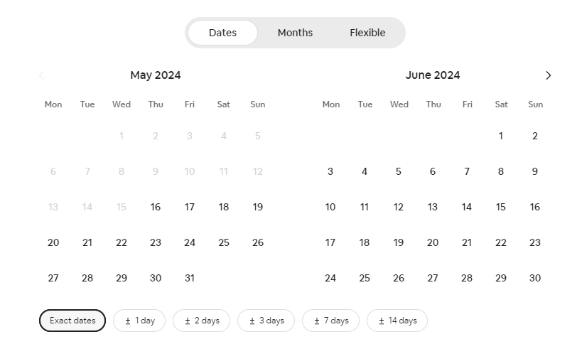
One good example is on Airbnb’s website. When a user is looking to book an accommodation, a calendar will pop up for them to select the dates they’re hoping to secure for their vacation. Although Airbnb is an innovative company, it doesn’t innovate on the user journey elements itself because it’s easy for users to interpret what to do next when they see this calendar:
Implementation tip: choose your most important screens and consider at least one way to implement each of the bullet points above.
OK, you managed to catch your users’ attention by removing irrelevant elements (block) and helping them understand what’s going on (interpret). The next step is to make sure they actually act on the call to action and complete the desired journey.
The most efficient way to do that is to remove as much friction as possible. That includes:

Remember, the more choices out there, the harder it is to choose. Therefore, the less friction, the better.
Implementation tip: identify all friction points, aka elements that require input or thinking from the user. Look for ways to reduce the friction they generate or, ideally, remove them altogether.
After successfully completing the user journey (act), the last step is to ensure that the memory stays in our users’ heads as long as possible.
It not only increases the chances of them coming back or recommending the product to friends and colleagues, but the better the end experience, the easier it will be for them to repeat it in the future.
There are four key principles to keep in mind:
Take this ad for example. Unexpectedness creates memorable experiences and brands:
Most people forget about users after they complete the desired user journey. Thus, nailing the post-conversion experience is a great way to differentiate on the market.
Implementation tip: make sure your user journey map includes the post-conversion experience. Is it as optimized as the rest of the journey?
By following the steps of the B.I.A.S. framework, you will be able to audit and optimize your user journey for system 1 (fast) thinking, which will almost surely increase your conversion rates between steps.
However, don’t go overboard. There’ll still be people in system 2 (slow) thinking mode, and even though they are a minority, their willingness to convert is usually significantly higher.
Strike the right balance by optimizing for fast thinkers first while allowing slow thinkers to dive deeper into the details of your product and all the possibilities you offer. For example, tooltips and “learn more” sections give slow thinkers the opportunity to dive deeper without creating too much extra clutter for fast thinkers.
Optimizing default user journeys for fast thinking but allowing alternate paths for slow thinkers is the key.

LogRocket lets you replay users' product experiences to visualize struggle, see issues affecting adoption, and combine qualitative and quantitative data so you can create amazing digital experiences.
See how design choices, interactions, and issues affect your users — get a demo of LogRocket today.

Having a clear color palette helps you avoid color clashes, speeds up the design process, and allows you to focus more on other creative aspects of your work.
We’ll talk about including message mining in your copywriting process to understand your audience and improve conversion rates.
Learn how to define project scope, use templates, make confident decisions, and leverage AI to enhance your workflow and meet your creative goals.
Humans are not rational. If you want to improve your UX game, you need to design for the irrational emotions that drive human behavior, not for sound logic.


