Between 1990 and 1999, computers with better processors, sound cards, and color displays became personal devices for entertainment and education. With wider internet adoption, they became tools for self-expression, especially through personal websites.
In the 90s, almost anyone could be a web designer, and the public wasn’t afraid to find beauty in imperfection. The distinct digital 90s aesthetic favored bold and eye-catching individualistic designs characterized by bright color palettes, animated GIFs, and dense layouts.
This era of the internet was unapologetically naive, experimental, and engineering-oriented. Designs from this period offer valuable insights into the relationship between identity expression and technological innovation.
The 90s were a kind of in-between transitional era. Its signature aesthetic reflects a moment in history where digital culture started to become more widely adopted, but was also tempered by the rudimentary computing power and scarce telecommunication bandwidth of the era.
The aesthetic of that period, though revolutionary for its time, can seem primitive and amateurish today. Despite their age, elements of the 90s websites remain influential in contemporary design.
90s web aesthetics can evoke nostalgia or even inspire modern minimalism that signals utility and robust engineering. Retro website designs also appeal to audiences who remember this period as a simpler, bygone age.
Let’s get into how we can take inspiration from key characteristics of that classic 90s style and apply them to modern websites.
If you’re more of a visual learner, in the video below, we do a deep dive into how this style of design has been making waves in modern websites. We talk about the history of ’90s design, features that you might see today, and examples of great sites that get inspiration from this iconic era:
Editor’s note — This update adds clearer context and a chart for the Memphis color palette and expands the section on applying 90s design principles in modern UX, emphasizing how contemporary technical know-how translates those ideas into today’s design workflows.
The 90s saw the internet transition from text-heavy pages to visually dynamic designs, thanks to emerging technologies like tables for layout, JavaScript, CSS, and Flash. This era brought a mix of creativity and constraints, shaping a bold and experimental web aesthetic.
Back in the 90s, limited bandwidth and low-res screens shaped how websites looked. Designers got creative, making up for the tech constraints with bright colors, bold visuals, and animated GIFs. These lightweight, quirky features not only added personality but also worked well with slower internet speeds.
Take the dancing baby GIF, for example. It’s one of the first viral memes — a wobbly, pixelated animation that somehow captured everyone’s attention. It’s a perfect throwback to a time when the web was all about experimenting and having fun, even with the tech hurdles.

Key takeaway: Bandwidth constraints encouraged creativity, producing lightweight yet expressive visuals.
In the 90s, designers made the most of just 256 colors, going all-in with bold, often clashing tones. While limited to 256 colors, these palette prefigured today’s flat and neon design trends.
Think Memphis Design’s funky shapes and vibrant hues mixed with grungy, corporate vibes that added character to early websites:

Typography? It was all about working with what you had. Fonts like Arial and Times New Roman were the go-to, but designers kept it interesting with creative sizing, colors, and layouts. Limitations didn’t stop them from making things pop.
Key takeaways:
The skeuomorphic design mimicked real-world objects using shadows, textures, and gradients to create a sense of depth. Buttons and icons often featured pixelated details that remain nostalgic classics today. Busy backgrounds — featuring patterns, gradients, or repeating logos — added depth and movement to designs.

Key takeaway: Skeuomorphic design helps bridge the gap between the physical and digital worlds by mimicking real-world objects, thereby making new digital interfaces intuitive, engaging, and easy to learn for users.
The “more is more” philosophy ruled the 90s web. This was referred to as “Maximalism”, where every available pixel had to be used to pack the screen with as much content as possible. The idea was simple: the more visual stimulation, the better the engagement.
This era was all about pushing boundaries — vibrant colors, animations, and eye-catching designs filled every corner of the screen. It was experimental, sometimes chaotic, but it laid the foundation for modern UX. These bold, in-your-face designs may seem over-the-top now, but they taught us a lot about grabbing attention and creating memorable online experiences.
Take, for example, the early days of Yahoo!:
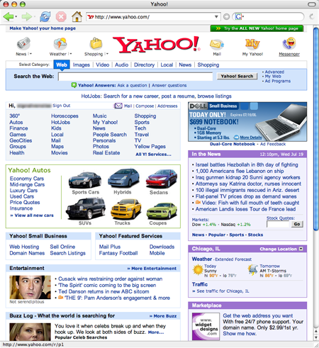
Their homepage was a prime example of “more is more” with vibrant colors, dense text, and a mishmash of images and links everywhere. Despite the clutter, it was a bold attempt at creating something unique, guiding the way for many early internet users to explore the digital world.
Key takeaway: Maximalist design is the opposite of minimalism, curated through an abundance of color, pattern, and texture. Maximalism works effectively for creativity, entertainment, and culture-related product designs.
Looking a bit closer at classic 90s websites can help us identify many interesting design approaches that illustrate how experimentation defined early web UX:
With limited computing power, clunkier resolutions, text-heavy origins, and users conducting experiments with colors, layout, and style, the result was a kitchen sink approach that could, at times, have startlingly original results.
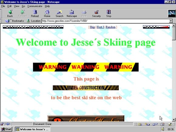
Geocities was an important host for thousands of highly individualized “home pages” and a key driver of what 90s web design looked like. A contemporary version of it is Neocities. From a design viewpoint, it is interesting to see how the original concept has been freshened.
Check out this great experiment by students at the University of Toronto in creating their own versions of “ugly” 90s websites:
Takeaway: Ornamentation, such as animations, fonts, or emojis can be used to distinguish a product and convey a sense of identity.
In the previous era of the late 80s, the internet resembled the line-by-line command interface of a terminal window. Used mostly by academics, government, and business, the internet of this period was used to exchange and read text-heavy documents and data.
An influential text-heavy, HTML-based format that became a web template is the wiki. Powering huge websites like Wikipedia or other user-edited public resources, the wiki retains the ethos of the text-heavy 90s website used to disseminate knowledge and information. Wikis are a classic template of 90s web design rooted in raw HTML concepts that are still in use.
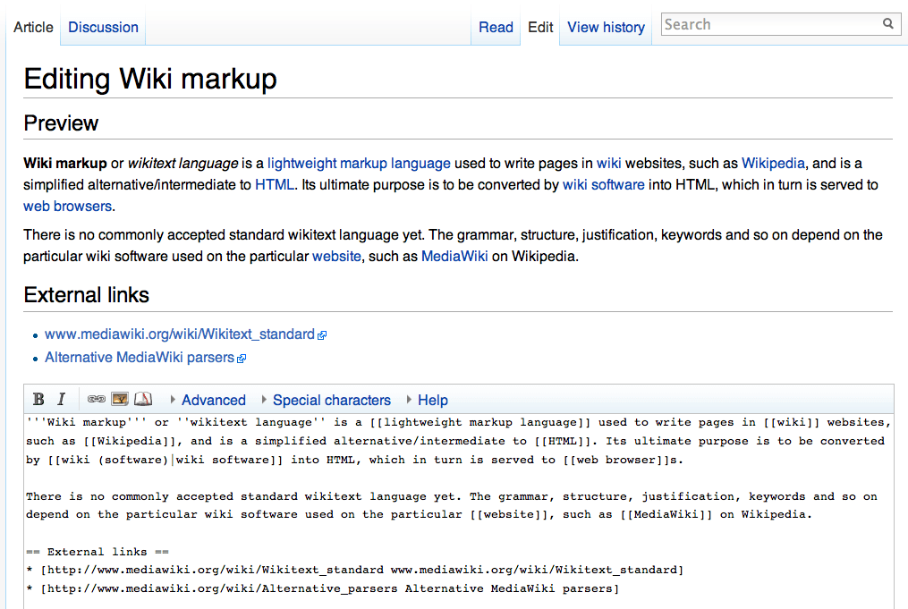
Takeway: Slow internet speeds led to the use of tables and bullet-point lists with clickable hyperlinks. These techniques remain the building blocks of contemporary web design.
More often than not, in this period, there was no hierarchical difference indicated between the myriad information and navigation options that a web page offered as text. A user was presented with thousands of clickable links or banners.
To distinguish themselves from the highly cluttered “Craigslist” look, some websites went the totally opposite way.
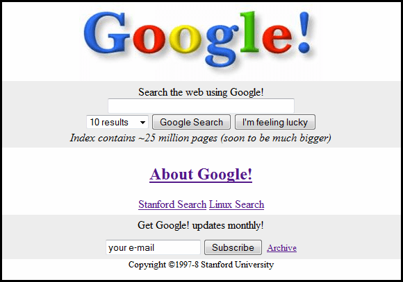
The best example of an ultra-simple website is the debut of Google in September 1998. The story goes that it was so radically different from the information-dense websites of that time that the copyright information was added to the bottom of the page so that users knew the page had finished loading.
Takeaway: Websites like Craigslist or Yahoo overwhelmed users with their maximalist approach to information. This led to newer approaches where negative space and hierarchical organization were used to guide the user.
90s web design encompassed both maximalism and austerity. One approach was characterized by busy visuals and vibrant multi-colored layouts, with every space filled with graphics and animations. Another represents a predecessor to today’s preference for cleaner design.
In this section, we’ll connect 90s aesthetics with actionable principles for contemporary UX practices:
Retro elements aren’t just fun; they’re a clever way for brands to stand out and grab attention. In an age of minimalist templates, nostalgic design can be a refreshing break.
That said, content can’t just be an info dump anymore. It’s got to tell a story, guiding users on a journey. People expect quick answers, so the design needs to be intuitive and solution-driven.
But here’s where the aesthetic-usability effect (a cognitive bias where users perceive a visually appealing product as being easier and more effective to use) comes into play. Moreover, when something looks good, people are more willing to overlook minor usability hiccups. The quirky, nostalgic charm of 90s designs might mean a few extra clicks, but users are often willing to forgive this extra effort if it’s visually appealing and evokes positive memories.
Take, for example, retro elements like pixelated icons or neon color schemes — while they may not be the easiest to navigate, they add personality and fun that keep users engaged:
Nostalgia can be a powerful tool for designers. Retro designs tap into powerful nostalgic feelings, evoking positive memories and emotions associated with the past. This approach has special appeal to consumers who appreciate when tradition meets innovation. In digital marketing, retro elements offer a sense of familiarity and warmth.
The low-fidelity look of the 90s is now interpreted as a desirable, counter-cultural aesthetic against the high-gloss perfection of mainstream tech, making it a powerful tool for niche branding.
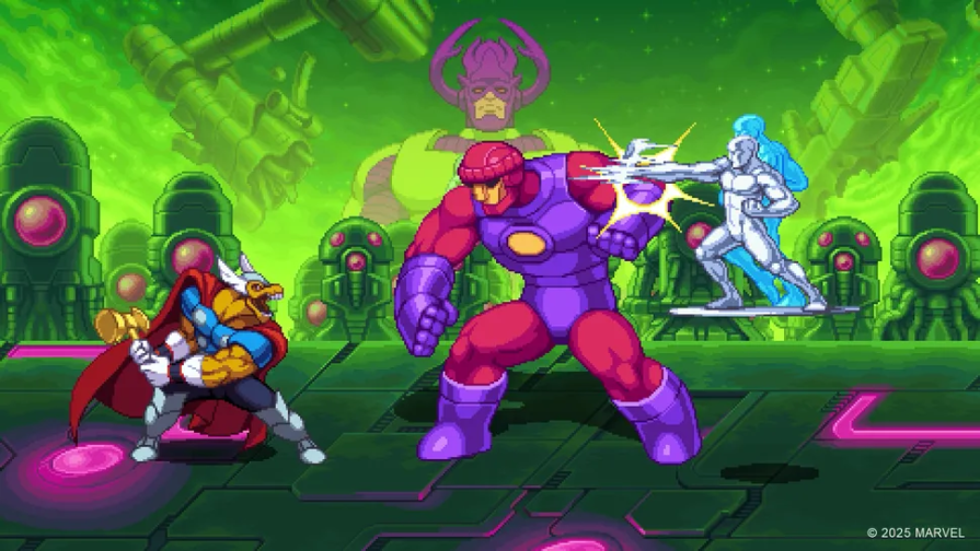
Nostalgia is particularly a good fit for indie products like fashion, music, food, and, especially, computer games. For example, Marvel Cosmic Invasion is a beat ’em up that combines classic pixel sprites with fluid animation and richly layered backgrounds: it connects a retro-theme with a retro-style:
The quirkiness of past design trends can serve as a contrast to sterile, ultra-modern “cookie-cutter” design templates. A website can evoke feelings of authenticity and exclusivity by incorporating 90s vintage styling, fonts, and color palettes.
Even when going for an older style era, there is no need to forget everything that design has learned over the last three decades.
The trick is knowing the rules so you can follow the fundamental ones, bend others, and break many. Always stick to basics like negative space, design consistency, hierarchy, and reducing memory load.
When using a retro design principle, understand why you’re deviating and how it will affect the user journey.
For example, you can easily reimagine the spirit of 90s animated GIFs with modern CSS animations and micro-interactions. Does that mean we should go wild and paper a webpage with all sorts of weird animations? For a serious corporate web app, maybe not. But an art or fashion brand, maybe yes! It all depends on the context.
Researching the different decades of web development is an opportunity to learn more about the roots of aesthetic conventions that are in use even today.
The 90s were a time of innovation and early adoption of digital technology for culture. Engaging with this period of design allows us to learn about the intellectual heritage, artistic history, and sense of individualism of the era. You can use this knowledge to both technically improve web development practices and tap into nostalgia to enhance your designs.
With limited computing power, clunkier resolutions, text-heavy origins, and slow internet connections, users conducted all sorts of experiments with animation colors, layouts, background textures, and styles to express their personalities or brands. Quirky media like animated GIFs thrived in the 90s due to a combination of technological feasibility, cultural aesthetics, browser capabilities, and the rise of meme culture.
Many of the bedrock principles of good design, such as the use of white space, buttons, hierarchy of information, cognitive load, and clear user journeys, arise from this context of free development and experimentation. You can trace norms of contemporary web design, like abstract emojis or itemized columns, back to ideas created in the 90s for whimsical, artistic, or technically astute reasons.
Take this away:
Disregarding current trends can help in creating something novel. However, you need to balance this with concerns like accessibility, confusion, clutter, and other user needs that amateur designers overlooked in earlier periods.

LogRocket's Galileo AI watches sessions and understands user feedback for you, automating the most time-intensive parts of your job and giving you more time to focus on great design.
See how design choices, interactions, and issues affect your users — get a demo of LogRocket today.

Explore the core principles of GUI design and learn how consistency, simplicity, feedback, accessibility, and user testing contribute to better digital experiences.

After five years in UX, I revisited the Daily UI challenge to reconnect with hands-on design. Along the way, I learned that great interfaces come from thoughtful briefs, sound judgment, and user feedback, not just better AI tools.

Learn what makes a great login screen through real-world examples and UX best practices for creating secure, accessible, and low-friction authentication flows.

Skeuomorphism helped define early digital interfaces by mimicking real-world objects to make technology more intuitive. Learn how it compares with flat design and neumorphism, why it declined, and where it still has a place in modern UX.


