Editor’s note: This blog was updated on 31 January 2025 by the author to provide new examples for 2025 and to cover common FAQs.
UX case studies are the backbone of a strong design portfolio. They offer a deep dive into how you tackle design challenges, showcasing your methods and results. For recruiters and potential clients, these case studies serve as a metric for evaluating your skills, problem-solving abilities, and talent.
But their value goes far beyond showcasing expertise. Building a case study is essential for skill development as it pushes you to reflect on your work, helping you identify your strengths and areas for improvement.
And that’s not all—by sharing your design process, you inspire and guide other designers, offering them a roadmap for tackling similar challenges.
So, what’s stopping you from creating your UX case study this year?
If you’re ready to create your own UX case study in 2025 but don’t know where to start, you’re in the right place. This article aims to inspire you with 25 carefully hand-picked UX case study examples, each offering valuable lessons. It also addresses some frequently asked questions on the subject, to give all the tools you need to create your next case study.
Let’s get started, shall we? But first, let’s look at the benefits of a well-detailed UX case study.
Is the effort it takes to create a UX case study truly worth it?
Absolutely!
Remember how in math class, showing your workings was even more important than getting the correct answer? UX case studies are like that for designers. They’re more than just showcasing the final product (the polished website or app) — they detail the steps taken to get there (the research, user testing, and design iterations). By showing your design process, you give potential employers or clients a peek into your thought process and problem-solving skills.
A well-laid-out case study has many benefits, including the following:
Now that you know why a stand-out case study is so important, let’s look at 25 examples to help you get creative.
This section explores UX case studies that take you through the complete design journey of creating a digital product from scratch.
If you’re a designer looking to get your foot in the door, this is one case study you need to check out. Christina Sa walks you through the creation of “Enjoy Korean,” a non-traditional app that teaches the Korean language. It’s so well detailed that it helped the creator land their first role as a UX designer:
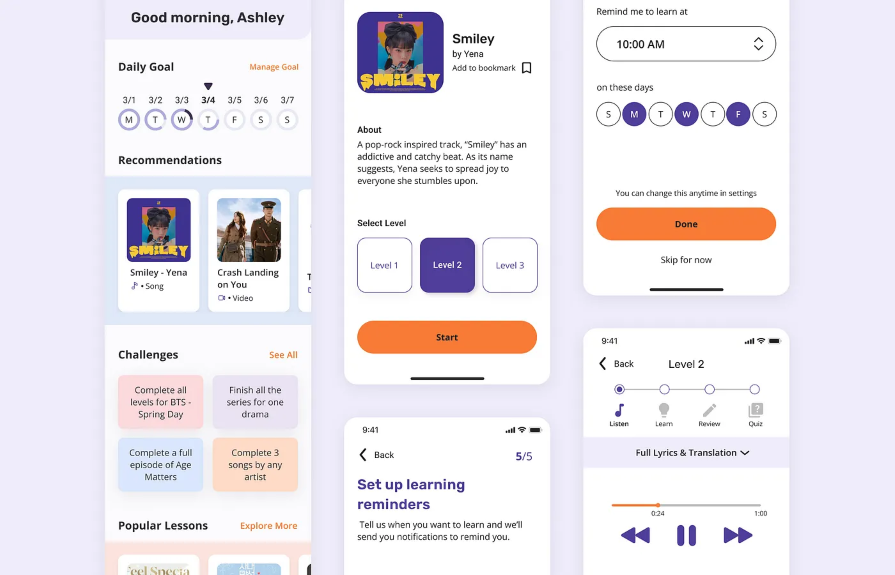
High-fidelity screens of the Enjoy Korean app. Image credit: Christina Sa on Medium
A structured design process, a user-centered approach, and effective communication can help you stand out. This case study shows how effective documentation can showcase your skills and open doors in the job market.
If you’re looking for a concise yet comprehensive case study that details every step of the design process, look no further. This impressive case study by Finna Wang explores the creation of a fan-focused responsive platform for Jambb, an existing social platform:
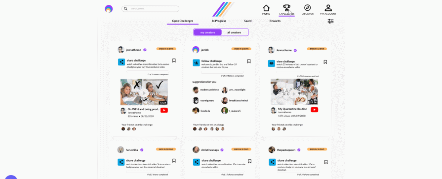
High-fidelity prototype of the Jambb platform. Image credit: Finna Wang
You can keep things clear and concise while still including key details. It’s a perfect example of combining thorough documentation with engaging visuals to create an easy-to-follow narrative.
If you need a highly visual case study that takes you through every step of the design process in an engaging way, this one is for you. This case study walks you through the design of a learning platform where users can find experts to explain complex topics to them in a simple and friendly manner:
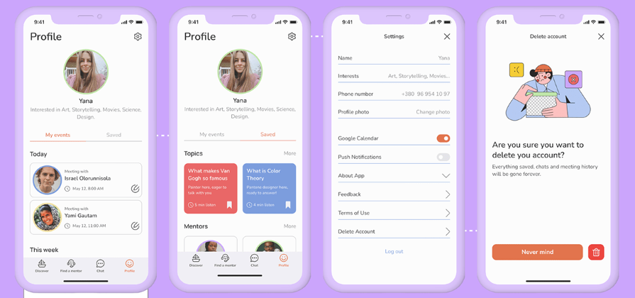
High-fidelity screens of the learning app. Image credit: Yana Hrytsai on Behance
You can captivate your audience by presenting complex information in a clear, engaging way. This case study shows how attention to detail, visual appeal, and a clear step-by-step process can make your work both professional and easy to follow.
If you want a case study that details the design process and is also visually appealing, you should check this one out. This case study by Orbix Studio takes you through the process of designing GiveHub, a fundraising app that helps users set up campaigns for causes they’re passionate about:
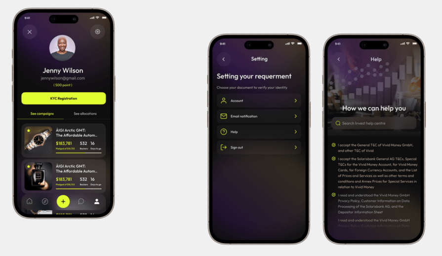
Profile and settings screens from the Givehub app. Image credit: Orbix Studio on Behance
A visually engaging design and clear structure can make your presentation easy to grasp. This case study shows how vibrant visuals, logical flow, and real data can help create an impactful presentation.
This case study is quite popular on Behance, and it’s easy to see why. It takes you through the creation of a travel app that lets users compare travel packages from various travel agencies or groups:
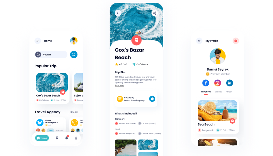
High fidelity screens of the travel agency app. Image credit: Behance
Judging by this case study’s popularity on Behance, it’s clear that the step-by-step process breakdown and strong focus on visuals really paid off.
If you’re looking for a UX case study that explores the design journey for both mobile and desktop versions of an app, this is one you should check out. It explores the process of creating Intelly, a healthcare app that transforms patient care with telemedicine, prescription management, and real-time tracking:
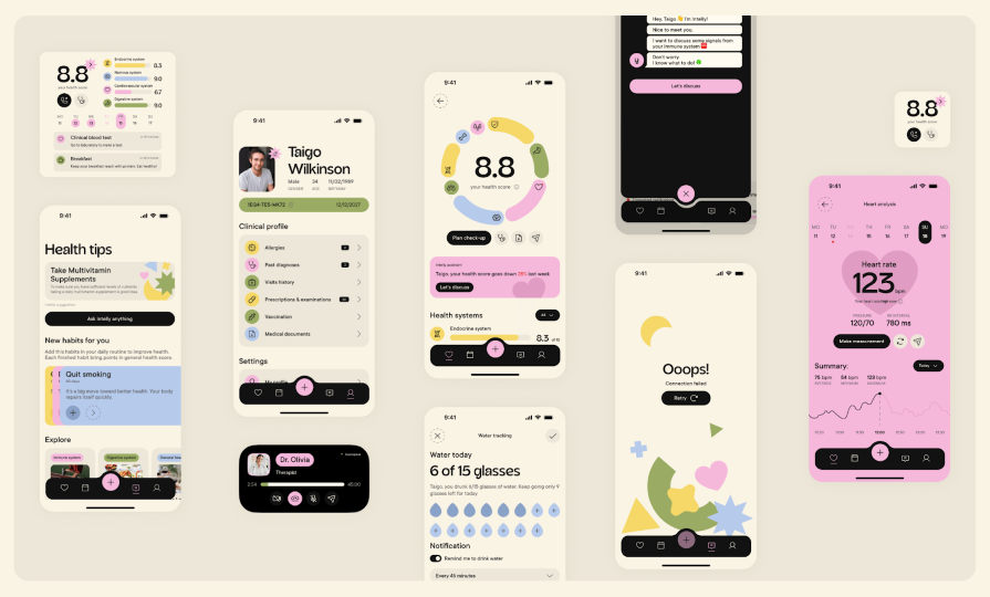
High-fidelity screens of the Intelly healthcare app. Image credit: Behance
This case study highlights the power of proactive problem-solving and creative thinking in design. By identifying key issues and design opportunities early on, the creators successfully tailored solutions to meet the needs of both mobile and desktop users, resulting in a well-executed app for both patients and doctors.
If you prefer a results-oriented case study, you’ll love this one. This case study delves into how Cox Automotive’s Manheim division used LogRocket to optimize their customers’ digital experience for remote car auctions:
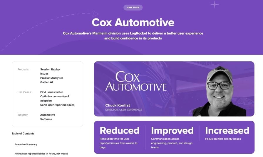
Image credit: LogRocket blog
Don’t be afraid to step outside of the norm. An unconventional approach can often lead to a more effective and impactful outcome.
User data and feedback are invaluable when it comes to enhancing digital experience. Cox Automotive used LogRocket to identify and address user-reported issues, gain insights into customer behaviors, and make data-driven decisions to optimize their product.
If you want a case study that tackles a super retable problem, this one’s a great read. The designer takes you through the design of Focusly, a screen-time management app. With a highly user-centric approach demonstrated through personal storytelling, thorough user research, user testing, and iterative design improvements, this case study is both relatable and insightful:
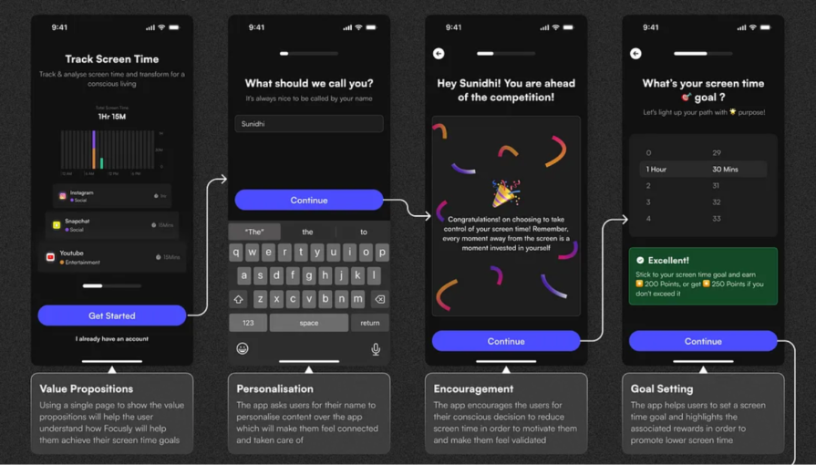
Focusly app’s onboarding screens with clear descriptions. Image credit: Raghabendra Sahu on Medium
This case study is a great example of the power of combining personal experience with a user-centric design approach. By framing the problem through their own struggles, the creator makes the challenge relatable while showing how thorough research, iterative testing, and real insights shape the final solution.
If you need a case study that showcases the designer’s problem-solving skills, this one’s for you. This case study takes us through the creation of MedCare, a healthcare app designed to address the challenges of accessing medical equipment and medicines during the pandemic. The case study is so well-presented that it helped the designer secure their first UX design role:
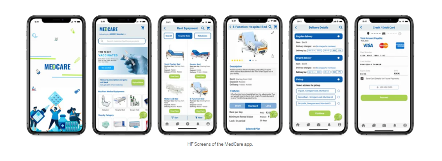
High-fidelity screens of the MedCare app. Image credit: Nikhil Deshpande
A well-structured case study not only showcases your design skills; it opens career doors. This case study shows how a clear problem-solving approach, strong user research, and thoughtful design decisions can make a real impact.
This case study takes you through the entire journey of designing a solution to tackle Indonesia’s alarming food waste problem. Packed with compelling visuals, user-centered solutions, and clear storytelling, this case study is both thought-provoking and actionable:
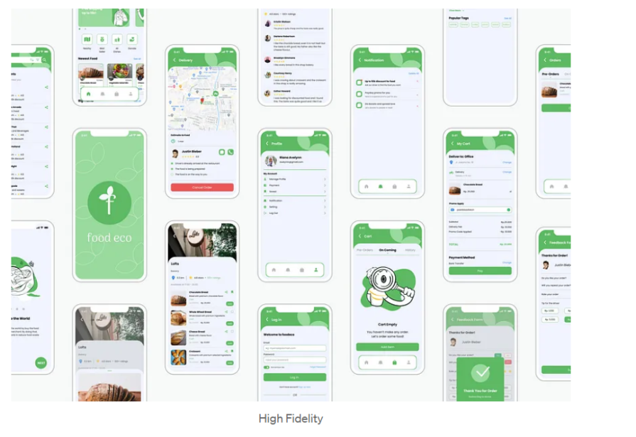
Cross-section of high-fidelity screens from the Food Eco app. Image credit: Rikeu Rosyana
Good design isn’t just about aesthetics — it’s about solving real problems. This case study shows how user research, clear storytelling, and smart design choices can come together to tackle a pressing issue in a practical and impactful way.
This case study walks you through designing Semojo, a user-centered solution to ease motorbike rentals in Yogyakarta, Indonesia. The engaging presentation, actionable insights, and seamless design solutions make this case study worth exploring:
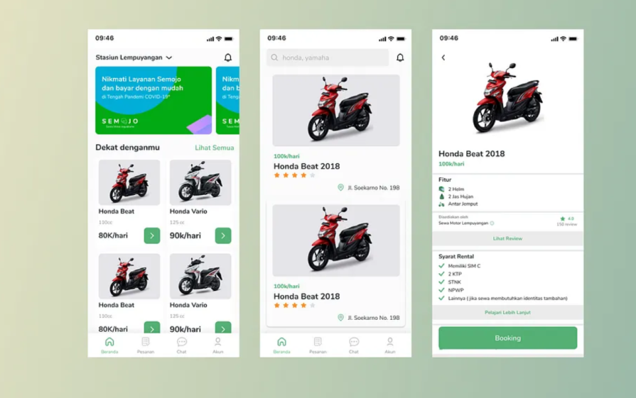
High-fidelity screens of the Semojo app. Image credit: Khoirul Syarif
This case study shows how catering to the specific needs of a target audience can lead to more user-centered and effective solutions.
These UX case study examples are more focused on the visual aspects of the design process, teaching you a thing or two about presentation and delivery.
If you love a case study that scores high on aesthetics with vivid colors, cool illustrations, and fun animations, you need to check this one out. It takes you on a visual journey of creating Rebank, a fintech product to revolutionize the baking industry:
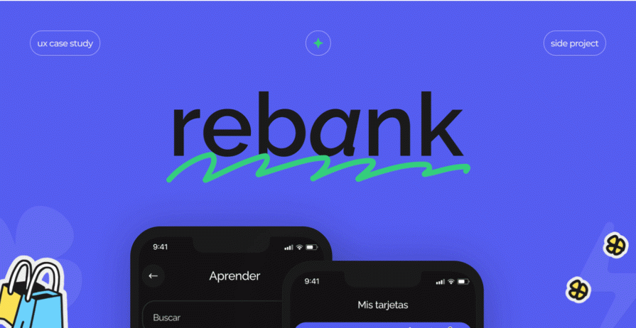
Image credit: Rebank app on Behance
This UX case study illustrates the value of thinking outside the box. Breaking away from the conventional design style of financial products makes it a stand-out case study.
If you’re looking for a case study that prioritizes aesthetics and visual appeal, you should check this one out. This case study by Orbix Studio gives us a peek into how they created Swiftwash, a laundry service app:
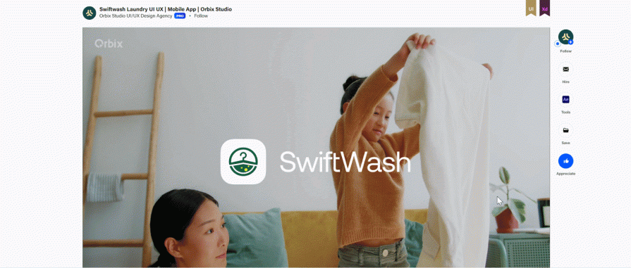
Image credit: Orbix Studio on Behance
If there’s one thing to take away from this case study, it’s the value of presenting information in a straightforward manner. Besides being easy on the eye, this case study is also easy to digest. The creators lay out the problem and detail the steps taken to achieve a solution, in an easy-to-follow way, while maintaining a high visual appeal.
If you’re looking for a concise case study with clean visuals, you should definitely check this one out. It takes us through the design of Wayfaro, a trip planner app that allows users to plan their itineraries for upcoming journeys:

Cross-section of screens from the Wayfaro app. Image credit: Behance
This case study shows the power of an attractive presentation. Not only is the mobile app design visually appealing, but the design process is presented in a sleek and stylish manner.
These UX case study examples delve into the redesign of existing apps, offering valuable insights into presentation techniques and problem-solving approaches.
If you’re looking to flex your problem-solving muscles, this case study is one to check out. The creator takes you through the detailed process of redesigning the Starbucks India app to level up their design skills:
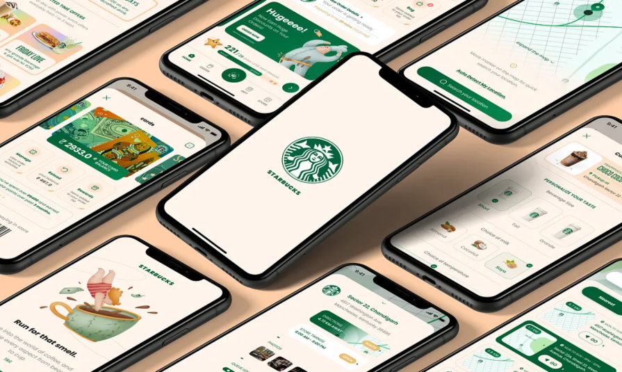
Cross section of screens from the redesigned Starbucks app. Image credit: Manish Singla on Medium
This case study shows how conducting thorough user research, validating design solutions through testing, and iterating based on feedback can help address user needs and pain points effectively.
If you’re looking for an engaging case study that’s light on information, you should check out this one. The creator, Andre Carioca, dives right into giving the Disney+ app user interface a little facelift to make it more fun and engaging:
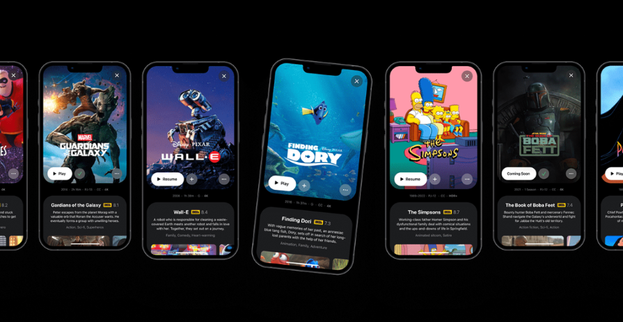
Cross section of screens from the redesigned Disney+ app. Image credit: Andre Carioca on Behance
Given how popular this case study is on Behance, you can tell that the designer did something right. It shows how injecting a little playfulness can elevate your case study and make it more delightful.
This case study takes you through the process of enhancing the user experience of Eventbrite, an app that helps users discover, book, and manage events. It covers user research, branding, wireframing, and prototyping:
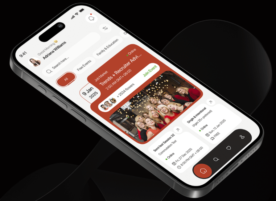
Screenshot of the redesigned Eventbrite app home screen. Image credit: Behance
This case study shows the importance of clear, structured storytelling. The creators present key design decisions, research insights, and visual elements in a concise and engaging way, making it a delight to read.
If you’re bored of the usual static case studies and need something more interactive, this app redesign is what you’re looking for. This case study takes you through the process of giving the Ryanair app a fresh look. Besides the clean aesthetics and straightforward presentation, the incorporation of playful language and interactive elements makes this case study captivating:
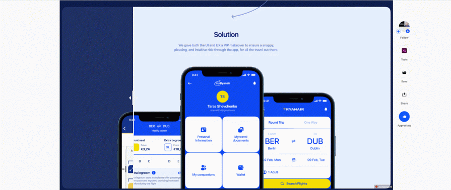
Before meets after: Screens from the redesigned Ryanair app. Image credit: Behance
This case study shows how combining interactivity, engaging copy, and strong visual design can create an immersive and easy-to-understand experience for readers.
If you want a case study that shows how to present complex data-driven insights in a clear, engaging, and design-forward way, this one’s for you. This case study starts by explaining why the redesign was needed and dives deep into analyzing the current app. The creator then takes you through the research and ideation phases and shares their proposed solution. After testing the solution, they made iterations based on the results:
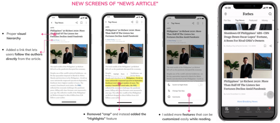
Screenshot of the redesigned Forbes app. Image credit: Amrita Pathania on Medium
When it comes to redesigning an existing product, it’s a good idea to make a strong case for why the redesign was needed in the first place.
This case study dives into the process of transforming Rapido, into a more streamlined, user-friendly, and visually appealing platform. With thoughtful design solutions, clean visuals, and a narrative that captures every step of the process, this case study is insightful and engaging:
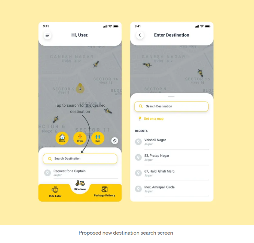
Search screens from the redesigned Rapido app. Image credit: Manan Gupta
This case study shows how effective user research can drive smart design decisions. By tackling pain points like clutter and accessibility, the designer made the app more intuitive and engaging.
These UX case study examples are centered around UX research, highlighting key research insights to enhance your design process.
This case study by Amanda Rosenburg, Head of User Experience Research, Google Classroom shows you how listening to user feedback can help make your products more useful and inclusive to users:
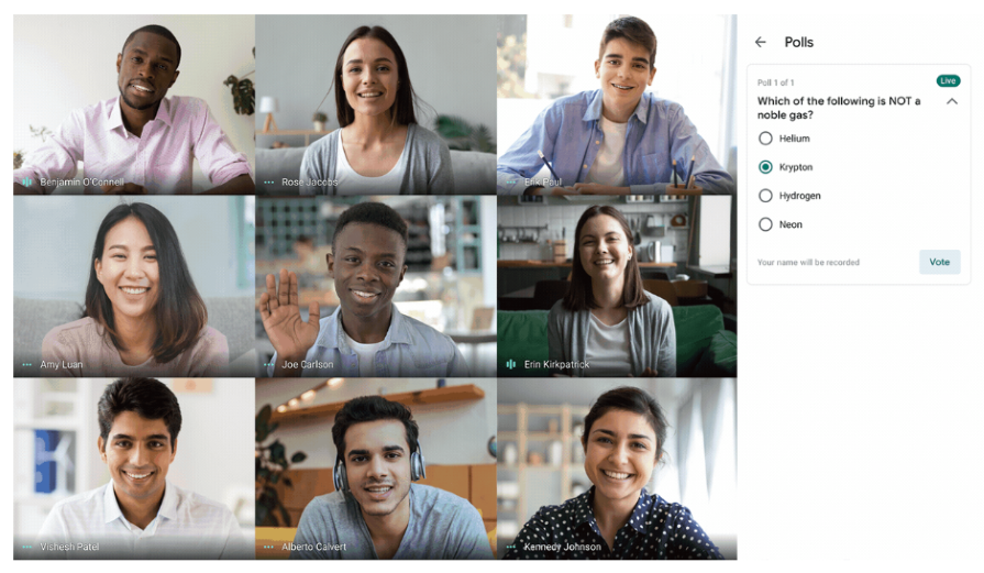
Image credit: Google blog
When there isn’t room for extensive user research and you need to make quick improvements to the user experience, it’s best to go straight to your users for feedback.
This case study by Nhi Ngo, a Senior User Researcher at Spotify shows you the importance of a human perspective in a data-driven world. When the Spotify team set out to develop and launch the ML-powered Shortcuts feature on the home tab, they hit a brick wall with the naming. A/B tests came back inconclusive.
Ultimately, they had to go with the product designer’s suggestion of giving the feature a name that would create a more human and personal experience for users. This led to the creation of a humanistic product feature that evoked joy in Spotify’s users and led to the incorporation of more time-based features in the model, making the content more time-sensitive for users:
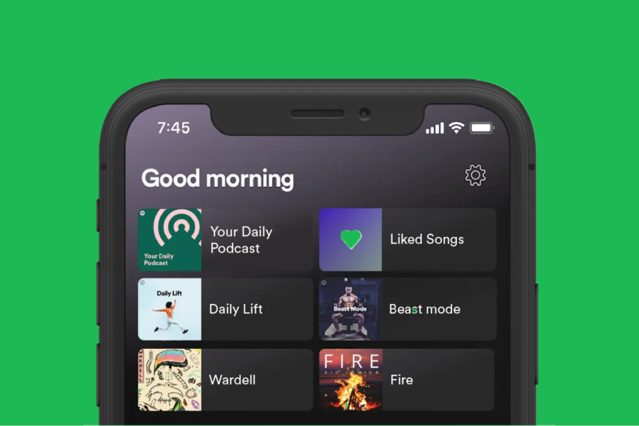
The redesigned “greetings feature” on Spotify. Image credit: Spotify insights on Medium
Although data-driven research is powerful, it doesn’t hold all the answers. So in your quest to uncover answers through research, never lose sight of the all-important human perspective.
The following UX case study examples are centered around the design of AI-powered products.
If you want to be wowed by a futuristic case study that merges artificial intelligence with spatial banking, this AI-powered Spatial Banking case study is exactly what you need. This study delves into the process of transforming traditional banking into a dynamic, hyper-personalized, and immersive spatial experience. With innovative AI-driven solutions, spatial computing, and a user-centered design approach, this case study showcases the future of banking:
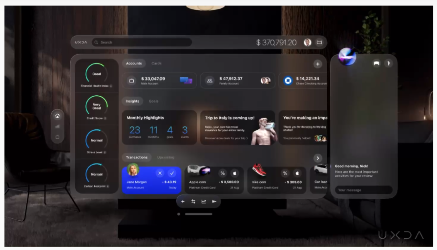
Image credit: UXDA blog
This case study demonstrates how pushing the boundaries of traditional design can lead to innovative, even ground-breaking solutions.
If what you need is an AI case study that isn’t information-dense, this one is for you. This study takes you on the journey of transforming a traditional data discovery tool into a clean, user-friendly, and highly engaging platform:
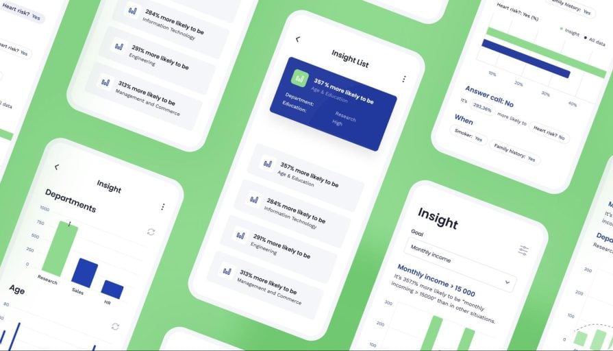
Cross section of high-fidelity screens from the Sage Express mobile app. Image credit: Arounda
This case study underscores the importance of showing your outcomes in tangible form. You’ve worked hard on a project, but what were the actual results?
If you’re looking for a clean and well-structured AI case study, this’ll be helpful:
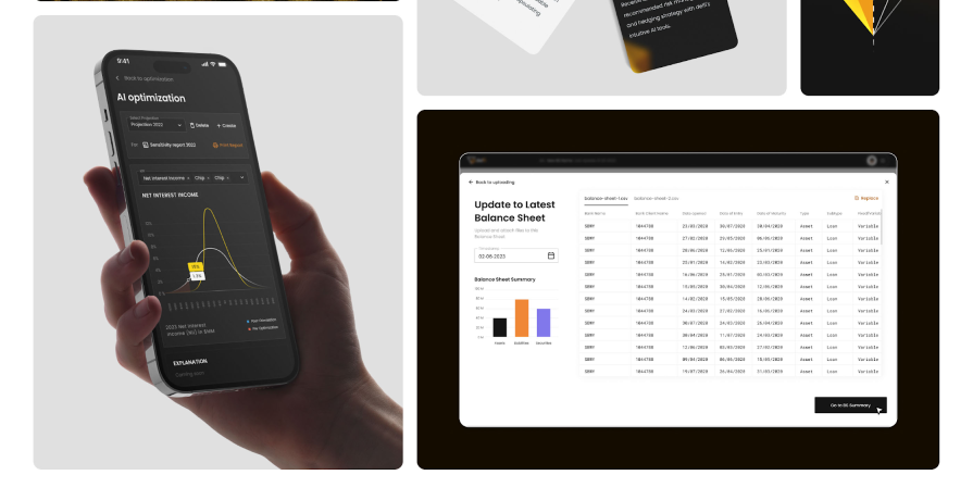
Image credit: Behance
This case study takes you through the creation of Delfi, an AI-driven banking financial report system. It details the entire design process from onboarding to prototype creation.
Why read this case study?
If there’s one thing to learn from this case study, it’s how a well-structured presentation can simplify complex information. Although the case study is heavy on financial data, the organized layout enhances visual appeal and aids comprehension.
Now, that’s quite an exhaustive list of examples to inspire your next UX case study, right? You’re welcome!
We’re about to wrap things up, but not without addressing some common questions you might have when creating your UX case study.
A UX case study is an illustration of how a designer tackled a design problem. It details the project goals, challenges, design process, outcomes, and lessons learned along the way.
After bringing your design project to life, documenting and showcasing all your hard work can seem challenging. But it doesn’t have to be. Here’s a basic outline to kickstart things:
A good UX case study tells a story. It’s more than just showcasing your design solutions; it takes the audience on a compelling journey of how your ideas came to be. It should be well-structured, engaging, and focused on solving a user problem. Most importantly, it should reflect your unique perspective.
Your case study isn’t a place to show every last detail of your design process. Avoid including unnecessary information to keep things concise. Also, avoid technical jargon as your audience might not all be UX experts.
Don’t be fixated on the number of words to include. The goal here is to keep things concise but thorough. It should be long enough to clearly explain the process but short enough to keep the reader engaged.
Before diving into your next UX case study, why not walk the paved path others have laid by drawing inspiration from their work?
This article has shown you 25 powerful case study examples across various niches, each providing valuable insights into the design process. Through these case studies, you can appreciate the importance of showcasing your design journey, not just the final polished product.
If you’re about to create your own case study, remember to walk your users through the design process, the challenges you faced, and your solutions. This gives potential recruiters and clients a glimpse of your creativity and problem-solving skills.
And finally, don’t forget to add that human touch. Let your personality shine through and don’t be afraid to inject a little playfulness and storytelling where appropriate. By doing so, you can craft a UX case study that leaves a lasting impression on your audience.
Header image source: IconScout
LogRocket's Galileo AI watches sessions and understands user feedback for you, automating the most time-intensive parts of your job and giving you more time to focus on great design.
See how design choices, interactions, and issues affect your users — get a demo of LogRocket today.

As products evolve into ecosystems, navigation becomes a system-level challenge. This article explores how to align structure, context, and user journeys to create seamless movement across tools without confusion.

Figma’s AI features have exploded in 2026 — from text generation and image editing to full UI drafts and code handoff. But speed isn’t the same as quality. This guide breaks down every major feature, what it’s good at, and where human judgment still does the heavy lifting.

Zero UI works well for screenless, voice-first experiences, but most digital products still require visual interaction. Here’s why multimodal UX offers a more scalable foundation for the future of design.

Multimodal UX goes beyond designing for screens. Learn how context-aware systems, progressive modality, failover modes, and accessibility-first design create better digital product experiences.