Showcasing social proof is one of the most impactful conversion rate optimization (CRO) tactics UX designers can implement. After all, few things motivate users to click the “purchase” button more than tangible evidence that the thing they will buy truly works.

In this article, I’ll dig deeper into different types of social proof with dissected examples of how reputable companies use them and why they work, as well as give you some tips on collecting and curating social proof from your organization.
Social proof is any form of external validation that a particular product or service is trustworthy and valuable.
Examples of social proof include:
Although UX designers rarely collect social proof themselves, they should be aware of what evidence their company already has and even champion collecting it from various channels. It’s a worthwhile activity, as incorporating social proof in your designs helps you build trust with quotes and reviews; communicate your value in an authentic, non-salesy way; and establish authority over competitive solutions that don’t have external proof of value.
Social proof is especially important when working on conversion-critical parts of the product, such as conversion funnels or landing pages.
We can distinguish various types of social proof. The most common ones include:
Let’s look deeper into each category and analyze a few examples from each.
A testimonial is a curated reference from a customer that highlights the value and trustworthiness of the product.
Contrary to reviews, which should be unmoderated and unfiltered, testimonials are handpicked and explicitly showcased in key parts of the user journey. Their goal is to reassure potential buyers that they’re making the right choice.
When you land on ProductLed’s Growth Certificate landing page, one of the most prominent sections you’ll notice is their testimonial section:

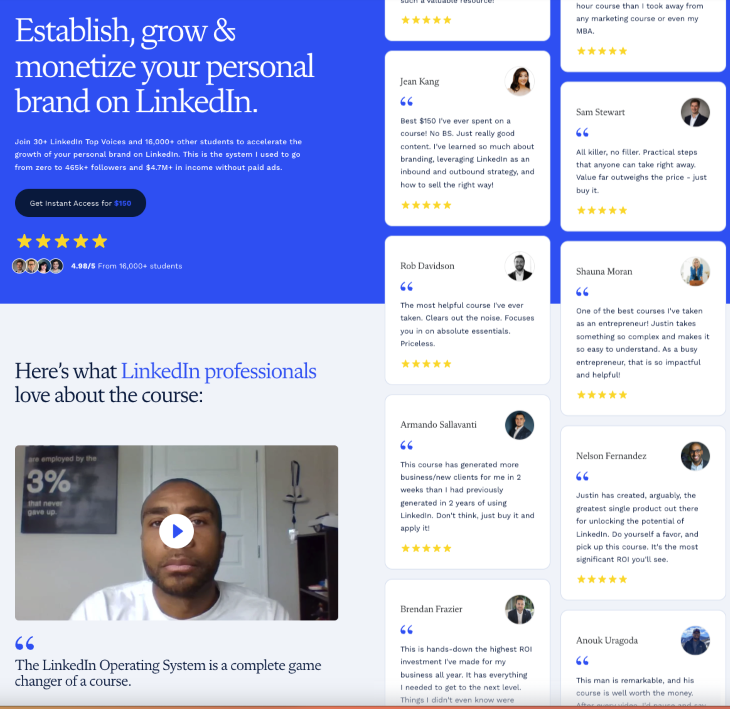
Justin Welsh is probably one of the best-selling solopreneurs on the Internet, and how he uses testimonials in his landing pages definitely helps:
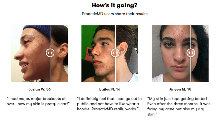
Proactiv sells anti-acne hygiene products, and their interactive graphic testimonials nail it:
Various rating and review systems are the most widespread type of social proof. Although they originated in ecommerce and marketplaces, nowadays, they’re becoming a standard in services and consumer products.
That shouldn’t be surprising, though. A volume of positive reviews establishes trust and credibility, regardless of the type of offering.
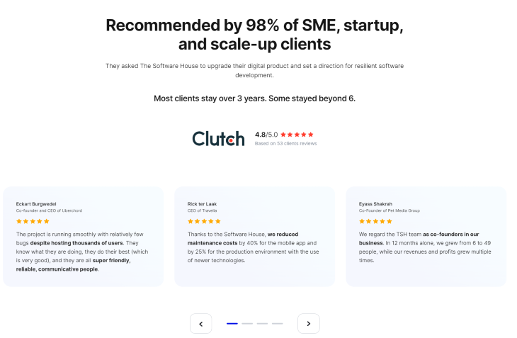
The Software House proves that client reviews can be a powerful selling point, even in the case of high-ticket B2B services:
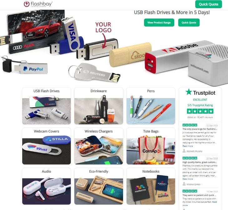
Flashbay shows you don’t need to reinvent the wheel, and sometimes, all you need is to implement an external plugin to boost credibility immediately:
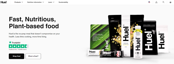
As with all innovative products on the market, Huel needs to establish credibility and spark further interest ASAP:
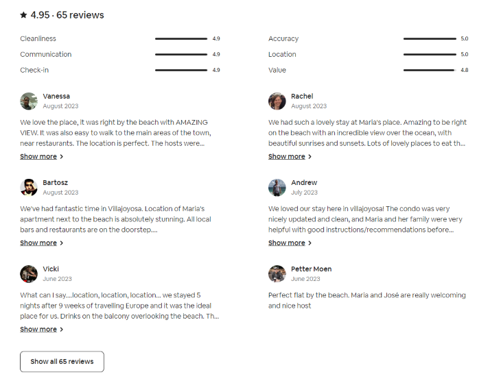
It’s not an overstatement to say that Airbnb has one of the best-designed review systems:
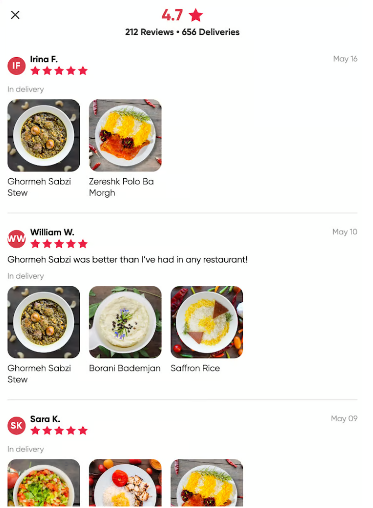
Shef understands that a single photo is worth more than a thousand words:
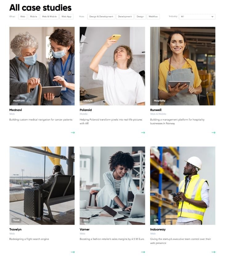
Compared to reviews and testimonials, case studies go deep. They tell a more detailed story of how your product or service helped others achieve their outcomes.
Although marketing teams usually prepare the content itself, designers have a critical role in the process — the way case studies will be positioned and presented on the site impacts the type and volume of content that needs to be prepared.
Strong marketing-design collaboration is key to creating case studies that stick.
Sometimes, the simplest presentation, like El Passion’s, works the best:
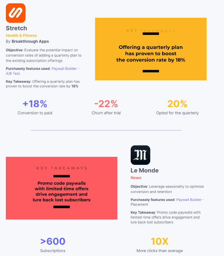
Purchasely deviates from standard case study formats and showcases their collaboration in a meaty summary format:
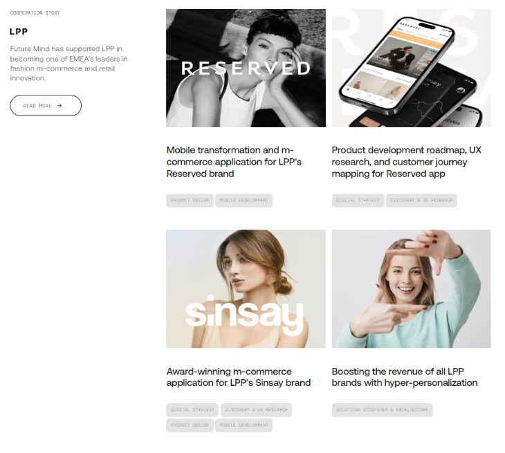
FutureMind uses case studies to tell bigger stories and stress the long-term partnerships with their clients:
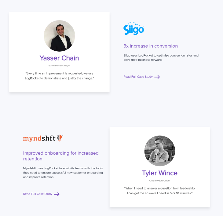
Forgive our bias. LogRocket maintains a balance of tangibility, empathy, and focus on outcomes:
In some specific cases, accredited certifications, awards, and partnerships are a powerful selling point.
It’s especially important if you offer specialized services requiring a niche skillset.
ClickIT is a DevOps-as-a-service provider that helps companies build architectures in the AWS cloud, and they have credentials to prove they know what they’re doing:

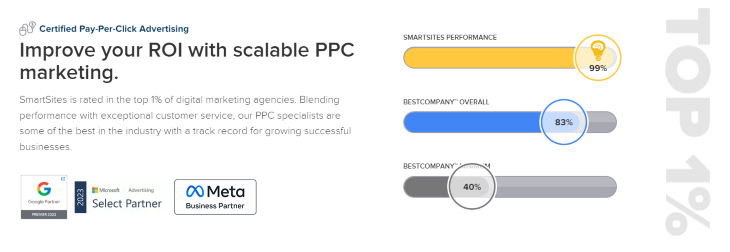
SmartSites shows you don’t always need to make a dedicated section for your credentials:
While testimonials, case studies, and certificates work great, sometimes just sharing who you work with can do the trick.
Say you are looking for a fitness coach. If someone could prove they trained Lionel Messi, would you need any other proof they know their job?
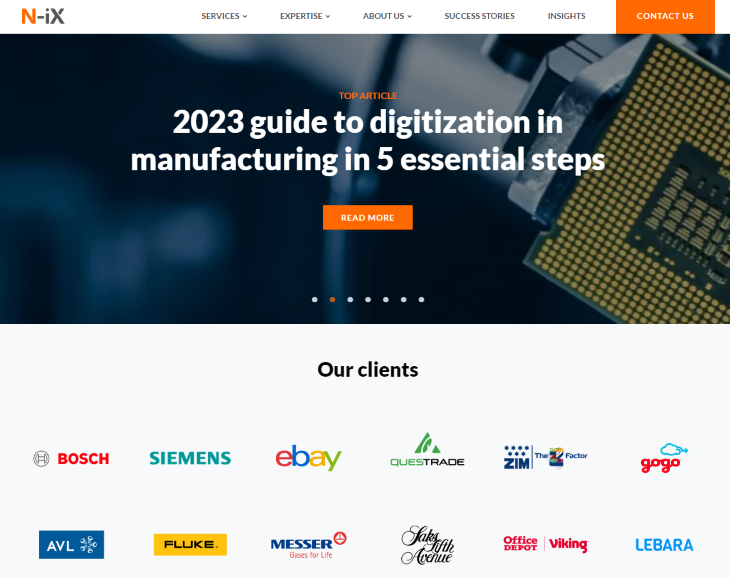
N-iX is a software development agency, but when you land on their homepage, you are not bombarded with catchy phrases about why they’re the best. They simply tell you who they work with:
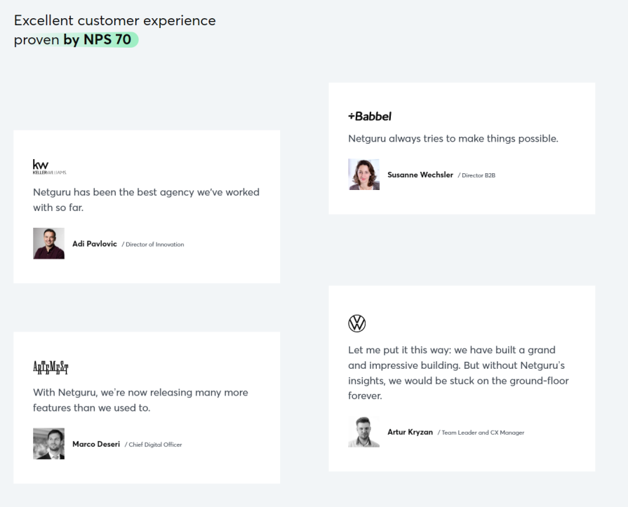
Netguru combines showcasing the clients they work with and testimonials to create powerful social proof:
ClickUp nails the positioning of its call-to-action (CTA):

There’s something going on if the Wall Street Journal speaks positively about your product and offering.
While rarely as impactful as other types of social proof content, if your company is talked about in the media (in a positive light, of course), it might be worth considering designing a separate page with highlights.
It’s especially important for high-ticket products. Potential buyers often need to gather buy-in from multiple stakeholders, and giving them ammunition in the form of articles and press mentions from reputable sources will make it easier for them.
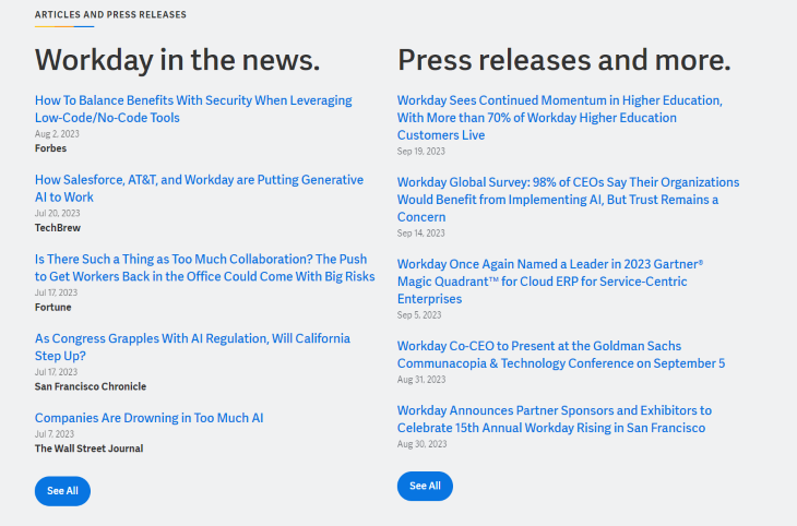
Workday uses a minimalistic approach to showcase its online presence and credibility:
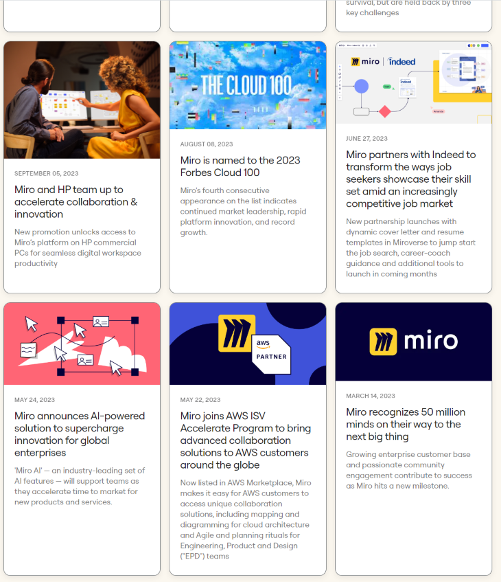
Miro adds a touch of joy and fun to showcase the company-related news in an eye-appealing manner:
As we saw in previous examples, including social proof in your design can help reinforce your value proposition, credibility, and authority. However, you first need to gather this social proof to do so. After all, you can’t just write fake testimonials yourself.
The good news is there’s a high chance there are bits of social proof already gathered in various parts of the company. Let’s look at a few options for gathering social proof as a designer.
If you work in a B2B context, sales and account management teams are your best friends here.
Odds are they already have numerous testimonials that they use during the sales process. They’re often open to sharing them, as implementing them in designs often results in more sales leads. Win-win.
In the case of B2C, reach out to your customer support team. You might be surprised, but users often write customer support tickets just to express gratitude for the product!
In both cases, you can also try direct outreach. Identify your most engaged users, and ask them directly for a testimonial. If you ask for high-effort tasks (such as video testimonials), consider offering a reward for their time.
If there are case studies, they are likely already published in some form on the website. Otherwise, you need to write them from scratch.
Contact your marketing team and kickstart the conversation there. If you present a solid pitch on how you could incorporate case studies in the website design to help generate more leads, there’s a high chance they’ll dedicate capacity to help you out.
Otherwise, focus on different types of social proof. Writing a case study is a labor-intensive process requiring marketing expertise, and doing it on your own might be counterproductive.
You might be surprised how many certificates and awards your company holds that you don’t even know about. After the initial joy of being recognized, people simply forget and move on.
Reach out to:
Depending on the type of organization you work for, other teams might know about relevant certificates and awards. Simply ask around as many people as you can.
Companies know who their biggest clients are. Reach out to the sales or marketing team and simply ask about it.
Always confirm with your legal department if you can showcase a particular client on your website — some of them might have non-disclosure agreements (NDAs).
The simplest way is to simply google it. Put your company’s name in Google search, choose the category “news,” and see if something valuable pops up.
If there are many valuable press mentions, creating a dedicated page section for that might be worth considering.
However, press sections work only if they’re frequently updated, and it shouldn’t be a designer’s job to worry about that. Collaborate with marketing and communications teams and ensure you have their buy-in and commitment before proceeding.
A skilled designer knows that a good design not only looks nice but also drives business metrics.
It’s especially crucial when designing conversion flows, such as sales funnels or landing pages. In such cases, focusing on highlighting social proof is often a sound design decision.
Incorporating various types of social proof can help you establish trust, boost credibility, and even get your sales message across without directly selling. There are numerous unique ways to implement each of these categories in your design. Hopefully, our examples gave you a healthy dose of inspiration for your own design journey.
Header image source: IconScout
LogRocket's Galileo AI watches sessions and understands user feedback for you, automating the most time-intensive parts of your job and giving you more time to focus on great design.
See how design choices, interactions, and issues affect your users — get a demo of LogRocket today.

AI tools can generate beautiful UI concepts in minutes, but most teams struggle to integrate those outputs into real design systems. This guide explores why AI drifts toward generic patterns and how to build governed workflows that keep speed without sacrificing brand consistency.

Adaptive interfaces personalize experiences using behavioral signals and machine learning. But when personalization becomes autonomous, systems can reinforce patterns, limit discovery, and shape user behavior in ways designers didn’t intend.

Security requirements shouldn’t come at the cost of usability. This guide outlines 10 practical heuristics to design 2FA flows that protect users while minimizing friction, confusion, and recovery failures.

2FA failures shouldn’t mean permanent lockout. This guide breaks down recovery methods, failure handling, progressive disclosure, and UX strategies to balance security with accessibility.