The Replay is a weekly newsletter for dev and engineering leaders.
Delivered once a week, it's your curated guide to the most important conversations around frontend dev, emerging AI tools, and the state of modern software.
While developing applications, it is not uncommon to make requests to an API for data within your app to display particular info to your users or process a user’s input in instances such as authentication.

These things happen when a user is interacting with your app, so there would be some sort of delay as the user awaits a response from this API request. The ideal move is to always let the user know that their request is being processed by showing a loading indicator either in the form of texts or animation.
In this tutorial, we’re going to learn how to use the Vue Loading Overlay Plugin in our Vue applications.
This tutorial requires a basic understanding of Vue.js to properly understand some of the concepts we’ll use.
The Vue Loading Overlay Plugin is a loading indicator that can be used in different ways in your Vue applications. They include:
It offers the freedom to select from three different loaders, which are:
It also comes with the option to use your preferred animated icon in place of the available options using slots. This feature comes in handy when you have a specific animation in mind, and I think this is one of the most important features of this plugin.
This plugin also comes with a list of options that you can further use to customize your loader of choice. Some of these options include:
These options can also be passed as props when using this plugin as a component.
This plugin can be installed using any of the two methods:
Yarn:
yarn add vue-loading-overlay
NPM:
npm install vue-loading-overlay
For this tutorial, we will be building a simple application that will help in understanding all of the concepts used in this article.
The complete application can be found on my GitHub.
Once the installation process is done, the next thing would be to set up this plugin for use in our app. Depending on how we would prefer to use this plugin, we will be configuring our application differently.
Let us take a look at them one by one.
The first thing we’ll need to do is import this plugin in the file we would like to use. In this case, I will be importing it in Home.vue for use like so:
<script>
import Loading from 'vue-loading-overlay';
import 'vue-loading-overlay/dist/vue-loading.css';
export default {
  name: 'Home',
  components: {
    Loading
  }
}
</script>
After importing it in the component, the loader component can be used by just placing it inside the container you want it to be in, or anywhere in your template if you want a full-page loader.
<loading />
Here’s what my Home.vue file looks like after configuration:
<template>
  <div class="home">
    <form @submit.prevent="logIn">
    <loading :active='isLoading' :is-full-page="fullPage" :loader='loader' />
      <label for="name" class="label">Name</label>
      <input type="text" name="name"  class="input__field" id="name">
      <label for="email" class="label">Email Address</label>
      <input type="email" name="email" class="input__field"  id="email">
      <button type="submit" class="submit__button">Submit</button>
    </form>
  </div>
</template>
<script>
import Loading from 'vue-loading-overlay';
import 'vue-loading-overlay/dist/vue-loading.css';
export default {
  name: 'Home',
  data() {
    return {
      isLoading: false,
      fullPage: false,
      loader: 'bars'
    }
  },
  components: {
    Loading
  },
  methods: {
    logIn() {
      this.isLoading = true;
      setTimeout(() => {
        this.isLoading = false
      }, 3000);
    }
  }
}
</script>
<style scoped>
.home {
  width: 500px;
  margin: auto;
  height: 500px;
  text-align: left;
}
form {
  width: 100%;
  max-width: 300px;
  margin: auto;
  /* important if you do not want fullscreen loader */
  position: relative;
}
.label {
  display: block;
  width: 100%;
  margin-bottom: 10px;
}
.input__field {
  margin-bottom: 10px;
  height: 40px;
  border: 1px solid #e4e4e4;
  border-radius: 5px;
  padding-left: 10px;
  width: 250px;
}
.submit__button {
  width: 80px;
  height: 40px;
  display: block;
  margin: 20px auto;
  background-color: #fff;
  border: 1px solid #e4e4e4;
  box-shadow: 1px 2px 4px 1px #e4e4e4;
}
</style>
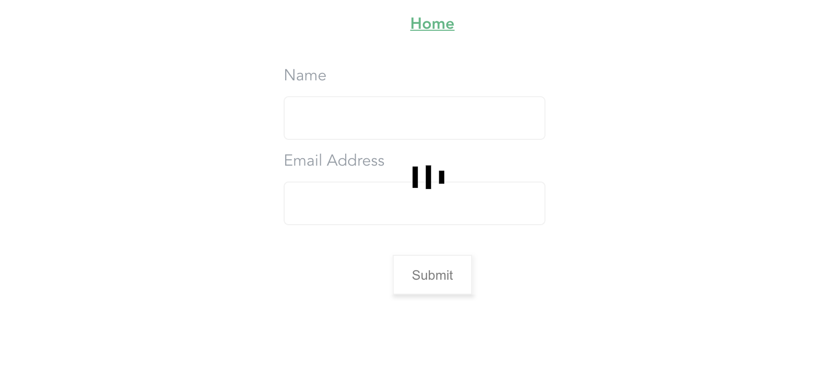
Here, we update our component with the loading component imported locally and place it inside our form element.
This loader component is passed three props which do the following:
active: This prop is being used to determine the state of the loader, i.e when it is false, the loader is not visible and when it is true, the loader becomes active.loader: This prop is used in setting your preferred loader type. It accepts bars, dots, or spinners. If this prop isn’t provided, spinners is used by default.is-full-page: This prop is used to determine whether or not the loader animation takes up the full width of the screen or not and in this case, I’ve set it to false. One important thing to note is that, when setting this value to false, the element wrapping the loader component would need to have its CSS position set to relative . Otherwise, the loader would still be full screen and that is why in the style section of this page, I added this property to the styling for form.The complete list of available props for this component can be found on their docs page.
In this file, since we’re not making an API call, we make use of the JavaScript setTimeout function to control the toggling of the loader. This function is then activated when the button is clicked.

Importing this component locally can get tiring if it is going to be used in more than one file in your application. The best thing would be to import this component globally in the main.js file.
import Vue from 'vue'
import App from './App.vue'
import router from './router'
import store from './store'
import Loading from 'vue-loading-overlay';
import 'vue-loading-overlay/dist/vue-loading.css';
Vue.component('loading-overlay', Loading)
Vue.config.productionTip = false
new Vue({
    router,
    store,
    render: h => h(App)
}).$mount('#app')
When this is done, we only have to rename our component in Home.vue and get rid of the imported version.
<template>
  <div class="home" ref="homeCont">
    <form @submit.prevent="logIn">
      <loading-overlay :active="isLoading" :is-full-page="fullPage" :loader="loader" />
      <label for="name" class="label">Name</label>
      <input type="text" name="name" class="input__field" id="name" />
      <label for="email" class="label">Email Address</label>
      <input type="email" name="email" class="input__field" id="email" />
      <button type="submit" class="submit__button">Submit</button>
    </form>
  </div>
</template>
<script>
  export default {
    name: "Home",
    data() {
      return {
        isLoading: false,
        fullPage: false,
        loader: "bars"
      };
    },
    methods: {
      logIn() {
        this.isLoading = true;
        setTimeout(() => {
          this.isLoading = false;
        }, 3000);
      }
    }
  };
</script>
<style scoped>
  .home {
    width: 500px;
    margin: auto;
    height: 500px;
    text-align: left;
  }
  form {
    width: 100%;
    max-width: 300px;
    margin: auto;
    /* important if you do not want fullscreen loader */
    position: relative;
  }
  .label {
    display: block;
    width: 100%;
    margin-bottom: 10px;
  }
  .input__field {
    margin-bottom: 10px;
    height: 40px;
    border: 1px solid #e4e4e4;
    border-radius: 5px;
    padding-left: 10px;
    width: 250px;
  }
  .submit__button {
    width: 80px;
    height: 40px;
    display: block;
    margin: 20px auto;
    background-color: #fff;
    border: 1px solid #e4e4e4;
    box-shadow: 1px 2px 4px 1px #e4e4e4;
  }
</style>
If you have a particular animation in mind that is different from the three available loader options, this plugin comes with the option of using slots to achieve this.
Slots make it possible for you to create components that can be reused in different cases in your application. Here’s an example of how slots work:
button.vue
<template>
  <button type="submit">
    <slot>Submit</slot>
  </button>
</template>
<script>
  export default {
    name: 'FormButton'
  };
</script>
<style>
</style>
Here, we create a button component and pass it a slot with a default value of submit. This value would serve as a fallback if no text is provided anywhere that this component is being used.
Home.vue
<template>
  <div class="home" ref="homeCont">
    <form @submit.prevent="logIn">
      <loading-overlay :active="isLoading" :is-full-page="fullPage" :loader="loader"></loading-overlay>
      <label for="name" class="label">Name</label>
      <input type="text" name="name" class="input__field" id="name" />
      <label for="email" class="label">Email Address</label>
      <input type="email" name="email" class="input__field" id="email" />
      <!-- replace existing button -->
      <form-button class="submit__button">Save</form-button>
    </form>
  </div>
</template>
<script>
  // import button component
  import FormButton from "@/components/button.vue";
  export default {
    name: "Home",
    data() {
      return {...};
    },
    components: {
      FormButton
    },
    methods: {...}
  };
</script>
<style scoped>...</style>
In this file, we import this newly created component and swap it with the existing submit button. We also pass it a custom text Save, and this text would replace the default text that was passed in the component.
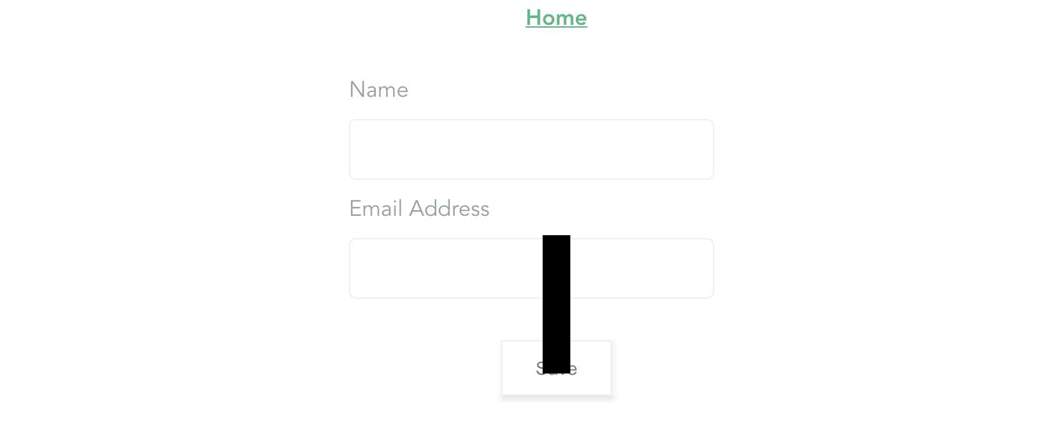
This is what our page looks like now:

Let us look at an example of how to use this slot to display our custom animated icon:
<template>
  <div class="home" ref="homeCont">
    <form @submit.prevent="logIn">
      <loading-overlay :active="isLoading" :is-full-page="fullPage" :loader="loader">
        <div class="loader__container"></div>
      </loading-overlay>

    </form>
  </div>
</template>
<style scoped>

  @keyframes move {
    0%,
    50% {
      transform: translateY(50px);
    }
    50% {
      transform: rotate(90deg);
      transform: translateY(50px);
    }
    60% {
      transform: translateX(50px);
    }
    75% {
      rotate: 0;
    }
    100% {
      transform: translateX(0);
      transform: translateY(0);
    }
  }
  .loader__container {
    width: 20px;
    height: 100px;
    background-color: #000;
    animation: move 5s ease-in-out infinite alternate-reverse forwards;
  }
</style>
Here, we create a custom animation using CSS animations and pass in a div to the loader as a slot.
This div would serve as our animating icon, and it would be visible in place of the existing value of the loader props. Now if we click on that button, we should see this:

Another way we can use this loader is as a plugin. This method has the same functions available to you as using it as a component.
An example of this is using slot for a custom animated icon by passing the component or element to an object that accepts a default property. Before you can use this loader plugin in your app, you will need to configure it to work as a plugin.
This is what you have to do:
main.js
import Vue from 'vue

// import the module
import Loading from 'vue-loading-overlay';
import 'vue-loading-overlay/dist/vue-loading.css';

// define the plugin and pass object for config
Vue.use(Loading, {
    color: '#000000',
    width: 64,
    height: 64,
    backgroundColor: '#ffffff',
    opacity: 0.5,
    zIndex: 999
});
Here, we import the component module together with its CSS file and declare it as a Vue plugin. We also pass an object of configuration for the loader.
This is similar to the props we pass to the loader when using it as a component. In this case, we pass properties like color, width, height, etc. as the default configuration for this loader. That way, we don’t necessarily have to set these values each time we want to use the loader.
The next thing would be to call this method where it is needed while passing a container property if we need the loader to be within a particular container.
About.vue
<template>
  <div class="home" ref="homeCont">
    <form @submit.prevent="logIn">
      <label for="name" class="label">Name</label>
      <input type="text" name="name" class="input__field" id="name" />
      <label for="email" class="label">Email Address</label>
      <input type="email" name="email" class="input__field" id="email" />
      <form-button class="submit__button">Save</form-button>
    </form>
  </div>
</template>
<script>
  import FormButton from "@/components/button.vue";
  export default {
    name: "About",
    data() {
      return {
        loader: "dots",
      };
    },
    components: {
      FormButton,
    },
    methods: {
      logIn() {
        let homeCont = this.$refs.homeCont;
        let loader = this.$loading.show(
          {
            container: homeCont,
            loader: this.loader,
          }
        );
        setTimeout(() => {
          loader.hide();
        }, 3000);
      },
    },
  };
</script>
<style scoped>...</style>
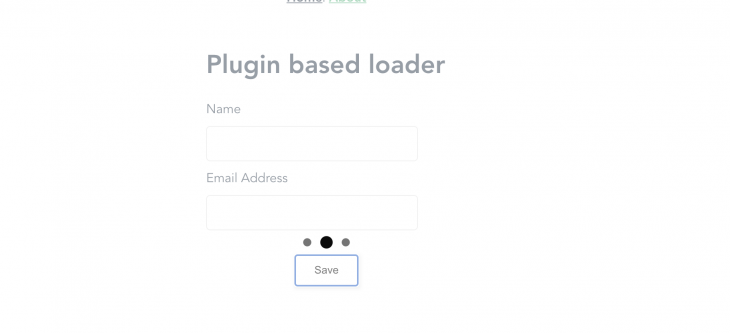
In this file, we call the method attached to the loader plugin and pass in an object that contains the container, which is the exact position we want the loader to appear.
We also pass in the loader type that we want on this page. So if you click on the button, you should see the loader display for 3s, after which we dismiss the loader using the loader.hide() method.

Note that it is possible to have more than one configuration for the loaders used on a page. The way to achieve this is to always pass your desired config options each time this plugin is called.
<template>
  <div class="home" ref="homeCont">
    <form @submit.prevent="logIn">
      <h1>Plugin based loader</h1>
      <label for="name" class="label">Name</label>
      <input type="text" name="name" class="input__field" id="name" />
      <label for="email" class="label">Email Address</label>
      <input type="email" name="email" class="input__field" id="email" />
      <form-button class="submit__button">Save</form-button>
    </form>
    <button class="submit__button" @click.prevent="showNewLoader">
      Show different loader
    </button>
  </div>
</template>
<script>
  // import button component
  import FormButton from "@/components/button.vue";
  export default {
    name: "About",
    data() {
      return {
        loader: "dots",
      };
    },
    components: {
      FormButton,
    },
    methods: {
      showNewLoader() {
        let homeCont = this.$refs.homeCont;
        let loader = this.$loading.show({
          container: homeCont,
          loader: "spinner",
          color: "red",
        });
        setTimeout(() => {
          loader.hide();
        }, 3000);
      },
    },
  };
</script>
<style scoped>...</style>
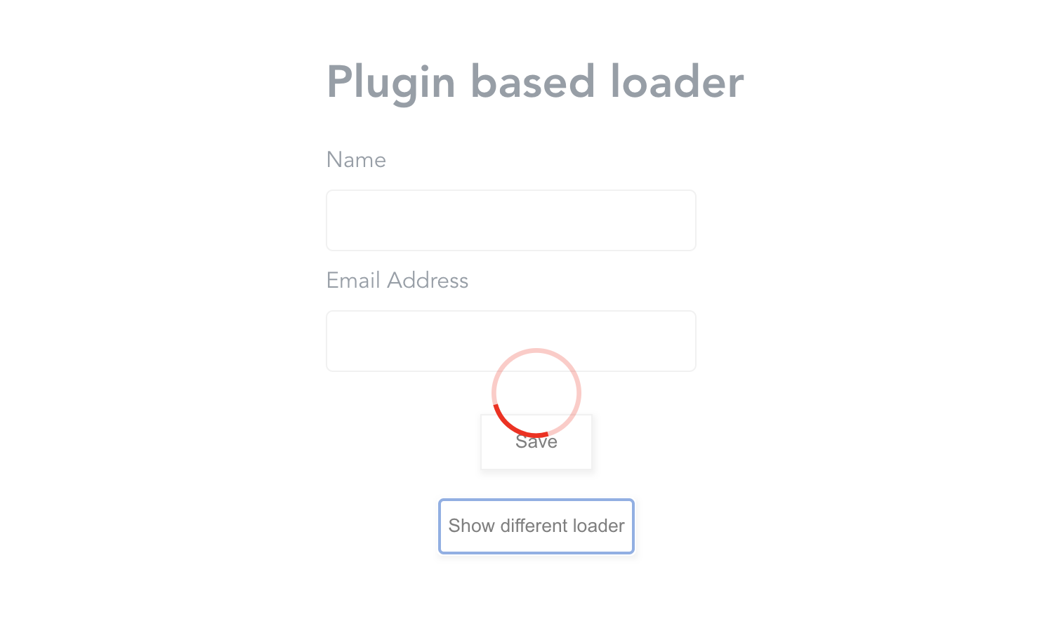
Here, we create a new method in which we call the loader method and pass a different loader and color value.
If we click on the new button added, we would observe the new loader on the page while the initial loader remains the same.

We have covered the Vue loading overlay plugin, its different installation processes, and how to set it up in your application as a component. We briefly explained Slots, how to use them in Vue, and how they’re being used in this component. We have also covered how to use it as a plugin with a config object.
Debugging Vue.js applications can be difficult, especially when users experience issues that are difficult to reproduce. If you’re interested in monitoring and tracking Vue mutations and actions for all of your users in production, try LogRocket.

LogRocket lets you replay user sessions, eliminating guesswork by showing exactly what users experienced. It captures console logs, errors, network requests, and pixel-perfect DOM recordings — compatible with all frameworks.
With Galileo AI, you can instantly identify and explain user struggles with automated monitoring of your entire product experience.
Modernize how you debug your Vue apps — start monitoring for free.

Learn about TypeScript v6’s breaking changes, new ES2025 features, and deprecated options. A complete migration guide from v5 to prepare for v7.

Learn how Vite+ unifies Vite, Vitest, Oxlint, Oxfmt, Rolldown, and Node.js management in one CLI.

AI companies are buying developer tools as coding agents turn runtimes, package managers, and linters into strategic infrastructure.

Learn how AI-assisted development governance uses rules, agents, hooks, and protocols to help AI coding tools produce safer, more consistent code.
Hey there, want to help make our blog better?
Join LogRocket’s Content Advisory Board. You’ll help inform the type of content we create and get access to exclusive meetups, social accreditation, and swag.
Sign up now