UI kits provide beautiful, ready-to-use UI components that speed up development. There are many excellent UI kits for React Native. One of the most popular, with more than 20,000 stars on GitHub, is React Native Elements.

In this tutorial, we’ll go over the basics of using React Native Elements. We’ll cover the following:
You can find all the component examples from this article on my GitHub.
Components in React Native Elements are like prefabricated buildings. For example, the Button component comes with a customizable icon and label prop baked in. All this is possible thanks to the fabulous folks at React Native Elements, combining popular open-source UI component libraries such as React Native Vector Icons.
If you’re using Expo, you just need to install React Native Elements and you’re good to go:
yarn add react-native-elements
Or, with npm:
npm install react-native-elements
Bare-bones React Native app:
yarn add react-native-elements
or
npm i react-native-elements --save
If you’ve already installed React Native Vector Icons and React Native Safe Area Context in your project, you can skip the next step. Otherwise, run the following:
yarn add react-native-vector-icons react-native-safe-area-context
or
npm i --save react-native-vector-icons react-native-safe-area-context
All components are wrapped in a <View />, which can be controlled with the containerStyle prop. Most components provide other customizable styling props, which enable you to style the components further (e.g. titleStyle).
Let’s explore this concept with a custom button:
import React from 'react';
import { Button } from 'react-native-elements';

export const CustomButton = (...props) => (
  <Button
    title="Click me!"
    containerStyle={{
      margin: 5,
    }}
    buttonStyle={{
      width: "100%",
      borderRadius: 35,
      backgroundColor: "green",
    }}
    titleStyle={{color: "red" }}
    {...props}
  />
);
The above code produces the following button:
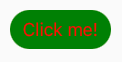
The color of the title text is styled with the titleStyle prop, the button color is styled with the buttonStyle prop, and the container (View) is styled with the containerStyle prop.
Theming in React Native Elements is designed to allow you to define the props of all components in one place, providing a consistent look and feel across Android, iOS, and the web.
To take advantage of this, you need to set up the ThemeProvider and provide a theme:
import React from "react";
import { ThemeProvider, Button } from 'react-native-elements';

const theme = {
  Button: {
   containerStyle: {
      margin: 5,
    },
    buttonStyle: {
      width: "100%",
      borderRadius: 35,
      backgroundColor: "green",
    },
    titleStyle: {
      color: "red",
    },
  },
};

export const App = () => {
  return (
    <ThemeProvider theme={theme}>
      <Button title="Click me!" />
    </ThemeProvider>
  );
};
The above code produces the same green button with red text. Using the theme object, we can now define the props for all React Native Elements components in one place.
Let’s say you want to extend or override the props you defined in theme? Here’s how you do that.
Components in React Native Elements follow a styling order:
theme object and applied second,<Button containerStyle={{ margin: 5 } />)External styles are applied last and supersede the styles you define with your theme object. The shape of your locally defined style must match the one you defined in theme:
// containerStyle shape: [{}]
const theme = {
  Button: {
    buttonStyle: [
      {
        backgroundColor: "green",
      }
    ]
  }
}
// This works: [{}]
<Button buttonStyle={[{ backgroundColor: "blue" }]} />
// This doesn't work - {}
<Button buttonStyle={{ backgroundColor: "blue" }} />
Due to the styling order, there are some quirks to be aware of. For example, the Button component has a type prop that accepts three string values: outline, clear, and solid:
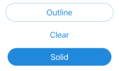
When you set your type prop to "outline" or "clear", it sets the background of the buttonStyle prop to "transparent".
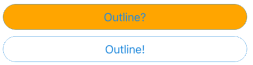
If you change the background color of the buttonStyle with your theme object, the type prop breaks. This is because the internal (default) styling is superseded by the new color that is set in the theme (theme) object. Since we know why it breaks, we can refab our prefab component.
const theme = {
  Button: {
    buttonStyle: {
      backgroundColor: "orange",
    },
  },
};
// this doesn't work
<Button type="outline" title="Outline?" />
// This does work
<Button
  type="outline"
  title="Outline!"
// Here we remove the colour defined in our theme object
  buttonStyle={{ backgroundColor: "transparent" }}
/>
From a simple <Divider /> to an animated <Rating /> component, React Native Elements aims to provide components for most common use cases.
Tired of the button component? Let’s explore what else React Native Elements has to offer.
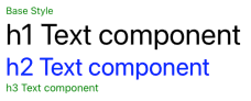
TextThe Text component has five styling props. You configure the base style of the Text component with the style prop. Each other styling prop has a corresponding boolean prop that allows you to select the desired style for the rendered text:
h1Style — h1h2Style — h2h3Style — h3h4Style — h4h1 Text component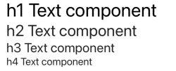
Each h[X]Style prop has its own fontSize and inherits the rest of its styles from the style prop.
In the example below, h3Style doesn’t have a color setting, so it inherits green from the style prop:
const theme = {
  Text: {
    style: {
      fontSize: 14,
      color: "green",
    },
    h1Style: {
      color: "black",
    },
    h2Style: {
      color: "blue",
    },
    h3Style: {
      fontSize: 15,
    },
  },
};
        <Text>Base Style</Text>
        <Text h1>h1 Text component</Text>
        <Text h2>h2 Text component</Text>
        <Text h3>h3 Text component</Text>
IconReact Native Vector Icons is configured for you and ready to use, taking all the hassle out of setting up icons. It uses the Material icon set by default, so the only required prop is the name. And like all components in React Native Elements, it’s fully customizable.
If you would like to use one of the other icon sets, you can set it with the type prop, as I have below for the bumble bee icon (type="entypo" name="swarm"):
<Icon type="entypo" name="swarm" color="#ecba16" />
<Icon name="bug-report" color="#00aced" />
<Icon name="verified" color="#51f0a4" />
It also has some convenient props, including:
raised, which sets a box border around the component container, andreverse, which reverses the logo color and component container background color.onPress, which makes the icon component pressable button// First Row// Second Row// Third Row// Fourth Row// OnPress example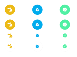
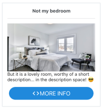
CardThe <Card /> component is a compound component with all the child components you need to create a stylish card in a matter of minutes:
Card.Divider receives all Divider props,Card.Title receives all Text props,Card.Image receives all Imageprops,Card.FeaturedTitle receives all Textprops, andCard.FeaturedSubtitle receives allTextpropsBelow is an example of how to use the Card component in React Native Elements:
import React from "react";
import { Button, Card, Icon, Text } from "react-native-elements";
const urlImage =
  "https://images.unsplash.com/photo-1595526114035-0d45ed16cfbf?ixid=MXwxMjA3fDB8MHxwaG90by1wYWdlfHx8fGVufDB8fHw%3D&ixlib=rb-1.2.1&auto=format&fit=crop&w=750&q=80";
export const CustomCard = () => (
  <Card>
    <Card.Title>Not my bedroom</Card.Title>
    <Card.Divider />
    <Card.Image source={{ uri: urlImage }} />
    <Text style={{ marginBottom: 10 }}>
      But it is a lovely room, worthy of a short description... in the
      description space! 😎
    </Text>
    <Button icon={<Icon name="code" />} title="MORE INFO" />
  </Card>
);
See how easy that was? It took me longer to pick the image than it did to write the code.
The icon prop available to the <Button /> component is already set up for us. All we need to do is add the <Icon /> component.
Also, notice that the <Button /> component is using the border radius that we defined earlier in the theme object. You can’t help but love the simplicity and ease of React Native Elements! 🥰
RatingThe Rating component is imported from react-native-ratings and wrapped in React Native Elements’ withTheme HOC. This allows you to style the component with your theme object, as you would with any other React Native Elements component.
You have two rating components available:
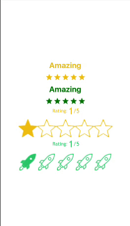
import React from "react";
import { Alert, View, StyleSheet } from "react-native";
import { AirbnbRating, Rating } from "react-native-elements";
export default function RatingsExample() {
  function setRating(rating: number) {
    Alert.alert("Rating is: " + rating);
  }
  return (
    <View style={styles.container}>
      <AirbnbRating
        count={5}
        reviews={["Terrible", "Meh", "Good", "Very Good", "Amazing"]}
        defaultRating={5}
        size={20}
        onFinishRating={setRating}
      />
      <AirbnbRating
        selectedColor="green"
        reviewColor="green"
        count={5}
        reviews={["Terrible", "Meh", "Good", "Very Good", "Amazing"]}
        defaultRating={5}
        size={20}
        onFinishRating={setRating}
      />
      <Rating
        startingValue={1}
        ratingCount={5}
        imageSize={60}
        onFinishRating={setRating}
        fractions={1}
        showRating
      />
      <Rating
        type="rocket"
        startingValue={1}
        ratingCount={5}
        imageSize={60}
        onFinishRating={setRating}
        fractions={1}
        showRating
      />
    </View>
  );
}
const styles = StyleSheet.create({
  container: {
    flex: 1,
    alignItems: "center",
    justifyContent: "center",
  },
});
If you’re using TypeScript, you’ll get an error for reviewColor=""; the prop is available but it hasn’t been declared. You can safely ignore this error, but if you want TypeScript to stop shouting at you, here’s how to shut it up:
react-native-elements.d.tsdeclare module "react-native-elements" {export interface AirbnbRatingProps {
reviewColor?: string;
}
}
InputThe Input component works just like the standard React Native input component, except it comes with all the bells and whistles you need to create an attractive input. As you might imagine, it’s fully customizable.
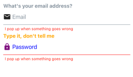
import React from "react";
import { View, StyleSheet } from "react-native";
import { Input, Icon } from "react-native-elements";
export const InputExample = () => (
  <View style={styles.container}>
    <Input
      label="What's your email address?"
      placeholder="Email"
      leftIcon={<Icon size={24} name="email" />}
      errorMessage="I pop up when something goes wrong"
    />
    <Input
      secureTextEntry
      label="Type it, don't tell me"
      placeholder="Password"
      leftIcon={{ name: "lock", size: 24, color: "purple" }}
      labelStyle={{ color: "orange" }}
      placeholderTextColor="blue"
      inputContainerStyle={{ borderBottomColor: "red" }}
      errorMessage="I pop up when something goes wrong"
    />
  </View>
);
const styles = StyleSheet.create({
  container: {
    flex: 1,
    alignItems: "center",
    justifyContent: "center",
  },
});
React Native Elements has lots of other components for common use cases, and they follow the same patterns that we’ve explored in this article. If you’d like to review the other components and different styling props in more detail, check out React Native Elements Playground. You can explore and tweak components, and even generate production ready code.
If you would like to theme your own components, you can use their withTheme HOC:
import React from "react";
import { Text } from "react-native";
import { withTheme } from "react-native-elements";
const CustomComponent = (props) => (
  <Text style={{ color: props.theme.colors.primary }}>This is a themed custom component! 😃</Text>
);
export default withTheme(CustomComponent);
React Native Elements is a great UI toolkit. If you want to get your project up and running quickly, you can’t go wrong with it.

LogRocket's Galileo AI watches sessions for you and and surfaces the technical and usability issues holding back your React Native apps.
LogRocket also helps you increase conversion rates and product usage by showing you exactly how users are interacting with your app. LogRocket's product analytics features surface the reasons why users don't complete a particular flow or don't adopt a new feature.
Start proactively monitoring your React Native apps — try LogRocket for free.

A guide for using JWT authentication to prevent basic security issues while understanding the shortcomings of JWTs.

Discover how to build, render, and automate product demo videos with Remotion, replacing traditional screen recordings with reusable React code.

Chrome’s Modern Web Guidance embeds modern web platform skills into AI coding agents, helping them choose native HTML, CSS, and browser APIs over legacy patterns.

Learn how to use Fallow to analyze AI-generated code, detect dead code, duplicate logic, and complexity issues, and integrate automated code quality checks into your AI-assisted development workflow.
Hey there, want to help make our blog better?
Join LogRocket’s Content Advisory Board. You’ll help inform the type of content we create and get access to exclusive meetups, social accreditation, and swag.
Sign up now

 Learn more →
