If you’re familiar with Gatsby, you’re probably aware of how fast it is and how it improves the overall development process and performance. According to its official documentation, Gatsby is “a React-based open-source framework for creating websites and apps. It’s great whether you’re building a portfolio site or blog, or a high-traffic e-commerce store or company homepage.”

Gatsby is indeed great for building a lot of things. It helps us create fast websites and apps without delay. Additionally, it offers a variety of tools to help you get started, regardless of what you’re trying to build, as fast as possible. You can also build and style a Gatsby app from scratch, as we’ll demonstrate in this tutorial.
For the styling, we’ll use Tailwind CSS. Tailwind is perfect for anyone who loves to write CSS but doesn’t want to necessarily create separate files for their styles. In addition, with Tailwind CSS, utility classes are created for you. All you have to do is use them in your project.
To show how Gatsby and Tailwind CSS work together, we’ll create a simple health and fitness blog. In the course of this tutorial, we’ll cover the following:
The finished product should look like this:

The images used in this demo are all from Unsplash; you can access them in my Github repository.
By the end of this tutorial, you should be able to use Tailwind CSS to style your Gatsby projects.
The Replay is a weekly newsletter for dev and engineering leaders.
Delivered once a week, it's your curated guide to the most important conversations around frontend dev, emerging AI tools, and the state of modern software.
In your terminal, run npm init gatsby . This generates a prompt with instructions that help you set up your Gatsby project.
Follow the instructions by choosing a name and folder for your project. When it asks If you will be using a CMS, choose “No or I’ll add it later.” Do the same when asked about the styling system. When it asks about installing additional features, choose “Build and host for free on Gatsby Cloud.” Then choose “Done.” If everything goes well, a Gatsby template will be generated for you.
As noted in the introduction, we’ll be using Tailwind CSS for styling, so let’s set it up.
(Note: using Tailwind CSS requires you to have Node.js 12.113.0 or higher installed.)
Type the following:
npm install -D gatsby-plugin-postcss tailwindcss@latest postcss@latest autoprefixer@latest.
You’ll notice that we also installed gatsby-plugin-postcss. This is because Tailwind CSS is a PostCSS plugin and the plugin helps us do some heavy lifting.
When it’s done installing, create a Tailwind configuration file by typing npx tailwindcss init -p. This creates the tailwind.config and postcss.config files in your project folder. The config files allow you to create configurations for your styling.
Let’s configure Tailwind CSS to remove all styles we don’t end up using in production. This will be done in the tailwind.config file. In the purge array, type in './src/**/*.{js,jsx,ts,tsx}'. Your Tailwind CSS config file should now look like this:

In gatsby-.config.js, enable PostCSS by adding gatsby-plugin-postcss in the plugins array. The Gatsby config file should now look like this:

Create a styles folder in your src folder and create a .css file to it. You may name it whatever you want; I’ll name mine global.css because my global styles will be written in it.
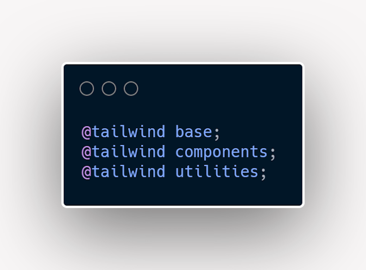
In the CSS file, we’ll add Tailwind’s base, utilities, and component styles by using the @tailwind directive.
Add the following to your CSS file:

Now for the final part of our Tailwind CSS setup, create a gatsby-browser.js file at the root of your project folder and import your CSS file using import "./src/styles/global.css".
Now we can start using Tailwind CSS in our project!
Gatsby offers a variety of plugins to make the development process easier. We’ll use the following plugins in our project:
Gatsby-source-filesystem helps us read files from different sources. The sources can include various directories in our project folder, WordPress, contentful, and many moregatsby-transformer-remark helps us work with Markdown filesgatsby-plugin-image and gatsby-plugin-sharp enable us to work with images in Gatsbygatsby-transformer-sharp lets us work with dynamic imagesTo install them, type the following:
npm install gatsby-plugin-image gatsby-plugin-sharp gatsby-source-filesystem gatsby-transformer-sharp gatsby-transformer-remark
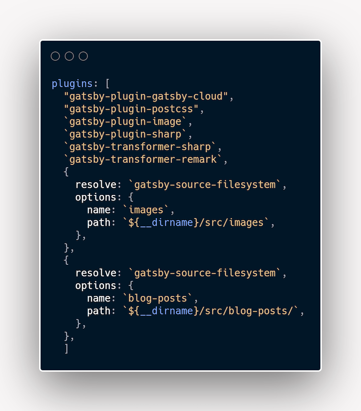
Your gatsby-config.js should look like this:

Now, let’s start building.
In our src folder, create a new folder named blog-posts. In the index file of the src folder, delete all existing content and create a new React component.
Run gatsby develop in your terminal in order to see the live changes as we work. Now you should be able to see your changes in http://localhost:8000/.
I’ll use the Montserrat and Rammetto fonts from Google Fonts. There are different ways to use it, but I’ll import it at the top of my global.css file.
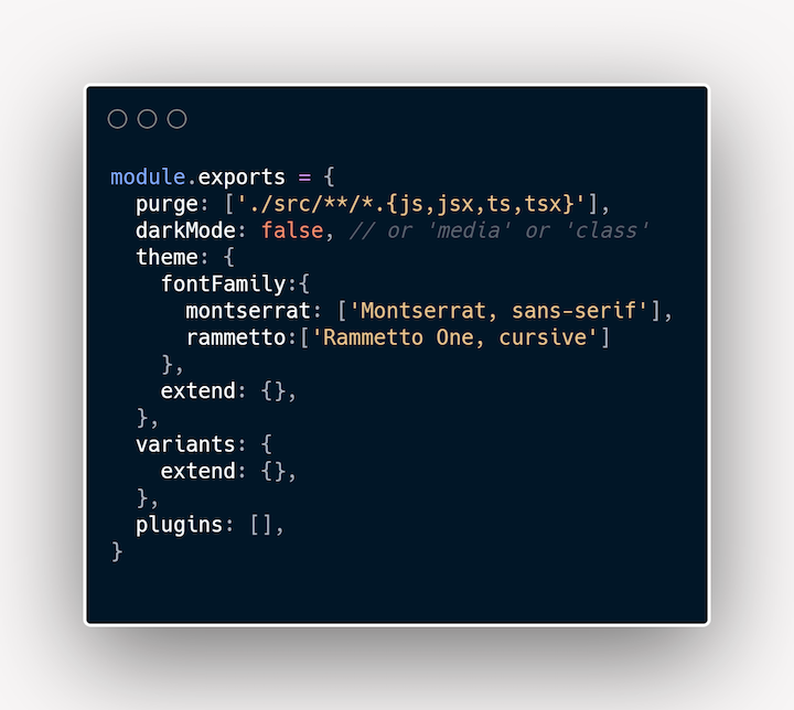
In your tailwind.config file, add fontFamily in the theme object. This lets you name and use multiple fonts.
Here’s what my Tailwind CSS config file looks like:

If you name a font family Cabin, when you want to apply it in your styles, you can simply write font-cabin and the Cabin font will be applied to your text.
We’ll use Markdown to create our page content. In my Github repository, src/blog-posts contains some content we can use for this demo.
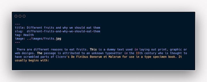
The blog-post Markdown files look like this:

The key/value pair at the top is the frontmatter of the page and contains additional information concerning the page.
When we’re done creating the Markdown files, it’s time to create some components.
We’ll start with the layout component, which we’ll use to create sections that will be repeated across pages. Sections such as the navbar and footer are contained in the layout. We can create the layout in the same way that we create React components and import it into all pages we want it to appear in.
Let’s create a layout file.
The template generated by Gatsby created a starter folder structure for us. We can modify it according to our taste.
In the src folder, create a components folder. In the components folder, create a Layout.js file.
In the file, create a React component named Layout. We’ll create our nav and footer in this component.
The layout accepts a children prop. Without this prop, The pages where the layout component is used would not function properly. Children props act as whatever will be contained inside the page’s layout.
This is what my Layout.js look like:
import React from 'react'
import {Link} from 'gatsby'

const Layout = ({children}) => {
    const linkStyle = `
     Hover:opacity-70
     text-sm
     sm:text-lg
    `
    const logoStyle=`
    text-white
    font-rammetto
    sm:text-base
    text-sm
    `
    return (
        <div>
            <nav className="flex sm:justify-between justify-around items-center bg-green-900 lg:px-20 sm:px-6 py-8 text-gray-100">
                <h3 className={logoStyle}>HealthRoom</h3>
                <ul className="flex">
                    <li className={linkStyle}><Link to="/">Home</Link></li>
                    <li className={linkStyle}><Link to="/contact">Contact</Link></li>
                    <li className={linkStyle}><Link to="/about">About</Link></li>
                </ul>
            </nav>

            <main>{children}</main>

            <footer className="text-center py-8 bg-green-900 text-gray-100">
                <p>Copyright 2030 <span  className={logoStyle}>HealthRoom</span></p>
            </footer>
        </div>
    )
}

export default Layout
You’ll notice that we imported a Link component at the top of the page. We use the Link component to go from one Gatsby page to another. This link isn’t used for external pages; for that we can simply use the anchor tag.
We also added some styles to the page using the Tailwind CSS utility classes. The utility classes can be applied as inline styles as well as in variable form. I prefer to create variables when a particular style or styles will be used in more than one place.
In the nav styles, we added background and text colors. Tailwind CSS provides some colors out of the box. You can also customize the colors by adding them to the Tailwind config file. We can add them the same way we added the font families.
Now that our navbar and footer have been created, let’s move on to other parts of our blog.
Next, we’ll create the header section. In the components folder, create a Header.js file. Create a React component and add the following to it:
 import React from 'react'

 const Header = () => {
    return (
        <header className="bg-green-900 text-gray-100 pt-16 pb-10 text-center">
        <h1 className="font-semibold font-rammetto lg:text-5xl sm:text-4xl text-2xl pb-4">
Welcome to the Health Room
  </h1>
        <p className=" lg:text-2xl sm:text-lg text-sm font-light">Your one stop blog for health and fitness information</p>
        </header>
    )
}

 export default Header
In this component, we have a header section that contains an H1 tag and a P tag. We also added some Tailwind classes to it. You’ll notice that we used font-rammetto in the H1 styling. We mentioned this earlier when we added the font families to our tailwind.config.js. font-semibold sets the font-weight to 600 and text-5xl makes the font size 3rem. We also gave it a padding-bottom of 1rem.
That’s all for the header component. Let’s work on the blog section of the page.
In the components folder, create a subfolder and name it blog. In the blog folder, create an index.js file and a BlogItem.js file. The BlogItem component will be a container for the image and title of each blog post. Let’s create it:
import React from 'react'
import {Link} from "gatsby"
import { GatsbyImage } from "gatsby-plugin-image";

const BlogItem = ({alt, image, slug, title}) => {
    return (
        <div className="hover:opacity-50">
            <Link to={`/${slug}`}>
                <GatsbyImage image={image}
                alt={alt} className="max-h-[200px]"
                />
                  <h3 className="font-semibold text-black max-w-4/5 text-center mt-2 capitalize sm:text-base text-sm">{title}</h3>
           </Link>
        </div>
    )
}

export default BlogItem
At the top of our file, we imported the GatsbyImage component from gatsby-plugin-image. Rather than using the img tag, we’ll use this component as our image wrapper.
The GatbsyImage component is used when we want to work with dynamic images. If we want to use static images, the StaticImage component comes in handy. The BlogItem component accepts some props; we’ll see why very soon.
In the index.js file we created in our blog folder, let’s add the following lines of code:
import React from 'react'
import { graphql, useStaticQuery } from 'gatsby'
import BlogItem from "./BlogItem"

const Blog = () => {

    const articles = useStaticQuery(graphql`
    {
        allMarkdownRemark {
        nodes {
            frontmatter {
                title
                tag
                slug
                image {
                    childImageSharp {
                        gatsbyImageData(layout: FULL_WIDTH, placeholder: BLURRED)
                    }
                }
            }
            html
            }
        }
    }
    `)

    const allArticles = articles.allMarkdownRemark.nodes.map((item, index) => (
        <BlogItem
        key={index}
        image={item.frontmatter.image.childImageSharp.gatsbyImageData}
        slug={item.frontmatter.slug}
        alt={item.frontmatter.title}
        title={item.frontmatter.title}
        />
    ))
    return (
        <div className="px-10 py-12">
            <h3 className="text-2xl font-rammetto">Health Tips For You</h3>
            <div className="grid md:grid-cols-3 grid-cols-2 gap-x-4 gap-y-10 mt-8">
            {allArticles}
            </div>
        </div>


    )
}

export default Blog
At the top of the page, we imported GraphQL and useStaticQuery from Gatsby. With Gatsby, we access our data with GraphQL. useStaticQuery is used when we are making a query in a file that is not a Gatsby page.
Right now, we are querying for data from our component folder, so we need to use useStaticQuery. If we were making this query from the pages folder, there would be no need for useStaticQuery.
Earlier in this tutorial, we added the gatsby-source-filesystem plugin, which helps us source data from our local files. The transformer-remark plugin transforms our Markdown files into MarkdownRemark nodes that we can query.
In our file, we’re making a GraphQL query to all the Markdown files we created and getting some information from them. We’re also mapping through all the Markdown nodes and rendering a BlogItem component for each one. To explore the GraphQL for your project, check http://localhost:8000/___graphql.
We also added some styling to the blog items section. We made the display grid and set the columns as follows: three on large screens and two on smaller screens.
The links in our nav menu all link to nonexistent pages, so let’s create components for them now.
In the components folder, create an AboutPage.js file and add the following
 import React from 'react'

const AboutPage = () => {
    return (
        <div className="text-center py-24 w-4/5 mx-auto">
            <h3 className="font-rammetto text-2xl pb-4">HealthRoom has always been about the readers</h3>
            <p>We created HealthRoom to ensure that every person has an opportunity to keep up with health and fitness tips.


             We hope to stay around for many years and continue offering our service to readers worldwide.
            </p>
        </div>
    )
}

export default AboutPage
In the div styling, you’ll seet the w-4/5 class used. It means that the content of the div should only take up 80 percent of the page.
Let’s create a contact component. In the components folder, create a ContactPage.js file and all the following
import React from 'react'

const ContactPage = () => {
    return (
        <div className="text-center py-48">
            <h2 className="font-rammetto text-3xl pb-4">Thanks for checking out HealthRoom.</h2>
            <p  className="font-semibold w-3/6 mx-auto">To contact us, send an email to [email protected] or call us on +724 9097245718 </p>
        </div>
    )
}

export default ContactPage
We created a simple component with the contact information for the website. You can make yours fancy by adding a form or customizing as you see fit.
That will be all the components we’ll need. Let’s use the components in our pages.
The starter template generated some files for us in the pages folder. We have the 404.js and index.js files. We can add and modify the pages as much as we want.
In our index.js file, add the following:
import React from "react"
import Layout from "../components/Layout"
import Header from "../components/Header"
import Blog from "../components/blog"

const Home = () => {
  return(
    <Layout>
      <Header/>
      <Blog/>
    </Layout>
  )
}

export default Home
We imported the Layout, Header and Blog components from the components folder and rendered them in our homepage.
Now when we check localhost:8000, we should see something like this:

Let’s create our other pages. In the pages folder, create a new file named about.js and add the following:
import React from 'react'
import Layout from "../components/Layout"
import AboutPage from "../components/AboutPage"

const About = () => {
    return (
        <Layout>
            <AboutPage/>
        </Layout>
    )
}

export default About
Here, we imported our Layout.js and AboutPage.js files from the components folder. If you click the About link in the nav, you should see something like this:

To create our contact page, let’s create a contact.js file in the pages folder and add the following:
import React from 'react'
import Layout from "../components/Layout"
import ContactPage from "../components/ContactPage"

const Contact = () => {
    return (
        <Layout>
            <ContactPage/>
        </Layout>
    )
}

export default Contact
Just as we did on the about page, we imported the layout and contactPage components from the components folder and rendered them on the page. The contact page should look like this now:

That’s all for the pages folder. On our homepage, if you click on any other blog items, a 404 page will be shown on our screen. This is because we have not created pages for them yet. We will need to create dynamic pages that will be generated when any of the blog items are clicked on.
To create dynamic pages in Gatsby, we’ll need to create a template for the pages. The template is what we want any page generated to look like. We can create as many templates as we like.
In the src folder, create a subfolder and name it templates. In the templates folder, create a file named article.js. In article.js, add the following:
import React from "react"
import {graphql} from "gatsby"
import Layout from "../components/Layout"
import { GatsbyImage } from "gatsby-plugin-image"

const Article = ({data}) => {
    const { html } = data.markdownRemark
    const { title, tag, image } = data.markdownRemark.frontmatter
    return(
      <Layout>
        <div className="w-4/5 mx-auto mt-9 article">
            <GatsbyImage image={image.childImageSharp.gatsbyImageData} className=" md:h-96 h-60"/>

            <section className="py-10">
                <span className="bg-gray-200 py-1 px-2 font-semibold">{tag}</span>
                <h2 className="font-semibold md:text-3xl text-xl
 py-4 capitalize">{title}</h2>

                <div dangerouslySetInnerHTML={{ __html: html }}></div>


                <p className="pt-8">Published in the {tag} category</p>
            </section>
        </div>
        </Layout>
    )
}

export default Article

export const query = graphql`
  query ArticleQuery($slug: String) {
    markdownRemark(frontmatter: {slug: {eq: $slug}}) {
      html
      frontmatter {
        title
            tag
            image {
                childImageSharp {
                    gatsbyImageData(layout: FULL_WIDTH, placeholder: BLURRED)
                }
            }
      }
    }
  }
`
Here, we created a template page for the articles on the page and we made a query to get the data that will be displayed on the page. Notice that we did not make use of useStaticQuery here. That’s because this is a page being generated by Gatsby, so we can make GraphQL queries without useStaticQuery.
In addition to the template, we need a file named gatsby-node.js in the root of our project folder. Let’s create it and add the following to it:
const path = require(`path`)

exports.createPages = async ({ graphql, actions }) => {


    const {data} = await graphql(`
      query AllArticles {
        allMarkdownRemark {
          nodes{
            frontmatter {
              slug
            }
           }
        }
      }


    `)

    data.allMarkdownRemark.nodes.forEach(item => {
        actions.createPage({
            path: item.frontmatter.slug,
            component: path.resolve(`src/templates/article.js`),
            context: {slug: item.frontmatter.slug}
        })
    })
}
This file runs at build time in a node environment. We can make queries to get data and use the data to generate pages at build time using the template file created.
We created an asynchronous function because we will make a query to fetch the data needed to add meaningful content to the template.
We pass two arguments to our function, GraphQL, and actions. GraphQL lets us fetch our desired data and actions contain some methods, including one for generating pages.
We then make a query to get the slug of all the Markdown files. The slug, in our case, is contained in the frontmatter of our Markdown files. It’s worth noting that here, GraphQL is a function, so we don’t just add backticks after it. Rather, we use a bracket in the usual way that is done for functions.
We iterate through all our Markdown files and, for each of them, create a page dynamically using the createPage method in actions. In this method, we pass an object that tells Gatsby how to create the page. For each Markdown file, it tells Gatsby the path to be used while creating the page, the template for the page, and data that will be used in creating the page.
Notice that the value of the path is the slug from the frontmatter in our Markdown files, which is what will be displayed on the address bar. The slug will be the route for the generated pages. We also set the path to the component that will be used as a template for the blog items.
In the context part, we pass in the slug as the variable we’ll need when creating the page. You can add multiple items there. The slug variable is used when making a query in our template page.
If everything goes as it should, when you run gatsby develop, you will be able to view each blog post when you click on the blog items on the home page.
Now we should see something like this:

We have come to the end of this Gatsby and Tailwind CSS tutorial. At this point, you should be able to set up and use Gatsby with Tailwind CSS to create your own projects.
You can see a demo of the finished blog here.
Install LogRocket via npm or script tag. LogRocket.init() must be called client-side, not
server-side
$ npm i --save logrocket

// Code:

import LogRocket from 'logrocket';
LogRocket.init('app/id');
// Add to your HTML:

<script src="https://cdn.lr-ingest.com/LogRocket.min.js"></script>
<script>window.LogRocket && window.LogRocket.init('app/id');</script>

useEffect breaks AI streaming responses in ReactSee why useEffect breaks AI streaming in React, and how moving stream state outside React fixes flicker and stale updates.

A real-world debugging session using Claude to solve a tricky Next.js UI bug, exploring how AI helps, where it struggles, and what actually fixed the issue.

CSS wasn’t built for dynamic UIs. Pretext flips the model by measuring text before rendering, enabling accurate layouts, faster performance, and better control in React apps.

Why do real-time frontends break at scale? Learn how event-driven patterns reduce drift, race conditions, and inconsistent UI state.
Would you be interested in joining LogRocket's developer community?
Join LogRocket’s Content Advisory Board. You’ll help inform the type of content we create and get access to exclusive meetups, social accreditation, and swag.
Sign up now