The Replay is a weekly newsletter for dev and engineering leaders.
Delivered once a week, it's your curated guide to the most important conversations around frontend dev, emerging AI tools, and the state of modern software.
According to the official documentation:

Chakra UI is a simple modular and accessible component library that gives you the building blocks to build Vue applications with speed.
In order to make the components as accessible as possible, each component has been crafted to be WAI-ARIA compliant while still making it possible to customize Chakra components based on constraint-based design principles.
The core concepts for this library include:
To follow along with this tutorial, you need the following:
There are currently three ways we can install chakra-ui-vue in our Vue application. Each of these commands would install both chakra-ui-vue and emotion.
Emotion is a library designed for writing CSS styles with JavaScript. They include:
YARN
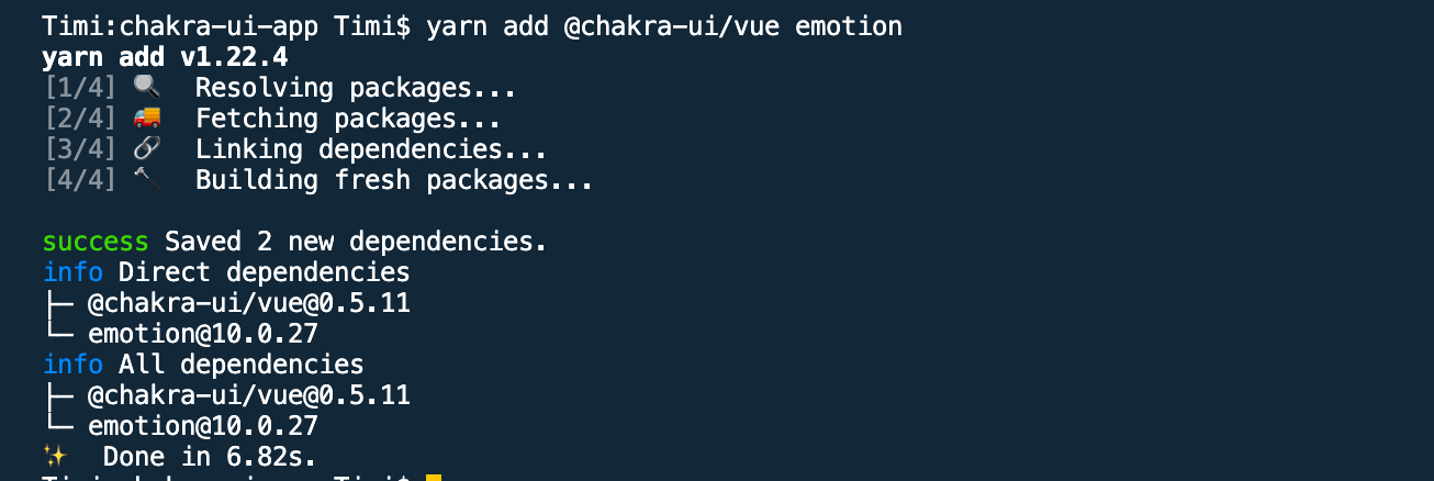
yarn add @chakra-ui/vue emotion
If this is successful, you should see something like this in your terminal:

NPM
npm install @chakra-ui/vue emotion --save
Vue CLI plugin
vue add chakra-ui
You’ll be prompted with some questions in your terminal. After that, your main.js will be updated. This is the only method of the three that adds the Chakra configuration to your app. Your main.js will look like this:
main.js
import Vue from 'vue'
import App from './App.vue'
import Chakra from '@chakra-ui/vue'
Vue.use(Chakra)
Vue.config.productionTip = false
new Vue({
    render: h => h(App),
}).$mount('#app')
Once this is done, the last thing you need to do to be able to use any of Chakra’s components is to import the CThemeProvider and wrap your main application inside it.
updated main.js
import Vue from 'vue'
// import 'CThemeProvider' using ES6 destructuring
import Chakra, { CThemeProvider } from '@chakra-ui/vue'
import App from './App.vue'

Vue.use(Chakra)

new Vue({
  el: '#app',
  //wrap your main app inside it
  render: (h) => h(CThemeProvider, [h(App)])
}).$mount()
At this point, you now have access to any of the components Chakra offers.
If you’re used to making use of CSS reset to reset all browsers or default CSS to avoid differences in styles/look of your application when viewing it on different browsers, Chakra offers a similar component for that and it is called CReset.
It is also advisable to set it up at the root of your Vue application so your application always starts up with the reset in mind. This way, all of Chakra’s components will work well. Here is an example of how to do this:
main.js
import Vue from 'vue'
import App from './App.vue'
import Chakra, { CThemeProvider, CReset } from '@chakra-ui/vue'
Vue.use(Chakra)
Vue.config.productionTip = false
new Vue({
    render: (h) => h(CThemeProvider, [h(CReset), h(App)]),
}).$mount('#app')
To use Chakra UI in Nuxt, we would need to install it together with the Nuxt module for emotion: @nuxtjs/emotion.
We can install them using YARN like this:
yarn add @chakra-ui/nuxt @nuxtjs/emotion
When this installation is done, the next thing would be to configure it for use in your app. To do this, open your nuxt.config.js file and add @chakra-ui/nuxt and @nuxtjs/emotion to the modules property in the file.
nuxt.config.js
export default {
    // existing config in the file
    modules: [
        '@chakra-ui/nuxt',
        '@nuxtjs/emotion'
    ]
}
The last configuration needed before your app is ready to use Chakra’s component is to import CThemeProvider and nest all the views (i.e the <Nuxt /> component) in your layout (if you have only one), or the desired layout you wish to use it on inside this CThemeProvider.
We can also choose to import CThemeProvider on every page where we want to use Chakra’s component, but it’s going to involve a lot of repetition in our code and that is not good practice. For this tutorial, I’ll be using the default layout, default.vue, found in the layouts/ folder.
default.vue
<template>
  <CThemeProvider>
    <Nuxt />
  </CThemeProvider>
</template>
<script>
import { CThemeProvider } from '@chakra-ui/vue'
export default {
  name: 'DefaultLayout',
  components: {
    CThemeProvider
  }
}
</script>
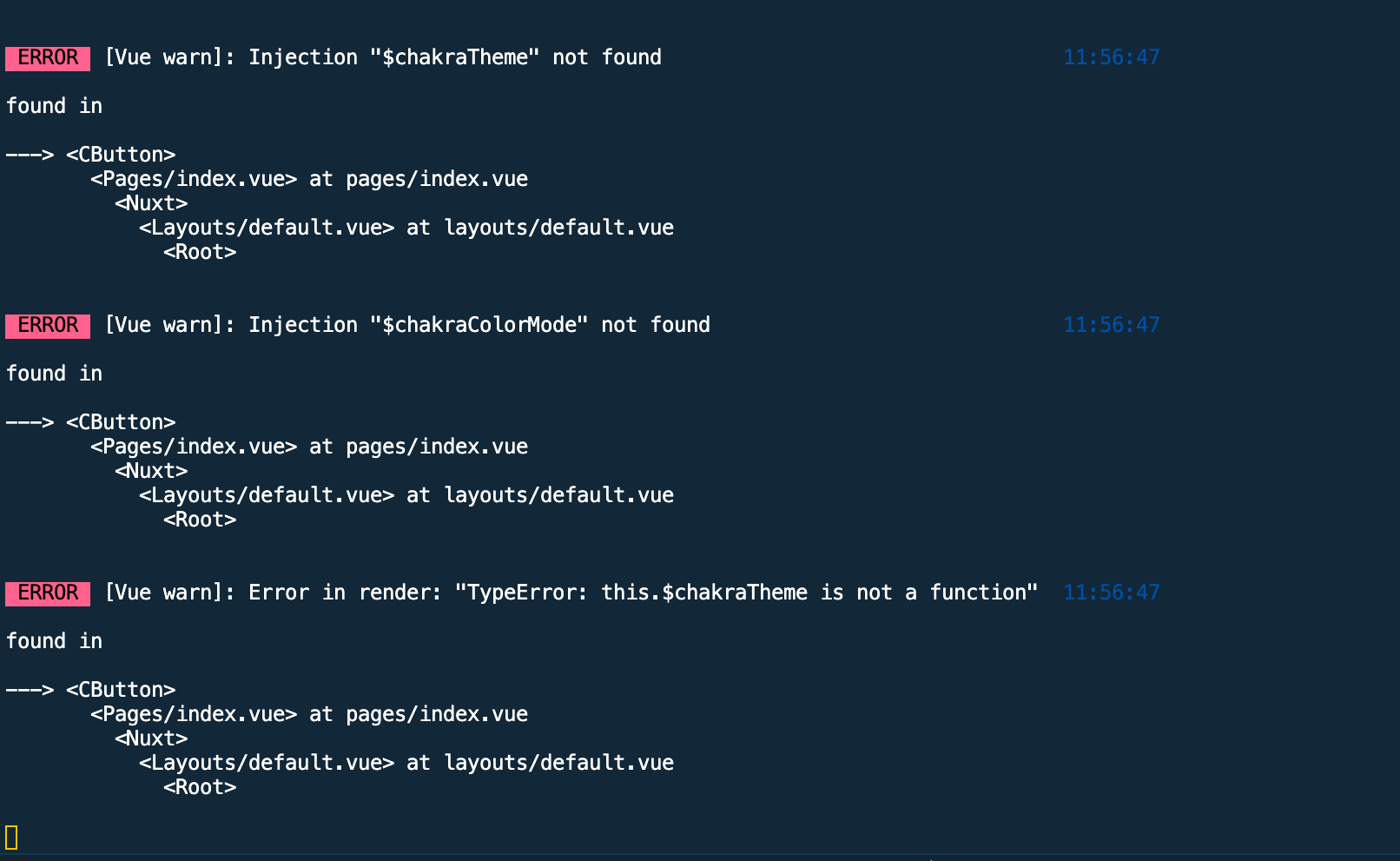
Now we can import individual components when we need them in any file. If you try using a component without importing the CThemeProvider, you’ll get an error in your terminal and in your browser that looks like this:

CSS Reset
To add the CReset property to your Nuxt app, import it in your layout file and nest it inside the CThemeProvider component.
default.vue
<template>
  <CThemeProvider>
    <Nuxt />
  </CThemeProvider>
</template>
<script>
import { CThemeProvider } from '@chakra-ui/vue'
export default {
  name: 'DefaultLayout',
  components: {
    CThemeProvider
  }
}
</script>
Chakra comes with the option of adding extra features to your app. These features are not readily available until you configure Chakra to include them in your application. Here is a list of available options and how they can be used:
extendTheme: This option enables users to create a custom theme for their app and add it to Chakra’s existing theme. It accepts the imported theme name. One thing to note is that your custom theme takes precedence over the default Chakra theme. This means that if the default theme has key names that can be found in your custom theme, it gets overwritten by what is in your custom theme.icons: This is where you configure Chakra to work with external icons (icons that can not be found in Chakra’s icon list). This can either be icons from an icon library or custom icons being used in a project. This option takes in the following properties;iconPack: This option allows you to configure other icon libraries to use with Chakra’s icon. An example is the popular Font Awesome icons library. Chakra allows users to add all the icons on Font Awesome and use it like a Chakra native icon.iconSet: This property is used in adding the icons from the iconPack and it accepts an object of icon names, e.g faMedal. It is important to always include the name of the icons needed in this object. This is because this option allows you to successfully use the icons as part of Chakra’s icon.extend: This option allows you to add custom icons to the list of already available Chakra icons. What this means is that, if you have an icon that was custom made and is on Figma, instead of either pasting the SVG code in your file or referencing the icon using an img tag, you can use it the same way you would use any of Chakra’s icon.Here’s how to use this options in both Vue and Nuxt apps:
Vue
main.js
# 1. Install fontawesome using this guide https://fontawesome.com/how-to-use/on-the-web/setup/using-package-managers

// 2. add it in your main.js file
Vue.use(Chakra, {
    icons: {
        iconPack: 'fa'
    }
})
Once you’re done with steps 1 and 2, the next step would be to import the icons we want and define them in iconSet.
import { faMedal } from '@fortawesome/free-solid-svg-icons'
Vue.use(Chakra, {
    icons: {
        iconPack: 'fa',
        iconSet: { faMedal }
    }
})
Now, we can make use of this icon in the same way we would use of a Chakra icon.
app.vue
<template>
    <c-box>
        <c-button>
            Chakra Consumed! ⚡️
            <!-- add the name of the icon to the component -->
            <c-icon name='medal'></c-icon>
        </c-button>
    </c-box>
</template>
<script lang="js">
// import the chakra icon component CIcon
    import { CBox, CButton, CIcon } from '@chakra-ui/vue'
    export default {
        name: 'App',
        components: {
            CBox,
            CButton,
            CIcon
        }
    }
</script>
Nuxt
To use these features in Nuxt, create a chakra property in your nuxt.config.js file. This property takes in an object of these options.
nuxt.config.js
//import the icon
import { faMedal } from '@fortawesome/free-solid-svg-icons'
export default {
    //existing config
    chakra: {
        icons: {
            iconPack: 'fa',
            iconSet: { faMedal }
        }
    }
}
Chakra theme lets you define and customize your app in relation to colors, fonts, border-radius, sizes, spaces, etc.
This can be super helpful when trying to achieve a standard of paddings for your buttons or even font sizes for the different headings in your app.
The theming method adopted for Chakra is based on System UI Theme Specification. Chakra gives users the ability to add extra configuration to the default theme by creating a js file in the src folder of your application. This file would look like this:
theme-file.js
export default {

}
So if you want to add a new config or overwrite default values for gray in colors, this is how to do it:
theme-file.js
export default {
    colors: {
        gray: {
            50: "#EDFDFD",
            80: "#C4F1F9",
            110: "#9DECF9",
            130: "#76E4F7"
        }
    }
};
After this is done, the next thing to do is import this file in the main.js file and add it to the extendTheme property so Chakra can add these newly defined values for gray to the existing config of our app.
main.js
import Chakra from '@chakra-ui/vue'
// import the file
import themeFile from './theme-file'
import { faMedal } from '@fortawesome/free-solid-svg-icons'
Vue.use(Chakra, {
    // add it to the extendTheme property
    extendTheme: themeFile,
    icons: {
        iconPack: 'fa',
        iconSet: { faMedal }
    }
})
So if you want to use this in your file, all you need to do is this:
<template>
    <c-box>
        <!-- using the newly added config for gray -->
        <c-button bg='gray.80'>
            Chakra Consumed! ⚡️
            <c-icon name='medal'></c-icon>
        </c-button>
    </c-box>
</template>
<script lang="js">
// import the chakra icon component CIcon
    import { CBox, CButton, CIcon } from '@chakra-ui/vue'
    export default {
        name: 'App',
        components: {
            CBox,
            CButton,
            CIcon
        }
    }
</script>
The official documentation encourages the use of tools like Coolors and palx for generating color palettes.
For Nuxt, I would advise you to place your theme file( in my case, theme-file.js in the plugins/ folder, after which you can import it in the nuxt.config.js file):
nuxt.config.js
import { faMedal } from '@fortawesome/free-solid-svg-icons'
// import the theme
import themeFile from './plugins/theme-file'
export default {
    modules: [
        '@chakra-ui/nuxt',
        '@nuxtjs/emotion'
    ],
    chakra: {
        // add it to chakra config
        extendTheme: themeFile,
        icons: {
            iconPack: 'fa',
            iconSet: { faMedal }
        }
    }
}
Now, if you try to use any of the properties declared in your custom theme file in your Nuxt app, you should see it in action.
There are so many other amazing features that would be very helpful in development when using the Chakra UI, some of these include:
Debugging Vue.js applications can be difficult, especially when users experience issues that are difficult to reproduce. If you’re interested in monitoring and tracking Vue mutations and actions for all of your users in production, try LogRocket.

LogRocket lets you replay user sessions, eliminating guesswork by showing exactly what users experienced. It captures console logs, errors, network requests, and pixel-perfect DOM recordings — compatible with all frameworks.
With Galileo AI, you can instantly identify and explain user struggles with automated monitoring of your entire product experience.
Modernize how you debug your Vue apps — start monitoring for free.

When should you move API logic out of Next.js? Learn when Route Handlers stop scaling and how ElysiaJS helps.

Explore how Dokploy streamlines app deployment with Docker, automated builds, and simpler infrastructure compared to traditional CI/CD workflows.

A side-by-side look at Astro and Next.js for content-heavy sites, breaking down performance, JavaScript payload, and when each framework actually makes sense.

AI-generated tests can speed up React testing, but they also create hidden risks. Here’s what broke in a real app.re
Hey there, want to help make our blog better?
Join LogRocket’s Content Advisory Board. You’ll help inform the type of content we create and get access to exclusive meetups, social accreditation, and swag.
Sign up now