Frontend libraries like Material UI, Bootstrap, and Ant Design make the life of a developer easier by simplifying layouts and increasing development speed. However, Atomic Layout, a new library, uses a different approach altogether for creating reusable layout units.

When we create a specific layout using existing frontend libraries, the components and spacing depend on the context, and vice versa. The mutual dependence makes layout styles non-flexible, causing headaches for developers when trying to make any improvements or modifications.
Atomic Layout follows atomic design principles and uses the CSS Grid for creating reusable layout units. It avoids mutual dependence by decoupling spacing and components, thereby creating context-free units for creating layouts.
In this article, we’ll install Atomic Layout and explore these concepts with proper examples. Let’s get started!
Atomic Layout is a React-based library that uses styled-components. Start by creating a React app and installing the required packages.
Install Create React App:
$ npx create-react-app atomic-layout
Install styled-components:
$ npm i styled-components atomic
Everything in Atomic Layout follows composition, which is an actual physical entity made up of multiple sub-elements. For example, a header is a composition of a logo, menu, and navigation actions.
We’ll create a responsive card element with an image, some text, and a button. Create a new file named Card.js and paste the following code into it:
import React from 'react'

export default function Card() {
    return (
        <div>
            <p>Hello</p>
        </div>
    )
}
Now that our React element has been created, let’s import the composition component from our Atomic Layout and wrap it around our React component as follows:
import React from 'react'
import { Composition } from 'atomic-layout'

export default function Card() {
    return (
        <Composition>
            <p>Hello</p>
        </Composition>
    )
}
The composition component takes an area prop that defines the blueprint for our layout. We define the area as a string and pass it to our composition component:
import React from 'react'
import { Composition } from 'atomic-layout'

const areasPhone = `
  image
  text
  button
`
export default function Card() {
    return (
        <Composition areas={areasPhone}>
            <p>Hello</p>
        </Composition>
    )
}
The area prop accepts the value, making the React area components available. They can be accessed via the children render function as follows:
import React from 'react'
import { Composition } from 'atomic-layout'

const areasPhone = `
  Image
  Text
  Button
`
export default function Card() {
    return (
        <Composition areas={areasPhone}>
        {(Areas) => (
      <>
        <Areas.Image>Image</Areas.Image>
        <Areas.Text>Text</Areas.Text>
        <Areas.Button>Button</Areas.Button>
      </>
    )}
     </Composition>
    )
}
Now, we have our basic card component ready to accept content. To recap, we’ve made several styled components and imported them into our Card.js.
Now, run the project with the following script:
$ npm start
We’ll get the following output:
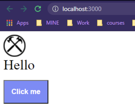
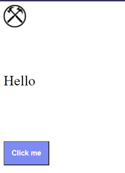
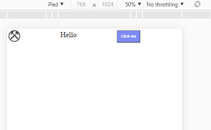
In this image, you’ll see three different areas. We can define spatial relation between them by providing additional props to our composition. Let’s specify a gap of 100px between the grid elements by adding a prop named gap to the composition component:
<Composition areas={areasMobile} gap={100}>
{(Areas) => (
<Areas.Image><Image src="https://www.clker.com/cliparts/R/S/Z/4/t/f/crossed-hammers-bw-100x100-md.png"></Image></Areas.Image>

        <Areas.Text><Text>Hello</Text></Areas.Text>
        <Areas.Button><Button>Click me</Button></Areas.Button>

)}
</Composition>
You’ll see the following:
We can make our card component responsive by defining a new blueprint for it. Imagine we want to adjust our card component for tablets. Create another string template:
const areasTablet = `
Image Text Button
`
We have a problem here. We can’t pass the card component to our areas prop because it already has a value for a phone display, which is the default in Atomic Layout.
To solve this issue, we’ll use responsive props, which have a structure of Prop name +Breakpoint + Behavior .
Breakpoints are certain conditions in which our layout acquires a new state, and we can assign different values to the area prop using the breakpoint. Props for the composition take different breakpoints, and Atomic Layout uses xs, the breakpoint for mobile devices, by default.
Atomic Layout uses the Bootstrap 4 breakpoints:
| Name | xs |
sm |
md |
lg |
xl |
|---|---|---|---|---|---|
| Screen width | <576px | ≥576px | ≥768px | ≥992px | ≥1200px |
Behavior simply defines how a prop is applied. It has the following values:
up: applies prop to the specified breakpoint and up. This is the default behavior. For example, if up is used with md, the prop would be applied from md to xldown: applies prop to a specified breakpoint and down. For example, if down is used with md, the prop would be applied from md to xsonly: applies the prop to the specified breakpoint onlyFor medium-sized screens, we can use the areaTablet in our composition:
<Composition areas={areasMobile} gap={100} areasMd={areasTablet} gapMd={10}

>
{(Areas) => (
  <Areas.Image><Image src="https://www.clker.com/cliparts/R/S/Z/4/t/f/crossed-hammers-bw-100x100-md.png"></Image></Areas.Image>

        <Areas.Text><Text>Hello</Text></Areas.Text>
        <Areas.Button><Button>Click me</Button></Areas.Button>

)}
</Composition>
Let’s run our project again to check whether the layout has been restructured for tablets:
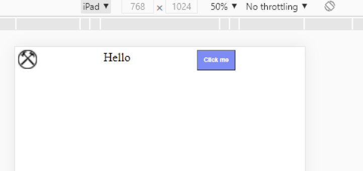
We used the Md breakpoint to get the exact output set by areaTablet for an iPad. Each prop in the Atomic Layout can be responsive, which can take development speed to a whole new level.
Atomic Layout allows us to set the visibility of content using the Visible component, a utility component that wraps children elements and allows them to become visible when certain conditions are met, like specific breakpoints or window widths. We can use the Visible component without CSS.
Import the Visible component from the package and wrap your areas with it. The Visible component accepts the breakpoints as props. Our code should now look like the following snippet:
import React from 'react'
import { Composition, Visible } from 'atomic-layout'
import Button from './Button'
import Text from './Text'
import Image from './Image'

const areasPhone = `
  Image
  Text
  Button
`
const areasTablet = `
Image Text Button

`
export default function Card() {
    return (
        <Composition areas={areasPhone} areasMd={areasTablet} gap={0} gapMd={0}>
        {(Areas) => (
      <>
        <Areas.Image><Image src="https://www.clker.com/cliparts/R/S/Z/4/t/f/crossed-hammers-bw-100x100-md.png"></Image></Areas.Image>

        <Visible for='md'>
            <Areas.Text><Text>Hello</Text></Areas.Text>
  </Visible>

        <Areas.Button><Button>Click me</Button></Areas.Button>

      </>
    )}
     </Composition>
    )
}
The text will only be visible on medium-sized screens. Let’s run our project again to check if we can see text on a mobile screen:
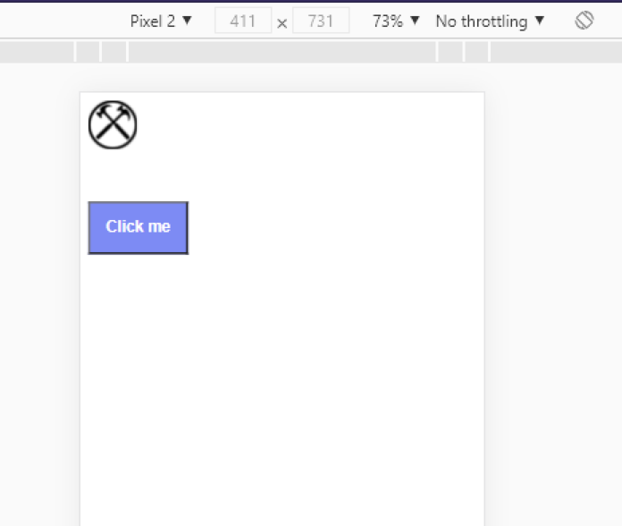
The text is hidden when we use a mobile display. Switching over to a tablet will make it visible:
Let’s go over what makes Atomic Layout different from other frontend libraries.
The areas in the composition are independent because their spacing is not bound to a specific context, assisting in the creation of smooth and reusable layouts.
CSS Grid is powerful. In my opinion, it is the future for the position of layouts. While other libraries are mostly Flexbox-based, Atomic Layout’s use of CSS Grid makes it adaptable for the future.
Atomic Layout’s main focus is on distributing spacing in the best way possible. Atomic Layout effectively defines the layout composition, instead of using rows and columns.
Handling dynamic content in Atomic Layout is simple and fast due to features like responsive props and the Visibility component. Developers can make production-level layouts without writing a single line of CSS and still obtain a responsive result.
The layouts created with the Atomic Layout are extremely responsive and share global settings, making the whole application unified.
Unlike other libraries, Atomic Layout focuses on a single thing: handling the spacing and layout structure. Atomic Layout excels in its job by providing an unbeatable development experience.
Now, you have everything you need to get started with Atomic Layout. Happy coding!
As web frontends get increasingly complex, resource-greedy features demand more and more from the browser. If you’re interested in monitoring and tracking client-side CPU usage, memory usage, and more for all of your users in production, try LogRocket.

LogRocket lets you replay user sessions, eliminating guesswork around why bugs happen by showing exactly what users experienced. It captures console logs, errors, network requests, and pixel-perfect DOM recordings — compatible with all frameworks.
LogRocket's Galileo AI watches sessions for you, instantly identifying and explaining user struggles with automated monitoring of your entire product experience.
Modernize how you debug web and mobile apps — start monitoring for free.
Hey there, want to help make our blog better?
Join LogRocket’s Content Advisory Board. You’ll help inform the type of content we create and get access to exclusive meetups, social accreditation, and swag.
Sign up now
Discover how to use Gemini CLI, Google’s new open-source AI agent that brings Gemini directly to your terminal.

This article explores several proven patterns for writing safer, cleaner, and more readable code in React and TypeScript.

A breakdown of the wrapper and container CSS classes, how they’re used in real-world code, and when it makes sense to use one over the other.

This guide walks you through creating a web UI for an AI agent that browses, clicks, and extracts info from websites powered by Stagehand and Gemini.

 Learn more →

One Reply to "Upgrade your CSS layouts with Atomic Layout "
“the area prop” but example code shows an areas prop, which is it?