Props are a fundamental concept in Solid. They help promote component reusability by facilitating the transfer of data from parent to child components.

In this article, we will discuss props and how they work in Solid. We’ll also explore some advanced concepts related to Solid props, including handling complex data structures. You can check out this GitHub gist to find all the code samples we’re going to cover in this guide.
The Replay is a weekly newsletter for dev and engineering leaders.
Delivered once a week, it's your curated guide to the most important conversations around frontend dev, emerging AI tools, and the state of modern software.
Props, or properties, are what make components reusable. They link parent and child components, allowing information, configuration, and functionality to flow throughout the hierarchy.
Props in Solid, like those in other frameworks, are read-only. This means that once a component receives them, it cannot edit or change them. A component can only use and consume the properties passed down from its parent or ancestor components.
This one-way data flow ensures that props are constant and predictable across the component hierarchy.
Like any modern frontend framework, Solid passes and updates props to enable communication between parent and child components. However, it takes a distinct approach that sets it apart from other frameworks.
Solid’s approach to handling props and updating the DOM is rooted in granular reactivity, dissolution of components after setup, rendering as a side-effect, and unique prop management techniques. This approach ensures efficient and precise updates to the DOM, setting Solid apart from other frameworks.
It’s also worth noting that Solid is designed to be easy to use with TypeScript. As a result, although it doesn’t have built-in type-checking like PropTypes in React, you can leverage TypeScript’s static type-checking capabilities for prop handling in Solid.
This integration is crucial in large-scale applications, where maintaining consistent data types across components is vital. You can define types for your props to ensure that the correct data types are passed, like so:
interface ChildProps {
  message: string;
  count: number;
  onEvent: (event: MouseEvent) => void;
}
const Child = (props: ChildProps) => (
  <div onClick={props.onEvent}>
    {props.message} - {props.count}
  </div>
);
const Parent = () => {
  const handleEvent = (event: MouseEvent) => {
    console.log("Event triggered", event);
  };
  return <Child message="Hello" count={10} onEvent={handleEvent} />;
};
Props in Solid follow a straightforward lifecycle:
createMemo, which can improve rendering performance, particularly for components that rely on complicated calculated dataSo, for example, here’s how the unmounting and cleanup stage of a prop’s lifecycle might look:
function Component() {
  // ...
  onCleanup(() => {
    console.log('this will be called whenever the component gets unmounted')
  })
  createEffect(() => {
    // ...
    onCleanup(() => {
      console.log('and this will be called whenever this effect re-runs, so you can do some cleanup, comparable to React's return-function')
    })
  })
  // ...
}
Solid has many great features that make frontend apps more performant and more efficient to develop. Some of the features that support Solid props include:
Now that we’ve reviewed props in Solid at a high level, let’s explore how to use them in our Solid apps.
To use props, define the function with a parameter representing the props object like so:
const DisplayValue = (props) => {
  return <div>{props.greeting}</div>;
};
We can also pass in props as signals to make them reactive. To do this, we can either pass the signal’s value as props or pass the signal’s getter function as props.
Here’s an example of passing the signal’s value as a prop:
 function DisplayValue(props) {
  return <div>Value: {props.value()} </div>;
}

function Value() {
  const [value, setValue] = createSignal(0);

  setInterval(() => setValue(value() + 1), 1000);

  return <DisplayValue value={value} />;
}
Here’s an example of passing the signal’s getter function as a prop:
function DisplayValue(props) {
  return <div>Value: {props.value} </div>
}
function Value() {
  const [value, setValue] = createSignal(0);
  setInterval(() => setValue(value() + 1), 1000);
  return <DisplayValue value={value()} />;
}
In terms of performance, there’s no significant difference between the two code snippets. Also, in terms of behavior, both snippets will display the current value of the count in the child component. The difference is more about how you want to get the count.
For example, if you want to do extra processing — like calling a function — before displaying the count, you’ll use props.value(), like in the first code snippet. If you just want to get the count directly, you’ll use props.value as we did in the second code snippet.
Custom props allow you to pass data or functions from one component to another. This enhances customization and reusability. Let’s look at a simple example:
// App.jsx
import { createSignal } from "solid-js";
import Child from "./Child";
function App() {
 // Create a reactive signal in the parent component
 const [parentMessage, setParentMessage] = createSignal("Hello from Parent!");
 // Custom prop: onMessageUpdate is a function that updates the parentMessage
 const customProps = {
   message: parentMessage,
   onMessageUpdate: () => setParentMessage("Updated from Parent!"),
 };
 return (
   <div>
     {/* Render the Child component and pass custom props */}
     <Child {...customProps} />
   </div>
 );
}
export default App;
In the code above, the App component creates a reactive signal named message and an updating function called onMessageUpdate. It then passes these to the Child component as custom properties:
function Child(props) {
 // Access reactive props directly without destructuring
 return (
   <div>
     <p>{props.message()}</p>
     <button onClick={props.onMessageUpdate}>Update Message</button>
   </div>
 );
}
export default Child;
When the Update Message button is clicked, the child component displays the message from the parent’s component using the reactive signal and interactively updates it through the provided function.
Let’s use an example to demonstrate the relationship between props and reactivity in Solid. To get started, we’ll use App.jsx as our parent component and then create another component as the child component.
Our App.jsx code should look like so:
import logo from "./logo.svg";
import styles from "./App.module.css";
import { createSignal } from "solid-js";
import Child from "./Child";
function App() {
  const [age, setAge] = createSignal(10);
  return (
    <div class={styles.App}>
      <Child age={age()} />
      <button onClick={() => setAge(age() + 1)}>update age</button>
    </div>
  );
}
export default App;
Here, our parent component manages the age state signal and renders the child component, passing the age value as a prop. We also added an event handler inside a button that updates the age when it’s clicked. This change is automatically reflected in the child component due to Solid’s reactivity.
Let’s create a child component and initialize our props:
//Child.jsx
function Child(props) {
  console.log(props);
  return (
    <div>
      <h3>age - {props.age}</h3>
    </div>
  );
}
export default Child;
Our child component receives the custom prop called age as an argument inside the component. It then renders and displays the value of the age prop, showing that age passed from the App.jsx parent component.
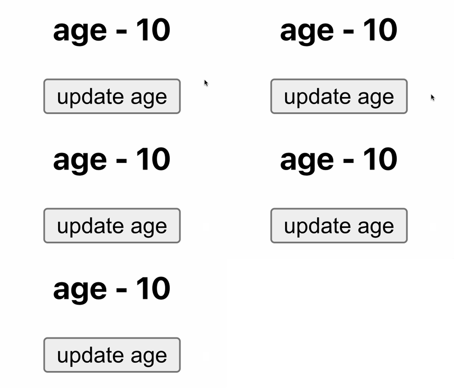
Here’s our result:

It’s also worth noting that destructuring prop objects is discouraged in Solid due to the possible loss in reactivity. Destructuring props can break the connection between your components, and Solid may not effectively track changes in those destructured variables, potentially leading to lost reactivity.
Let’s try to destructure a prop to see what happens. Update the child component we created earlier to look like this:
function Child(props) {
const { age } = props;
return (
<div>
<h3>age - {age}</h3>
</div>
);
}

export default Child;
You’ll notice that whenever we try to update by clicking the button, the default value remains fixed. This is because the prop has lost its reactivity:

Remember, reactivity in Solid means that whenever a property gets updated, its consumers should also get updated. So, when we destructured the prop in our example, the age property automatically lost its reactivity. That’s why destructuring props is never recommended.
Let’s explore another scenario using the Object.assign method to get the age value instead. Update the child.jsx code to this:
function Child(props) {
  const updatedProps = Object.assign({ name: "koded" }, props);
  return (
    <div>
      <h3>age - {updatedProps.age}</h3>
      <h3>name - {updatedProps.name}</h3>
    </div>
  );
}
export default Child;
We created a new object named updatedProps using the Object.assign method. This new object combines the properties from props and sets the default name property to koded.
If we check the result in the browser, you’ll notice the age isn’t updated even in this case:

That’s because this operation creates a new object reference. Solid will not be able to track changes within this new object as it would with the original prop object, which means even if we use the Object.assign method, the prop would still lose its reactivity.
So, what method can we use, then?
Solid has a few utilities to help us when working with props, one of which is the mergeProps utility function. Let’s take a look at mergeProps next.
mergeProps function to preserve reactivityWe can use the mergeProps function to combine and manage properties or attributes within a component. It allows you to customize how props are combined or processed. Using mergeProps in Solid preserves the reactivity of the props being merged.
Let’s see how we can use mergeProps in our example. Update the child.jsx code to the following:
import { mergeProps } from "solid-js";

function Child(props) {
const updatedProps = mergeProps({ name: "koded" }, props);
console.log(props);
return (
<div>
<h3>age - {updatedProps.age}</h3>
<h3>name - {updatedProps.name}</h3>
</div>
);
}

export default Child;
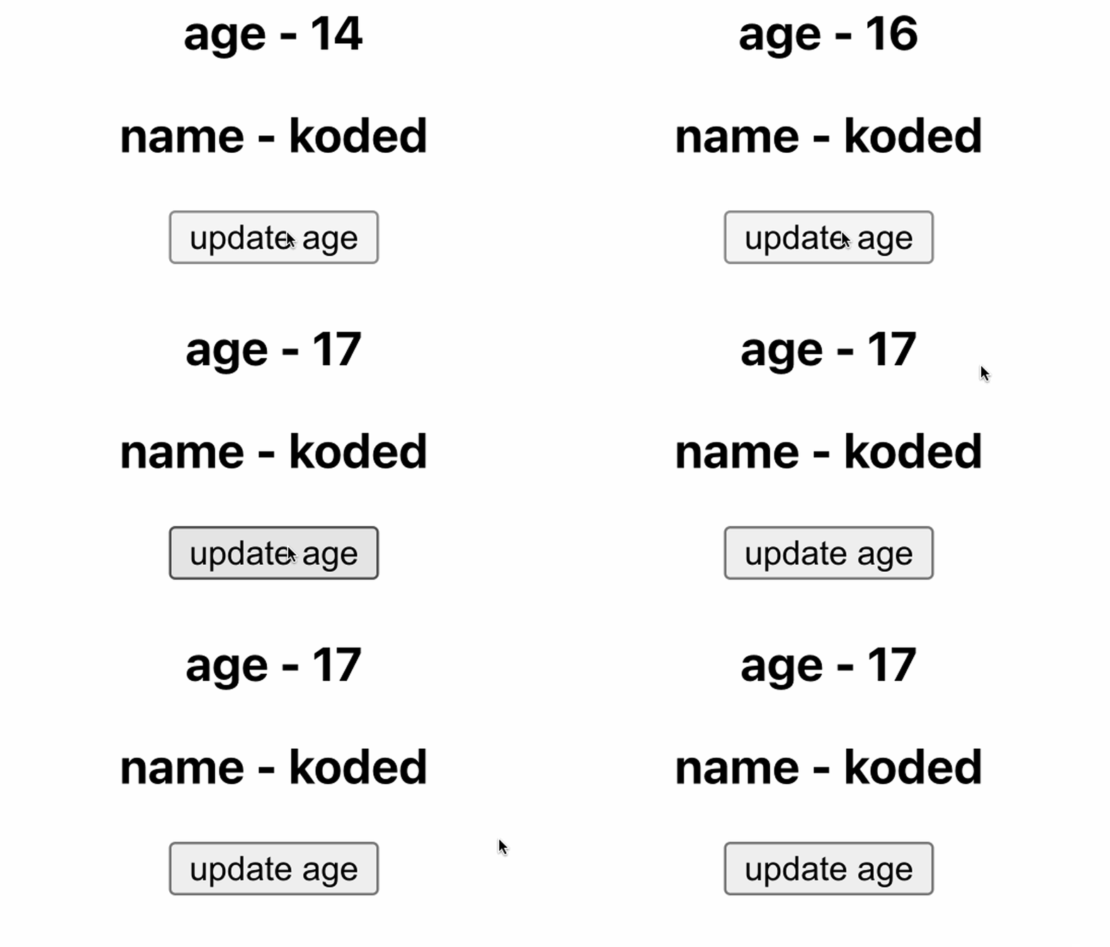
When we check our browser, we see that we get the name and age as before. However, in addition, when we click the button, the age gets updated because it doesn’t lose its reactivity:

splitProps utility functionThe splitProps function, as the name suggests, is mainly used for splitting props. In other words, we can split props in our child components and use them whenever we receive them. Let’s look at how it works. In our app.jsx file, paste this:
import logo from "./logo.svg";
import styles from "./App.module.css";
import { createSignal } from "solid-js";
import Child from "./Child";
function App() {
const [age, setAge] = createSignal(10);
const [name, setName] = createSignal("koded");
const [address, setAddress] = createSignal("lagos");
return (
<div class={styles.App}>
<Child age={age()} name={name()} address={address()} />
</div>
);
}

export default App;
Likewise, paste the following in our child.jsx file:
import { splitProps } from "solid-js";
function Child(props) {
const [primaryInfo, secondaryInfo] = splitProps(props, ["age", "name"]);
return (
<div>
<p>name:{primaryInfo.name}</p>
<p>age: {primaryInfo.age}</p>
<p>secondaryinfo: {secondaryInfo.address}</p>
</div>
);
}

export default Child;
In our Child component, we are using splitProps to split the props object into two parts:
primaryInfo contains the props with keys age and name using the splitProps function. You want to extract these specified props from the original props objectsecondaryInfo contains the rest of the props, which is the address prop in this caseHere’s the result:

The splitProps function helps split us props into individual objects. We can then group these objects and use the group to extract the properties from a specific object. This can be particularly helpful when you want to manage large datasets by splitting them into different groups.
We can also use splitProps to extend props. For example, you could add new properties to the objects returned by splitProps like so:
import { splitProps } from "solid-js";
function Child(props) {
 const [primaryInfo, secondaryInfo] = splitProps(props, ["age", "name"]);
 secondaryInfo.additionalProp = "Extra Data"; // Extending props
 return (
   <div>
     <p>name:{primaryInfo.name}</p>
     <p>age: {primaryInfo.age}</p>
     <p>secondaryinfo: {secondaryInfo.address}</p>
     <p>additionalProp: {secondaryInfo.additionalProp}</p> // Using the extended prop
   </div>
 );
}
export default Child;
In the code above, an additionalProp is added to secondaryInfo, effectively extending the props. The additionalProp is then used in the returned div. This targeted approach provides more control and flexibility in how props are managed within a component.
children propsImagine we want to pass data from the parent to the child component — not simple data like a string or Boolean, but something like HTML content. In such a case, it’s recommended to use children props.
You can pass children props between the component’s braces — i.e., <child></child> — like so:
//app.jsx
import logo from "./logo.svg";
import styles from "./App.module.css";
import { createSignal } from "solid-js";
function App() {
return (
<div class={styles.App}>
<Child>
<h1> hi this is a children prop</h1>
<span> logrocket blog rocks!!! </span>
</Child>
</div>
);
}

export default App;
Let’s test this out by adding the code below to our child.jsx file:
function Child(props) {
return <div>{props.children}</div>;
}
export default Child;
Here’s our result:

When working with children in Solid components, you should be careful not to create the children multiple times.
Solid addresses this concern with the children helper, which wraps the children prop in a memo and resolves any reactive references within the nested children. As a result, you can interact with the children directly.
After updating our child.jsx code to use the children helper, we have this:
import { children } from "solid-js";
function Child(props) {
const childrenSample = children(() => props.children);
return <div>{childrenSample()}</div>;
}
export default Child;
In the revised code, childrenSample is a memoized version of of the props.children prop. While the result may appear the same, the helper function effectively resolves the concern mentioned earlier.
The children helper creates a memo around props.children, ensuring that the children content is not created multiple times. It remembers the previous children content and only updates when there are actual changes.
This optimization improves the performance of your application, especially in instances where the children content remains the same or is reactive.
Conditional classes help create dynamic and responsive user interfaces. They allow you to change the styling of HTML elements to match user activities, change data, or change component statuses.
You can define conditional styling patterns using the classList feature, making your Solid apps more flexible and maintainable. Let’s look at an example of how to use them:
//app.jsx
function App() {
return (
<div class="container m-auto">
<div class="grid grid cols-4 gap-10 my-4">
<Card title="Card Title 1" round={true} />
<Card title="Card Title 2" />
</div>
</div>
);
}

export default App;
The App component in the code above renders a grid of two Card components. Each Card receives title prop.
The round prop is used to conditionally apply Tailwind to style the cards.
Now, let’s write the code for our Card.jsx component:
import logo from "./logo.svg";
import styles from "./App.module.css";
import { createSignal } from "solid-js";
export function Card(props) {
  return (
    <div
      class="bg-white p-4 text-cente shadow-xl"
      classList={{ "rounded-xl": props.round }}
    >
      <h2 class="">{props.title}</h2>
      <p>
        Lorem ipsum dolor sit amet consectetur adipisicing elit. Velit
        architecto doloribus consequatur ipsam in quibusdam ipsum saepe
        provident nobis explicabo! Eveniet, debitis quia! Soluta quas
        necessitatibus minus culpa minima quis?
      </p>
    </div>
  );
}
export default Card;
The Card component is responsible for rendering individual cards. It receives title and round props.
When props.round is true, the rounded-xl class is added to the div element, resulting in rounded corners for the card. When props.round is false, the rounded-xl class is removed, leaving the card with default square corners.
This allows for flexible and dynamic card styling based on the provided props. See how our example Card components look:

Debugging prop issues in Solid can be done in a couple of ways that are similar to React, but with some unique characteristics due to Solid’s reactivity system:
props properties are getters that call signals, while JSX attributes compile into effects that update the DOM. When effects access these signals, they subscribe to changes, unless the access is untracked. Destructuring props calls getters outside of an effect, so nothing will subscribe to changes in the underlying signal. To avoid this and maintain reactivity in your destructured props, use @solid-primitives/destructure in your runtime code or babel-plugin-solid-undestructure in your build chain, which replaces destructuring with direct accessAnd that’s it! We have successfully learned how props work in Solid projects.
This article talked about what props are and how they work in SolidJS, along with features of Solid that are relevant to working with props. We also explored concepts like mergeProps, splitProps, and children props. Visit this GitHub repo to find all the code samples we used in this guide.
Props are a fundamental concept in component-based web development. They play a vital role in promoting reusability and conveying data from parent components to child components, thus allowing information to flow seamlessly across our applications.
I hope this advanced guide to Solid props unlocks new dimensions of reusability, helping you build more modular and maintainable codebases. Please share if you found this helpful.
There’s no doubt that frontends are getting more complex. As you add new JavaScript libraries and other dependencies to your app, you’ll need more visibility to ensure your users don’t run into unknown issues.
LogRocket is a frontend application monitoring solution that lets you replay JavaScript errors as if they happened in your own browser so you can react to bugs more effectively.

LogRocket works perfectly with any app, regardless of framework, and has plugins to log additional context from Redux, Vuex, and @ngrx/store. Instead of guessing why problems happen, you can aggregate and report on what state your application was in when an issue occurred. LogRocket also monitors your app’s performance, reporting metrics like client CPU load, client memory usage, and more.
Build confidently — start monitoring for free.

A side-by-side look at Astro and Next.js for content-heavy sites, breaking down performance, JavaScript payload, and when each framework actually makes sense.

AI-generated tests can speed up React testing, but they also create hidden risks. Here’s what broke in a real app.re

Why the future of DX might come from the web platform itself, not more tools or frameworks.

A hands-on test of Claude Code Review across real PRs, breaking down what it flagged, what slipped through, and how the pipeline actually performs in practice.
Would you be interested in joining LogRocket's developer community?
Join LogRocket’s Content Advisory Board. You’ll help inform the type of content we create and get access to exclusive meetups, social accreditation, and swag.
Sign up now