Editor’s Note: This post was reviewed and updated on 5 November 2021 with relevant information and code blocks.

Compound components are an advanced pattern, so it might be overwhelming to use. This guide aims to help you understand the pattern so that you can use it effectively with confidence and clarity. In this article, we’ll use context API.
Compound components are a pattern in which components are used together such that they share an implicit state that lets them communicate with each other in the background.
In other words, when multiple components work together to have a shared state and handle logic together, they are called compound components.
Think of compound components like the
<select>and<option>elements in HTML. Apart they don’t do too much, but together they allow you to create the complete experience. — Kent C. Dodds
When you click on an option, select knows which option you clicked. Like select and option, the components share the state on their own, so you don’t have to explicitly configure them.
<TabSwitcher>
  <header>
    <ul className="tablist">
      <li>
        <Tab id="a">
          <button>Tab A</button>
        </Tab>
      </li>
      <li>
        <Tab id="b">
          <button>Tab B</button>
        </Tab>
      </li>
    </ul>
  </header>
  <main>
    <TabPanel whenActive="a">
      <div>
        a panel
      </div>
    </TabPanel>

    <TabPanel whenActive="b">
      <div>
        b panel
      </div>
    </TabPanel>
  </main>
</TabSwitcher>
When you click on the buttons inside the Tab component, the corresponding tab panels’ content is rendered. Furthermore, notice that we are using multiple components together to create one single compound component. As a result, this helps in code reusability.
Render props is a great pattern. It is versatile and easy to understand. However, this doesn’t mean that we have to use it everywhere. If used carelessly, it can lead to obfuscated code.
Having too many nested functions inside the markup makes it difficult to read. Remember, nothing is a silver bullet, not even render props.
By looking at the example, some advantages to using compound components are pretty clear.
For example, the developer owns the markup. The implementation of TabSwitcher doesn’t need a fixed markup structure. You can do whatever you like, nest a Tab 10 levels deep (I’m not judging) and it will still work. Because they are compounded together, they can share state data with each other seamlessly
Also, the developer can rearrange the components in any order. Suppose you want the Tabs to come below the Tab Panels. No changes are required in the component implementation, we just have to rearrange the components in the markup
And finally, components don’t have to be jammed together explicitly. They can be written independently but are still able to communicate. In the example, Tab and TabPanel components are not connected directly, but they are able to communicate via their parent TabSwitcher component.
TabSwitcher) has some stateTabSwitcher shares its state and methods with child components. In this case, our child components are Tab and TabPanelTab uses the shared methods to communicate with TabSwitcherTabPanel uses the shared state to decide if it should render its contentTabSwitcher compound component in ReactTo implement a compound component, I usually follow these steps.
For TabSwitcher, we need to have two things. First, you need to know which tab content to show, and second, it should switch tab panels when the user clicks.
This means we need to control the rendering of the tab panel content and have a click event listener on the tabs, so when Tab is clicked, the corresponding tab panel content is shown.
To accomplish this, we need three components:
TabSwitcher : parent component to hold the stateTab : component that tell its parent if it’s clickedTabPanel: component that renders when the parent tells it toThe compound component pattern has some boilerplate code. This is great because in most cases, we can write it without too much thinking.
import React, { useState, createContext, useContext } from "react";

//the name of this context will be DataContext
const DataContext = createContext({});

function Tab({ id, children }) {
  //extract the 'setActiveTabID` method from the DataContext state.
  const [, setActiveTabID] = useContext(DataContext);
  return (
    <div>
      <div onClick={() => setActiveTabID(id)}>{children}</div>
    </div>
  );
}
function TabPanel({ whenActive, children }) {
  //get the 'activeTabID' state from DataContext.
  const [activeTabID] = useContext(DataContext);
  return <div>{activeTabID === whenActive ? children : null}</div>;
}

function TabSwitcher(props) {
  const [activeTabID, setActiveTabID] = useState("a");
  //since this component will provide data to the child components, we will use DataContext.Provider
  return (
    <DataContext.Provider value={[activeTabID, setActiveTabID]}>
      {props.children}
    </DataContext.Provider>
  );
}

export default TabSwitcher;
export { Tab, TabPanel };
Here, we are making a context. The child components will take data and methods from the context. The data will be the state shared by the parent, and the methods will be for communicating changes to the state back to the parent.
The Tab component needs to listen to click events and tell the parent which tab was clicked. It can be implemented like this :
function Tab({ id, children }) {
  //extract the 'setActiveTabID` method from the DataContext state.
  const [, setActiveTabID] = useContext(DataContext);
  return (
    <div>
      <div onClick={() => setActiveTabID(id)}>{children}</div>
    </div>
  );
}
Tab component takes the id prop and on-click event call setActiveTabID method, passing its id. This way, the parent knows which Tab was clicked.
The TabPanel component needs to render its children only when it is the active panel. It can be implemented like this :
function TabPanel({ whenActive, children }) {
  //get the 'activeTabID' state from DataContext.
  const [activeTabID] = useContext(DataContext);
  return <div>{activeTabID === whenActive ? children : null}</div>;
}
TabPanel takes whenActiveprop, which tells it when to render the children. The context provides the activeTabId through which TabPanel decides if it should render its children or not. TabSwitcher needs to maintain active tab state and pass the state and methods to the child components.
function TabSwitcher(props) {
  const [activeTabID, setActiveTabID] = useState("a");
  //since this component will provide data to the child components, we will use DataContext.Provider
  return (
    <DataContext.Provider value={[activeTabID, setActiveTabID]}>
      {props.children}
    </DataContext.Provider>
  );
}
The TabSwitcher component stores activeTabID. By default, it is a. So, the first panel will be visible initially. It has a method that is used to update the activeTabID state. TabSwitcher shares the state and the methods to the consumers.
Let’s see how they all fit together.
import React, { useState, createContext, useContext } from "react";

//the name of this context will be DataContext
const DataContext = createContext({});

function Tab({ id, children }) {
  //extract the 'setActiveTabID` method from the DataContext state.
  const [, setActiveTabID] = useContext(DataContext);
  return (
    <div>
      <div onClick={() => setActiveTabID(id)}>{children}</div>
    </div>
  );
}
function TabPanel({ whenActive, children }) {
  //get the 'activeTabID' state from DataContext.
  const [activeTabID] = useContext(DataContext);
  return <div>{activeTabID === whenActive ? children : null}</div>;
}

function TabSwitcher(props) {
  const [activeTabID, setActiveTabID] = useState("a");
  //since this component will provide data to the child components, we will use DataContext.Provider
  return (
    <DataContext.Provider value={[activeTabID, setActiveTabID]}>
      {props.children}
    </DataContext.Provider>
  );
}

export default TabSwitcher;
export { Tab, TabPanel };
The compound component can be used like this:
import TabSwitcher, { Tab, TabPanel } from "./TabSwitcher";

function App() {
  return (
    <div className="App">
      <h1>TabSwitcher with Compound Components</h1>
      <TabSwitcher>
        <Tab id="a">
          <button>a</button>
        </Tab>
        <Tab id="b">
          <button>b</button>
        </Tab>

        <TabPanel whenActive="a">
          <div>a panel</div>
        </TabPanel>

        <TabPanel whenActive="b">
          <div>b panel</div>
        </TabPanel>
      </TabSwitcher>
    </div>
  );
}
export default App;
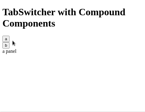
This will be the output:
And that’s a wrap for your quick guide to React compound components. Thanks for reading!
Install LogRocket via npm or script tag. LogRocket.init() must be called client-side, not
server-side
$ npm i --save logrocket

// Code:

import LogRocket from 'logrocket';
LogRocket.init('app/id');
// Add to your HTML:

<script src="https://cdn.lr-ingest.com/LogRocket.min.js"></script>
<script>window.LogRocket && window.LogRocket.init('app/id');</script>

Learn how contrast-color() automatically picks accessible text colors using native CSS, without JavaScript.

Learn how to build smooth staggered animations in CSS using modern features like sibling-index(), complete with practical examples, fallbacks, and accessibility tips.

Compare the top AI development tools and models of July 2026. View updated rankings, feature breakdowns, and find the best fit for you.

Learn how to detect unused and ghost dependencies in JavaScript projects using Knip, a project-level linter that keeps your dependency graph accurate.
Would you be interested in joining LogRocket's developer community?
Join LogRocket’s Content Advisory Board. You’ll help inform the type of content we create and get access to exclusive meetups, social accreditation, and swag.
Sign up now

 Learn more →
