Editor’s note: This guide to the top React date pickers was last updated on 16 May 2023 by Abhinav Anshul to reflect recent changes to React and to include new sections on RC Datepicker, React infinite calendar, and the benefits of using a date picker in React.

As developers, we always look for ways to save time on our projects. This is the primary motivation behind creating libraries; they prevent us from repeatedly implementing identical functions. With frontend frameworks like React, sharing common functionality for different projects is easier than ever.
In this post, I’ll walk you through some of the date picker libraries that I found really useful. Note that we’ll only be going through the libraries which have been updated recently. This is to ensure it will work on your project without going through many hoops.
Jump ahead:
A React date picker is a UI component that allows you to select a date or a range of dates. Opting for a pre-existing React date picker component instead of constructing your own can significantly streamline your work. This is due to their comprehensive features that cater to most, if not all, of your potential needs. In case you are using a component library already, chances are they do provide a date picker component. If not, you can always opt for other popular ones out there.
Using a date picker over building your own can provide several benefits, including:
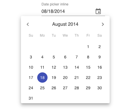
If you’re using Material UI as the base for the UI components of your project, you will most likely have to use Material UI’s date and time picker as well. The good thing about this library is that it is still very customizable even though you’re constrained with Material Design. You can customize the styles via the createMuiTheme() function provided by Material UI.
This is the only component in this list that has a clock view. This makes it easy to pick the time in desktop and mobile views. Material UI has an MUI-X library that provides more complex components for advanced use cases. This date picker comes within the MUI-X itself.
According to the official documentation, you can choose between date-fns, dayjs, luxon, or moment as the datetime library for parsing and formatting dates. The datetime picker doesn’t come with the core Material UI dependencies, so you’ll have to install those with the following command:
npm install dayjs @mui/x-date-pickers @mui/material @emotion/styled @emotion/react --save
And, use it like this:
import React from "react";
import { AdapterDayjs } from "@mui/x-date-pickers/AdapterDayjs";
import { LocalizationProvider } from "@mui/x-date-pickers/LocalizationProvider";
import { DatePicker } from "@mui/x-date-pickers/DatePicker";
export default function DatePickerMaterialUI() {
  return (
    <div>
      <LocalizationProvider dateAdapter={AdapterDayjs}>
        <DatePicker />
      </LocalizationProvider>
    </div>
  );
}
This is the most straightforward library among the bunch. Pick this date picker if you’re looking for a lightweight library for your project. Don’t be fooled by its size; it can provide all the common functionalities that date pickers usually need. Its base style is very simple, which makes it easy to customize. It comes with its own date-utilities for working with and localizing dates. (Though you can use your date library of choice if you want to).
The best part about this library is that it has an extensive list of custom modifiers for almost anything that you can do with it. For example, you can mark specific days as disabled or select a date range on click. You can install it like so:
npm install react-day-picker date-fns
Once installed, here’s how you can use it:
import React from "react";
import { DayPicker } from "react-day-picker";
import "react-day-picker/dist/style.css";
export default function ReactDayPicker() {
  const [selected, setSelected] = React.useState();
  return (
    <DayPicker
      mode="single"
      selected={selected}
      onSelect={setSelected}
    />
  );
}
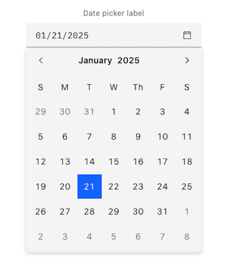
Carbon is IBM’s open source design system that uses IBM’s Design Language as its foundation. It’s pretty much the IBM equivalent of Material Design Guidelines from Google. But unlike Material UI, which is only available for React, Carbon also supports Vue, Angular, Svelte, and even vanilla JavaScript. So, if you want to adopt Carbon Design for your next project, then you can use this date picker. Otherwise, skip it.
At its core, it’s a design system, so it really focuses on the consistency of design. Things like the alignment of various elements and how the various states should look are given utmost priority.
It also allows the user to input dates manually. This is often prone to mistakes, so you’ll have to implement the validation yourself. Under the hood, it uses flatpickr, so you can customize it fully by using flatpickr options. You can install it like this:
npm install carbon-components carbon-components-react carbon-icons --save
Then, use it like so:
import React from 'react';
import { DatePickerInput } from 'carbon-components-react';

export default function CarbonDatePicker() {

  return (
    <DatePickerInput
        placeholder="mm/dd/yyyy"
        labelText="Date Picker label"
        id="date-picker-single"
        onChange={date => {
          console.log(date);
        }}
      />
    </DatePicker>
  );
}
Refer to the flatpickr docs as the documentation because Carbon uses that under the hood.
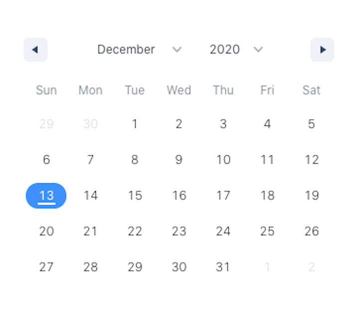
This is one of the lightweight libraries in this list. This date picker doesn’t depend on any date library to work. It has a customizable calendar view, so you can have a month, year, decade, and even a century view.
The downside of this library is the lack of usage samples. It only has a usage sample for its most common use case. If your use case isn’t very common, you’ll need to dig through the prop documentation. You can install it with the following command:
npm install react-date-picker --save
You can then use it like so:
import React, { useState } from 'react';
import DatePicker from 'react-date-picker';

export default function MyDatePicker() {
  const [value, setValue] = useState(new Date());

  const onChange = (date) => {
    setValue(() => date);
  }

  return (
    <div>
      <DatePicker
        onChange={onChange}
        value={value}
      />
    </div>
  );
}
The developer who made this library has separated the related functionality, such as time picker, datetime picker, and date range picker, into their own package. Be sure to check them out if you need more than just a date picker:
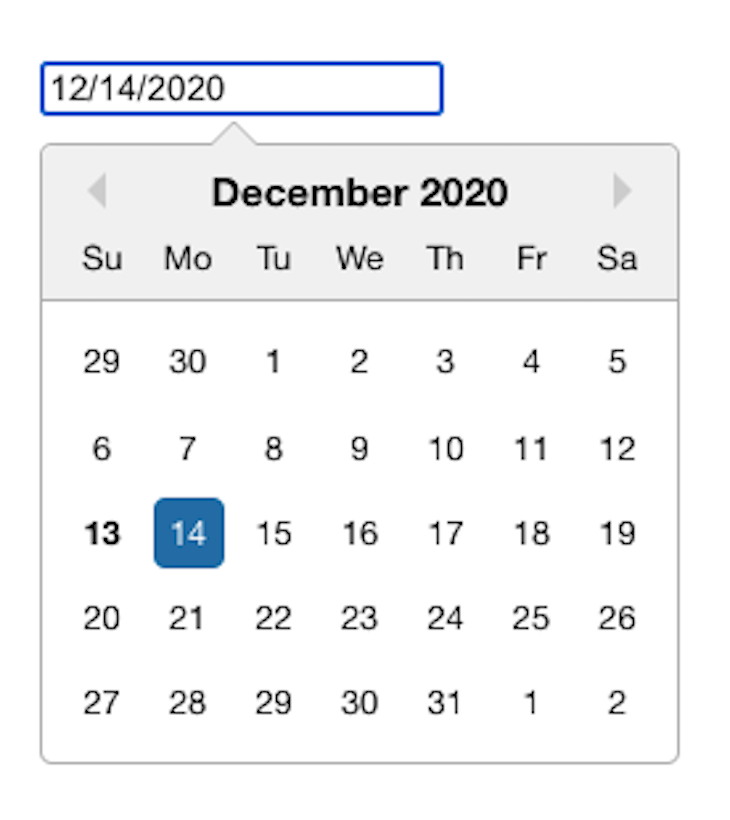
Airbnb’s React Dates is one of the older libraries on this list. Despite its age, Airbnb’s React Dates continues to be diligently updated and maintained. It’s localizable, mobile-friendly, and built with accessibility in mind. It relies on Moment.js for working with dates, so it’s a bit heavy compared to the lightweight libraries on this list.
The biggest downside of this library is that they don’t have proper documentation and usage samples. All they have is a Storybook and a few examples on their GitHub repo. So, if you’re fairly new to React or don’t like digging through the code, you can probably skip this one.
You can install it with the following command:
npm install react-dates --save
Then, use it like so:
import React, { useState } from "react";
import "react-dates/initialize";
import "react-dates/lib/css/_datepicker.css";
import { SingleDatePicker } from "react-dates";

export default function ReactdatesDatepicker() {
  const [date, setDate] = useState(null);
  const [isFocused, setIsFocused] = useState(false);

  function onDateChange(date) {
    setDate(date);
  }

  function onFocusChange({ focused }) {
    setIsFocused(focused);
  }

  return (
    <SingleDatePicker
      id="date_input"
      date={date}
      focused={isFocused}
      onDateChange={onDateChange}
      onFocusChange={onFocusChange}
    />
  );
}
This is a simple and reusable date picker component. The great thing about this library is that its documentation has examples of all the use cases you can think of. Things like using custom class names, highlighting specific days, and adding date and time filters all have corresponding examples.
Their examples also use vanilla JavaScript, meaning the developer can use any date library for date manipulation. However, it uses date-fns for localization. The downside with this library is that its default UI doesn’t look that great. It’s built to be simple; thus, it assumes that the developer will have to customize the styles on their own.
You can install it with the following command:
npm install react-datepicker --save
You can then use it like so:
import React, { useState } from "react";
import DatePicker from "react-datepicker";
import "react-datepicker/dist/react-datepicker.css";

export default function HackeroneDatepicker() {
  const [date, setDate] = useState(new Date());

  function onChange(date) {
    setDate(date);
  }

  return <DatePicker selected={date} onChange={onChange} />;
}
React Rainbow is a UI components library just like Material UI. So if you’re already using React Rainbow, then you’ll most likely be stuck using its date and time components. Otherwise, you’ll have to adopt the whole library to use it. It has a date picker, a datetime picker, and a date picker modal.
The main disadvantage of this library is that its components cannot be installed individually, so you have to use the whole UI library to use its date and time picker components. Another disadvantage is that it’s very opinionated about how the components should look and function. For example, you can’t have an inline date picker, as everything needs to be in a modal.
You can install it with the following command:
npm install react-rainbow-components --save
The date picker can then be used like so:
import React, { useState } from "react";
import { DatePicker } from "react-rainbow-components";

export default function RainbowDatepicker() {
  const [date, setDate] = useState(null);

  function onChange(date) {
    setDate(date);
  }

  return (
    <DatePicker
      id="datePicker-1"
      value={date}
      onChange={onChange}
      label="DatePicker Label"
      formatStyle="large"
    />
  );
}
Just like React Rainbow, the date and time picker comes packaged with the whole UI component library itself. It follows the Ant Design Specifications, so there’s a huge focus on the consistency of the design to provide better user experiences.
This means that you’ll only get the full benefit of using this component if you also use the whole UI component library. By default, the date picker uses Moment.js for working with dates. But, they also provide a way to use another one, which is great, especially if you’re concerned about the bundle size.
Another great thing about it (and all of Ant Design’s components) is that they provide editable demos via CodeSandbox, CodePen, and StackBlitz. This makes it easy to try them out by simply forking their demo. You can install it with the following command:
npm install antd --save
Once installed, you can use it like so:
import React, { useState } from "react";
import { DatePicker } from "antd";

export default function AntDatepicker() {
  const [date, setDate] = useState(new Date());
  function onChange(date, dateString) {
    setDate(date);
  }
  return <DatePicker onChange={onChange} />;
}
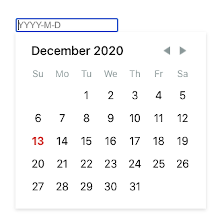
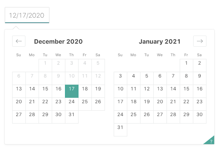
If you’re looking for a nice-looking date range picker with little to no CSS customization on your part, then this package is for you. But, even though that’s the case, this library is still highly customizable. Unfortunately, the docs and examples could use a little improvement. So, if you’re looking to implement some uncommon date range picker functionality, you might have some trouble.
Another downside is that this project is currently unmaintained, as stated in the repo. While currently, the source code is stable; it might cause issues to your project in the foreseeable future.You can install it with the command you’ll see below. The GitHub repo mentioned that it’s a date library agnostic date picker, but it has marked the date-fns library as a peer dependency, so you also have to install it on your project:
npm install react-date-range date-fns --save
You can then use it like so:
import React, { useState } from "react";
import { Calendar } from "react-date-range";
import "react-date-range/dist/styles.css";
import "react-date-range/dist/theme/default.css";

export default function HypeserverDatepicker() {
  const [date, setDate] = useState(new Date());

  function onChange(date) {
    setDate(date);
  }

  return <Calendar date={date} onChange={onChange} />;
}
This is a quite straightforward day picker library. It comes with an opinionated UI style that you can further change based on your project needs. The only downside with this is there is no proper documentation available. You might need to read through the source code for more complex cases.
So, if you are a beginner in React, there are plenty of options available. It uses momentjs under the hood; therefore, to support locale, you also need to import the moment library. Overall, rc-datepicker is a pretty good standalone date-picker library. You can install it like so:
npm install rc-datepicker --save
Once installed, here’s how you can use it:
import { DatePickerInput } from "rc-datepicker";
import { useState } from "react";
import "rc-datepicker/lib/style.css";

export default function RCDatePicker() {
  const [date, setDate] = useState("");
  const onChange = (jsDate, dateString) => {
    // ...
  };
  return (
    <div className="App">
      <DatePickerInput
        onChange={onChange}
        value={date}
        className="my-custom-datepicker-component"
      />
    </div>
  );
}
React infinite calendar is a feature-rich date picker. Despite its small size, it offers a wide range of high-level APIs you can use in your project. However, this date picker is slightly different from the rest in terms of UI and usability. It offers a unique UI where you can scroll infinitely using CSS transitions.
React infinite calendar is highly customizable, has built-in keyboard navigation support, and even has a translation API. If your project needs a standalone date picker component with a scrollable effect, react infinite calendar is probably the best library.
The only downside is it uses a lot of underlying dependencies such as react-tiny-virtual-list, react-transition-group, compose, etc. Also, for the date manipulation, it uses the date-fns library. You can install it as:
npm install react-infinite-calendar react-addons-css-transition-group --save
And use it like this:
import InfiniteCalendar from "react-infinite-calendar";
import "react-infinite-calendar/styles.css";

export default function ReactInfiniteCalendar() {
  return (
    <div>
      <InfiniteCalendar selected={new Date()} disabledDays={[0, 6]} />
    </div>
  );
}
Here’s a comparison table of all the libraries. Note that all of the libraries in this list are customizable, accessible, and localizable, so I excluded those features from the table below:
| Library | Components | Stand-alone | Date library agnostic | TypeScript support |
|---|---|---|---|---|
| Material UI Date/ Time picker | Date, time | No 🚫 | Yes ✅ | No 🚫 |
| react-day-picker | Date, date range | Yes ✅ | Yes ✅ | No 🚫 |
| Carbon Design Systems date picker | Date, time, date range | No 🚫 | Yes ✅ | No 🚫 |
| wojtekmaj / react-date-picker | Date, time, date range | Yes ✅ | Yes ✅ | No 🚫 |
| airbnb / react-dates | Date, date range | Yes ✅ | No 🚫 (Moment.js) | No 🚫 |
| React Datepicker by hackerone | Date, time, date range | Yes ✅ | No 🚫 (date-fns) | No 🚫 |
| React Rainbow components date picker | Date, date range, time | No 🚫 | Yes ✅ | Yes ✅ |
| Ant Design DatePicker | Date, date range, time | No 🚫 | Yes ✅ | Yes ✅ |
| hypeserver / react-date-range | Date, date range | Yes ✅ | No 🚫 (date-fns) | No 🚫 |
| rc-datepicker | Date | Yes ✅ | No 🚫 (Moment.js) | Yes ✅ |
| React Infinite calendar | Date | Yes ✅ | No 🚫 (date-fns) | Yes ✅ |
That’s it for this roundup of date picker libraries. As you have seen, you can choose from many date picker libraries. Some include their time picker component, while others only have a date picker component. Some are simple, with only the basic date picker functionality, while others have many options to customize the user experience.
Lastly, there are those that integrate nicely with big UI component libraries such as Material UI and Ant Design. If you’ve used a great date picker library not on the list above, please let us know in the comments below.
Install LogRocket via npm or script tag. LogRocket.init() must be called client-side, not
server-side
$ npm i --save logrocket

// Code:

import LogRocket from 'logrocket';
LogRocket.init('app/id');
// Add to your HTML:

<script src="https://cdn.lr-ingest.com/LogRocket.min.js"></script>
<script>window.LogRocket && window.LogRocket.init('app/id');</script>

Mutative processes data with better performance than both Immer and native reducers. Let’s compare these data handling options in React.

Radix UI is quickly rising in popularity and has become an excellent go-to solution for building modern design systems and websites.

In this article, we’ll explore CSS cascade layers — and, specifically, the revert-layer keyword — to help you refine your styling strategy.

Nushell is a modern, performant, extensible shell built with Rust. Explore its pros, cons, and how to install and get started with it.

 Learn more →

8 Replies to "Exploring the top React date pickers"
I like this one
https://rsuitejs.com/components/date-picker/
An issue with a lot of these date pickers, or the blame probably lies more on the developer using these, is that the locale isn’t taken into account. As a European, visiting European sites with date pickers, too many are month-day-year with Sunday first, which isn’t how it’s done in Europe.
What are the creteria for “TypeScript support”? For instance, Material-UI date pickers components are written in TypeScript but labelled “No” for this category.
`use-date-input` is a set of hooks for building your own Date Picker / Date Input / Date Range UI components.
https://github.com/mark-tate/use-date-input
Full docs on
https://mark-tate.github.io/use-date-input/
It can be used with any Date library, styled with your own theme and you can swap out any of the components, with your own . Would welcome any feedback or contributions.
This is best for my requirement
https://kiarash-z.github.io/react-modern-calendar-datepicker/
Thank you so much for this blog, it saved a lot of time! Very helpful.
Nice list and write up. Has anyone seen a range date picker for react with built in presets like ‘today’, ‘last 7 days’, last 30 days? My favourite all time remains https://www.daterangepicker.com/ but its jquery based unfortunately
Thanks for your post. Finally I was able to use the material UI Datepicker