

Data visualization sits at the center of many frontend applications, from real-time analytics dashboards to financial tools. For years, React developers have relied on established libraries such as Chart.js and Recharts. TanStack Charts adds a newer option with a different way of thinking about how charts are defined and rendered.
To compare the three, I built the same marketing analytics dashboard with TanStack Charts, Recharts, and Chart.js. Rather than looking only at feature lists, we’ll compare how each library models a chart, what the implementation feels like in React, and how the approaches differ in performance, maintainability, and developer experience.
To follow along, you’ll need:
At a high level, each library starts from a different mental model:
| Library | Mental model |
|---|---|
Chart.js (+ react-chartjs-2) |
A chart is a configuration object rendered to Canvas |
| Recharts | A chart is a tree of React components rendered to SVG |
| TanStack Charts | A chart is a data definition based on a Grammar of Graphics approach |
Those differences shape almost everything that follows, from how much code you write to how easy the result is to customize.
Before comparing the finished dashboards, it helps to understand how each library expects you to build a chart.
Chart.js renders primarily to an HTML5 <canvas>. Instead of composing a chart from React components, you pass a configuration object that describes the data, styles, axes, gridlines, and interaction behavior.
Because Chart.js is tree-shakable, you also register the scales, elements, controllers, and plugins your chart uses before rendering it:
import {
  Chart as ChartJS, CategoryScale, LinearScale, PointElement,
  LineElement, BarElement, Title, Tooltip, Legend, Filler,
} from 'chart.js'

ChartJS.register(
  CategoryScale, LinearScale, PointElement, LineElement,
  BarElement, Title, Tooltip, Legend, Filler
)
The tradeoff is fairly clear: the chart stays outside React’s component tree, but larger configurations can become dense as styling and interaction requirements grow.
Recharts takes a more familiar approach for React developers. A chart is ordinary JSX:
<AreaChart data={data}>
  <CartesianGrid strokeDasharray="3 3" vertical={false} />
  <XAxis dataKey="date" />
  <YAxis tickFormatter={(val: number) => `$${(val / 1000).toFixed(0)}k`} />
  <Area dataKey="revenue" stroke="#3b82f6" fill="url(#revenueGradient)" />
</AreaChart>
Axes, grids, tooltips, and visual marks are represented as components, so the chart reads much like the rest of a React interface. That makes the API easy to follow if you’re already comfortable composing JSX.
TanStack Charts separates the logical definition of a visualization from the component that renders it. Instead of describing the chart as a component tree, you define marks, scales, and interaction behavior as data.
A basic multi-mark chart looks like this:
const definition = defineChart({
  marks: [
    areaY(data, { x: 'date', y: 'revenue', fill: '#6366f1' }),
    lineY(data, { x: 'date', y: 'revenue', stroke: '#6366f1' }),
  ],
  scales: { y: { scale: scaleLinear, nice: true, grid: true } },
})
This adds another abstraction to learn, but it also keeps the data and chart logic separate from the rendering layer.
To see how those mental models hold up in a real interface, I built the same marketing analytics dashboard three times. All three versions use Tailwind CSS, with only minor visual differences between implementations.
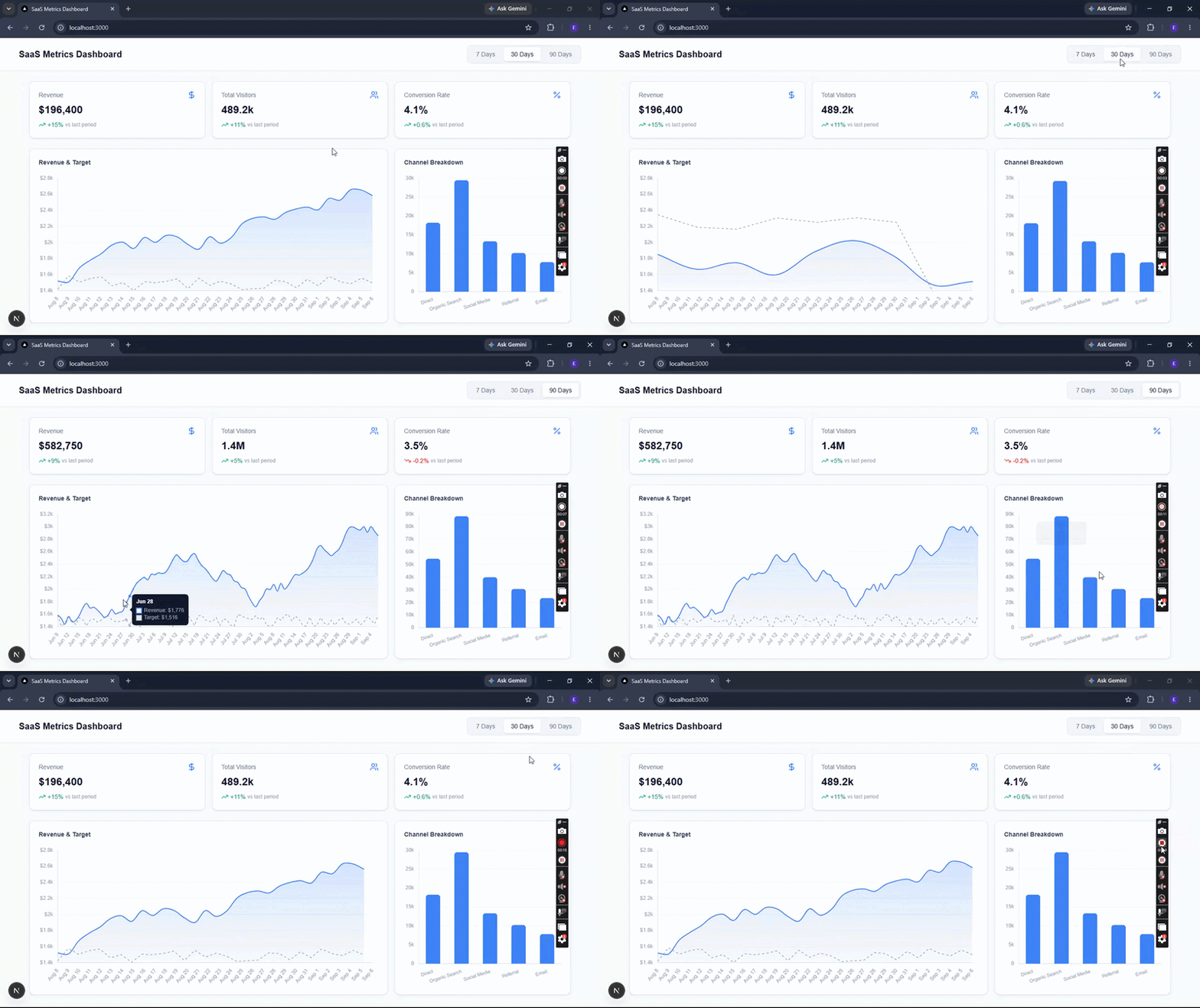
The revenue trend chart is a useful place to compare them because it combines multiple datasets, custom formatting, tooltips, and responsive sizing.
Install Chart.js and its React wrapper:
npm install chart.js react-chartjs-2
Here is the complete RevenueTrendChart.tsx implementation:
'use client'

import '@/lib/chartRegistry'
import { Line } from 'react-chartjs-2'
import type { ChartData, ChartOptions } from 'chart.js'
import { DailyRevenueDatum } from '@/types/dashboard'

interface RevenueTrendChartProps {
  data: DailyRevenueDatum[]
}

export function RevenueTrendChart({ data }: RevenueTrendChartProps) {
  const chartData: ChartData<'line'> = {
    labels: data.map((d) => d.date),
    datasets: [
      {
        label: 'Revenue',
        data: data.map((d) => d.revenue),
        borderColor: '#3b82f6',
        backgroundColor: (context) => {
          const ctx = context.chart.ctx
          const gradient = ctx.createLinearGradient(0, 0, 0, 320)
          gradient.addColorStop(0, 'rgba(59, 130, 246, 0.25)')
          gradient.addColorStop(1, 'rgba(59, 130, 246, 0.00)')
          return gradient
        },
        fill: true,
        tension: 0.35,
        pointRadius: 0,
        pointHoverRadius: 5,
        pointHoverBackgroundColor: '#3b82f6',
        borderWidth: 2,
      },
      {
        label: 'Target',
        data: data.map((d) => d.target),
        borderColor: '#94a3b8',
        borderDash: [5, 5],
        pointRadius: 0,
        fill: false,
        borderWidth: 1.5,
      },
    ],
  }

  const options: ChartOptions<'line'> = {
    responsive: true,
    maintainAspectRatio: false,
    interaction: {
      mode: 'index',
      intersect: false,
    },
    plugins: {
      legend: { display: false },
      tooltip: {
        backgroundColor: '#0f172a',
        titleColor: '#f8fafc',
        bodyColor: '#94a3b8',
        padding: 10,
        cornerRadius: 8,
        callbacks: {
          label: (context) =>
            ` ${context.dataset.label}: $${(context.parsed.y ?? 0).toLocaleString()}`,
        },
      },
    },
    scales: {
      x: {
        grid: { display: false },
        ticks: { color: '#94a3b8', font: { size: 12 } },
      },
      y: {
        grid: { color: '#f1f5f9' },
        ticks: {
          color: '#94a3b8',
          font: { size: 12 },
          callback: (val) => `$${Number(val) / 1000}k`,
        },
      },
    },
  }

  return (
    <div className="relative w-full h-80">
      <Line data={chartData} options={options} />
    </div>
  )
}
Here, Line comes from react-chartjs-2, while the separate chartRegistry file registers the scales, elements, and plugins the chart needs. The dates become labels, and the revenue and target values are configured as two datasets.
The rest of the behavior lives in the options object, including currency formatting, tooltip styling, axis configuration, and interaction behavior. The <Line /> component itself stays small because most of the implementation lives in configuration.
Install Recharts:
npm install recharts
Here is the RevenueTrendChart.tsx implementation:
'use client';

import {
  ResponsiveContainer,
  AreaChart,
  Area,
  XAxis,
  YAxis,
  CartesianGrid,
  Tooltip,
} from 'recharts';
import { ChartTooltip } from './ChartTooltip';
import type { DailyRevenueDatum } from '@/types/dashboard';

interface RevenueTrendChartProps {
  data: DailyRevenueDatum[];
}

export function RevenueTrendChart({ data }: RevenueTrendChartProps) {
  return (
    <div className="w-full rounded-2xl border border-zinc-200 bg-white p-5 shadow-sm dark:border-zinc-800 dark:bg-zinc-900">
      <h2 className="mb-4 text-sm font-semibold uppercase tracking-wide text-zinc-500 dark:text-zinc-400">
        Revenue Trend
      </h2>
      <div className="h-80">
        <ResponsiveContainer width="100%" height="100%">
          <AreaChart
            data={data}
            margin={{ top: 10, right: 10, left: 0, bottom: 0 }}
          >
            <defs>
              <linearGradient id="revenueGradient" x1="0" y1="0" x2="0" y2="1">
                <stop offset="5%" stopColor="#3b82f6" stopOpacity={0.25} />
                <stop offset="95%" stopColor="#3b82f6" stopOpacity={0} />
              </linearGradient>
              <linearGradient id="targetGradient" x1="0" y1="0" x2="0" y2="1">
                <stop offset="5%" stopColor="#a855f7" stopOpacity={0.15} />
                <stop offset="95%" stopColor="#a855f7" stopOpacity={0} />
              </linearGradient>
            </defs>
            <CartesianGrid
              strokeDasharray="3 3"
              stroke="#e2e8f0"
              vertical={false}
            />
            <XAxis
              dataKey="date"
              stroke="#94a3b8"
              fontSize={12}
              tickLine={false}
              axisLine={false}
            />
            <YAxis
              stroke="#94a3b8"
              fontSize={12}
              tickLine={false}
              axisLine={false}
              tickFormatter={(val: number) => `$${(val / 1000).toFixed(0)}k`}
            />
            <Tooltip content={<ChartTooltip />} />
            <Area
              type="monotone"
              dataKey="target"
              stroke="#a855f7"
              strokeWidth={1.5}
              strokeDasharray="5 5"
              fill="url(#targetGradient)"
              name="Target"
            />
            <Area
              type="monotone"
              dataKey="revenue"
              stroke="#3b82f6"
              strokeWidth={2}
              fill="url(#revenueGradient)"
              name="Revenue"
            />
          </AreaChart>
        </ResponsiveContainer>
      </div>
    </div>
  );
}
The tooltip is a separate React component:
export function ChartTooltip({ active, payload, label }: ChartTooltipProps) {
  if (!active || !payload?.length) return null;

  return (
    <div className="rounded-xl border border-zinc-200 bg-white px-4 py-3 shadow-lg dark:border-zinc-700 dark:bg-zinc-900">
      <p className="mb-2 text-xs font-semibold uppercase tracking-wide text-zinc-500">
        {label}
      </p>
      <div className="flex flex-col gap-1">
        {payload.map((entry) => (
          <div key={entry.dataKey} className="flex items-center gap-2">
            <span
              className="inline-block h-2.5 w-2.5 rounded-full"
              style={{ backgroundColor: entry.color }}
            />
            <span className="text-sm text-zinc-600 dark:text-zinc-400">
              {entry.name}:
            </span>
            <span className="text-sm font-semibold text-zinc-900 dark:text-zinc-50">
              {(entry.value ?? 0).toLocaleString()}
            </span>
          </div>
        ))}
      </div>
    </div>
  );
}
The structure is much more visible in the JSX. <AreaChart> contains the grid, axes, tooltip, and data series as children, while SVG gradients are defined directly in <defs>.
The custom tooltip also behaves like any other React component, which makes it straightforward to style with Tailwind and keep separate from the chart definition.
Install TanStack Charts:
npm install @tanstack/charts
Then define the RevenueTrendChart.tsx component:
import { useMemo } from "react";
import { defineChart, areaY, lineY } from "@tanstack/charts";
import { scaleBand } from "@tanstack/charts/scales/band";
import { scaleLinear } from "@tanstack/charts/scales/linear";
import { tooltip } from "@tanstack/charts/tooltip";
import { Chart } from "@tanstack/charts/react";
import type { DailyRevenueDatum } from "../types/dashboard";

interface RevenueTrendChartProps {
  data: readonly DailyRevenueDatum[];
}

const currency = new Intl.NumberFormat("en-US", {
  style: "currency",
  currency: "USD",
  maximumFractionDigits: 0,
});

export function RevenueTrendChart({ data }: RevenueTrendChartProps) {
  const definition = useMemo(
    () =>
      defineChart({
        marks: [
          areaY(data, {
            id: "revenue-area",
            x: "date",
            y: "revenue",
            fill: "#6366f1",
            fillOpacity: 0.12,
          }),
          lineY(data, {
            id: "revenue-line",
            x: "date",
            y: "revenue",
            stroke: "#6366f1",
            strokeWidth: 2,
            points: true,
          }),
          lineY(data, {
            id: "target-line",
            x: "date",
            y: "target",
            stroke: "#a1a1aa",
            strokeWidth: 1.5,
            strokeDasharray: "4 4",
          }),
        ],
        scales: {
          x: {
            scale: () => scaleBand<string>().padding(0.1),
            axis: { label: "" },
          },
          y: {
            scale: scaleLinear,
            nice: true,
            grid: true,
            axis: {
              label: "",
              ticks: { format: (v: number) => currency.format(v) },
            },
          },
        },
        focus: "nearest-x",
        tooltip: {
          use: tooltip,
          items: [
            {
              id: "revenue",
              label: "Revenue",
              text: (point) =>
                point.markId === "revenue-line"
                  ? currency.format(point.yValue as number)
                  : null,
            },
            {
              id: "target",
              label: "Target",
              text: (point) =>
                point.markId === "target-line"
                  ? currency.format(point.yValue as number)
                  : null,
            },
          ],
        },
      }),
    [data]
  );

  return (
    <Chart
      definition={definition}
      height={360}
      ariaLabel="Revenue trend over time"
      className="w-full"
    />
  );
}
Here, the chart definition is memoized so it only recalculates when data changes. The visualization itself is described through marks: an areaY mark provides the revenue fill, a lineY mark draws the revenue line, and a second lineY mark draws the target.
The scales and tooltip behavior live in the same definition, while the React render stays small. That separation is the main architectural difference from Recharts: the visualization is defined first, then passed to the <Chart /> component for rendering.
After building the same dashboard three times, the practical differences became easier to see. None of the libraries is the obvious choice for every project; the better fit depends on how much data you’re rendering, how your team prefers to structure UI code, and how much control you need over the rendering model.
| Criterion | Chart.js | Recharts | TanStack Charts |
|---|---|---|---|
| Learning curve | Requires learning a nested configuration API | Familiar if you’re comfortable with React and JSX | Requires learning its chart-definition and Grammar of Graphics concepts |
| Code structure | Configuration-heavy; complex charts can produce large option objects | Component-driven; chart structure remains visible in JSX | Definition-driven; separates chart logic from rendering components |
| Runtime characteristics | Canvas rendering is well suited to dense datasets | SVG is easy to style and inspect, but very dense charts can create more DOM work | Designed around an abstract chart definition, with performance depending on the renderer and chart setup |
| Maintainability | Centralized configuration can be useful, but large objects can become difficult to scan | Components are easy to isolate and organize in a React codebase | Separating chart definitions from rendering can work well in shared visualization systems |
| Best fit | Data-heavy charts where Canvas rendering is useful | SaaS dashboards and React applications that benefit from composable JSX | Design systems or applications that benefit from separating visualization logic from rendering |
Chart.js is a strong fit when rendering performance and dense datasets matter more than keeping every part of the chart in the React component tree. Its Canvas-based approach also avoids creating an SVG element for each visual mark.
Chart.js is a strong fit when rendering performance and dense datasets matter more than keeping every part of the chart in the React component tree. Its Canvas-based approach also avoids creating an SVG element for each visual mark.
The cost is configuration complexity. As charts become more customized, more behavior moves into nested options and callbacks, which can make large configurations harder to scan.
Recharts feels the most natural if your team already thinks in React components. Axes, tooltips, grids, and series appear directly in JSX, and custom UI can be handled with ordinary React components.
That makes it a practical choice for many SaaS dashboards and internal tools. For extremely dense or frequently updating visualizations, however, its SVG rendering model is worth considering as part of the performance budget.
TanStack Charts makes the most sense when you want the visualization definition to be less tightly coupled to the component tree. Marks, scales, and interactions live in a chart definition, leaving the React component responsible mainly for rendering it.
That can be useful for design systems or applications where chart logic needs to stay consistent across multiple views. The tradeoff is a newer mental model and more concepts to learn before the API feels as immediate as Recharts.
The three libraries solve the same problem from noticeably different directions.
For a typical React dashboard, Recharts offers the shortest path from data to a customized UI because its component model fits naturally into JSX. Chart.js is compelling when you expect dense datasets and want Canvas rendering without a large SVG tree. TanStack Charts takes the most architectural approach of the three, separating chart definitions from the rendering layer in a way that can pay off in shared design systems and more complex visualization codebases.
The right choice comes down less to a universal performance ranking than to the constraints of the application you’re building. If you know whether your priority is rendering density, React-native composition, or reusable visualization logic, the differences between these libraries become much easier to evaluate.

React 19.3 and modern CSS make several common patterns unnecessary. Here are 10 features that let you delete old React code and simplify your apps.

Explore the top AI agent frameworks in 2026 and compare how they handle tools, memory, structured output, streaming, and step limits.
Tailwind CSS component libraries provide pre-built components to streamline the process of developing aesthetic, user-friendly interfaces.

Jev is a TypeSafe AI decision model that classifies messages using typed questions. Learn how to use it for routing to reduce unnecessary LLM calls.
Would you be interested in joining LogRocket's developer community?
Join LogRocket’s Content Advisory Board. You’ll help inform the type of content we create and get access to exclusive meetups, social accreditation, and swag.
Sign up now
 Learn more →