
Modern frontend development frameworks have advanced tremendously in the past few years, making it easier to build full-fledged web apps with dynamic functionality. But, that might not be something that we always need. For example, if we want to build a static, information-heavy site (like a documentation website), a framework might not be the best choice because the main focus is the content and not the infrastructure maintenance.

In that case, what we need would be closer to a static site generator (like Gatsby, Hugo, Jekyll). But, static site generators aren’t the best choice either because we would have to build a lot of documentation-focused functionality (like versioning, search, and code blocks) ourselves.
This is where Docusaurus and Starlight come in. Both of them are designed from the ground up for documentation websites. Docusaurus is the more mature among the two, while Starlight is still under beta. In this article, we will explore how both of these tools compare with each other on several factors, including their ease of deployment, support for features like light/dark mode and sidebars, and more.
The Replay is a weekly newsletter for dev and engineering leaders.
Delivered once a week, it's your curated guide to the most important conversations around frontend dev, emerging AI tools, and the state of modern software.
Created by Facebook, Docusaurus is an open source static site generator built on top of React. Docusaurus is also used by several platforms like Redux, Ionic, Supabase, etc. to host their documentation. They recently released version 3.0 of the framework. The generator provides documentation-centric features like MDX support, versioning, translation, search, and loads of customization options.
Starlight is a static site generator built on top of Astro. It is also open source but not as feature-rich as Docusaurus because it is still in beta. Regardless, it still provides features like MXD support, navigation, search, code blocks, etc. One advantage of being built on top of Astro is that custom components can be written in our favorite frameworks like Svelte, Vue, and Solid in addition to React.
Both Docusaurus and Starlight provide CLI options to help us get started. All we need is Node and npm installed on our system.
To create a new Docusaurus project, we can use the following command:
npx create-docusaurus@latest docusaurus-site classic
This creates a new project with the name my-website. By passing the classic flag, we are utilizing @docusaurus/preset-classic. This preset is a collection of several core features like documentation, blog, custom pages, and CSS support. Additionally, we can pass the --typescript flag to enable TypeScript support:
npx create-docusaurus@latest docusaurus-site classic --typescript
Once the script has finished running, we can navigate to the project folder and start the local dev server:
cd docusaurus-site
npm run start
That brings up the local dev server at http://localhost:3000. It looks something like this:
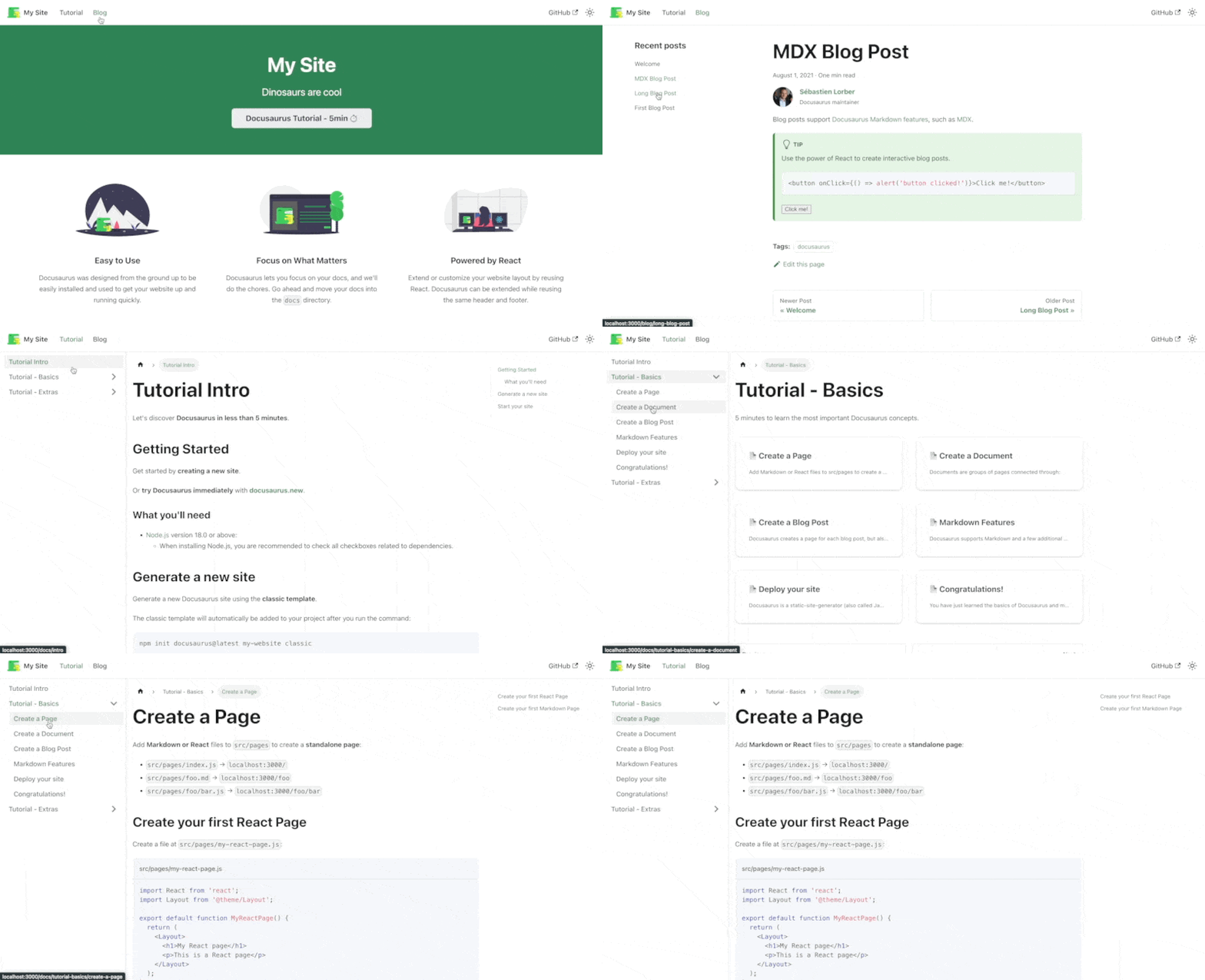
As you can see, we already have quite a lot of functionality out of the box. We will come back to this later in the article.
Getting started with Starlight is equally easy. We need to use this command:
npm create astro@latest -- --template starlight
This opens an elaborate CLI wizard that guides us through the process. At the end of it, we have a new directory with a fresh Astro project, with or without TypeScript support. We can ls into the project directory and start the local dev server:
ls starlight-site
npm run dev
The following site will come up on localhost:
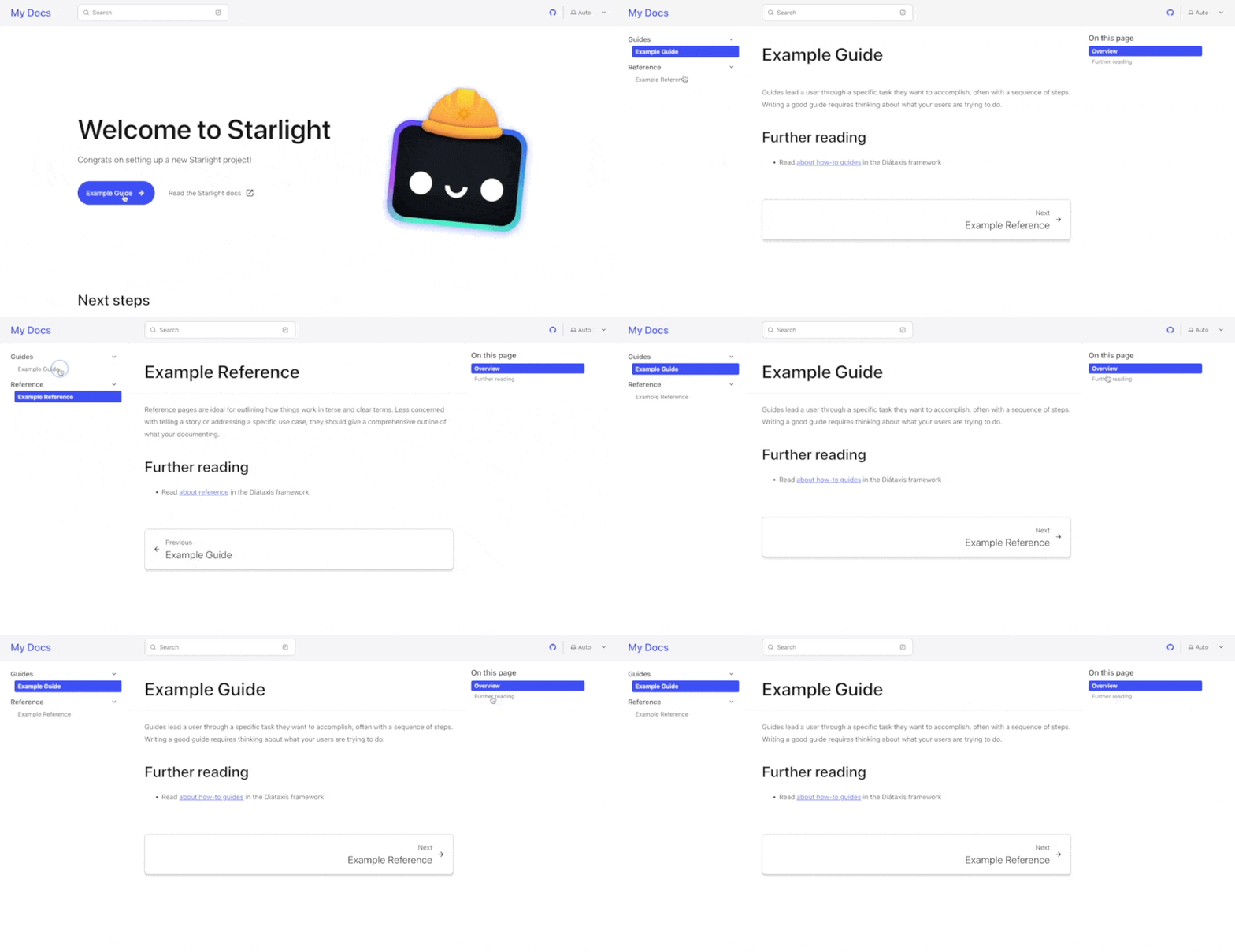
Although not as exhaustive as Docusaurus, Starlight still has some functionality out of the box. We will explore this in detail later in the article.
Both Docusaurus and Starlight generate static sites. This means that theoretically, they can be deployed on any platform that supports deploying static sites (like Apache or NGINX). But both of them provide a significantly better developer experience if we deploy on their recommended platforms.
Docusaurus supports simple deployment on platforms like Vercel and Netlify, Vercel being the recommended option. For deploying on Vercel, we just need to import the GitHub repository of our Docusaurus site to Vercel and it will take care of the rest. We can deploy with the default options selected:
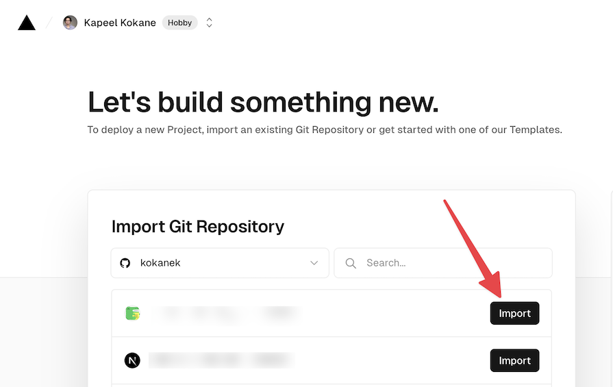
An additional benefit of deploying this way is that we get the latest production deployment to run whenever we push to the main branch of the imported GitHub repository.
Deploying a Starlight project is as good as deploying any Astro site. There are many guides available on the Astro documentation for all platforms you can imagine:
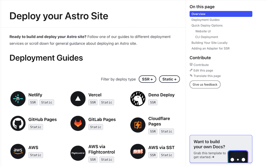
We’ll look at the Vercel deployment process just for comparison.
Similar to Docusaurus, the Starlight project can be deployed to Vercel as a static site by default. But if we need to have SSR capabilities too, we need to run the npx astro add vercel command. This will make the required modifications to the astro.config.mjs file to support SSR.
Now that we’re clear on setting up the repositories and deploying them, let’s take a look at the features that both of them provide.
The Docusaurus site we created using the CLI has many features out of the box.
The startup example comes with several documentation pages. These are the pages that we can use to write our documentation. They are written in Markdown, which would be converted to a React component by MDX:
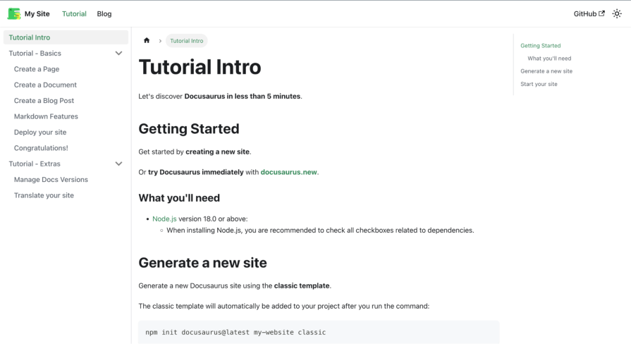
The docs currently show one article named “Tutorial intro” and two other collapsed menus named “Tutorial – Basics” and “Tutorial – Extras.” That is because the Docusaurus repository contains a docs folder with an intro.md file and two other folders. Docusaurus follows a file system-based routing structure that makes it easy to create nested pages.
The startup example also comes with a blog page. This page can be used to write blog posts, which could be considered announcements or updates related to our product:
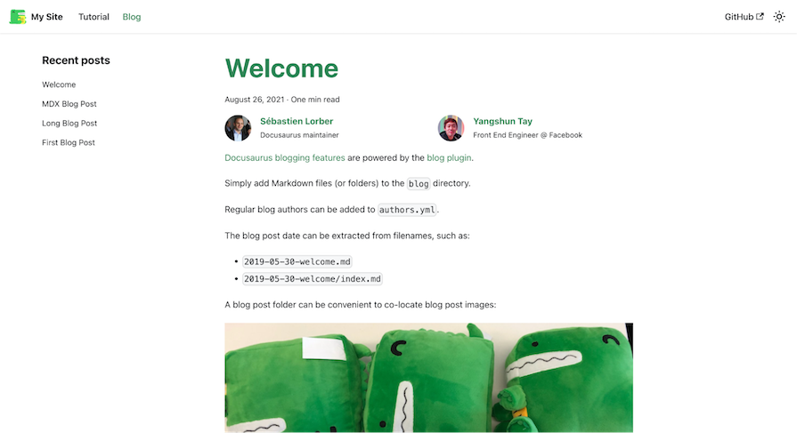
There are currently four blog posts available because the blog folder in the repository contains the respective files.
The sidebar is a navigation menu that is shown on the left side of the page. It is automatically generated based on the file system. But we also have the option of supplying it manually by creating a sidebars.js file in the root of the repository.
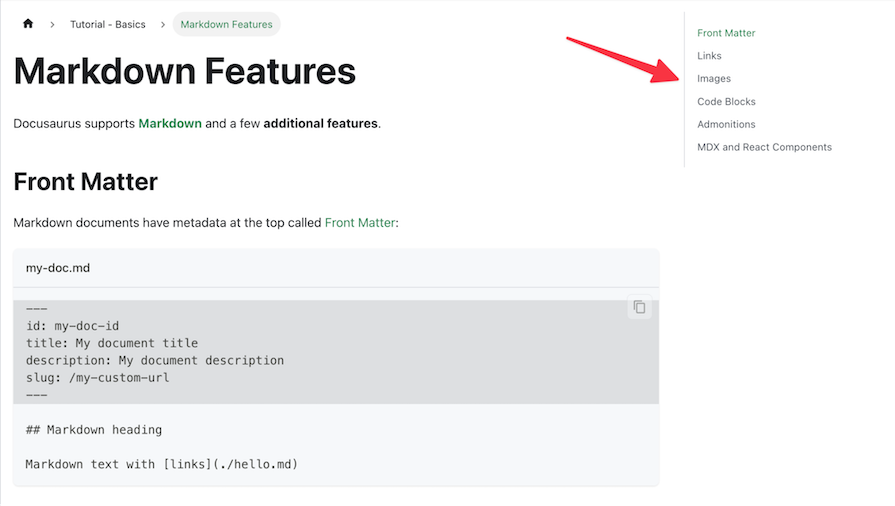
We can also see that we get an auto-generated table of contents on the right side of the page. This is a navigable menu that shows all the H2 and H3 headings on the current page:
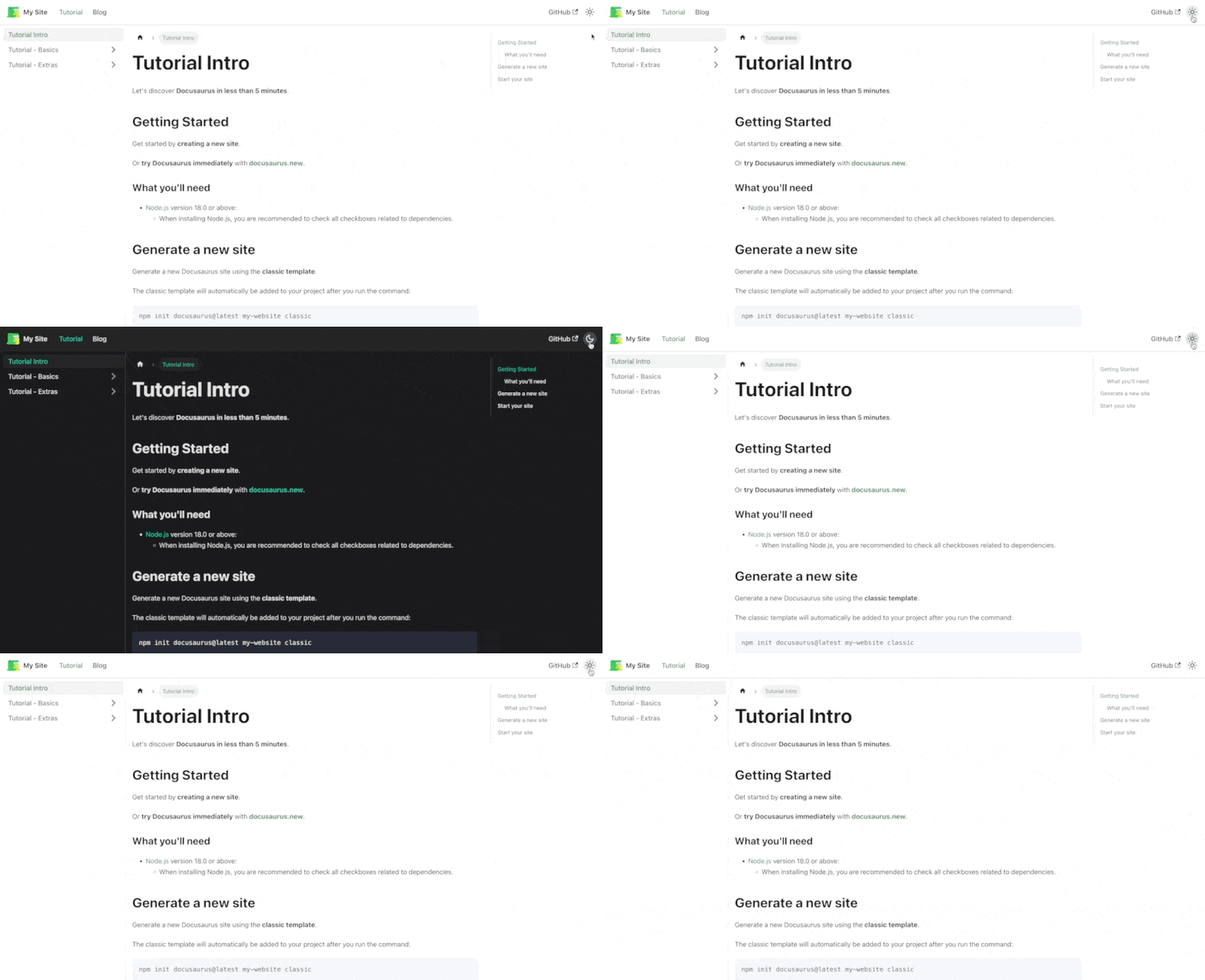
On the top right corner of the page, we can also see a little sun icon. This is a toggle button that can be used to switch between light and dark modes. The implementation of the default dark mode is taken care of by Docusaurus out of the box:
When it comes to Starlight, we can see some of the features that we saw in Docusaurus. Some features are missing and others are extra. Let’s explore them now.
Starlight introduces us to the concept of guides and references according to the Diátaxis framework, where guides are supposed to be step-by-step instructions to accomplish an end goal. Relatedly, references are supposed to be a detailed comprehensive outline of what we’re trying to document. Apart from this theoretical difference, there is no difference in the visual appearance of both of them in Starlight:
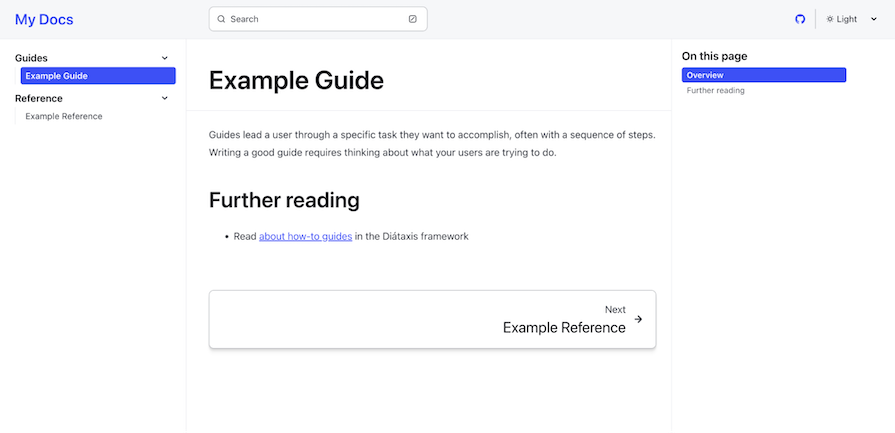
Similar to Docusaurus, Starlight also has a sidebar and a table of contents. It is automatically generated based on the file structure. But we can also supply it manually by editing the starlight.sidebar property in the astro.config.mjs file.
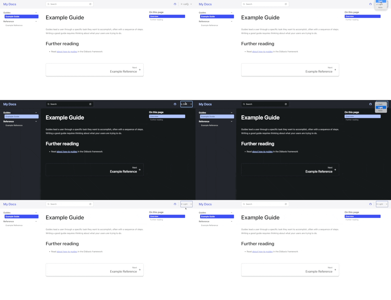
Starlight also provides dark mode support out of the box. We can choose the mode to be light, dark, or a system default from the toggle on the top right of the page:
The features we explored above were the common, core features of Docusaurus and Starlight. Now, let’s look at some of the more unique features they offer.
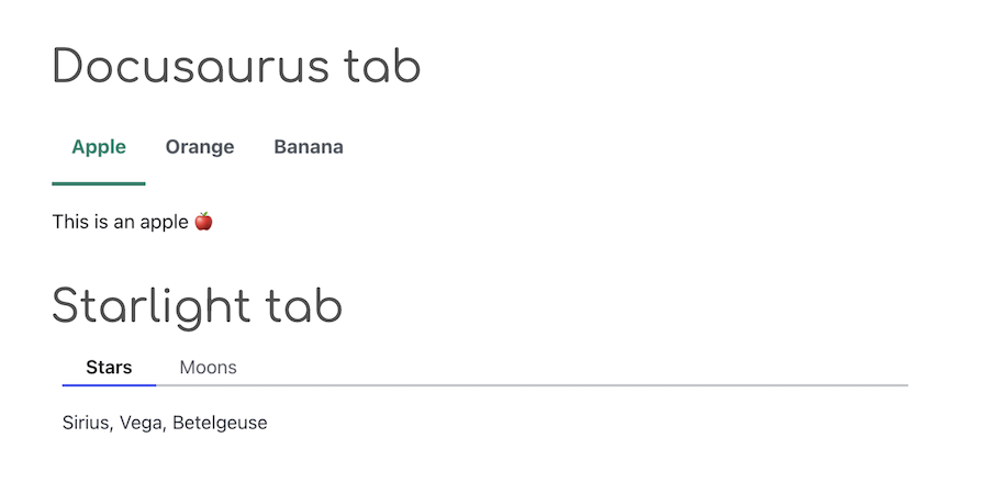
Both Docusaurus and Starlight provide built-in components to create the tab layout where multiple variations of a step need to be presented:
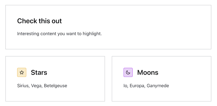
Starlight goes the extra mile and also provides built-in components to create cards and manage their layout as well:
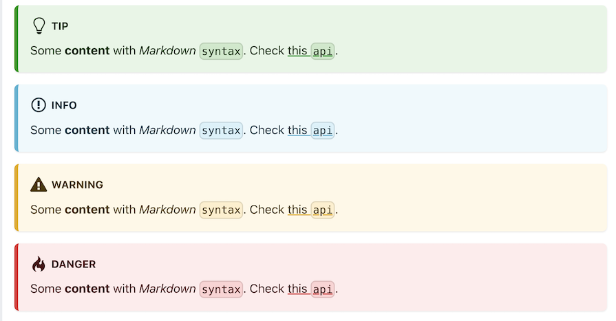
Both frameworks provide special components to emphasize certain blocks of text. In Docusaurus, they are known as admonitions while Starlight calls them asides.
Here’s how Docusaurus renders its admonitions:
And this is how asides look in Starlight:
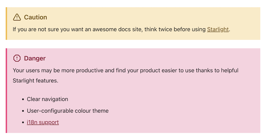
To render these in both frameworks, we’ll use this code inside our Markdown files:
:::caution
If you are not sure you want an awesome docs site, think twice before using [Starlight](../../).
:::
The frameworks will take care of the rest.
This is one aspect where Docusaurus takes the lead as it provides support for rendering math equations and diagrams out of the box.
Math equations can be rendered by wrapping Latex equations between $ symbols or by surrounding multiple lines between $$ symbols. We just need to install the remark-math and rehype-katex plugins.
We can also create diagrams inside of our documentation using mermaid.js. Upon installing and enabling the Mermaid plugin, any code block with the language set to mermaid will be rendered as a diagram.
Both Docusaurus and Starlight support the front matter. It is used to provide additional metadata to the Markdown files. It is written at the top of the Markdown file between --- symbols and is parsed as YAML.
Several properties of the Markdown file can be overridden using front matter. For instance, the title of the page can be overridden using the title property. The slug or the browser URL can also be controlled from the front matter if required. Here’s an example of a Markdown file with front matter:
---
id: doc-with-tags
title: A doc with tags
tags:
- Demo
- Getting started
---

The markdown goes here
Here are the front matter properties that Docusaurus supports. And here are the Starlight ones.
Both frameworks also support code blocks with syntax highlighting. Docusaurus uses prism-react-renderer for theming, while Starlight uses an Astro package called expressive-code to control customizations.
In Docusaurus, line highlighting is handled via special comments like // highlight-next-line, highlight-start, and highlight-end and also by specifying the line numbers at the top of the code block.
In Starlight, this can be accomplished with the line number range as well as using string matching. For example, including "var a = 10" at the top of the code block will highlight that string.
This even works with RegEx. Special formatting can also be applied to show lines that were inserted or deleted if we want to represent a diff between the before and after states of a code block. Take a look at the following block in Starlight:
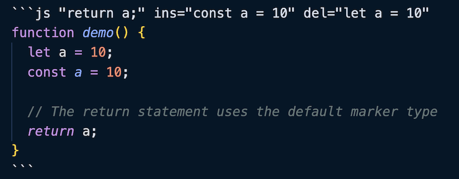
This code block will show up like so:

Docusaurus provides the option to display line numbers in the block of code by specifying the showLineNumbers property at the top of the code block.
Starlight provides the capability to change the appearance of the code block window by specifying the title property at the top of the code block or by providing a filename as the first comment in the code block.
Those were the inbuilt capabilities offered by the frameworks. In addition to that, we are also provided with several options through which we can customize the appearance of our site from scratch.
We can customize the appearance of our site by writing custom CSS. Both frameworks provide a way to do this.
In Docusaurus, we can supply it as the theme key inside of the docusaurus.config.js file under presets:
{
  presets: [
    [
      '@docusaurus/preset-classic',
      {
        theme: {
          customCss: ['./src/css/custom.css'],
        },
      },
    ],
  ],
}
Then, we can write all our custom CSS inside of the custom.css file. Docusaurus will make that CSS globally available throughout the site. In addition to that, we can modify the CSS linked to the existing CSS classes by targeting theme class names.
We can also change the value of the CSS variables in the custom.css file to change the appearance of the site as we like. For example, if we want to change the primary color for the dark mode, we could do something like this:
[data-theme='dark'] {
--ifm-color-primary: #4e89e8;
}
Similarly, in Starlight, we can create a custom CSS file in our source directory and then supply its path in the astro.config.mjs file:
{
  integrations: [
    starlight({
      title: 'Docs With Custom CSS',
      customCss: [
        './src/styles/custom.css',
      ],
    }),
  ],
}
Like Docusaurus, Starlight’s default look can be modified by changing the values of the color palette variables:
:root[data-theme='light'] {
--sl-color-accent-low: #c2dbed;
--sl-color-accent: #0073aa;
}
Both frameworks also provide capabilities to override the default look of the different aspects of the site.
Docusaurus provides us with what it calls Swizzling. It is the capability to eject a particular component like the sidebar or footer so that we get access to the source code of that component in our repo. Then, we can modify it to suit our preferences and it will reflect on our site.
Starlight provides a similar capability called component overrides. The process to accomplish this is a little different. We need to create a new Astro component based on our preferences and then supply it in the astro.config.mjs file as an override:
{
  integrations: [
    starlight({
      title: 'Custom site',
      components: {
        SocialIcons: './src/components/MyComponent.astro',
      },
    }),
  ],
}
This example overrides the SocialIcons component with our custom component.
In addition to those customization options, both frameworks provide the capability of creating entire pages from scratch.
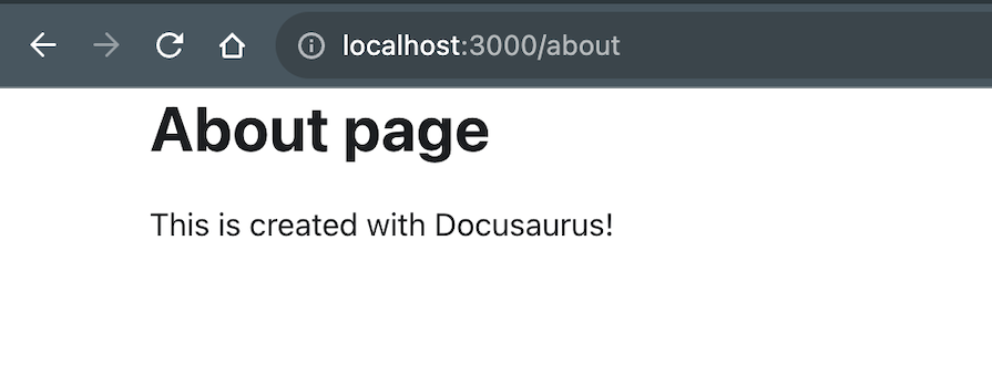
In Docusaurus, we can create a new page by creating a new file in the src/pages folder. Then, we can write the contents of the React page.
For example, the homepage that we get when we create a new Docusaurus site is a React component. It comes up at the / route because there is a file named index.js in the src/pages folder. We can extend this by creating more pages. For example, say we create a file named about.js:
import React from 'react';


export default function About() {
  return (
    <div className="about">
      <h1>About page</h1>
      <p>This is created with Docusaurus!</p>
    </div>
  );
}
Then, we can access it at the /about route:
Starlight does not directly provide this capability but we can use it indirectly via MDX. We can create a new Astro component inside the src/components folder called about.astro:
<div>
  <p>This is created with Astro!</p>
</div>
Then, we can create a new MDX file inside the docs/guides folder called about.mdx:
---
title: About page
description: This is a page created with an Astro component
---


import About from '../../../components/about.astro';


<About />
Then, we can access it at the /guides/about route:
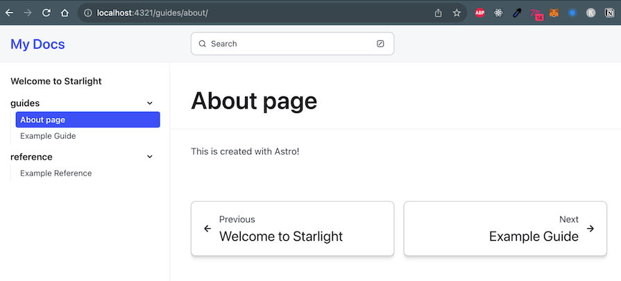
Note that for the About page to show up in the sidebar, we need to delete the sidebar config from the astro.config.mjs file so that it is auto-generated. This feature to write React components directly within Markdown documents is a functionality provided by MDX. So, it is also supported in Docusaurus.
Because both Docusaurus and Starlight are static site generators, they are quite performant out of the box. Starlight also has the added advantage of opting into SSR if required. Let’s take a look at the performance metrics of both frameworks by running Lighthouse.
When we run Lighthouse on the homepage of our startup example, we get the following results:

These are pretty good results – all the scores are above 90. When we try to run the same test on a content page instead of the homepage that was built with React, we get this:
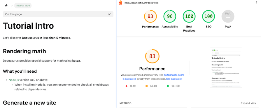
This time, the Largest Contentful Paint (LCP) suffers, but still gives a decent score above 80.
When we run Lighthouse on the homepage of our startup example, we get the following results:
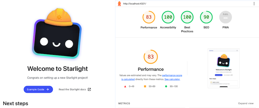
The scores observed are comparable to those of Docusaurus. Similarly, for Starlight, both the homepage and content page yield nearly identical scores. This may be because the homepage is also built with MDX and not React as was the case with Docusaurus.
Both Docusaurus and Starlight are great frameworks for building documentation websites. Docusaurus is more mature and has the advantage of being a stable release (3.0) while Starlight is still in beta at the time of writing this article. But Starlight has the advantage of being built on top of Astro and thus, being able to use the latest features of the web platform.
Throughout this article, we observed that Starlight is nearly on par with Docusaurus regarding features. However, Starlight stands out for its flexibility in allowing custom components in your preferred framework. Docusaurus is the better choice for those seeking a more established solution, especially if math or diagram rendering is essential. Both options are good choices depending on your specific needs.
Install LogRocket via npm or script tag. LogRocket.init() must be called client-side, not
server-side
$ npm i --save logrocket

// Code:

import LogRocket from 'logrocket';
LogRocket.init('app/id');
// Add to your HTML:

<script src="https://cdn.lr-ingest.com/LogRocket.min.js"></script>
<script>window.LogRocket && window.LogRocket.init('app/id');</script>

AI companies are buying developer tools as coding agents turn runtimes, package managers, and linters into strategic infrastructure.

Learn how AI-assisted development governance uses rules, agents, hooks, and protocols to help AI coding tools produce safer, more consistent code.

A step-by-step guide to building your first MCP server using Node.js, covering core concepts, tool design, and upgrading from file storage to MySQL.

Using security headers in your Next.js apps is a highly effective way to secure websites from common security threats.
Would you be interested in joining LogRocket's developer community?
Join LogRocket’s Content Advisory Board. You’ll help inform the type of content we create and get access to exclusive meetups, social accreditation, and swag.
Sign up now