Editor’s note: This article was last updated on 21 July, 2022 to update the code, include more up-to-date information on featured spinner and notification libraries, and include information on SVG and CSS options.

To make your web projects more interactive and user-friendly, you may find you want to add some additional UI features like spinners that show a loading state, or notifications that indicate application events.
Today we are going to explore how we can implement those features. Rather than simply showing some examples, we will focus on how we can integrate them into a full-stack project.
So what exactly are we going to discuss here?
First, we will review all the necessary steps needed to add a spinner (to indicate loading, for example) to our project.
Then, we will manage notifications using only one “Notification Container” in our project, and learn how we can use them to display a message. We are going to discuss two different npm packages for this so that we can compare them a bit.
Here I’ll use an existing MERN project to which we can add those features to see the outcome. I’m not going to discuss this existing project in depth since our aim here is just to show the implementation and integration of the above features.
In fact, we already have a good tutorial for that project, which explains everything you’ll need to understand. If you want, you can read it from here.
Here is the GitHub repo for the server side of the project, and here is the repo for the client side. Just clone or download them, whatever you prefer.
Before running the API server, you need to create a MongoDB instance locally or on cloud to store data of the web app. If you wish to create one on the cloud, you can create a free MongoDB cluster on MongoDB Atlas. Add your database connection string to the config/default.json file.
Use instructions provided in the README.md file or those provided below to start the web app backend. To start running the server, make sure you are in the MERN_A_to_Z/ directory and type the following commands:
npm install
npm run app
# --- or ---
yarn install
yarn app
The above commands will install dependencies and start the RESTful API server on port 8082. We just need the running server. After that, we don’t have to make any changes there.
To start the client app’s development server, make sure you are in the MERN_A_to_Z_Client/mern_a_to_z_client/ directory and type the following commands:
npm install
npm start
# --- or ---
yarn install
yarn start
We’ll work strictly in our client project; all changes will occur there.
Now that you have both the server and client sides of the project running, visit http://localhost://3000 to see the project live. You will see the web app as follows: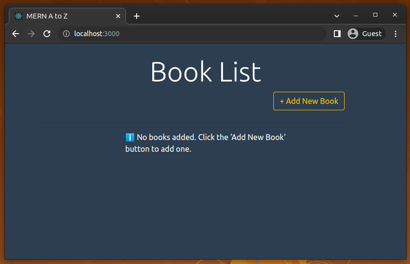
Here I’m going to add a loading spinner to our existing MERN project. First, we will add a traditional GIF-based spinner animation, later, we will use a popular package for adding modern CSS-animation-based spinners. We will update our ShowBookList.js file to add a loading spinner in the ShowBookList component.
So, create a folder named common inside the component folder. The path should like this: MERN_A_to_Z_Client/mern_a_to_z_client/src/components/common. Now, inside the common folder, create a file named Spinner.js and add a .gif file for a loading spinner.
You can find different kinds of .gif files free all over the internet; you can use web-based tools to generate them, or you can use the one provided with the source code.
Now, update your Spinner.js with the following code:
import React from 'react';
import spinner from './spinner.gif';

function Spinner() {
  return (
    <div>
      <img
        src={spinner}
        style={{ width: '100px', margin: 'auto', display: 'block' }}
        alt="Loading..."
      />
    </div>
  );
};

export default Spinner;
Here, we import the .gif file (import spinner from './spinner.gif';). If you’re using your own, different spinner file, replace spinner.gif with the filename you want to add.
Now, update your ShowBookList.js file with this:
import React, { useState, useEffect } from 'react';
import '../App.css';
import axios from 'axios';
import { Link } from 'react-router-dom';
import BookCard from './BookCard';
import Spinner from './common/Spinner';

function ShowBookList() {

  let [books, setBooks] = useState([]);
  let [loading, setLoading] = useState(true);

  useEffect(() => {
    axios
      .get('/books')
      .then(res => {
        setBooks(res.data);
        setLoading(false);
      })
      .catch(err =>{
        console.log('Error from ShowBookList');
      })
  }, []);

  let listContent;

  if(loading) {
    listContent = <div className="list-msg"><Spinner/></div>;
  }
  else if(books.length === 0) {
    listContent = <div className="list-msg">ℹ️ No books added. Click the 'Add New Book' button to add one.</div>;
  }
  else {
    listContent = books.map((book, k) =>
      <BookCard book={book} key={k} />
    );
  }

  return (
    <div className="ShowBookList">
      <div className="container">
        <div className="row">
          <div className="col-md-12">
            <br />
            <h2 className="display-4 text-center">Book List</h2>
          </div>

          <div className="col-md-11">
            <Link to="/create-book" className="btn btn-outline-warning float-right">
              + Add New Book
            </Link>
            <br />
            <br />
            <hr />
          </div>

        </div>

        <div className="list">
              { listContent }
        </div>
      </div>
    </div>
  );
}

export default ShowBookList;
Here we import our Spinner component from common/Spinner.js and use some logic inside the ShowBookList function for assigning a value to listContent. We also added a loading state initially set to false with the let [loading, setLoading] = useState(false) statement.
You don’t need to follow the same logic; you can write in your own way, and obviously, it will be different depending on your project type.
Now, run the project and visit: http://localhost:3000/
You will see a Loading spinner like the following one for a very short period of time. This is the delay time of fetching data through the API. That means this spinner will be shown until the loading state variable becomes false.
I recorded the following preview by commenting out the setLoading(false); statement because the loading state change is instantaneous — we can only see the spinner for a long time on very slow network connections and low-end devices.
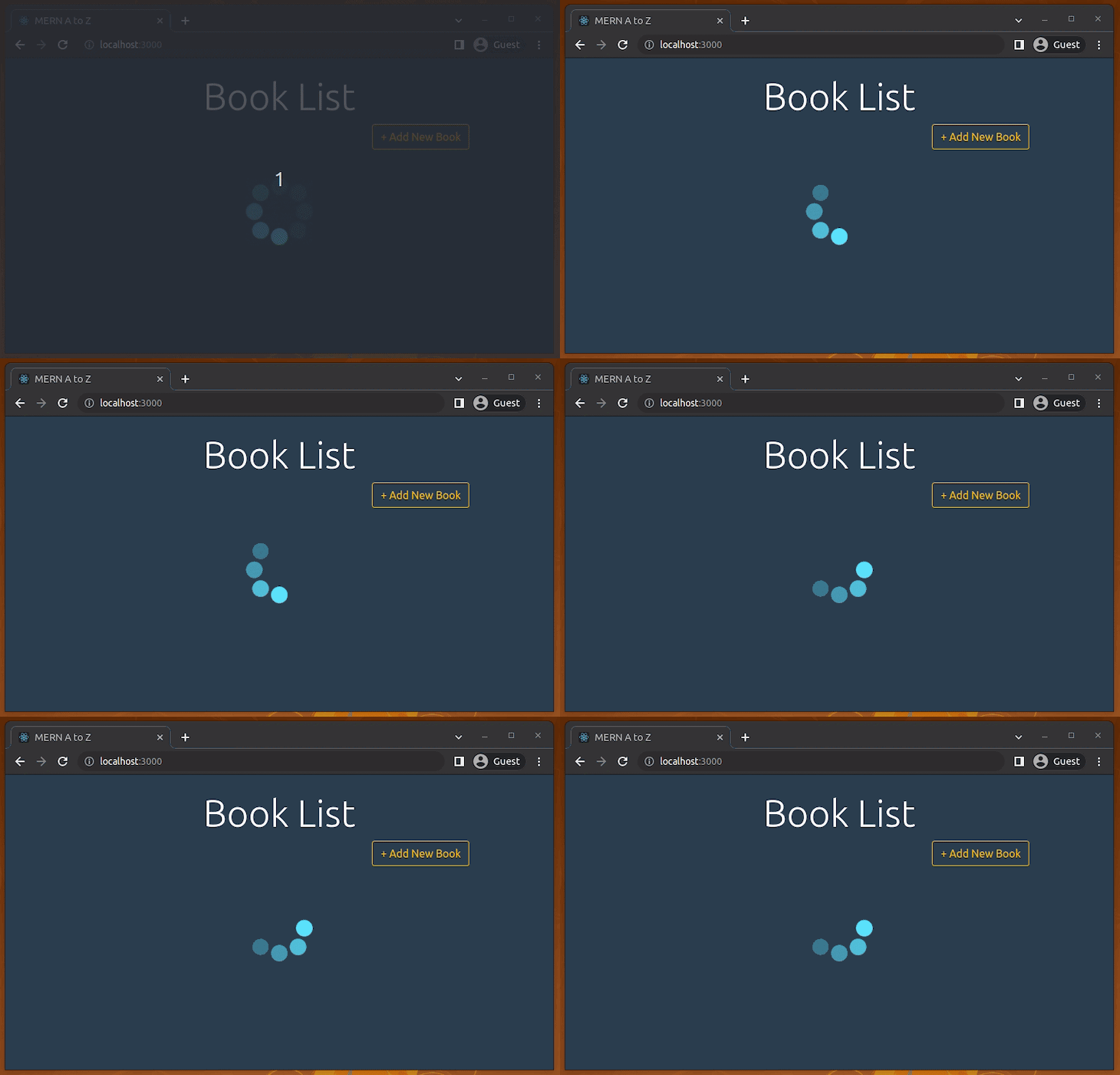
You can adjust the background color of the spinner, or you can, of course, use a customized spinner. Here my goal was just to show where and when we can use GIF spinners and how can we set one up.
There are many tools out there to generate nice GIF spinner animations, and they offer a good solution for adding spinners to React apps. But GIFs have now become a bit outdated due to better approaches like CSS animations and animated SVGs. Also, GIFs come with a considerable download size like any other image file (i.e., our sample spinner GIF’s size is 26.3 KB).
The popular react-spinners package offers many built-in customizable CSS-based spinners for React apps. Let’s replace our previous GIF-based spinner with a modern and lightweight one!
First, install the react-spinners package:
npm install react-spinners
# --- or ---
yarn add react-spinners
Next, update the previously created Spinner.js with the following code:
import React from 'react';
import ClipLoader from 'react-spinners/ClipLoader';

function Spinner() {
  return (
    <div style={{ width: '100px', margin: 'auto', display: 'block' }}>
      <ClipLoader color="#52bfd9" size={100}/>
    </div>
  );
};

export default Spinner;
Now you will see the CSS-DOM-based spinner animation, as shown in the following preview:
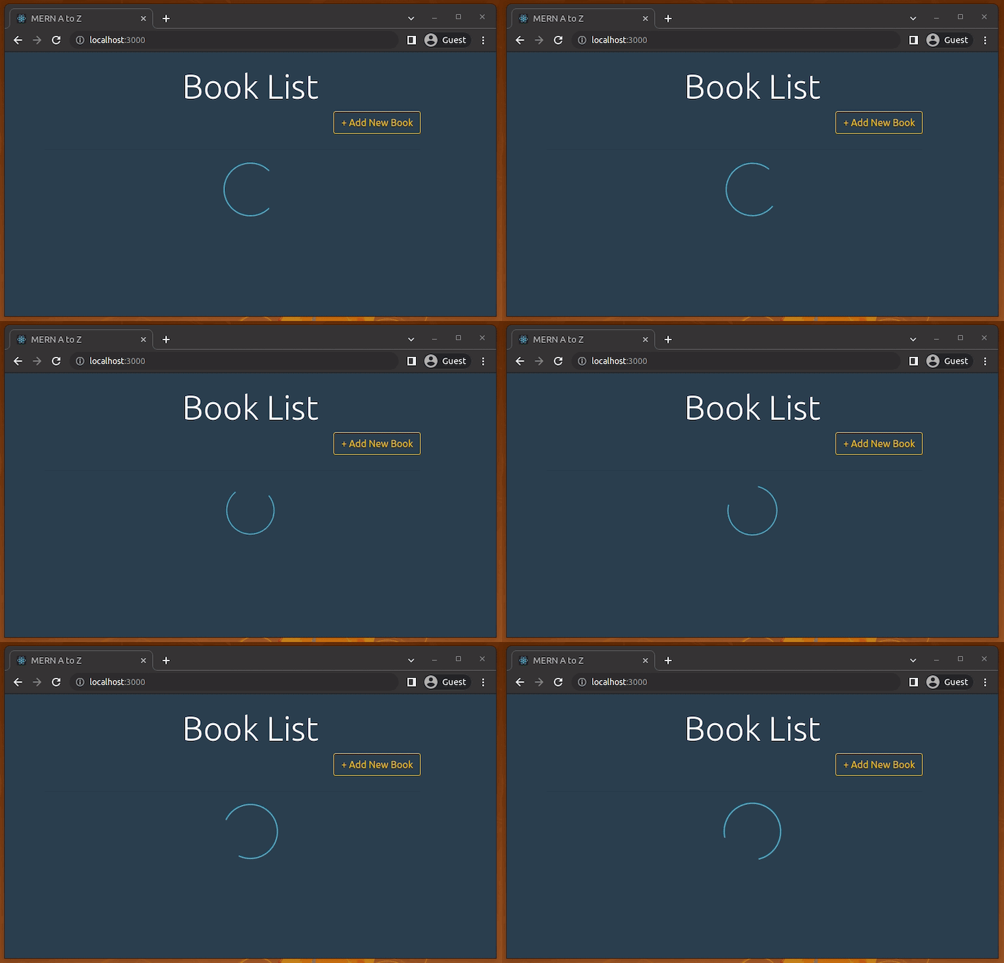
You can customize your spinner according to your app theme with the color prop. Also, you can do more adjustments to the spinner with size, width, and height props.
Here we used the ClipLoader spinner component with the book store app for demonstration, but you can choose a different loading animation from the built-in component list. Try to use several customized spinners!
The react-spinners package renders normal DOM elements. You can use react-loading and react-loader-spinner packages if you need to use SVG-based spinner animations.
Now I’ll show how we can handle notifications in our React project. First we’ll be using react-notifications, which, as its name suggests, is a notification component for React.
Go to the client project directory (MERN_A_to_Z_Client/mern_a_to_z_client/) and install the following npm package:
npm install react-notifications
# --- or ---
yarn add react-notifications
Run the project again.
Now update the App.js file. Import NotificationContainer from react-notifications and the notifications.css file:
import React from 'react';
import { BrowserRouter, Route, Routes } from 'react-router-dom';

// React Notification
import 'react-notifications/lib/notifications.css';
import { NotificationContainer } from 'react-notifications';

import CreateBook from './components/CreateBook';
import ShowBookList from './components/ShowBookList';
import ShowBookDetails from './components/ShowBookDetails';
import UpdateBookInfo from './components/UpdateBookInfo';

import './App.css';

function App() {
  return (
    <BrowserRouter>
      <Routes>
        <Route exact path='/' element={<ShowBookList/>} />
        <Route path='/create-book' element={<CreateBook/>} />
        <Route path='/edit-book/:id' element={<UpdateBookInfo/>} />
        <Route path='/show-book/:id' element={<ShowBookDetails/>} />
      </Routes>
      <NotificationContainer/>
    </BrowserRouter>
  );
}

export default App;
So far, so good — we have completed our setup for NotificationContainer.
Make sure to use only one
NotificationContainercomponent in the app.
Now it’s time to pass notifications from different components to display their message.
Here you just have to import the NotificationManager from react-notifications. After that, you are ready to pass notifications through NotificationManager.
Look at the changes I have made in the CreateBook.js file to pass notifications from the CreateBook component.
Open CreateBook.js and update it with the following code:
import React, { useState } from 'react';
import { Link, useNavigate } from 'react-router-dom';
import axios from 'axios';

// React Notification
import { NotificationManager } from 'react-notifications';

import '../App.css';

function CreateBook() {

  let [book, setBook] = useState({
    title: '',
    isbn:'',
    author:'',
    description:'',
    published_date:'',
    publisher:''
  });
  let navigate = useNavigate();

  function onChange(e) {
    setBook({...book, [e.target.name]: e.target.value});
  };

  function onSubmit(e) {
    e.preventDefault();

    axios
      .post('/books', book)
      .then(res => {
        navigate('/');
        NotificationManager.success('You have added a new book!', 'Successful!', 2000);
      })
      .catch(err => {
        NotificationManager.error('Error while creating new book!', 'Error!');
      })
  };

  return (
    <div className="CreateBook">
      <div className="container">
        <div className="row">
          <div className="col-md-8 m-auto">
            <br />
            <Link to="/" className="btn btn-outline-warning float-left">
                Show Book List
            </Link>
          </div>
          <div className="col-md-8 m-auto">
            <h1 className="display-4 text-center">Add Book</h1>
            <p className="lead text-center">
                Create new book
            </p>

            <form noValidate onSubmit={onSubmit}>
              <div className='form-group'>
                <input
                  type='text'
                  placeholder='Title of the Book'
                  name='title'
                  className='form-control'
                  value={book.title}
                  onChange={onChange}
                />
              </div>
              <br />

              <div className='form-group'>
                <input
                  type='text'
                  placeholder='ISBN'
                  name='isbn'
                  className='form-control'
                  value={book.isbn}
                  onChange={onChange}
                />
              </div>

              <div className='form-group'>
                <input
                  type='text'
                  placeholder='Author'
                  name='author'
                  className='form-control'
                  value={book.author}
                  onChange={onChange}
                />
              </div>

              <div className='form-group'>
                <input
                  type='text'
                  placeholder='Describe this book'
                  name='description'
                  className='form-control'
                  value={book.description}
                  onChange={onChange}
                />
              </div>

              <div className='form-group'>
                <input
                  type='date'
                  placeholder='published_date'
                  name='published_date'
                  className='form-control'
                  value={book.published_date}
                  onChange={onChange}
                />
              </div>
              <div className='form-group'>
                <input
                  type='text'
                  placeholder='Publisher of this Book'
                  name='publisher'
                  className='form-control'
                  value={book.publisher}
                  onChange={onChange}
                />
              </div>

              <input
                  type="submit"
                  className="btn btn-outline-warning btn-block mt-4"
              />
            </form>
        </div>
        </div>
      </div>
    </div>
  );
}

export default CreateBook;
Run the project and visit http://localhost:3000/create-book. Now you will see a message like the following after creating a new book. You will also get an error message if the system fails to add a new book.
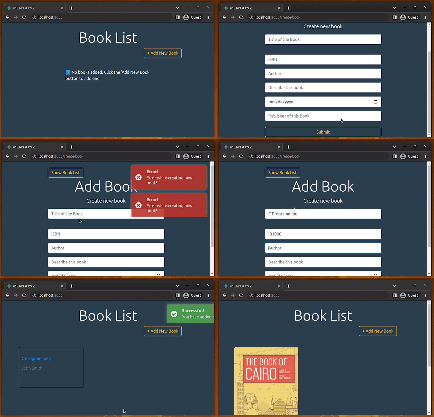
You can apply this same method in different components in your project. Notifications will be displayed in different colors depending on the notification type: info, success, warning, and error.
You can also pass five different parameters along with the message: message, title, timeOut, callback, and priority.
NotificationManager APIsFor this package, there are four different APIs available to us of the following types:
info
success
warning
error
Here’s an example for the success type. Simply replace success with the proper notification type for the given scenario:
NotificationManager.success(message, title, timeOut, callback, priority);
The parameters that follow the notification type are described below:
message: the message we want to pass. It has to be a string.
title: The title of the notification. Again, its type is string.
timeOut: The popup timeout in milliseconds. This has to be an interger.
callback: We can pass a function (type; function) through the notification. It executes after the popup is clicked.
priority: This is a boolean parameter. We can push any notification to the top at any point by setting the priority to true.
Now that we have discussed react-notifications, let’s move on to react-toastify. Both packages serve a similar purpose, but react-toastify has more built-in features than react-notifications, and it is also more open to customization.
React-toastify is more popular than react-notifications according to their weekly downloads record at the time of writing.
React-toastify was built with many features, some of which are:
For this part, I want to create a new project to show the whole setup. Let’s use create-react-app to get an initial setup for our React project.
npx create-react-app react-notification-example
From the project directory (react-notification-example), run the project:
npm start
# --- or ---
yarn start
Now, open the App.js file and update it with this:
import React, { useState } from 'react';
import './App.css';

function App() {
  let [totalSize, setTotalSize] = useState(0);
  let [sizeLimit] = useState(100);

  function addDownloadTask(size) {
    if(totalSize + size <= sizeLimit) {
      setTotalSize(totalSize + size);
    }
  };

  function reset() {
    setTotalSize(0);
  }

  return (
    <div className="App">
        <header className="App-header">
          <div>
            <button onClick={() => addDownloadTask(40)}>
              Download A(40GB)
            </button>

            <button onClick={() => addDownloadTask(80)}>
              Download B(80GB)
            </button>

            <button onClick={() => addDownloadTask(30)}>
              Download C(30GB)
            </button>
          </div>

          <div>
            <button onClick={reset}>
              Reset
            </button>
          </div>

          <b>
            Download Limit: {sizeLimit} GB
          </b>

          <h1>
            Total File Size: {totalSize} GB
          </h1>
        </header>
    </div>
  );
}

export default App;
This update will change the view of your http://localhost:3000/, and you should see the following page on your browser:
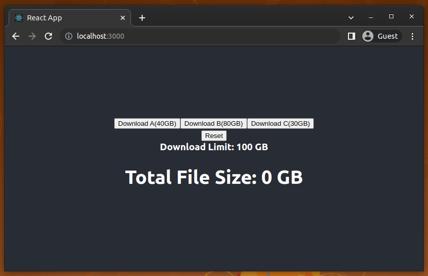
Here you have three options to download three different files by clicking them. Once you click any of them, Total File Size will display the updated number (total number of GB you have downloaded). We set the download limit to 100. You can change them, of course, and there is also a Reset button to reset the total download size.
This app doesn’t have any server functionality, and those Download buttons won’t download any file. It’s just a counter that counts total downloaded file size. This is enough to show the uses of react-toastify.
From your project folder (react-notification-example), run the command for your preferred package manager to install react-toastify:
npm install react-toastify
# -- or ---
yarn add react-toastify
Now, update App.js with these two lines to import the necessary stuff for react-toastify:
import { ToastContainer, toast } from 'react-toastify';
import 'react-toastify/dist/ReactToastify.css';
After that, add ToastContainer inside the App function once in your application tree. If you are not sure where to put it, then rendering it in the application the root component would be the best option.
<ToastContainer position="top-right"/>
Position is optional here, but the default position value is the top right of your browser. If you want, you can replace the position value with any of the following:
top-lefttop-righttop-centerbottom-leftbottom-rightbottom-centerNow you can set notifications to pass through ToastContainer. I have added three different types of notifications — success, error, and info — inside the addDownloadTask and reset functions.
Our final App.js file should look like this:
import React, { useState } from 'react';

// React Toastify
import { ToastContainer, toast } from 'react-toastify';
import 'react-toastify/dist/ReactToastify.css';

import './App.css';

function App() {
  let [totalSize, setTotalSize] = useState(0);
  let [sizeLimit] = useState(100);

  function addDownloadTask(size) {
    if(totalSize + size <= sizeLimit) {
      setTotalSize(totalSize + size);
      toast.success(`You have downloaded a ${size} GB file successfully!`);
    }
    else {
      toast.error('Download limit exceeded!');
    }
  }

  function reset() {
    setTotalSize(0);
    toast.info('Download counter was initialized to 0');
  }

  return (
    <div className="App">
        <header className="App-header">
          <div>
            <button onClick={() => addDownloadTask(40)}>
              Download A(40GB)
            </button>

            <button onClick={() => addDownloadTask(80)}>
              Download B(80GB)
            </button>

            <button onClick={() => addDownloadTask(30)}>
              Download C(30GB)
            </button>
          </div>

          <div>
            <button onClick={reset}>
              Reset
            </button>
          </div>

          <b>
            Download Limit: {sizeLimit} GB
          </b>

          <h1>
            Total File Size: {totalSize} GB
          </h1>
        </header>
        <ToastContainer/>
    </div>
  );
}

export default App;
You will get the following success notification after every successful downloading attempt:
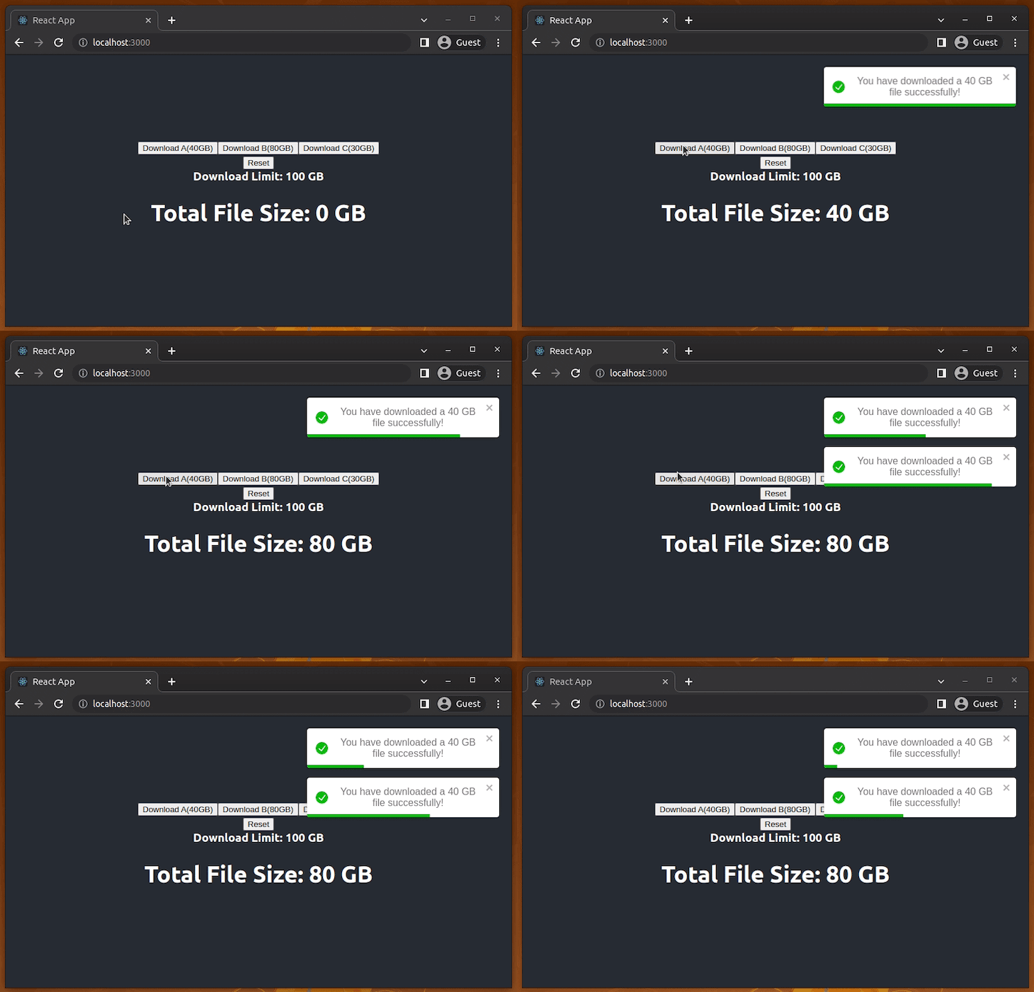
If you look at the notification closely, you’ll see there is a progress bar within the notification. This indicates the remaining display time for the notification.
You get the following error notification when you try to execute a download after exceeding or meeting the download limit:
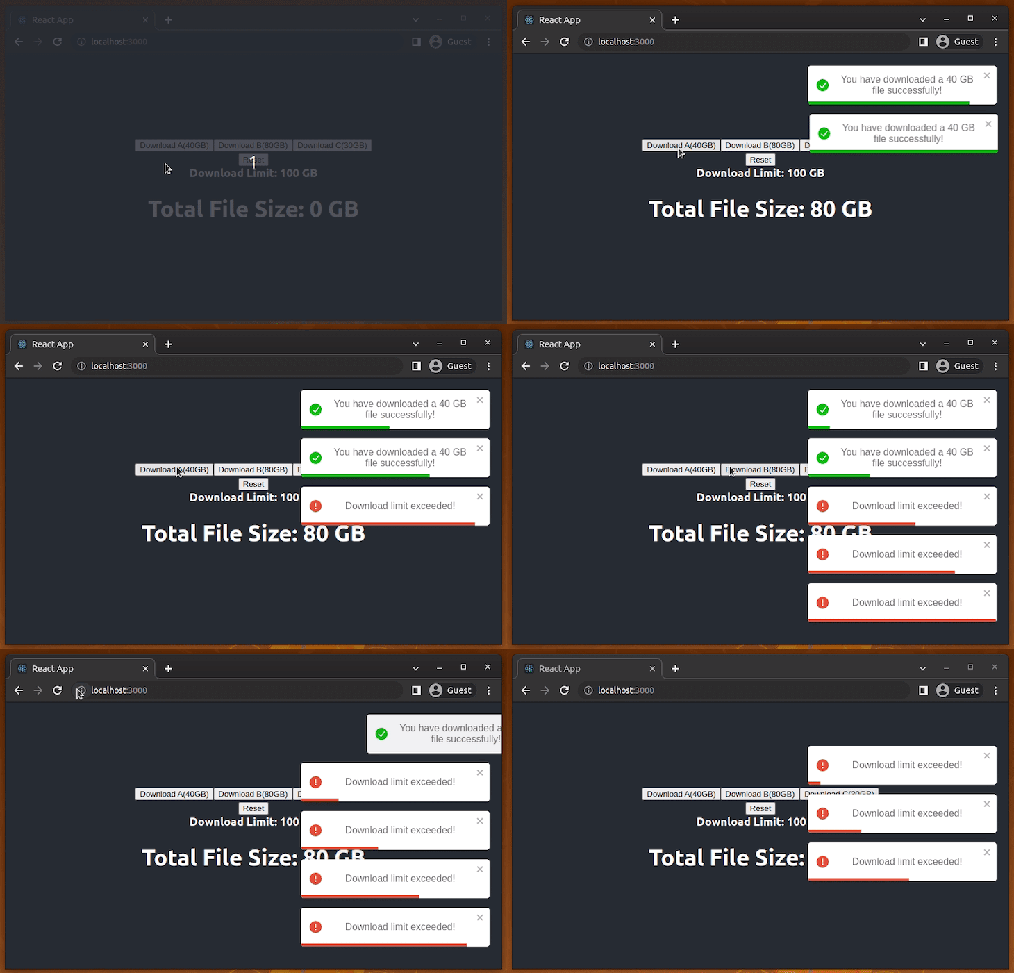
And it will show an info notification when you press the Reset button:
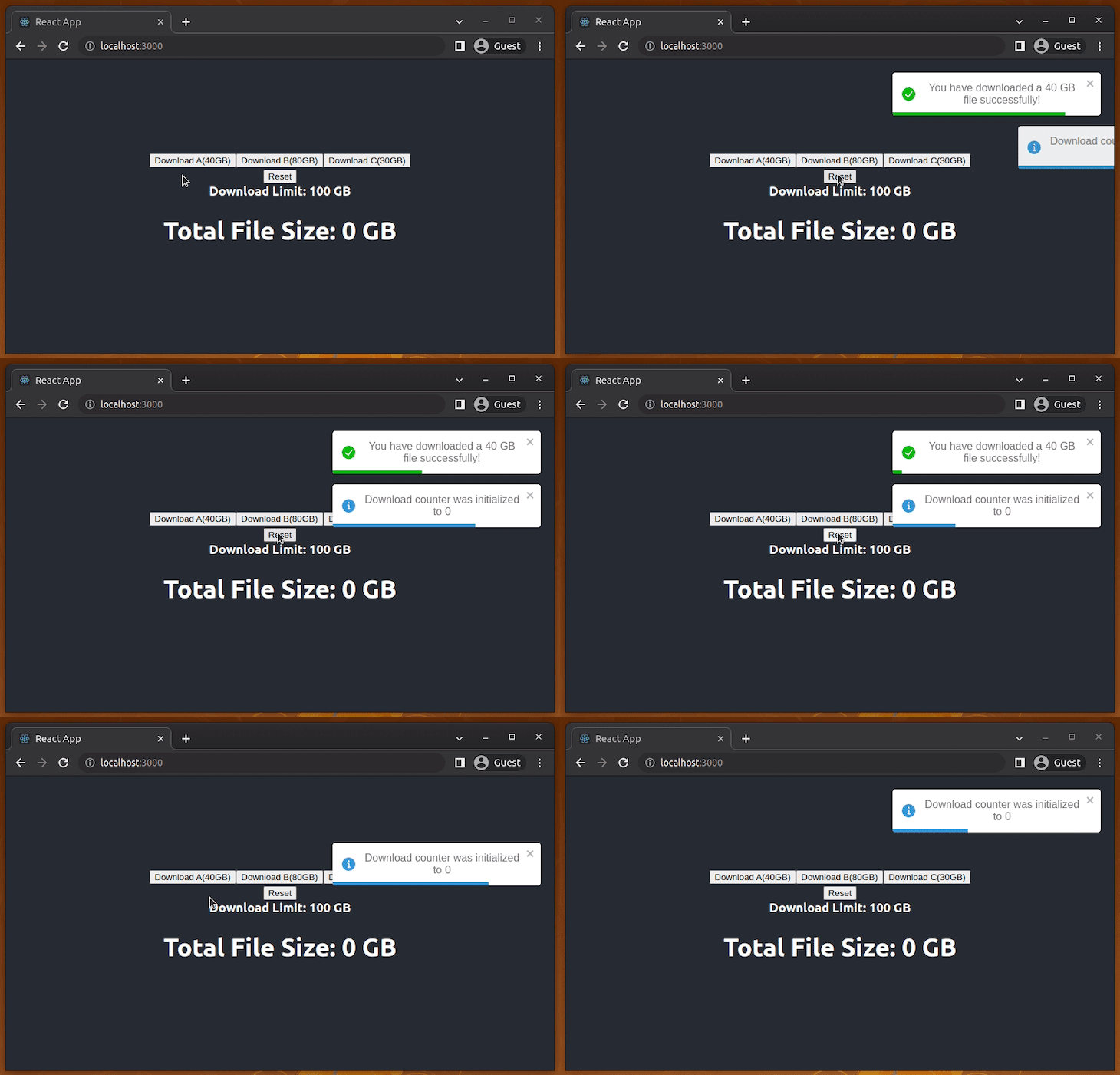
You can also dismiss any notification by simply clicking it, or you can swipe them to the left or right.
React-toastify is fully customizable, and there are also many more exciting features to fulfill all your needs. You can check out the full documentation for react-toastify here.
Like any other npm package, these notification packages also have alternatives. For example, you can use the following alternative packages for displaying these toaster notifications in React:
Today we have discussed adding a spinner and two different packages for managing notifications in a React project. Consider using pure CSS-based or SVG-based spinner animations over traditional GIFs due to customizability and efficient size. However, using smaller-sized GIF spinners is fine if it doesn’t affect the bundle size too much. Nowadays, some developers tend to use Facebook-like content loaders (also known as the skeleton loader or placeholder loader) over spinners. However, spinners offer standard and minimal animated UI elements compared to the modern skeleton loader.
Both notification packages are popular and customizable. React-notifications is simpler than react-toastity, but I would recommend react-toastify over react-notifications because the former is more popular and has more customizable options to go along with all the same features of react-notifications.
Install LogRocket via npm or script tag. LogRocket.init() must be called client-side, not
server-side
$ npm i --save logrocket

// Code:

import LogRocket from 'logrocket';
LogRocket.init('app/id');
// Add to your HTML:

<script src="https://cdn.lr-ingest.com/LogRocket.min.js"></script>
<script>window.LogRocket && window.LogRocket.init('app/id');</script>
Would you be interested in joining LogRocket's developer community?
Join LogRocket’s Content Advisory Board. You’ll help inform the type of content we create and get access to exclusive meetups, social accreditation, and swag.
Sign up now
Discover how to use Gemini CLI, Google’s new open-source AI agent that brings Gemini directly to your terminal.

This article explores several proven patterns for writing safer, cleaner, and more readable code in React and TypeScript.

A breakdown of the wrapper and container CSS classes, how they’re used in real-world code, and when it makes sense to use one over the other.

This guide walks you through creating a web UI for an AI agent that browses, clicks, and extracts info from websites powered by Stagehand and Gemini.
3 Replies to "Adding spinners and notifications to your React app"
Don’t use a gif for spinners. Use an svg with css animation.
Great resource. Thanks for sharing with us. My app have some odd behaviour. I stopped the backend server and tried to save a new user (Trying to force for an error). Both notifications (success and error) were executed. Are you know why?
axios.post().then(–succes-notification).catch(–error-notification)
I’m using react-toastify if make sense.
Thank You…..!