resizeMode in React Native to scale images
Imagine a website without images or illustrations — only plain text. It would be pretty unappealing and boring! Images make our applications and websites more appealing to the users, improve UX and SEO, and help us visually illustrate the points we are trying to pass across.
Using the right image and ensuring that it fits the viewport well will improve the website’s design and overall user experience. A distorted, overlapping, or poorly cropped image will only reduce the website’s design.
In this article, we will look at how to work with an image’s resizeMode in React Native and compare it to resizing images in CSS. Jump ahead:
resizeMode in React Native
resizeModeCheck out the full code in this GitHub repo. Then, let’s get started.
Before we begin looking into the resizeMode property in React Native, we should first look at how it works in CSS. Both cases cover the same basic concepts, so this will help us understand the topic in more detail.
You can also jump ahead in this article to start reading about resizeMode in React Native right away.
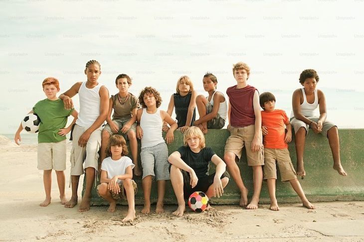
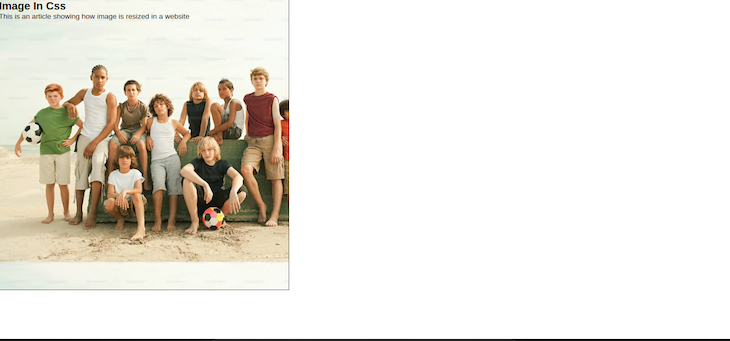
We will use the following stock image in our CSS image resizing demos:
Look at the code below:
// App.js

import React from "react";
import "./styles.css";
export default function App() {
  return (
    <div className="App">
      <div className="image-container">
        <section>
          <h1>Image In Css</h1>
          <p> This is an article showing how image is resized in a website </p>
        </section>
      </div>
    </div>
  );
}
In the code above, we have a header and paragraph tag. We will be designing a hero section that has an image as a background and text on top of it. To add our image from our CSS file, copy the code below:
* {
  margin: 0;
  padding: 0;
}
.App {
  font-family: sans-serif;
}
.image-container {
  background-image: url("https://plus.unsplash.com/premium_photo-1664298270691-6aa217e5b1a5?ixlib=rb-4.0.3&ixid=MnwxMjA3fDB8MHxwaG90by1wYWdlfHx8fGVufDB8fHx8&auto=format&fit=crop&w=870&q=80");
  height: 70vh;
}
The output of the code above will be the following:
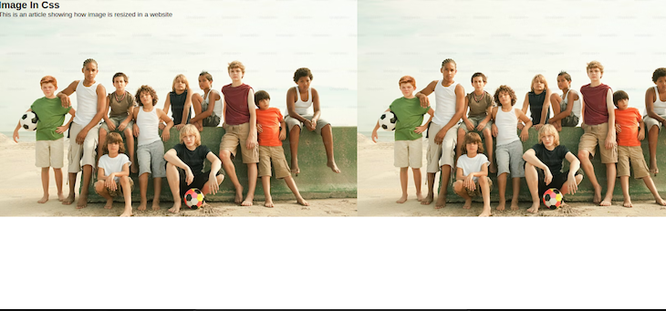
We can see that the image is repeated. If we add a border to show the width and height of the parent div container, like so:
* {
  margin: 0;
  padding: 0;
}
.App {
  font-family: sans-serif;
}
.image-container {
  background-image: url("https://plus.unsplash.com/premium_photo-1664298270691-6aa217e5b1a5?ixlib=rb-4.0.3&ixid=MnwxMjA3fDB8MHxwaG90by1wYWdlfHx8fGVufDB8fHx8&auto=format&fit=crop&w=870&q=80");
  height: 85vh;
  border: 2px solid black;
}
Then we will have something like this:
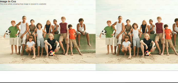
In the image above, you will also notice that the height of the image is not occupying the full height of the parent container. This is because both have different dimensions and by extension different aspect ratios.
As a reminder, the aspect ratio of an element is the ratio between the height and width of the element. Simply put, it is the proportional relationship between the height and width of an image.
An aspect ratio is written with the width and the height separated by a colon. For example, an image that is 300 pixels wide and 300 pixels high has an aspect ratio of 1:1 — i.e., it has an equal number of pixels in width and height.
In CSS, you can use the aspect-ratio property to determine how your container or element will look. See the CSS below:
.image-container {
  background-image: url("https://plus.unsplash.com/premium_photo-1664298270691-6aa217e5b1a5?ixlib=rb-4.0.3&ixid=MnwxMjA3fDB8MHxwaG90by1wYWdlfHx8fGVufDB8fHx8&auto=format&fit=crop&w=870&q=80");
  height: 85vh;
  border: 2px solid black;
  aspect-ratio: 1/1;
}
Adding a 1:1 aspect ratio to the container — in other words, giving the image’s parent container an equal width and height — will give the output below:
You can tweak the aspect ratio to see other results.
Now, back to our background image styling. We can make it look much better by adding a background-position and background-size property as well as removing the background-repeat property like below:
.image-container {
  background-image: url("https://plus.unsplash.com/premium_photo-1664298270691-6aa217e5b1a5?ixlib=rb-4.0.3&ixid=MnwxMjA3fDB8MHxwaG90by1wYWdlfHx8fGVufDB8fHx8&auto=format&fit=crop&w=870&q=80");
  background-position: center;
  background-repeat: no-repeat;
  background-size: cover;
  height: 85vh;
  border: 2px solid black;
}
The background-position moves the image either to the left, right, top, bottom, or center of the container. The background-size property has values like the center, cover, contain, and inherit.
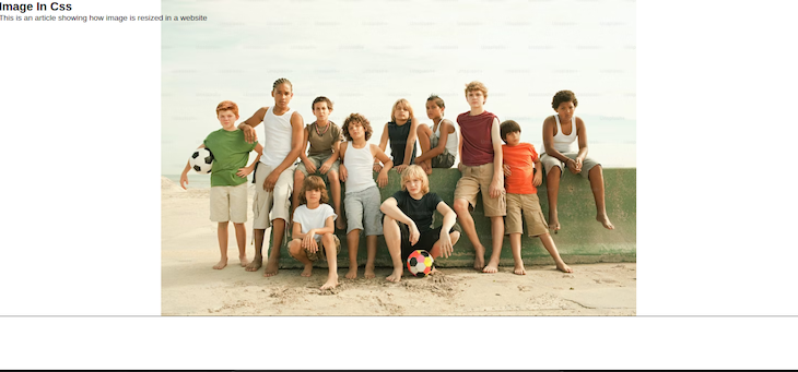
The center value moves the image to the center while maintaining the image’s original aspect ratio. This might result in empty spaces around the image if the image’s aspect ratio or dimensions is smaller than that of the parent container:
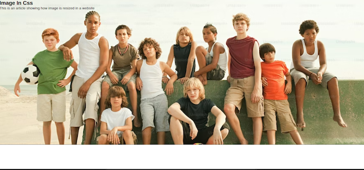
The contain value scales or enlarges the image to fill the parent container without stretching the image or cropping any part out. In this case, because we are setting the background-repeat property to no-repeat, the image will fit the height of the parent container but will leave empty spaces on the sides:
The inherit value inherits the value of the parent container. This means that if the parent container has a value of contain, the image automatically takes that value. If the value of the parent container is cover, then the image’s value becomes cover. See the CSS below:
.App {
  font-family: sans-serif;
  background-size: cover;
}
.image-container {
  background-image: url("https://plus.unsplash.com/premium_photo-1664298270691-6aa217e5b1a5?ixlib=rb-4.0.3&ixid=MnwxMjA3fDB8MHxwaG90by1wYWdlfHx8fGVufDB8fHx8&auto=format&fit=crop&w=870&q=80");
  background-position: center;
  background-repeat: no-repeat;
  background-size: inherit;
  height: 85vh;
  border: 2px solid black;
}
In this case, since the parent container doesn’t have a background-size value, the inherit value does nothing:

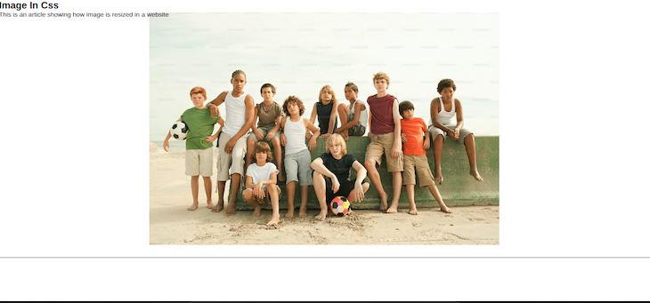
The cover value fits the image into the parent container such that the image is enlarged to take the parent container’s aspect ratio. This will result in cropping out some portions of the image:
Among the different values, we can see that the cover value gives us the closest output to what we want because it fills the whole parent width.
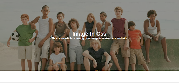
Let’s add a text overlay to finish our background image styling. First, we will reduce the brightness of the image so that our text can be visibly seen. To do so, we will add a background-color property, then a background-blend-mode property:
* {
  margin: 0;
  padding: 0;
}
.App {
  font-family: sans-serif;
  color: #fff;
}
h1 {
  font-size: 50px;
  text-align: center;
}
p {
  font-size: 24px;
  font-weight: 600;
}
.image-container {
  background-image: url("https://plus.unsplash.com/premium_photo-1664298270691-6aa217e5b1a5?ixlib=rb-4.0.3&ixid=MnwxMjA3fDB8MHxwaG90by1wYWdlfHx8fGVufDB8fHx8&auto=format&fit=crop&w=870&q=80");
  background-color: rgba(36, 36, 36, 0.493);
  background-position: center;
  background-repeat: no-repeat;
  background-size: cover;
  background-blend-mode: darken;
  border: 2px solid black;
  height: 85vh;
  display: flex;
  justify-content: center;
  align-items: center;
}
The background-blend-mode property blends the image with the background-color. It has values like lighten, darken, luminosity, saturation, and so on.
In the code above, I used the RGBA color system so I can add some light opacity to the color. Then, I set the background-blend-mode value to darken to reduce the brightness of the background-image. The output of the code will be:
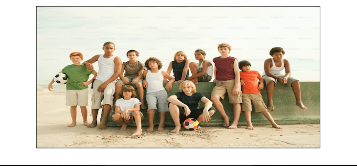
Similarly, you can use the object-fit property to resize an image. Let us look at the JavaScript code below:
// App.js

import React from "react";
import "./styles.css";
export default function App() {
  return (
    <div className="App">
      <div className="image-container">
        <img
          src="https://plus.unsplash.com/premium_photo-1664298270691-6aa217e5b1a5?ixlib=rb-4.0.3&ixid=MnwxMjA3fDB8MHxwaG90by1wYWdlfHx8fGVufDB8fHx8&auto=format&fit=crop&w=870&q=80"
          alt="boys"
        />
      </div>
    </div>
  );
}
Here’s the CSS code we’ll use for styling:
* {
  margin: 0;
  padding: 0;
}
.App {
  display: flex;
  justify-content: center;
  align-items: center;
  padding-top: 30px;
}
.image-container {
  border: 3px solid black;
  height: 85vh;
  aspect-ratio: 2/1;
}
img {
  width: 100%;
  height: 100%;
  object-fit: fill;
}
We gave our image container a height and then, using the aspect-ratio we learned about, we determined what we want our width to be. We also gave it a border to show the container’s width and height.
Next, using the object-fit property, you can give your image a value of contain, cover, fill, and so on. In this case, we gave it a value of fill, resulting in this output:
We have looked at how to handle image resizing in CSS on the web. Next, we will be looking at how to resize images in React Native.
resizeMode in React NativeNote that there is more than one way to resize images in React Native. We can either resize the image in the CSS style as we have seen above, or we can resize it directly in the image component.
The image component in React Native provides a resizeMode option that we can use to resize our images directly. The code snippet looks like this:
<Image source={image_source} resizeMode="repeat" />
In React Native, the resizeMode property has five values — cover, contain, stretch, repeat, and center. These values help us to resize our images when the frame doesn’t match or fit the raw image dimensions.
The cover, contain, and center values for resizeMode behave similarly to their background-size counterparts in CSS, which makes them easy to understand.
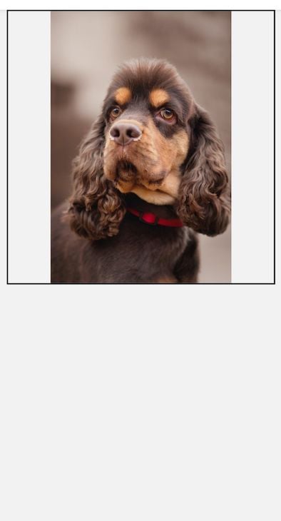
We will use the following stock image as we explore each resizeMode property value in React Native:
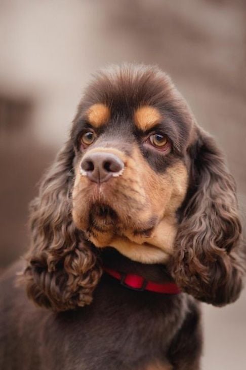
Let’s dive into the five resizeMode property values now.
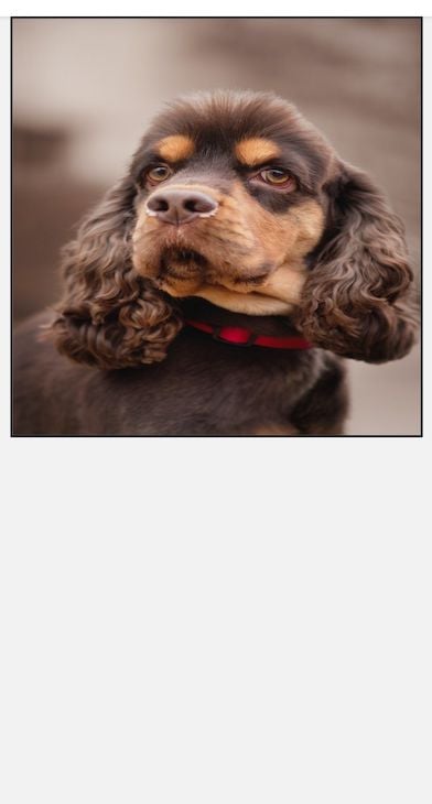
cover propertyThe default resizeMode property in React Native is cover. Like background-property: cover in CSS, this property resizes images by an equal factor in both dimensions so that the image maintains its original proportions and is not stretched or distorted when resized.
Using cover means that the image fills the entire container of the parent view. However, this property may result in parts of the image being cropped out if the aspect ratio of the view does not match the aspect ratio of the image.
A good use case for this property would be to display image backgrounds where we want the image to occupy and fill the entire container, as we did in the above example. However, with this property, you’ll want to ensure that the image you select will look fine when cropped to fill the view.
Let’s look at the following example:
// App.js

import React from 'react';
import {View, Image, StyleSheet, Dimensions, SafeAreaView} from 'react-native';
import Img2 from '../assets/image2.jpg';
export default function Home({navigation}) {
  return (
    <SafeAreaView style={styles.container}>
      <View style={styles.imageContainer}>
        <Image source={Img2} style={styles.image} />
      </View>
    </SafeAreaView>
  );
}
const windowWidth = Dimensions.get('window').width;
const styles = StyleSheet.create({
  container: {
    flex: 1,
    flexWrap: 'wrap',
    flexDirection: 'row',
    alignItems: 'center',
    justifyContent: 'center',
  },
  imageContainer: {
    height: 400,
    width: windowWidth - 20,
    borderWidth: 2,
    borderColor: '#000',
  },
  image: {
    flex: 1,
    resizeMode: 'cover',
    width: '100%',
  },
});
The code above would give us the result below:
As you can see, the image completely fills the parent view, which is indicated by the black border. However, if you compare this to the original image, you can see that some areas have been cropped out.
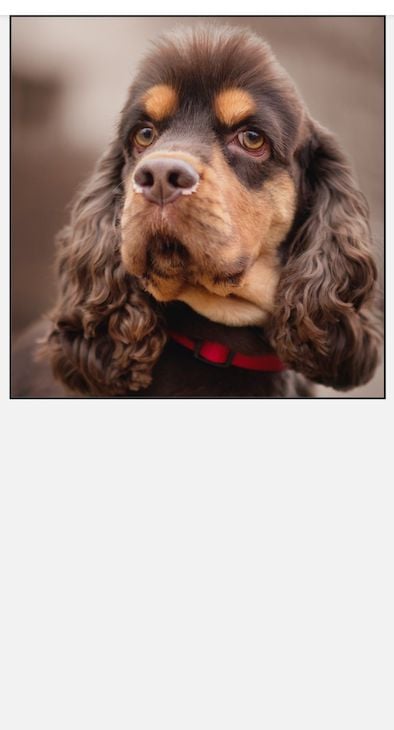
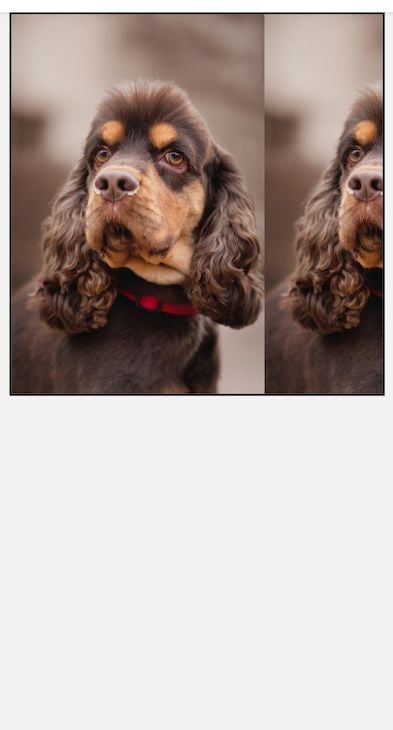
contain propertyThe contain property resizes the image’s height and width so that the image fits the parent container while maintaining the image’s original aspect ratio. This is similar to background-property: contain in CSS and results in an image that is fully visible within the view.
This means just like in CSS, if the view’s aspect ratio does not match the aspect ratio of the image — i.e., the image’s aspect ratio is less than the view’s aspect ratio — using the <code<contain property to scale your image will result in empty spaces being left around the image.
Look at the example below:
// App.js

import React from 'react';
import {View, Image, StyleSheet, Dimensions, SafeAreaView} from 'react-native';
import Img2 from '../assets/image2.jpg';
export default function Home({navigation}) {
  return (
    <SafeAreaView style={styles.container}>
      <View style={styles.imageContainer}>
        <Image source={Img2} style={styles.image} />
      </View>
    </SafeAreaView>
  );
}
const windowWidth = Dimensions.get('window').width;
const styles = StyleSheet.create({
  container: {
    flex: 1,
    flexWrap: 'wrap',
    flexDirection: 'row',
    alignItems: 'center',
    justifyContent: 'center',
  },
  imageContainer: {
    height: 400,
    width: windowWidth - 20,
    borderWidth: 2,
    borderColor: '#000',
  },
  image: {
    flex: 1,
    resizeMode: 'contain',
    width: '100%',
  },
});
In the code above, the aspect ratio of the image does not match the aspect ratio of the view, resulting in the following:
You can see that the image fits into the view but leaves some empty spaces on the sides. An example use case of this property could be for displaying user profile pictures where you want the entire image to fit into the container and still be visible.
stretch propertyThe stretch property stretches the image to fill the entire view container. This may result in a distorted or stretched image if the aspect ratios for the image and view do not match. Let’s see this in action:
// App.js

import React from 'react';
import {View, Image, StyleSheet, Dimensions, SafeAreaView} from 'react-native';
import Img2 from '../assets/image2.jpg';
export default function Home({navigation}) {
  return (
    <SafeAreaView style={styles.container}>
      <View style={styles.imageContainer}>
        <Image source={Img2} style={styles.image} />
      </View>
    </SafeAreaView>
  );
}
const windowWidth = Dimensions.get('window').width;
const styles = StyleSheet.create({
  container: {
    flex: 1,
    flexWrap: 'wrap',
    flexDirection: 'row',
    alignItems: 'center',
    justifyContent: 'center',
  },
  imageContainer: {
    height: 400,
    width: windowWidth - 20,
    borderWidth: 2,
    borderColor: '#000',
  },
  image: {
    flex: 1,
    resizeMode: 'stretch',
    width: '100%',
  },
});
The code above will result in the following:
As you can see, although the image completely fills the view, it doesn’t look like the original image. This is another useful property for background images that you want to fill the entire container, but may not be ideal if your image and container aspect ratios do not match closely.
repeat propertyThe repeat property repeats the image to fill the view container while maintaining the image’s original aspect ratio. In other words, if there are empty spaces because the view’s aspect ratio is bigger, it then repeats the image to fill up the spaces.
Look at the example below:
// App.js

import React from 'react';
import {View, Image, StyleSheet, Dimensions, SafeAreaView} from 'react-native';
import Img2 from '../assets/image2.jpg';
export default function Home({navigation}) {
  return (
    <SafeAreaView style={styles.container}>
      <View style={styles.imageContainer}>
        <Image source={Img2} style={styles.image} />
      </View>
    </SafeAreaView>
  );
}
const windowWidth = Dimensions.get('window').width;
const styles = StyleSheet.create({
  container: {
    flex: 1,
    flexWrap: 'wrap',
    flexDirection: 'row',
    alignItems: 'center',
    justifyContent: 'center',
  },
  imageContainer: {
    height: 400,
    width: windowWidth - 20,
    borderWidth: 2,
    borderColor: '#000',
  },
  image: {
    flex: 1,
    resizeMode: 'repeat',
    width: '100%',
  },
});
Here’s the result of the code above:
Repeating images as shown above can be useful if you want to have image patterns or a tile design. However, if you’re not careful about how you use this, it can end up looking sloppy or cluttered to your user.
center propertyLike background-size: center in CSS, the center property in resizeMode moves the image to the center of the view container.
If the image’s aspect ratio is smaller than the aspect ratio of the view, it will result in empty spaces around the image. On the other hand, if the image’s aspect ratio is bigger than that of the view, the image is shrunk or reduced to fit the view.
This can be useful for displaying user profile avatars and logos. That is because you want the avatar or logo to always be at the center of the parent container, without minding the aspect ratio.
See the example below:
// App.js

import React from 'react';
import {View, Image, StyleSheet, Dimensions, SafeAreaView} from 'react-native';
import Img2 from '../assets/image2.jpg';
export default function Home({navigation}) {
  return (
    <SafeAreaView style={styles.container}>
      <View style={styles.imageContainer}>
        <Image source={Img2} style={styles.image} />
      </View>
    </SafeAreaView>
  );
}
const windowWidth = Dimensions.get('window').width;
const styles = StyleSheet.create({
  container: {
    flex: 1,
    flexWrap: 'wrap',
    flexDirection: 'row',
    alignItems: 'center',
    justifyContent: 'center',
  },
  imageContainer: {
    height: 400,
    width: windowWidth - 20,
    borderWidth: 2,
    borderColor: '#000',
  },
  image: {
    flex: 1,
    resizeMode: 'center',
    width: '100%',
  },
});
Our output would look like so:

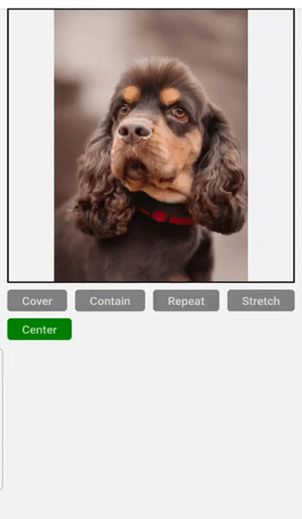
resizeModeLet’s build a sample app to see how the different image resizeMode values work. This will help demonstrate our lesson in a practical and visual way for better understanding. Spin up your React Native app using your preferred method — I prefer using Expo — and let’s continue.
In your App.js file, copy the following code. There’s a lot here, but don’t worry! I will explain below:
// App.js

import React, {useState} from 'react';
import {
  View,
  Text,
  Image,
  StyleSheet,
  Dimensions,
  SafeAreaView,
  TouchableOpacity,
} from 'react-native';
import Img2 from '../assets/image2.jpg';

export default function Home({navigation}) {
  const [state, setState] = useState('contain');

  return (
    <SafeAreaView style={styles.container}>
      <View style={styles.imageContainer}>
        <Image source={Img2} style={styles.image} resizeMode={state} />
      </View>

      <View style={styles.buttonWrapper}>
        <TouchableOpacity
          style={state === 'cover' ? styles.activeButton : styles.button}
          onPress={() => setState('cover')}>
          <Text style={styles.buttonText}>Cover</Text>
        </TouchableOpacity>
        <TouchableOpacity
          style={state === 'contain' ? styles.activeButton : styles.button}
          onPress={() => setState('contain')}>
          <Text style={styles.buttonText}>Contain</Text>
        </TouchableOpacity>
        <TouchableOpacity
          style={state === 'repeat' ? styles.activeButton : styles.button}
          onPress={() => setState('repeat')}>
          <Text style={styles.buttonText}>Repeat</Text>
        </TouchableOpacity>
        <TouchableOpacity
          style={state === 'stretch' ? styles.activeButton : styles.button}
          onPress={() => setState('stretch')}>
          <Text style={styles.buttonText}>Stretch</Text>
        </TouchableOpacity>
        <TouchableOpacity
          style={state === 'center' ? styles.activeButton : styles.button}
          onPress={() => setState('center')}>
          <Text style={styles.buttonText}>Center</Text>
        </TouchableOpacity>
      </View>
    </SafeAreaView>
  );
}
const windowWidth = Dimensions.get('window').width;
const styles = StyleSheet.create({
  container: {
    flex: 1,
    flexWrap: 'wrap',
    flexDirection: 'row',
    alignItems: 'center',
    justifyContent: 'center',
  },
  imageContainer: {
    height: 400,
    width: windowWidth - 20,
    borderWidth: 2,
    borderColor: '#000',
  },
  image: {
    flex: 1,
    width: '100%',
  },
  buttonWrapper: {
    flexDirection: 'row',
    width: windowWidth - 20,
    marginTop: 20,
    justifyContent: 'space-between',
    flexWrap: 'wrap',
  },
  activeButton: {
    backgroundColor: 'green',
    paddingVertical: 5,
    paddingHorizontal: 20,
    borderRadius: 5,
    marginBottom: 10,
  },
  button: {
    backgroundColor: 'grey',
    paddingVertical: 5,
    paddingHorizontal: 20,
    borderRadius: 5,
    marginBottom: 10,
  },
  buttonText: {
    fontSize: 20,
    fontWeight: '600',
  },
});
We have an image that we want to resize to fit our view container.
We also have five buttons, each representing the five resizeMode values. When we click each button, we are setting the associated value — contain, cover, repeat, stretch, and center — as the current value of our state.
Finally, when a button is clicked, we change the color of the button to green to show that it has been clicked and that the image is now resized to the indicated resizeMode value. The final application looks like this:
In this article, we explored the different resizeMode property values in React Native and how to use them. We also saw how to resize images using CSS for the web, as well as what images will look like when using these properties.
When building React Native applications, we have to understand these image resizeMode property values — along with the aspect ratios for our image and view — so that we can scale our images better and improve the visual design and user experience.

LogRocket's Galileo AI watches sessions for you and and surfaces the technical and usability issues holding back your React Native apps.
LogRocket also helps you increase conversion rates and product usage by showing you exactly how users are interacting with your app. LogRocket's product analytics features surface the reasons why users don't complete a particular flow or don't adopt a new feature.
Start proactively monitoring your React Native apps — try LogRocket for free.

A guide for using JWT authentication to prevent basic security issues while understanding the shortcomings of JWTs.

Discover how to build, render, and automate product demo videos with Remotion, replacing traditional screen recordings with reusable React code.

Chrome’s Modern Web Guidance embeds modern web platform skills into AI coding agents, helping them choose native HTML, CSS, and browser APIs over legacy patterns.

Learn how to use Fallow to analyze AI-generated code, detect dead code, duplicate logic, and complexity issues, and integrate automated code quality checks into your AI-assisted development workflow.
Hey there, want to help make our blog better?
Join LogRocket’s Content Advisory Board. You’ll help inform the type of content we create and get access to exclusive meetups, social accreditation, and swag.
Sign up now

 Learn more →
