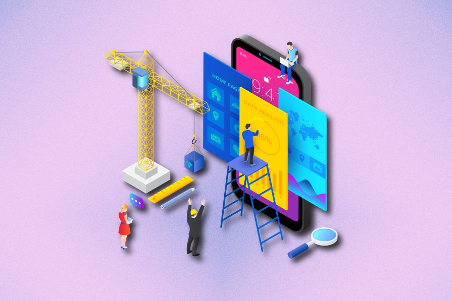
Most digital products typically use minimalist, corporate-friendly UI/UX designs to create task-oriented product interfaces. However, designers shouldn’t limit themselves to strict professionalism. To craft really memorable UIs, they can embrace creativity beyond traditional norms. And retro-futuristic designs allow them to do just that.

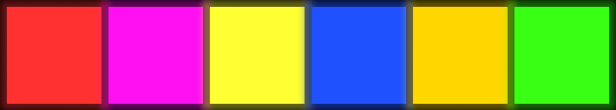
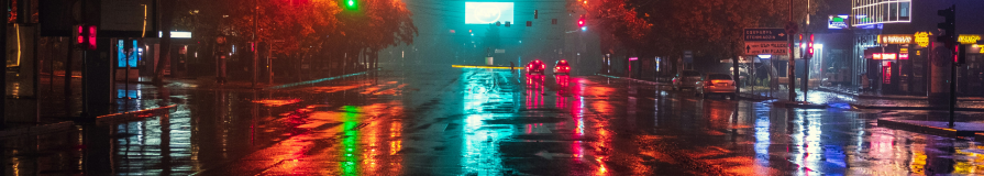
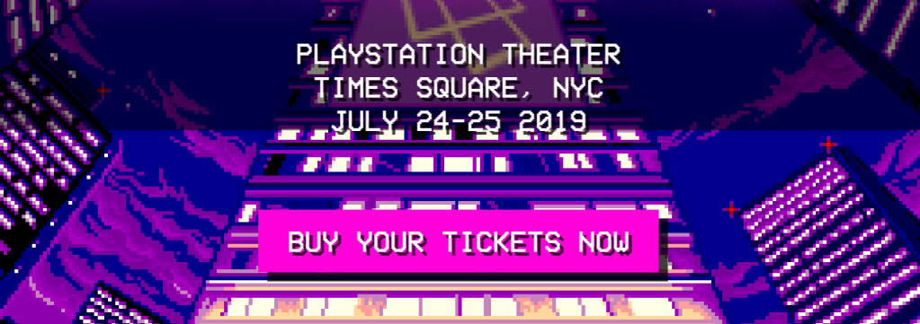
Retro-futurism is a popular design concept designers can use to infuse nostalgia, creativity, and futuristic aesthetics into digital experiences. These designs use an aesthetic theme that reveals a possible technological future thought with the 20th century’s old-fashioned technologies. They use neon color palettes, sci-fi imagery, cyber-themed typography, dark backgrounds, and metallic textures.
In this article, I’ll discuss the concept of retro-futuristic design and its characteristics, its advantages, and how retro-futurism has made a comeback. I’ll also share how you can effectively use retro-futurism to create modern, memorable product interfaces by discussing design practices and exploring several example UIs that effectively use retro-futuristic design principles.
Retro-futurism is a creative movement that reveals a possible future imagined during the 20th-century timeline, especially between the 70s and 90s. This concept speculates about an alternate 21st century based on the technological predictions and feasibility of the past. It blends futuristic aspirations with vintage aesthetics, often featuring themes such as:
Retro-futurism creates a nostalgic sci-fi experience with classic technology — so UI/UX designers can create memorable digital product interfaces by effectively using retro-futurism as the fundamental design concept.
Retro-futuristic design thrives on a blend of nostalgia and futuristic imagination, creating visually rich and immersive digital experiences. It borrows heavily from past visions of the future — drawing inspiration from early sci-fi films, arcade aesthetics, and the neon glow of cyberpunk worlds.
If you’re looking to integrate retro-futurism into UX design, here are the essential characteristics to focus on:


Some product domains and design scenarios are naturally suitable for creating nostalgic, memorable UX, but some aren’t. And so we should carefully decide on using retro-futurism for product designs. Retro-futurism is particularly effective for:
It works best when the design intent is to evoke curiosity, excitement, and a sense of adventure. However, it is not suitable for corporate websites, enterprise applications, or healthcare systems, where professionalism, clarity, and task efficiency are prioritized over aesthetic experimentation.
Retro-futurism blends nostalgia with forward-thinking aesthetics, making it a powerful design approach for digital products. Here’s why it stands out:
By embracing retro-futurism, brands can create standout experiences that are both visually striking and emotionally resonant.
I’ll now evaluate some retro-futuristic product design examples under several design categories and focus on practical design aspects:
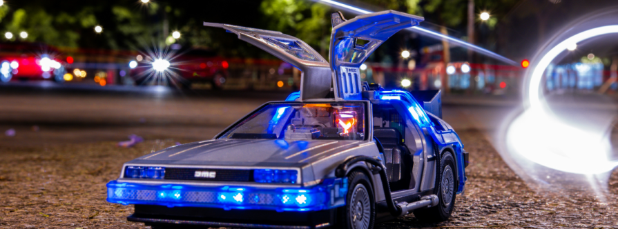
Cyberpunk, one of the most well-known retro-futuristic subgenres, portrays a dystopian era future where technological advancements coexist with social decay and environmental collapse. These designs often incorporate neon-lit cityscapes, glitch effects, and punk-inspired UI elements to create immersive digital experiences.
The Cyberpunk-Neon GitHub repository provides theme files to let you customize the GNU/Linux operating system with cyberpunk-themed UI elements:
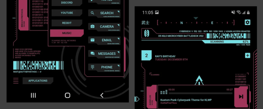
The Cyberpunk theme for KLWP Android app implements a custom app launcher with a cyberpunk theme with neon colors and cyber-themed UI elements:
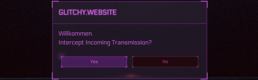
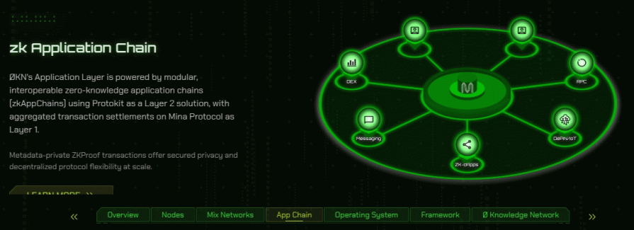
Many retro-futuristic UIs simulate the graphical user interfaces (GUIs) of advanced computer devices in classic sci-fi movies and games. These designs often mimic old-school terminal aesthetics, glowing wireframes, and technical readouts.
The 0 Knowledge Network website, for example, looks like a computer screen shown in most sci-fi movies:
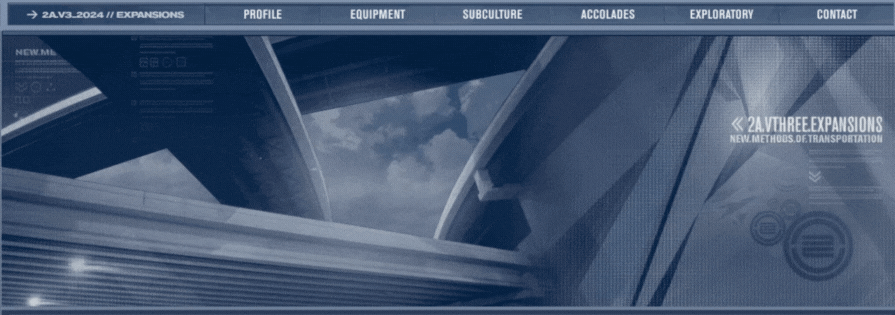
The official website of 2Advanced Studios, a legendary web design agency, implements a computer UI we usually see in military computer devices of popular sci-fi movies:
Space exploration has long been a defining element of retro-futurism, imagining intergalactic travel, cosmic colonies, and futuristic spacecraft. Designs in this category often integrate celestial imagery, astronauts, and starry backgrounds with neon highlights.
The SpaceWalker launcher Android app implements a retro-futuristic, space-travel-related theme with a slightly faded neon color scheme and suitable imagery:
The Elodin System company’s website, too, uses a retro-futuristic space travel aesthetic while maintaining a corporate-friendly approach:
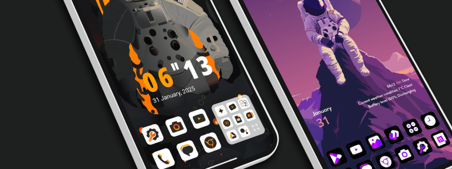
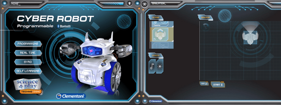
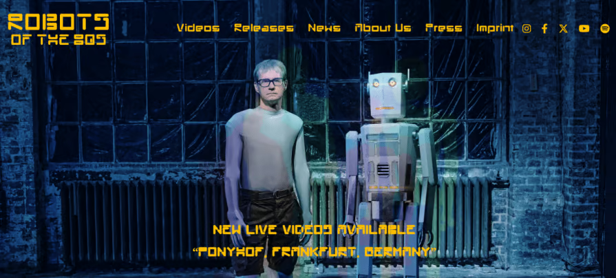
Retro-futurism often envisions robotic assistants and industrial machines designed with a mix of bulky 20th-century engineering and futuristic automation. These designs frequently use metallic textures, gradient lighting, and robotic imagery.
The Cyber Robot Android app that offers a programmable interface for a toy robot, for example, implements a retro-futuristic GUI with neon colors and metallic textures:
The Robots of the 80s music band’s website also uses a retro-futuristic theme with old-fashioned robot images, sci-fi typography, and a neon color scheme:
Some retro-futuristic designs use pixel art designs to highlight futuristic but old-fashioned computer technology. These designs often feature chunky pixels, bright neon colors, and grid-based UI elements.
A striking example of a pixel-art-inspired retro-futuristic theme is the Laracon 2019 landing page:
Retro-futurism isn’t limited to a single aesthetic. It can integrate various design concepts to match different products and user needs:
Designers can improve their retro-futuristic designs further and solve generic design challenges in retro-futurism by adhering to the following dos and don’ts:
Retro-futurism blends past and future aesthetics. Avoid making designs too retro (e.g., directly replicating vintage tech) or too futuristic (e.g., using hyper-modern sci-fi elements).
The sweet spot? 20th-century tech infused with futuristic imagination.
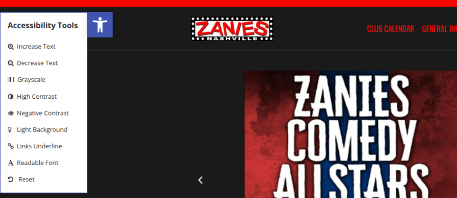
While retro-futuristic designs often feature neon colors, bold typography, and intricate textures, readability and accessibility should remain a priority. Opt for high-contrast, eye-friendly color schemes and legible fonts.
Accessibility toolbars — like the one used on Zanies Comedy Club’s website — allow users to toggle maximalist elements as needed. Here’s an example:
A retro-futuristic interface should feel nostalgic, not obsolete. Ensure the experience remains modern and functional by incorporating responsive layouts, keyboard shortcuts, and intuitive UI patterns beneath the aesthetic layer.
Think of retro-futurism as a design skin, not a limitation.
Retro-futurism can be detail-heavy, which may slow down the design process. Speeding things up doesn’t mean sacrificing creativity — use design tools, templates, and UI kits to maintain efficiency while keeping the aesthetic strong.
Alternatively, you can use digital design tools and search for existing templates/UI kits to speed up the UI/UX process without sacrificing creativity.
Here’s a quick checklist for you to keep handy when you’re taking up a retro-futuristic design project:
By following this checklist, you can create immersive, retro-futuristic interfaces that balance nostalgia with usability. The key is to embrace creativity without sacrificing functionality, making sure my design feels intentional rather than just a stylistic experiment!
Retro-futurism may have originated in the 20th century, but its influence is stronger than ever in modern digital design. By blending nostalgic aesthetics with futuristic imagination, designers can craft memorable, marketing-friendly experiences that stand out from traditional corporate minimalism.
This approach thrives in industries like gaming, AI, and sci-fi-related products, where bold, unconventional interfaces create engagement and intrigue. Whether you’re evoking the neon glow of a ‘90s website or channeling the sleek machinery of classic sci-fi, retro-futurism offers a unique design language that resonates with users and sparks curiosity.

LogRocket's Galileo AI watches sessions and understands user feedback for you, automating the most time-intensive parts of your job and giving you more time to focus on great design.
See how design choices, interactions, and issues affect your users — get a demo of LogRocket today.

AI has accelerated design execution, but speed can come at the expense of intentionality. Learn how UX teams can preserve product thinking and judgment.
UX testing is not limited to layouts, copy, and visual design. Full-stack and server-side experiments help teams evaluate how backend logic, APIs, algorithms, and product flows affect the overall user experience.
In A/B, A/B/n, or multivariate testing scenarios, using p-value with traditional null-hypothesis-based statistical analysis is so common, and most designers […]
Traditional A/B testing splits traffic evenly, but multi-armed bandits dynamically send more users to the better-performing version. Here’s how the method works, where it helps, and when UX teams should use it over classic A/B testing.


